Showing posts with label idea. Show all posts

Monday, May 25, 2020

The New Normal: My Sister's Challenge Envelope

A couple weeks ago, my sister delivered to me a Challenge envelope. We like to make cards together and it's fun to throw ideas around at the table. But since Covid-19, we haven't been able to get together. This envelope contained all sorts of scraps, stickers, and bits that were left over on her craft table one day. She gave it to me to see if I could make some cards with it all. I finally finished the challenge.

I made 5 cards with everything in the envelope. I provided the card bases and a few little embellishments like foil or glitter glue. I also added sentiments or greetings on them. I'm going to add some details here about how I approach using up scraps to get a finished product and hope that maybe you'll find it helpful for using up the leftovers on your craft desk.

The very first thing I do with random bits and bobs is to sort them out by color family. This really allows me to see if I have enough of one color to make a card or if I'll need to draw in another color to have enough for a card front. Patterned papers are great for bridging color families and adding some visual texture to a card front. Scraps are small enough that you don't have to fuss too much with the pattern being too busy.

Let's look at the first card I made from the envelope.

Bottom's Up!  The blue scraps in the envelope were various tones and the largest piece was blue vellum. I'll note here that I hate vellum and I never use it so I wanted to use it up in one big chunk. I figured the best way to do that was as a background. The scrap of water paper paired with the frog part allowed me to make a focal element that matched the vellum. The top part of the card was simply done to cover up the tape behind the vellum. I provided most of that scrap from the pile on my desk in order to tie in the two small leaf stickers I had in the envelope.

By sorting the scraps out by color first, I could easily see how much I had to work with and where I would need more and where I would have plenty. 

So then,

Nobody Sweeter  I still had some blue stuff left but since I wasn't sure how to put them together, I moved on to the pink pile. The pink family had these great patterned papers and a stamped image that was already colored in. I played around with the placement and finally decided to make the floral into a cake topper. The paper scraps were used up on a single card and I used some light bluish line stickers to define the tiers of the cake. The foam dot on the little butterfly was falling off anyway so I just removed it and glued it down flat. This one came together quickly because I could make the focal image from the scraps themselves.

After this, I decided to see what I could make from what I considered the gold family.


The gold family had only a couple stickers in it and I tried to pair the gold family with the green family. But somehow the shades of the patterned paper in the green family weren't quite vibrant enough for this brightly colored butterfly sticker. I had been provided with this green vine still on the Xyron sticker paper. When I pulled off the top part to expose the sticker, I noticed that a lot of the adhesive was stuck in the leaf portions. So I decided to foil it and see what happened. Then the copper colored foil would bridge the gap between the green and the gold families. 

Since the fence piece was white, it would match anything and I put my greeting beneath it as it looked weird just hanging there. I pulled in some paper from the blue family as I decided that the butterfly looked best on the turquoise cardstock. The blue family also had the largest scraps of paper left. 

So after I sort the scraps by color, I then look at their size. Will it fit the length or width of a card front? How big is it in relation to the other scraps I've got? 
So sort by color first, then by size.
Then this happened,

This stamped image of a seed packet was in the envelope, already colored in purple and pink.  Remember what I said about size? This element was the biggest thing I had left but I already used all my pink stuff for the "nobody sweeter" card. I was going to pair it with the blue family but I didn't have a lot left. The green patterned paper was double sided. It had a rusty orange color on the back (which might have worked well with the butterfly sticker) but I really liked this plaid pattern better. It seemed to match some of the deeper green tones in the leaves so I framed out the stamped image with it and added the word that was also in the envelope. The Hope word matched the green plaid and also covered up the gap between the thin scraps along the edge. 

Then I was left with the leftovers from the leftovers. Now all I had was one or two things from different color families. These truly were scraps as I now had nothing to use as a focal image that had come in the envelope. So I pulled in a focal of my own to make it work.


What I had left was the patterned paper from the blue family and the metallic gingko leaves from the gold family. I could match the patterned paper with a turquoise base but I was unsure if I could get the leaves on there. They seemed very out of place with the paper. After putzing around with it, I finally decided to use the stickers as a cluster and I just grabbed the focal element that I had already finished laying on my desk. The metallic of the embossed image on the focal tied the leaves into the card  so they didn't look so haphazard. 

On the inside of this card, I used up the last strip of blue vellum that I had cut off the first card and put a sentiment over it to cover up the tape. 

Now in conclusion, do I like all the cards? Not really. But I had a lot of fun and they're not all bad. I love the pink one and the last two. I'm not a fan of the first card because I just couldn't think of a greeting to go well with it. The yellow butterfly one seems a little "thrown together" to me. While I love that the foiling turned out so well, I wish I could have done a better job with the fence. That fence or gate was actually the back of a sticker so the side that is facing up is the shiny side...the side that nothing sticks to! So I couldn't stamp on it like I had planned to. I just overthought it.

Anyway, I hope this long wordy post was worth it for ya!
For those who are still locked down, keep it up, you're almost there! Stay at home and stay safe.
For those who are re-opening, stay safe and wear your mask for others beside yourself.
For those in New York State, we're getting there, people! Keep up the good work! Phase 2 will be here before you know it because we got this thing down!

-Wy

Thursday, January 11, 2018

TBTH: 5 Most Popular Posts of 2017

Most posts on my blog get around 28-33 views. I consider that a normal response for a post. Some garner not so much interest and some, like the following seem much more popular.

I decided to countdown the 5 Most Popular Posts on my Blog for 2017.

5. Witch Market, Salem, Mass.
 This post was part of my month long Halloween celebration and I almost didn't finish the project in time. Posted only a couple days before the holiday, it scored 43 views. I still have this project sitting on my computer desk where I can see it everyday. It was a particular favorite of mine.

4. The Tell-Tale Heart
This was my first post for the month of October to kick off the Halloween season. It got 55 views. It was a great way to start the month with the newest addition to my growing "Ode to Poe" collection of canvas'.

3. Craft Time
This made me happy to see! This post was written about some crafty time I spent with my niece and it got 61 views! We had fun coloring and making up scenes for some "crazy cats". If you craft with kids, you know why this is special.

2. Poe Appreciation Day: Tag Book 1 & 2 
I counted this as a single post since it was a part one and a part 2 of the same project. Between the two of them, there were 122 views. This project was part of a blog hop for Lost Coast Designs. I still love the tag book and continue to gain ideas and inspiration from it.

So what post was the top of the list?

1. Party Like the Dead
The top post of the year scored an amazing 126 views! This post was about my party decor for a Day of the Dead themed party. It featured invitations, a banner, treat boxes, and straws. I hope to do a couple more posts like this for Halloween 2018!


There it is in a nutshell. Check out those links for anything you may have missed!
Thanks for checking out the blog!
-Wy

Sunday, March 05, 2017

Practice Makes Perfect

In general, when I make cards, I'm using some rubber stamps somewhere. I like to stamp but it's never perfect the first time out.

I'm here to tell ya, practice may not make perfect but it sure does help it look better. Especially when you've just gotten unmounted rubber stamps and can't wait to use them!

Like this bird I got just before I left on vacay. I needed to stamp it a few times to get the feel for the stamp. Did I need to get good pressure in the middle? Would I need to use some magazine beneath the paper to cushion it? What kind of ink would look best with the paper I wanted to use? Did one black look better than another?

Once stamped a few times, I could practice coloring. Which markers to use? Which colors looked good? See the bird on the left...I was experimenting with the grays. I wanted a crow but I didn't want to lose the patterning in the stamp. But then, what if I did purple? The crow on the right was me figuring out which purples went together as well as if they were too dark and would cover up the pattern. Since the crows were only practice, I didn't have to be precise and I could test colors on the background of the paper because I would cut the crows out, if they came out well. So you can see a little scribble here and there on the paper.


I used to be afraid to do this. I felt like I was wasting my supplies and my time. But when you get into a project, one that requires a lot of work, you don't want to screw it up because you're not sure what color to use. That paralyzes me. I start staring at it hesitant to try anything because it might not be what I really want. Then, I'll have to start all over again. So NOW, I'm not afraid of practice. It allows the finished project to go more smoothly and I can feel better about the results.

And not all practice has to be trashed. I salvaged some of these birds for other things and the angels will become card fronts soon. Those that didn't make the cut can always be flipped over and stamped on the other side. Wink.

I'm not sharing the finished piece just yet but once some of the smaller projects are done, you'll be seeing some of this stuff in action.

Back from vacation and eager to get more art started!
-Wy
"Let's get it started. Let's get it started in here!"---Black Eyed Peas

Thursday, January 12, 2017

Welcome 2017

I went back to my Welcome 2016 post to see what goals I made last year that I may have accomplished or not. If you're interested in the whole post, click that link...the goals are down toward the bottom, if you're the scrolling type. (Hey, no judgement, I like that scrolling action, too.)

In this post, I'm going to do the same type of thing. I'm going to set my goals for this year and reflect on anything I might have learned this past year. I know some of it is the same as last year! But this year, I'm ahead of the game and thinking about this stuff a month earlier. I wonder if that will mean I'll get more stuff accomplished!

Goals accomplished in 2016:
1. Inspiration Wednesday Journal Completed! It was completed in good time and before the start of the next year. All those posts are labeled with Inspiration Wednesday so if you click that label over at the right, they'll all come up. Overall, I had a good time with it. But as with all art journals I have completed so far, I never like it all. I've got some ugly mixed in there and it will stay there. Just as I've got some great stuff in there and it will stay there. That is how I approach art journaling: keep it all because it's a snapshot of a moment in time.

2. Art Journal Adventure Completed!  This was just completed early this year with the same caveat as above...a bit of good, meh, and ugly. But I can honestly say my favorite page is in this journal. I'm hoping for more of THAT this year.

3. Color Palette Journal still underway. I have not worked in this journal in quite some time. I have several ideas for palettes laid out but have not done them. I think I got wrapped up in keeping up with the two above journals that I couldn't find time to work in this one. It may also be that this one was going to be fundamentally different in technique as I decided to use less paints and more "scrapbook" type things. I'm calling this one a FAIL as the goal of starting this journal was to look at that Pinterest board and utilize it for inspiration. That really didn't happen.

4. Designing Calender Pages is progressing.  I do have some of these pages done but I don't share them here. Perhaps when I get them done and I'm happy with them. I am making some but my focus for them has shifted over the year. I started thinking they'd be very representative of the "season" or "holiday". But I changed my mind and starting doing pages that just feel like that month in color or shape. I haven't decided whether the ones I already had finished will make the cut. So a FAIL in that I didn't get it done but it is a work in progress and I'm ok with that.

5. Design a Divination Deck.  Did you read #4? Ditto here. My major challenge here is that I'm changing my mind a lot. I like to have things "themed" rather than just a random assortment of artwork. This may be my stumbling block. So yea, it's a small FAIL.

6. Make more altered books...um, big FAIL. Didn't make a one in 2016. Ugh.

I also accomplished:
1. A couple winter/Christmas canvas'.

2. A load of Halloween projects to keep this blog very active for the month of October. (Despite the loss of my cat-friend, Aussie, in that month, too.) I was quite proud of another Poe canvas called, "Black Cat", which pairs quite well with "Raven" from 2015. Even my mom, who isn't much into Halloween, liked that canvas and allowed me to display it all month in our living room.

What I learned in 2016:

1. Distress inks and it's color palette are my favorite. I dissed the Distress markers last year and vowed to use them up and not replace them. I may be changing my mind. After having purchased and used the Zig Clean Color Real Brush markers, I was still going back to the Distress Markers for the colors. The Zig I had purchased were bright and bold and I found myself wanting the paler, grungier colors of the Distress palette. Whether I will replace the Distress markers as they "go up", I'm not sure. It's the color palette I like and I can color with the ink pads as well as a marker.

2. I learned a lot about color this year. Not just that I think of colors in terms of the Distress palette but how certain colors layer over each other and mix together. I am feeling quite confident in my color instincts. I have also become obsessed with making swatches of all of my colorants. (How bad is it? I even swatched out a box of crayola crayons. No kidding.)

3. I get great enjoyment from Halloween projects. The 3-D pieces that I completed this year were along this theme and I had a fantastic time making them. I LOVED it.

4. The most important thing I learned this year was that creativity comes from action. The less time I had to play around in my basement with art journaling, the less ideas I had for any projects I wanted to complete. When I had a rare two days in a row to create, I found that on the second day, my energy levels were up and I got a lot accomplished. I needed to start something, anything, just to get my juices flowing. Each subsequent project was more satisfying and seemed "better" to me. Creativity comes from motion, from play, and from giving yourself the time to let that happen.

Goals for 2017:

1. Work more in the Color Palette Journal. What the heck, maybe this year!

2. Make altered books!  What the heck, maybe this year!

3. Make Halloween projects whenever I want!  Why stick to October? I'm going to start earlier this year. I think I started a month ahead last year. I may just do them whenever I want and save them for October.

4. Finish Calender and Divination Cards pages.  Hopefully, I'll have a finished project for both this year. These may help with the next goal, too.

5. Get the Etsy shop back up and running. I had a shop a while ago but let it fall away. Now that I cam taking photos of just about everything I create, I might as well post them for sale. I have a horrible time selling anything at craft fairs as I don't have the time or the support. For me, it's hard to set up a table in an outdoor venue as I have no help to put up a tent. So the Etsy shop may be a way to sell some cards and canvas' to support my art habit. This also means I will be investing in a "business" which brings the decision as to whether to "brand" myself differently. My challenge here will be to just make a decision and stick with it.


Well, I wonder if any of these things will get done this year. I'm hopeful. I should be working a bit less so I'll have some time to devote to these goals.
-Wy

Tuesday, February 02, 2016

Welcome 2016

January always goes by too fast. I never really have the energy to invest in a New Year until February. Then, February drags on forever and ever with deep cold and the crappy Valentine's Day holiday. By March, I'm usually ready for fresh starts and new projects so I anticipate the next month or so to be slow around the blog and my craft space.

Come March things will be a bit different, hopefully.

But I still like to post things even when I have no photos or finished projects to share and this is one of THOSE posts; the wordy kind. More of a plan for me than entertainment or education for any readers. Sigh.

Year in Review

So let me take a quick look back at 2015 to see what I accomplished. I love lists!

1. I completed my Inspiration journal...sort of. I completed the Inspiration Wednesday portion of it. I'm still working on the last few pages. Since I wasn't working in a Donna Downey journal, I had more pages than needed for the year of Inspiration Wednesdays. But I feel good about having kept up with the journal and following along with Donna pretty consistently. I was never more than two weeks behind in class.

2. I completed my Artist Journal. I pulled out the last few pages in the wee early week of January but I did get it done. Whew!

3. I created a few more canvases with which I am quite happy. One of which is currently on display in my local art gallery. (See it HERE.)

4. I blogged very regularly. More regularly than I have in a while and have shared at least three posts a month for much of 2015.

5. I managed to organize a space just for card making and a space for mixed-media. Card making materials are upstairs with a new Ott light to provide true light to a "dark" space. Mixed media materials and more art journaling materials are in the basement where I can make a mess and not have to clean it up right away.

6. I organized my growing rubber stamp collection. I finally put all my stamps in a single place and cataloged the red rubber ones that had no picture of what they were. I feel very good about my stamp binder!

Here's a few things I learned this year:

1. I no longer like Distress Markers. I loved them at first and fresh ones work really well on watercolor paper. BUT they don't stay FRESH. They seem to have a short life compared to other markers I've used, even Crayola makers seem to last longer. I like a "wet" marker and these Distress Markers just aren't cutting it anymore. I will just use up what I've got and not invest in any more. I mainly use markers for coloring in stamped images and, let face it, it's hard to stamp onto watercolor paper. I REFUSE to buy the Ranger stuff in those little sheets...ugh!
This also means I'm in the market for new markers. I don't want alcohol markers so I'm currently torn between the Zig Clean Color Real Brush or the Spectrum Aqua. I'm leaning toward Spectrum Aqua as the Zig still seem to work best on watercolor paper.

2. I'm on the fence about the Dylusions paints. I haven't played with them a lot so I may learn to like them more but the few times I've used them it's a love-hate relationship. I LOVE the BLACK MARBLE...it is perfect for art journaling...I can't say enough about it. But the colors...um...well, they're not really what I was expecting. I knew they weren't opaque but they really do need two coats to cover anything. They were supposed to play well with the spray inks but the one time I did that, the ink stayed wet on top forever! I even heat it and it just never seemed to soak in. I'm thinking there must be a learning curve on that...I may have had too much paint down first? And the white is practically useless as a paint so far. Semi-opaque? Not even.

3. I love Golden products! I will be investing in Golden paints and mediums this year rather than comparable stuff in smaller jars. For example, I'll spend more money on a large bottle of glazing medium from Golden instead of the small tube from Ranger. Don't misunderstand: I think Ranger makes top quality products. But art mediums have been around a long time and it irks me that they present "new" mediums as if they've never been invented. But honestly, I think I may be addicted to fluid acrylic. Working in the Inspiration Wednesday class really revived my enthusiasm for that media.

4. I never have a problem with ModPodge. I have heard so much about Mod Podge not working for people or warping papers too much or getting too sticky even when dry that I felt the need to add this lesson to my list. I have been using it for most of my collage applications for paper and it works fine. It works best with scrapbook papers or those of similar weight. It doesn't work so well with magazine cut outs...but even when I use a different medium like gel medium, the results vary. It works great as a sealant for gelatos as well. Mod Podge is cheap and readily available and I will continue to use it without guilt or shame.

5. Do my own thing. I just need to do my own thing and not get caught up in getting stuff completed. If it takes a month, it takes a month. I need to just loosen up and have some fun. I need to get more of my personality into my work.

Goals for 2016

1. Complete Inspiration Wednesday 2016 in a timely manner. Yup, I'm signed up for this year and already working in my journal. This year I bought the REAL Inspiration Journal straight from Donna Downey Studios.

2. Start work in a Color Palette journal. My pinboard on Pinterest has WAY TOO MANY color palettes that caught my eye. I need to start using them for my journal inspiration. This is the year.

3. Start an Art Journaling adventure with the Joggles blog. This website is my go-to for mixed media supplies and paper crafting stuff. Barb has started a weekly prompt for art journaling and I want to try to play along. I'm already 4 weeks behind! Oops.

4. Design calendar images. I have an idea in my head to make a work that represents each month and then use these projects to make a calendar at the end of the year. The projects would have to be flat so they could be scanned into a computer to be reprinted. Just have to keep in mind any copyright issues with images and stamp images. I also have to remember that these would have to be in a "landscape" format, rather than "portrait"...which I always tend to do.

5. Create a Divination Card deck. With a similar idea as the calendar, I would create each card in the deck so it could be scanned into the computer to be reproduced as a "playing" card. I have made a few decks of this type by hand and it just isn't feasible to make them this way if I want to sell them. If I could create the artwork so it can be reprinted in the small size, I could sell many for less. I envision various versions of the deck with multiple possibilities for each card. So every couple years or so I can add a new deck with all new artwork.

Divination cards are not quite Tarot and not quite "wizards" cards. They are inspired by both and are used in a similar fashion to the Major Arcana of Tarot. I believe them to be quite unique and if I can get my ass in gear to make unique artwork to support the idea, I think I'd have a nice little item to offer for sale.

6. Make more altered books! I've put off too many of these and I've got to get going before I drown in all the ephemera I'm saving up for these suckers. A few themes: birds, Star Wars, Space/Aliens, Magic, Halloween 2, animals.

Well, that's a start. Let's see if I stay so focused up to March.
Thanks for hanging in with me and the blog!
--Wy
"How many pickled peppers did Peter Piper pick?"

Wednesday, January 27, 2016

Chibitronics: Paper Lanterns

Note: This post was originally written last Fall but I didn't post it. Since I'm short on time, I'll post it now. Enjoy!

This is so EASY. I love how these paper lanterns can be hung up ANYWHERE. Seriously, a paper lantern that glows on a battery so you don't have to worry about cords or lines. Hang 'em outside in a tree for a great backyard party!

I have always loved paper lanterns and when they light up, I get all giddy inside! I used the components from the Starter Kit at Chibitronics to make a super simple circuit that you can slide inside the lantern to light it up with battery power! The best part is that the circuit is super simple, it can slide in and out of the lantern, and the top binder clip becomes a hook that you can attach a line to to string it up!


You'll need these items to get started and this makes ONE paper lantern.
Paper lantern (with metal frame)
cardstock
copper tape
5 LED stickers (white)
3V lithium flat battery (1)
binder clip
exacto knife
ruler 
pencil
 

I bought my paper lanterns at Oriental Trading Company. I got blue but they come in a variety of colors and the small ones are about 5" in diameter. These paper lanterns come flat and they have a metal frame that gets inserted down the center to hold it open. This metal frame has a loop extension (used to attach a string to hang it up) and this is the important part. This loop is what is going to hold your circuit inside the lantern.

See that metal loop in there? That's what you need. I'm not sure if all brands or sizes of paper lanterns have this so be sure its there. It makes this project quick and easy. Here's how it works:

1. From the cardstock, cut a piece that's just smaller in width than your metal frame, about 1 inch wide and 1 1/2" longer than the frame. You want a piece of cardstock that will nestle inside the frame but be longer so you can fold over the top to hold the battery. Like this:

These are the front and the back of the cardstock with the circuit already on it.
2. You need to make your fold at the top of the cardstock to hold the battery. Just tuck the battery in there and fold over it. Then, remove the battery and crease the cardstock well.
3. Make a slit in the cardstock with an exacto knife. The slit should be big enough for that metal loop to slide through and it should be positioned just under the flap when closed. (You can see it in the second photo above. It's that hole just to the right of where the copper tape ends.)
4. Make your circuit. Using the copper tape and LED stickers from Chibitronics, assemble your circuit. This is a straight forward circuit, nothing fancy. Just lay the copper tape from the negative side in a straight line and fold over to the back. Do the same with the positive battery line. Just make sure the tape doesn't cross or touch anywhere.
Once you have added the LED stickers, just add the battery and fold over the flap. Add a binder clip to hold it closed and the lights should come on. (If they don't, or one or two are flickering, you just need to make a better connection between the light and the tape. I press them down with a bone folder to make sure the stickers are stuck on. I may need to add another piece of copper tape over the top of the sticker if my gap between the parallel lines of tape is a bit too big.)

5. Now that you have this piece, it's just a matter of assembly. Put the metal frame into the paper lantern. Add your circuit by slipping the cardstock down the center and sliding the metal loop at the top of the lantern through the slit in your cardstock. The binder clip is now your hangar and the lights will stay on as long as the clip is in place.
REMEMBER: if you remove the clip, the battery will fall out as it is not attached to anything!

To disassemble the lantern, just remove the circuit first. Unhook it from the loop and then pull it out of the lantern. Once removed, you can take off the binder clip and remove the battery from it. Then, you can remove the metal frame from the lantern to fold it back down flat. All these pieces can then be stored away and used again!
Wasn't that easy?!
Now you can really get creative! You can decorate the outside of the lanterns for extra pop. You can dangle streamers from the bottom of the lanterns for a bit of movement or to make these small lanterns seem larger. These would liven up any party! Personally, I'm thinking of orange ones with jack o' lantern faces for Halloween!

You can find the light stickers and circuit supplies at Chibitronics to turn your ordinary paper lanterns into something extraordinary.

Have a great week!
-Wy

Wednesday, March 11, 2015

It Makes Me Happy

Go HERE to see the latest Red Carpet Studio Challenge Post! (50 Shades of Grey)


I decided to experiment with something last weekend because of several things.
1. I ran out of TAPE RUNNER. Both of my tape runners just ran dry and I was too lazy to haul my butt to the nearest JoAnn's (a 45 minute drive). I am particular about tape runners because I like my cards to stay together! I've tried some that just don't work. Glue sticks are okay for some things but I don't trust them to stay stuck, either.

2. I am down to 2 "art journals". I promised myself that I wouldn't buy another blank journal because I still have the Artist Journal and my new large format Dylusions journal. I am having withdrawal! I'm still getting used to the larger size of my "Inspiration Journal" and the Artist Journal (as I've mentioned before) just doesn't do INK.

3. Both of the above meant that I had to turn my attention to a few canvases. I did one, then another. Realized that I was out of Multi Medium. I use that stuff to adhere 3-D elements 'cuz....well, see #1; I like things to stay stuck.

Those three things conspired against me and unleashed my Experimental Self. I have been meaning to try a little something but never really had the notion to just experiment and see how it worked. What is it?
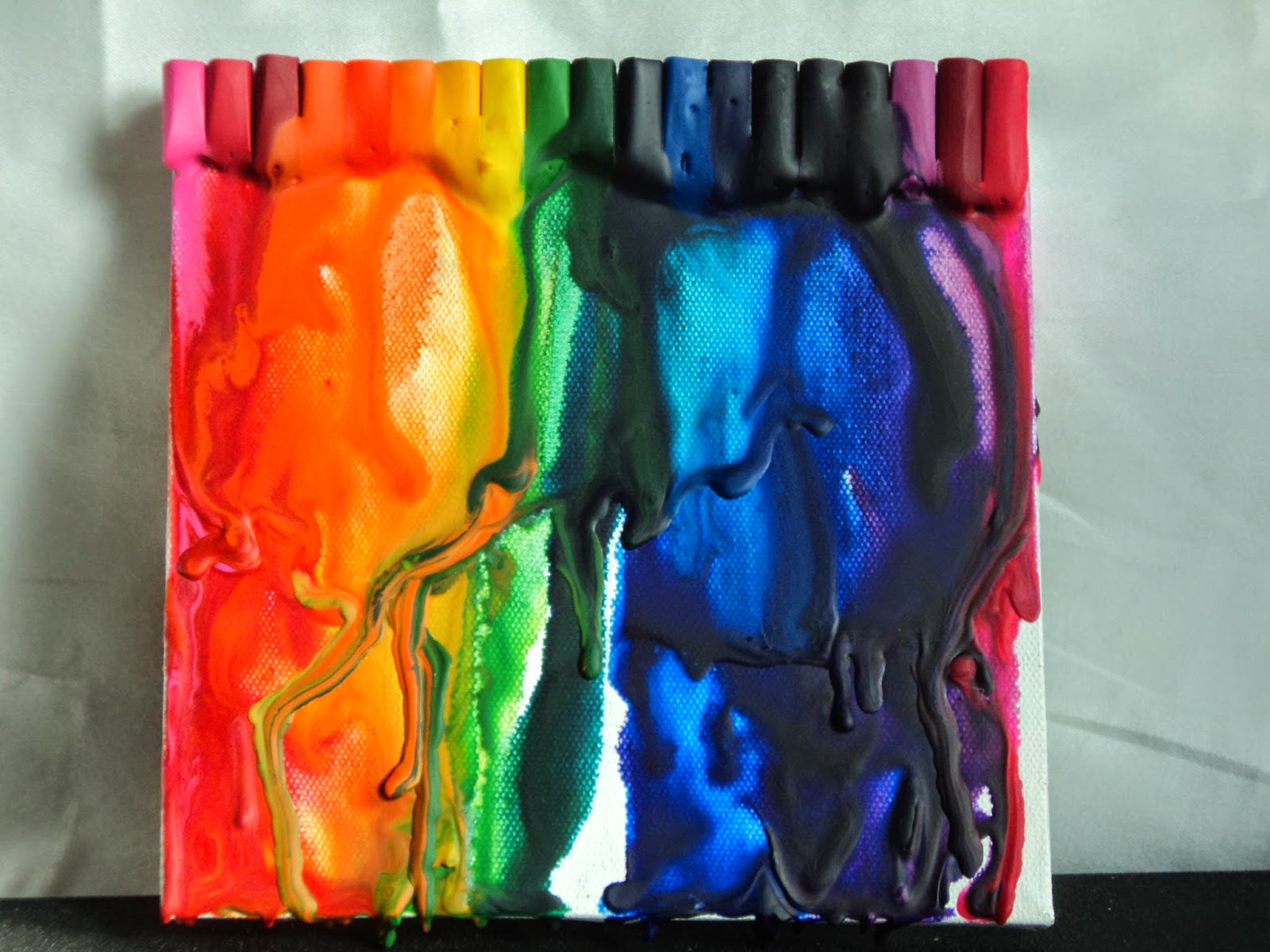
Melting crayons.

You've seen the photos on Pinterest of those melted colorful rainbows dripping down canvas, right? I have wanted to try it for a long time. So I finally did.


Crayon Canvas:  I had this 6X6 "canvas" that my sis bought at a garage sale. (It was a black and white abstract thing that I just primed with white gesso.) It had been sitting on my table for at least 6 months so I used it for the experiment. I also had a large box of Crayola crayons (A special Millenium assortment with a bit of everything from neons to metallics.) that needed to be used. I chose a rainbow of colors with a few to transition and broke off an end. I peeled off the label and glued them to the top of the canvas. (No special glue here just white craft glue.)


After the glue had dried, I just used my heat gun to melt the crayons. I tipped the canvas to let it drip. I just love the drips! This was SO MUCH FUN!
 
 I thought maybe just let it drip in little rivers of color but once I got going, I just needed to see the swirls. The best part was that if I didn't like it, I just kept heating it and let it run right off the canvas and added more from the top. The worst part was that there was no way to control where these drips were going and what colors they would end up mingling with. My green got a little friendly with my orange which wasn't what I wanted but hey, it's only an experiment!

So it made me HAPPY! This was so fun and I got a few more ideas about how to use it. I'd like to do some dots of wax, melt the wax enough that I can sketch in it or write a few words.

I have NO IDEA what I'm going to do with this canvas or how to complete it. It seems unfinished to me. But I really don't care. It was just plain fun!

Hope you try something new soon!
-Wy
"If it makes you happy, it can't be that bad."  -Sheryl Crow

Sunday, February 01, 2015

My Planner...finally.

I decided since I was making this anyway, I'd link it up to the Simon Says Stamp Wednesday Challenge (Anything Goes!).

Here's what I made:

I haven't used a planner since college (um...some 20 years ago). Instead, I have always used just a small pocket calender to jot down an appointment or two. (It's true; I have no social life!) But this year, I saw all the cute little planners coming out at CHA and I have seen the Erin Condren planners...I thought they were such fun. (And I've developed a need to keep more deadlines and work schedules organized.) But there were 2 problems: 1. They were costly. 2. They weren't EXACTLY what I needed.

Most planners seemed to be WAY MORE than my little life required. Yet I was hesitant to make my own because I liked the "schedule" look of the lined pages. Sort of a calender, sort of a schedule. And some times of the year would be more busy than others. I also wanted it to double as a sort of sketchbook for random ideas with blank pages or graph paper or some other place to just doodle.

That's when I stumbled across this video on YouTube:  Sea Lemon Planner
I was totally excited about the template for the pages! That was exactly what I needed and she was sharing it. The size was perfect as well at 8.5 X 5.5, half a sheet of copy paper. So here's the planner I made this weekend. (Only a month into the year; not bad...better than waiting for something from CHA to hit the shelves!)


So the first thing I did was print out the sheets from the template, making sure they were double-sided. (If you're unsure of how to do that, or don't have a printer...with ink...just save the download on a flash drive and take it to a copy store. My local UPS Store can print it out while you wait and do it on a thicker paper, if you're particular about those things.) I just went with standard, cheap copy paper and amazingly I had just bought ink for my very old printer.

I cut those sheets in half as well as some blank copy paper and some graph paper. I stacked it all up as it would appear in the planner. I opted to put my blanks and my graph paper at the back of the book.

On to the covers! I just cut a piece of cardboard in half that had once been the backing of a scrapbook paper pack, I think. (I'm not certain because it came out of my HOARD of saved cardboard. I kept an ungodly amount in hopes of making journals. I'm still working on that...) You can use just some cereal boxes cut up!

I decided on a theme from a new stamp set I had and some paper I loved so much, I hardly used it.


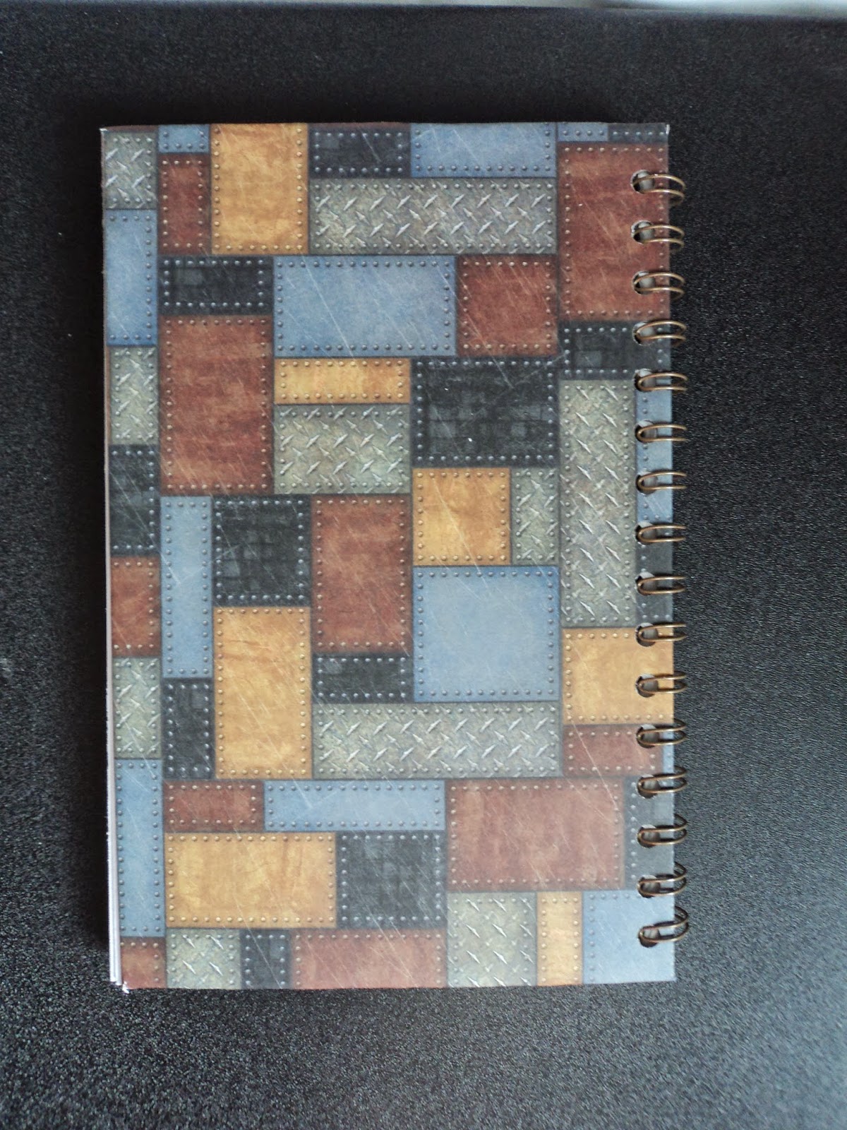
 Scrapbook paper: Hot off the Press, Steampunk. Stamp: Dandy Robot, Stamper's Anoynomous

I cut a 12 X 12 paper down to 12 X 9 and cut off the corners to wrap it around the cardboard. I used Scor-Tape to secure it. I cut another piece down to 8 X 5 to go on the inside of the covers.  I cut the banners at the top from scraps from the paper pack, matted them on black cardstock, and added some old typewriter numbers from my stash.


I stamped the robot onto white cardstock and colored it with Distress Markers. I used Perfect Pearls, Copper to color in the face and hand so he has a little shimmer. I went around the edge of the cover with a ColorBox black pigment ink and added embossing powder. (Lindy's Stamp Gang, Byzantine Bronze) Once I had the cover done, I decided to add a little something to the inside front cover.


I added two coin envelopes decorated with the same paper pack and a few rubber stamps from an old 7gypsies set (that doesn't impress me much). The top one that's horizontal lifts on the right to reveal the pocket while the bottom one is pretty straight-forward.

 
I didn't embellish the back as I want this to be usable. It will be slid in and out of my desk and stacked under projects and stuff. I wanted it to be flat and secure.

When I had everything the way I wanted it, I just used my Cinch binding machine and added the binding. It's a 1/2 binding wire in old bronze. (The Cinch is like a Bind-it-All and uses the exact same wire.)


So there's my new planner! Ain't she a Dandy?
I'll be giving it some work soon. I may need new pens...

Have a great week!
--Wy
"Candy is dandy but liquor is quicker."

Friday, July 18, 2014

Distress Stain Dots

It's no secret to those that know me that CIRCLES are my favorite shape! Dots, bubbles, buttons, bottlecaps, coins, polka dots, and even scalloped circles and flower shapes just make me happy. (My second favorite shape is probably the star, FYI.)

A quick and easy background can be made from Distress Stains (or paints!) with that nifty little dauber top! That's right...big round DOTS! It's really a no-brainer background but it's super fun to create. All you really have to do is choose your colors, grab your black pen, and go to town!

Here's a few photos of how I made one for a birthday card for my sister.


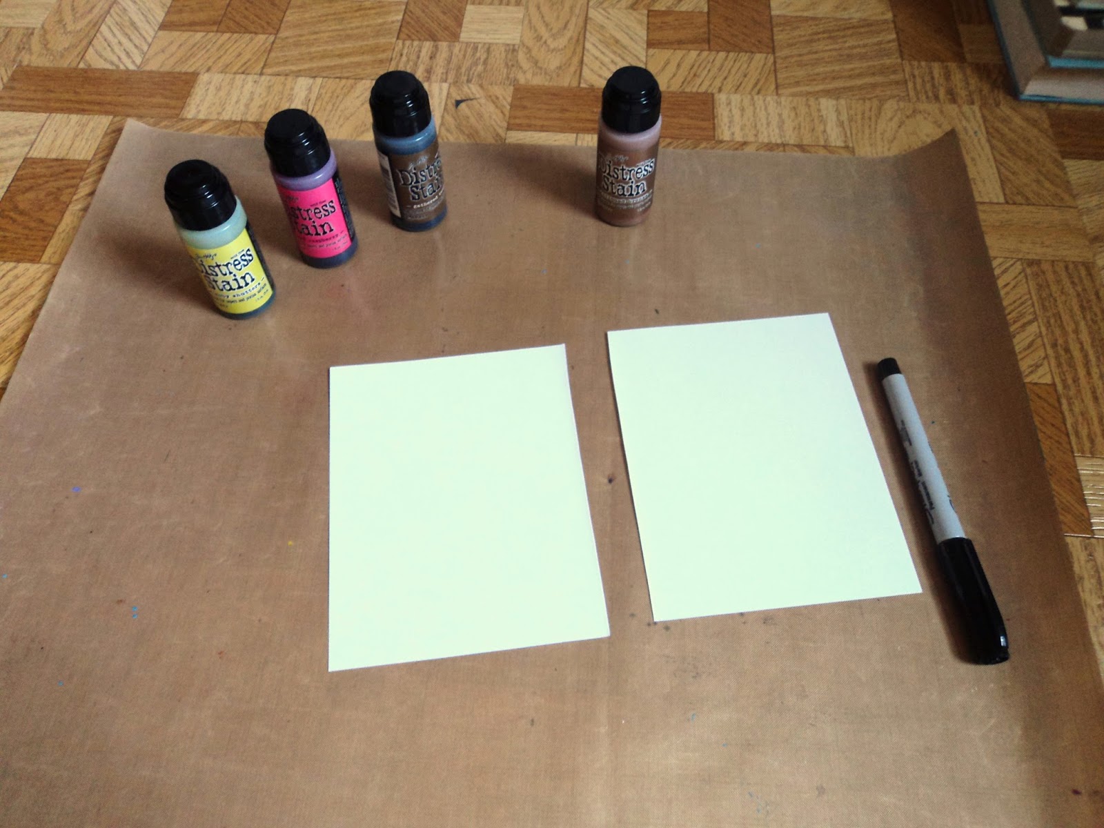
Here's what I used for supplies: Distress Stains (3-4 colors), sheet of light-colored cardstock, permanent fine line pen (Sharpie black Extra fine tip), craft sheet


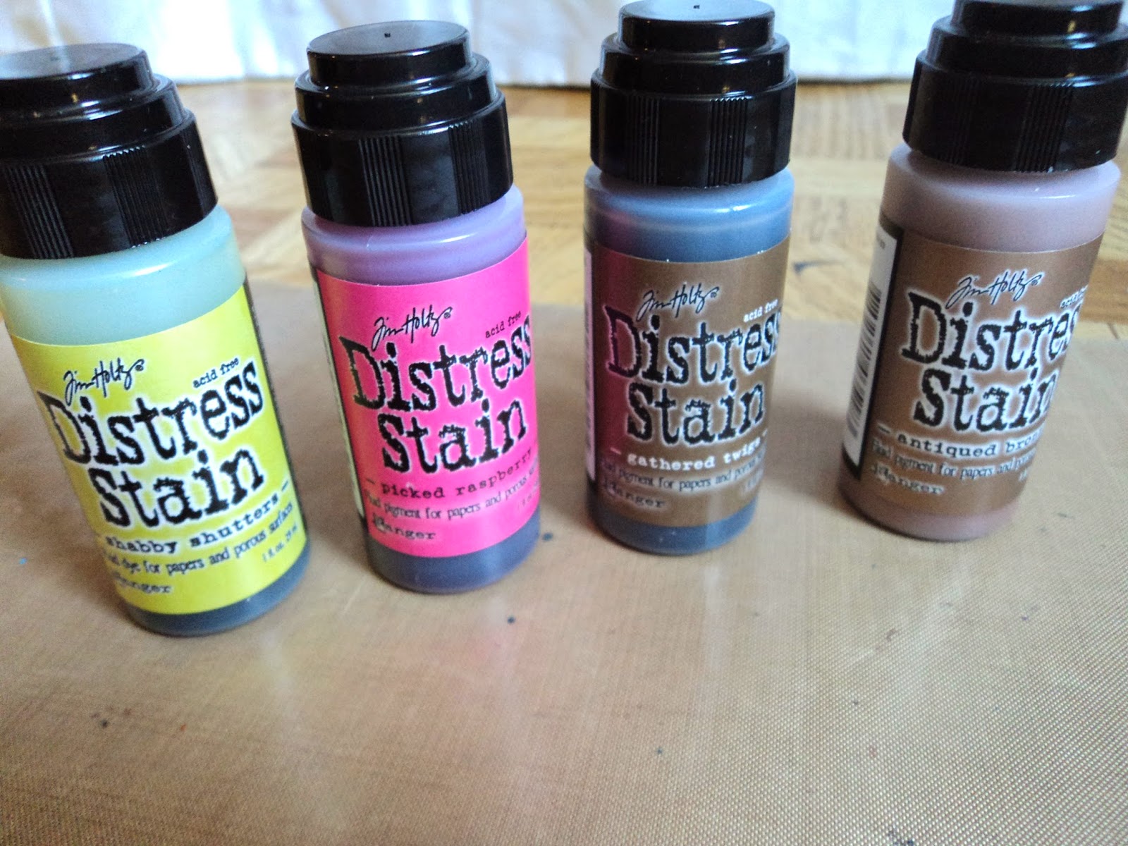
I used these colors: Shabby Shutters, Picked Raspberry, and Gathered Twigs for my dots. The last color is Antiqued Bronze (a metallic) and I only used that around my edge once my background was complete. Three colors seemed perfect for the size of the card I was making. I chose these colors as they reminded me of a vintage chocolate shop!


You may have to dab the stain onto a scrap paper or your craft sheet to get the top nice and juicy. If its dry, you're dots will look incomplete.


Once the dabber top is nice and wet with the stain, just press it firmly onto the paper. Don't slap it on there as that will cause splattering at the edges. You want a nice crisp edge to your dot. (though splattering is another great thing that can be done with these stains! Try that, too, while you've got your stains out!) Allow some time to let the stain soak into the paper and avoid wiping your hand across it until it's dry.


You can work however you feel most comfortable to create a series of large dots all over the cardstock. Because I have a weird need to have my dots pretty evenly spaced and to avoid two of the same color together, I stamped one dot at a time and alternated the colors. I basically made a dotted line down one side of the card switching up the colors to each dot.


So what you end up with looks like the above photo. The dots are in a grid like pattern, which is what I liked; it didn't leave too much white space and some of my dots still fell off the edges.


Here's where the pen comes in. Just adding a sketchy outline to the colors makes them feel more completed and more a part of the page. I just went around each dot with the Sharpie and made sure I had some imperfect curves.


Once the dots were finished I just added some Distress Ink around the edge of the whole piece then went over the edge with the metallic Distress Stain to form a thin border. (sorry forgot to take a photo of that!)

My background cardstock was a card that I cut in half to experiment on. It wasn't very thick, I'm guessing a 67 lb. The stain did warp the paper a bit but since I was going to stick it onto the front of another card, I didn't mind. But I'd probably use a thicker cardstock in the future.
I made my dots in a very "grid-like" pattern. But my first round was more random:

So just experiment.
Also, though I didn't use Distress paints (or any other media with a dauber top), the technique would work the same. Just use the dauber as a stamp rather than a brush. When using Distress Paints, you can work on darker colored cardstock as the paint is opaque and would show up against the paper. Stains won't do this so it's best to use a light colored cardstock.

You can also dress up the dots any way you like. You can add some glitter to them, or Glossy Accents (to make them shine and give them dimension), or even draw a little pattern in each with your black marker. I'm going to be experimenting with these ideas next!

I'm discovering that the best backgrounds are the ones I make myself from scratch. I will not be intimated by the blank white paper!

Have fun!
--Wy
"If you are ashamed to stand by your colors, you had better seek another flag." --author unknown

Wednesday, March 26, 2014

The Pocket Box


 Front
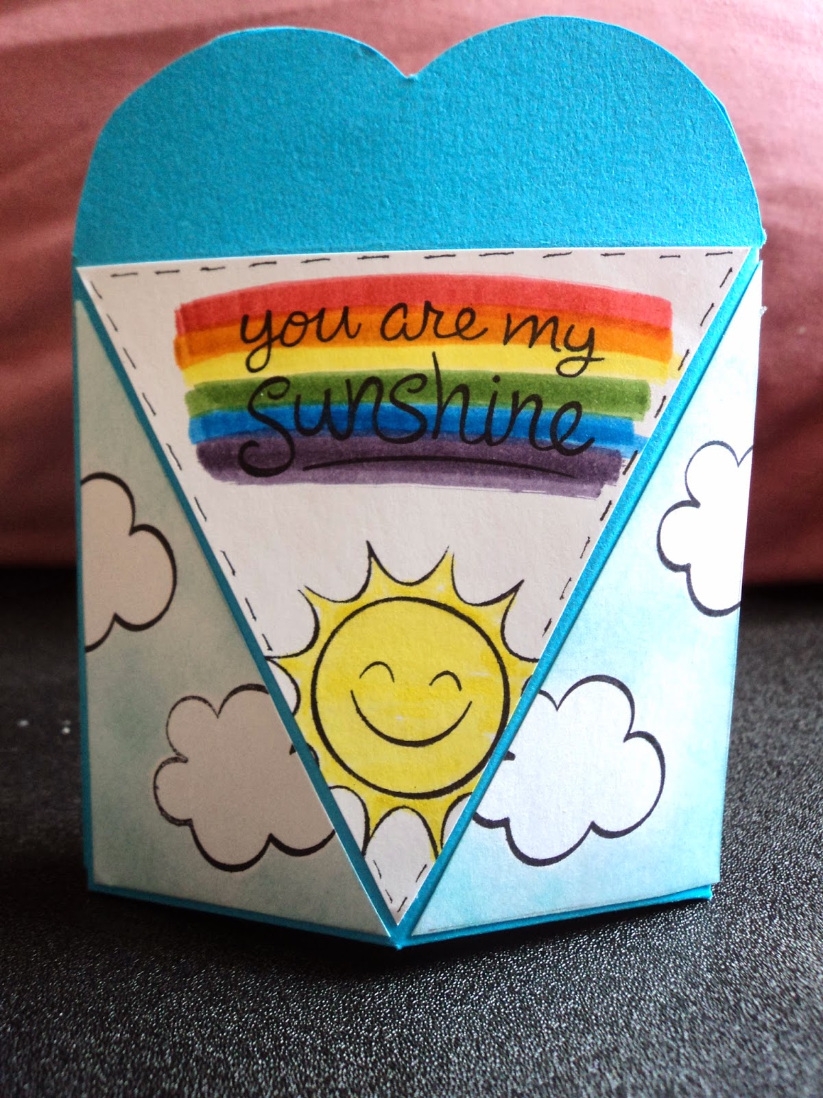
Pocket of Sunshine: Giving credit where credit is due: This little pocket favor "box" is from a template designed by the Hot off the Press DT and can be found (as a free download) among their webisodes at paperwishes.com. Wanna see it? Go HERE! Want the download? Go HERE and see page 6 and 7 of the file!

It was super easy. I printed off the template to a sheet of white cardstock in order to reuse it, rather than printing the pattern directly onto my turquoise cardstock. (Now that I have the template cut out, I only have to trace around it and score it onto whatever I want to make the box.) There's even patterns for the triangles so you don't have to measure them! Be sure to print out those, too!


Back

I placed the template over my turquoise cardstock and traced it. Then, I cut it out and scored it according to the template with a bone folder and a ruler. I used Scor-Tape to assemble the "box". Scor-Tape has a great hold and you need to use an adhesive that has great STICK so the flaps at the bottom won't give way when you add something inside! The Scor-Tape 1/8th inch was perfect for the job.

I cut the triangles out of white cardstock. I used the set "Sunny Skies" from Lawn Fawn to embellish the triangles. I stamped out my clouds first then masked them. I applied Broken China Distress Ink over the background with a sponge. I wasn't looking for total coverage just a hazy sky. The clouds pop out once the masks are removed. I stamped the sun and the sentiment from the same set. The sentiment is highlighted with the rainbow created by Distress Markers.


I decided to leave the embellishment there. But you can adapt this template to suit almost any occasion. I'm sure my niece would love to find these decorated with snowflakes and Olaf the snowman from the movie Frozen. They would make great Easter decoration/favor boxes, too, as the middle triangle could be made into a carrot or Easter bunny head!

The box just pops open at the top and really need no closure as it stays shut of it's own accord. That I like! These are just perfect to hold a little tea bag, chocolate truffle, coins, a gift card, small crafty gifts or jewelry! And no one says you have to add those triangles on...you could just decorate it then assemble. :)

Whatever your desire, try it out. ITS FUN!!!!
--Wy
"Raindrops on roses and whiskers on kittens..." --A Few of My Favorite Things, Sound of Music


Sunday, January 26, 2014

Red Carpet Studio (RCS) Challenge #62: The Breakfast Club


For Red Carpet Studios Challenge #62, the movie inspiration is The Breakfast Club. So anything to do with Breakfast or sleepy heads or mornings as the subject of a paper craft is eligible to be in the drawing. Just go HERE to see all the details of linking up your photo and see more inspiration from our awesome Design Team!

Our DT member, Erica, is a Stampin Up! consultant and will be providing the prize to one of our randomly selected participants!
I'm not much of a morning person and "breakfast" is usually brunch or just lunch. So when I am awake for breakfast, I want it to be special!


That means breakfast in bed! It's a fantasy come true as a tray of morning goodness is brought right to you as you're still nestled under your covers. Nothing beats being served bacon and eggs and your hot beverage of choice. (Mine is hot chocolate!) So I decided to do a whole collection of items to brighten up that Breakfast Tray. I selected a color palette that wakes you up and screams '80's; yellow (the only color I think of with breakfast), hot pink, and bright green!


 I decided on a flower theme to tie all the elements together. I am really liking the look of torn paper so I went with that. I made my little bouquet out of torn paper and attached them to straws with washi tape. The straws are still usable but the tops bend down behind them so they also look like little flowers! (Doing it again, I'd drop the pink paper in the center...they kinda ended up looking like eyes...shiver...creepy...)


No special occasion is complete without a card. I carried my colors and my little round flowers over to the front of this simple card. All of the papers I used in the set are from Hot off the Press; Cardmaker's Citrus Pack. This card is a standard A2.


Now the utensils holder was a true inspiration from the Pinterest board! Here's where I found the directions Bird's Party Blog.  I think it could probably be shortened a bit as my plastic utensils weren't that long. I used 1/8" Scor-Tape as my adhesive around the edges to be sure they wouldn't come apart when the utensils were slid in and out.


I did some background stamping to give the papers a little more texture. A fork, spoon, knife, and a folded napkin fit nicely in this little pocket. Best part is this idea can be adapted for ANY kind of party or special event!


Last but not least, I made a placemat or tray liner. I took these photos before I covered it. The bottom photo was intended to be "the top" but I didn't like the way it strayed from my theme. It seemed that I had lost focus of my color palette. Since it was a double sided piece of paper, I just flipped it over and did another design on the other side!

I started with a 12 X 12 paper and cut it down to 10 X 12. Then, I decorated it the way I liked on both sides. Don't use any 3-D embellishment if you want to cover it and be able to wipe it off! Once the paper was done I cut pieces of clear Contact paper large enough to fit with about a 1/2 inch overhang on all sides. You have to be a bit careful with the Contact paper to be sure that you don't get too many air bubbles or crinkles in it. Do it on a large flat surface which won't be damaged by the sticky surface of the Contact paper when you pull it off. It's just the overhang you have to be concerned with. Apply that to both sides then trim the Contact paper edge and round the corners. Voila! a custom placemat that can be wiped off and reused. It's also a great idea if you use copies of favorite photos with funny captions!

I hope you enjoyed the Breakfast Set inspired by The Breakfast Club for Red Carpet Studios. Hope to see your project over there real soon!
--Wy
"Don't you forget about me."  song from The Breakfast Club

Featured Post

The Chocolate Game

 Let's talk about something sweeter than my other blog posts of late. Let's talk chocolate. But no guarantees that anything I want t...