Showing posts with label Color Palette Journal. Show all posts

Sunday, August 01, 2021

The Color Palette Journal: Autumn Feast

 It's been awhile. 

I have no excuses or apologies. No one should.

But I do have a layout to share from the Color Palette Journal. I randomly selected a palette from my Pinterest board and will select another when this is posted. I work in a small Dylusions journal and my main mediums are ink and paper. This journal focuses mostly on rubber stamping and collage.

Here's the Autumn Feast color palette:

I didn't want to go the Autumn route but that's where I ended up because I just love Autumn!

Here's what I made:


I decided to make the leaves in the two shades of brown and use the colors in the background. I used a stencil set I hadn't used...ever. It's simple, faintly familiar, and just what I wanted: something to get the mojo flowing. As with many of the art journal pages I've shared on this blog, their main purpose is to spur my creativity and just settle my anxious mind. 

On to the next...

-Wy

oh, and yes...I have been contemplating this year's Halloween projects. I await a little inspiration from Tim Holtz in August but I have begun to think on some things that I'd like to get done that I have left over from previous years. Stay tuned. Halloween is coming.

Tuesday, May 18, 2021

The Color Palette Journal: Red or Pink?

 I finished another spread in the Color Palette Journal. I will be randomly selecting the next one from my Pinterest Board.

My main problem with this palette was the dark red/pink/coral color. I couldn't decide what color it actually was. I thought, at first, a dark coral...more orange than red. But when placed next to the pink, it appeared more like red or a dark pink. I mention this because these are usually the hang-ups that prevent me from getting a layout done in good time. I begin to fixate on finding the "perfect" match and then I get nothing accomplished. I often forget that I'm the one setting the rules, so I can be the one to break them!

So here's what I made. It's simple and straight forward mostly for the reason mentioned above. I wanted to focus on the water droplets in this photo but completely forgot about that aspect in my quest for the perfect color. 

Here's the Color Palette that I had selected:


Here is my journal page:


Despite my color confusion, I had a great time making the spread. The red color is a neon shade that I thought would look more pinkish. But I still like it and it made me happy. It gave me a chance to use up some scraps and play with some newer supplies in my stash. (Karin Markers and neon ink pads)

On to the next...

-Wy

Friday, April 23, 2021

The Color Palette Journal: Fabric or Feathers?

 The random palette selected this time had a photo that was difficult to say what it was exactly. At first, I thought it was fabric but on closer inspection, it might be feathers. In any case, I took neither of these to heart.


This palette is difficult for me as many of these colors are ones that I rarely, if ever, use. Reddish purples aren't my faves and the dusty colors aren't in my wheelhouse. I managed to scrounge together some ink pads and markers that came close to this palette and I just did a simple watercolor background. 


The completed pages aren't any masterpiece, but I like the final outcome. Hey, it's just a journal page and now that it's done, I can get on to a different set of colors. Hopefully, ones that are more inspirational. 

-Wy

Monday, March 29, 2021

The Color Palette Journal: Cold Stone

 Hey, I finally got back to my Color Palette Journal! I often forget how much I enjoy working in this journal until I sit down to do a page spread.

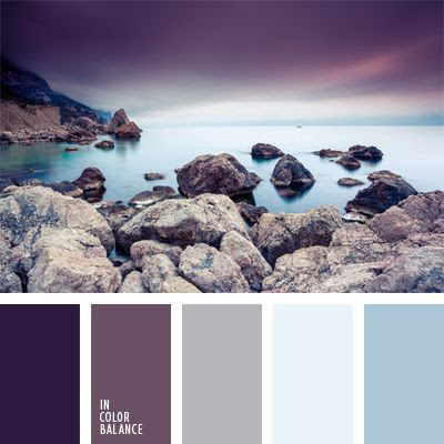
Here is the randomly selected Color Palette:


I named it Cold Stone but my journal page doesn't quite reflect that.

My pages began with me pulling out my Distress inks to match some colors in the palette. Dusty Concord and Speckled Egg. I found some solid cardstocks to match the light blue and gray as well as some scraps on my table that matched the purples.

But my plan didn't come together until I found a scrap of paper in my "scrap file" that was exactly what I needed. The paper was of two deer on a snowy day looking off to the distance. It had the purple tones I wanted as well as the steel blues. I had saved this paper (it was the top of a small notepad) because I did love the image so much. So I knew I had a scene on my hands (again) but what to put in the background? I was onto Spring things, not Winter snow. That's when I decided to look through the stamps sets that I hadn't used yet. I found one from Altenew with a layered cloud, rain and lightning. Yup, lightning struck!

Here's the page spread without much more exposition.


Overall, I really like it. It ain't perfect, it ain't great art. But it has some of my favorite colors, a favorite sheet of paper is now preserved, and I learned a few things. All my ideas didn't come to fruition but then again a lot of this page spread came about through serendipity. 


Thanks for stopping in for a look! I will be randomly selecting another Color Palette for my next spread from my Pinterest board. Take a look over there if you need some color inspiration!

-Wy

Wednesday, February 24, 2021

Color Palette Journal: Warmth

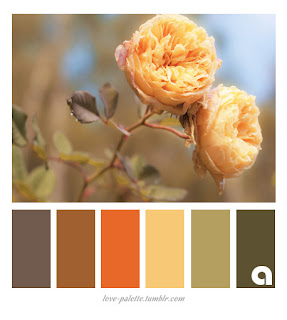
 This palette reminded me of Autumn with it's warm colors and dull yellow. Here in NY, it's still winter. But the past few days have been above freezing so that means: Spring is coming! 

So the inspiration for my journal was to take these Autumn colors and turn them into Spring.

Here's the Color Palette that was randomly selected from my Pinterest board:

My inspiration came as I was art journaling (a different journal) and looking through my large stencils. I found an old stencil that was spring and Easter themed. It's one of those stencils that you were supposed to use to draw shapes. It had all kinds of flower petals and leaves, grass, a couple bunnies, an egg, and a carrot. Yuppers...carrots are orange. And I could use the browns for chocolate bunnies. 

So here's what it turned out to be:


The page seems a bit plain and bare of pattern but I do like it. I had to add a little yellow Peep in with my chocolate bunnies. It's another scene which is a common theme in this journal. Still, this journal is one of my favorites.

So I'm off to randomly select another Color Palette from the 200+ pins on my Pinterest Board. Let's see what I get for next time!

-Wy

Sunday, February 14, 2021

Color Palette Journal: Spring Tones

 I'm back playing in the Color Palette Journal!

This palette seems familiar and I think I may have done it before...or one that is very similar. In flipping through my journal, I see that my panda page used the same colors basically. But I don't mind.

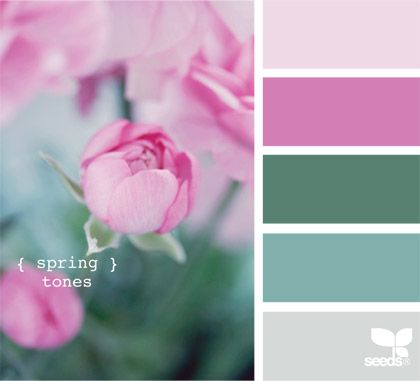
So here's the current palette:

Called Spring Tones, I like the cool blue-greens and the pure pinks. A touch of gray never hurt.

So here's what I did with it.


I've been doing a lot of scenes lately and decided to stick with that as I enjoy doing them. I've also wanted to do some birds like I've seen in Amber K. Creative youtube videos.

I also got a new background stamp of birch trees. I've been wanting a stamp like this because I have a stencil of birch trees that I love. The problem is that I want the stencil to be in the reverse; in essence a stamp image. This one is pretty dang close.

I like how it came out and it satisfied a lot of art cravings this time.

I'll be doing my random draw from my Color Palette Pinterest board soon for my next spread! I'm kinda hoping for bright colors this time!

Stay safe.
-Wy

Wednesday, February 03, 2021

Color Palette Journal: Reflection

 I've finally done another page in my Color Palette Journal. I've had the idea for a while but never quite got around to executing it. 

My Color Palette Journal is inspired by my Color Palette Pinterest Board. I randomly choose a palette and do a page in this particular journal with those colors. I may or may not be inspired by the photo attached with the palette. Once a palette is done in my journal, I blog it and remove the palette from my Pinterest Board so I will not repeat the exact same palette. (I do have very similar palettes on the board with different photos. Those stay.) 

So this was the inspirational Color Palette this time. Simply called: Reflection.


I have done artworks of lotus and water lilies in the past so I was not anxious to do one again. I have also experimented with mirror images and didn't think I wanted to take that route. So my journal page ended up being a simple theme I had wanted to add to the journal using these colors. The most challenging part of this palette was the lack of green. I did a scene and found it hard to work around the green/blue combo that I typically use for a landscape.


I changed my mind about where the "color" would go. I was going to have black dragons and a twilight background featuring the lighter purple color. I ditched the idea because the dragon stamps would lose their details. (Stamps and castle die-cut by Lawn Fawn.)

I rather like how this turned out. I also flipped through this journal as I hadn't looked at it in awhile. Once it's finished, I think I'll be making a video flip-through of it as I really like most of the pages. Don't hold your breath; I still have plenty of pages to complete!

Cheers to more creativity this year!

-Wy

Friday, July 03, 2020

Color Palette Journal: Desert Sky

I have decided to normalize the blog titles even though, here in the US, things are hardly normal. I'm not going to elaborate on the big picture with Covid-19 because it is nothing I can control. I can only control my own actions. I need to let the rest go. It frustrates me too much. It gets me all worked up. Soooo...

Let's talk about art journaling.

I find myself really liking my Color Palette Journal. I haven't had this much fun and satisfaction since I finished up my Sing Song Journal. (Go back through some old posts here on the blog to see pages from that. A journal inspired by the songs that I was listening to while I sat down to create.) Since my Pinterest board has over 200 color palettes still on it, I think I may be doing these journals for a while. I have come to the conclusion that I am mainly inspired by color. (duh) 

So here's the Palette that was randomly selected for this spread. I named it Desert Sky.
It's hard to tell if that really dark color is a very dark blue or black. I chose dark blue.
I had a spread in this journal that already had stamps on it. I used some Lawn Fawn stamps and set up a scene but I had never colored it in. So this palette seemed to work well for it.


Unbelievable: This came together quickly since I only needed to add color. My Nessie is a bit darker than I'd like but overall I like the page. It isn't great art but I think it's cute. The word is my word for the week because it's what I mutter to myself every time I turn on the news.

Wherever you are, please stay safe.
Stay home if you can. Wear a mask because it works! 
Wash your hands and social distance no matter what.
Please don't make this last longer than it has to. Be smart.
-Wy

Thursday, June 18, 2020

The New Normal: Phase 3 Day 7

This week so far has been pretty good. New York is looking good and the summer weather is here. Still a little strange not to be able to really do anything besides go to work and get groceries. Yes, stores are opening but I'm not really at the point where I want to go to a store for Non-essentials yet. I'm not much of a shopper anyway so "shopping" is more of a chore for me or an errand. 

I do, however, miss the movie theater and the casino. I miss dining in a restaurant. While restaurants are opening in reduced capacity with masks essential for service, I'm not brave enough yet. I'll continue the take-out ordering for now. I'm not so leery of my area as case numbers are practically non-existent but I am concerned with travelers from other areas of the country. Are all the snowbirds home from Florida? If they come now, will they quarantine or at least get tested?

But I think I'll get over that soon enough. I may have more to worry about from Canadian traffic when the border reopens than from snowbirds.

Anyway, this week is feeling more like the old normal for me. The mask situation is a bit better so I may be getting used to it. Though sometimes when I'm just sitting here at home, I can still feel it on my face. Creepy.

So I made another Color Palette Journal Page. You can see more Color Palettes on my Pinterest Board. I just added a few new ones this week. sigh. I'll never get these all done. But I'm sure gonna have some fun trying.

So here's the palette I called "Autumn Leaves"

The only minor change I made was in the darker burgundy color. I ended up using a product that I thought looked like burgundy but once it was out of the bottle, it was much more a dark red. It lacked the purple vibe that burgundy is known for. But I stuck with it.


This spread all began with the paper. I was going to try to paint or ink the background in dark brown but decided to look through the paper stash first. Glad I did because this pattern inspired the steampunk butterfly and the feel of the pages.


I accomplished what I wanted with the pages and that was to do something that wasn't Autumn themed. So there's that.

Have a great weekend!
Wear your Mask, We ain't out of this yet.
-Wy

Sunday, June 07, 2020

The New Normal: Phase 2: Day 9

Whew! What a week.

I have been staying away from the news once again but I still don't consider the week a good one for me personally. If I had to classify it, I'd say it was frustrating and annoying.

But I tried to get it out of my system with an art journal page.
You know the drill: Color Palette Journal, Pinterest Board inspiration.

Here's the Palette I tentatively called "Purple Mountain Majesty".

When I see a palette with black in it, I immediately think that black will be my background. I do like to work on black paper and substrates. However, I decided to keep the black to a bit of splatter and focus on the delightful combination of teal and purple.


I thought I'd do purple flowers on a teal background but as my need to scream grew in intensity, I changed my plan to go with bugs. Bugs, those little devilish ingrates that get under your skin and burrow into your thoughts to cause that frustrating itch that you cannot scratch. It was the heart of my mood.
The page seemed a bit empty after I had all my bugs in place but a bit of washi tape solved that problem. I framed the opposite corners with some phrases found in a Tim Holtz stamp set (along with the bugs). 


Despite the negative mood in which this was conceived, I am rather enamored with the page. I love the touches of washi.

Time to choose another palette. This journal is beyond it's halfway point, certainly not enough to finish the 250 odd pins on the board, so expect to see another Color Palette Journal after this one.

Black Lives Matter
Wear Your Mask
Save lives.
Be Kind.
-Wy

Monday, June 01, 2020

The New Normal: Phase 2: Day 3

My part of the world is in Phase 2 of reopening in NY State. Lots of people can go back to work, stores can open with loads of guidelines in place, masks must be worn everywhere, social distance should be observed when possible, and barbers/hair salon stylists must be tested for Covid-19 every 2 weeks. Still no restaurant seating or large gatherings of any type.

Except of course for protests. RIP George Floyd.

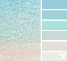
With the impending apocalypse, I decided to work in my Color Palette Journal. The random palette selected this time was one of sea and sky. You can see my selections on my Pinterest board.

So as you can see, it's mostly an ombre of turquoise. Naturally you think of the sea and the photo inspires that. 

But today...
well, today, I just went here.


I admit that it doesn't look like much but it's the sky and the sea. It's peace. It's the wordless, undefined feeling in my heart. It's indistinct but hopeful. It's looking to the horizon, and seeing the incoming warmth that chases off the chill of the fog and spray of the sea. 
It's not Today. It's Tomorrow.
All of our Tomorrows out there past the sea rising to the sky.

Hang tight, all. 
Stay safe. Wash your hands. Wear a mask.
Speak up. Speak out.
-Wy

Featured Post

The Chocolate Game

 Let's talk about something sweeter than my other blog posts of late. Let's talk chocolate. But no guarantees that anything I want t...