I've finally done another page in my Color Palette Journal. I've had the idea for a while but never quite got around to executing it.
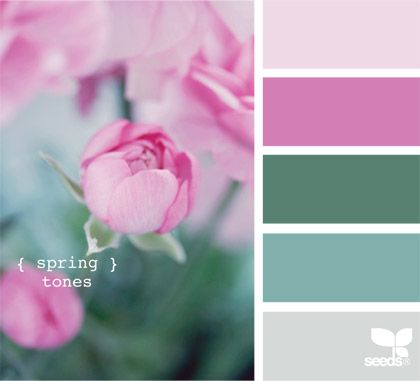
My Color Palette Journal is inspired by my Color Palette Pinterest Board. I randomly choose a palette and do a page in this particular journal with those colors. I may or may not be inspired by the photo attached with the palette. Once a palette is done in my journal, I blog it and remove the palette from my Pinterest Board so I will not repeat the exact same palette. (I do have very similar palettes on the board with different photos. Those stay.)
So this was the inspirational Color Palette this time. Simply called: Reflection.
I have done artworks of lotus and water lilies in the past so I was not anxious to do one again. I have also experimented with mirror images and didn't think I wanted to take that route. So my journal page ended up being a simple theme I had wanted to add to the journal using these colors. The most challenging part of this palette was the lack of green. I did a scene and found it hard to work around the green/blue combo that I typically use for a landscape.
I changed my mind about where the "color" would go. I was going to have black dragons and a twilight background featuring the lighter purple color. I ditched the idea because the dragon stamps would lose their details. (Stamps and castle die-cut by Lawn Fawn.)
I rather like how this turned out. I also flipped through this journal as I hadn't looked at it in awhile. Once it's finished, I think I'll be making a video flip-through of it as I really like most of the pages. Don't hold your breath; I still have plenty of pages to complete!
Cheers to more creativity this year!
-Wy