Showing posts with label steampunk. Show all posts

Thursday, June 18, 2020

The New Normal: Phase 3 Day 7

This week so far has been pretty good. New York is looking good and the summer weather is here. Still a little strange not to be able to really do anything besides go to work and get groceries. Yes, stores are opening but I'm not really at the point where I want to go to a store for Non-essentials yet. I'm not much of a shopper anyway so "shopping" is more of a chore for me or an errand. 

I do, however, miss the movie theater and the casino. I miss dining in a restaurant. While restaurants are opening in reduced capacity with masks essential for service, I'm not brave enough yet. I'll continue the take-out ordering for now. I'm not so leery of my area as case numbers are practically non-existent but I am concerned with travelers from other areas of the country. Are all the snowbirds home from Florida? If they come now, will they quarantine or at least get tested?

But I think I'll get over that soon enough. I may have more to worry about from Canadian traffic when the border reopens than from snowbirds.

Anyway, this week is feeling more like the old normal for me. The mask situation is a bit better so I may be getting used to it. Though sometimes when I'm just sitting here at home, I can still feel it on my face. Creepy.

So I made another Color Palette Journal Page. You can see more Color Palettes on my Pinterest Board. I just added a few new ones this week. sigh. I'll never get these all done. But I'm sure gonna have some fun trying.

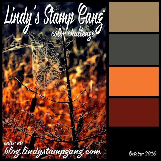
So here's the palette I called "Autumn Leaves"

The only minor change I made was in the darker burgundy color. I ended up using a product that I thought looked like burgundy but once it was out of the bottle, it was much more a dark red. It lacked the purple vibe that burgundy is known for. But I stuck with it.


This spread all began with the paper. I was going to try to paint or ink the background in dark brown but decided to look through the paper stash first. Glad I did because this pattern inspired the steampunk butterfly and the feel of the pages.


I accomplished what I wanted with the pages and that was to do something that wasn't Autumn themed. So there's that.

Have a great weekend!
Wear your Mask, We ain't out of this yet.
-Wy

Wednesday, October 26, 2016

Throwback Thursday: Sept 15, 2013

TBT is a day early so I can join in on some Challenges! You can see the original post HERE.

This year I was inspired by my golden pumpkin portrait aptly named, "Patchwork Jack". I was inspired not only by this canvas, but by two challenges.

My color palette was inspired by Lindy's Stamp Gang Challenge for October. You can find the details at their BLOG.
The products I used were: Hag's Wart Orange Magical (from this Halloween set);
Red Hot Poker Orange Starburst Spray; Fuzzy Navel Peach Starburst Spray; A Bit O'Bubbly Starburst Spray; and 3 embossing powders: Byzantine Bronze; Queen Sheba's Silver; Midnight Violet.  

I was inspired in composition by the October challenge at Creative Embellishments, HERE. They had this lovely inspiration:
pumpkin
 I used their chipboard gears in various sizes. (Here's a few of them.) I also used these jack o'lanterns.
 There was a twist to their challenge to add a touch of metal.
(If you like to create things...any things...check out these monthly challenges. You get an opportunity to win some quality products from their shops!)
 
So here is what I created:
Steampunkin':  This has been a vision in my head for a couple Halloweens now. This was the year to make it. It's a 12 X 12 canvas. I collaged a background of patch-worked papers in black and white. I used a large piece of watercolor paper as a "mother board" for all the orange. I used the Lindy's magical and Starburst sprays to get the color. I tore out my pumpkin and stamped the light bulbs. (Stamp image from Joggles.com)
Next comes the fun.
All those gears along the edge were embossed with a variety of the Lindy's powders. I used them in combination with each other and added in some copper (from Ranger) for the small pumpkins. I love that the Midnight Violet powder looks black but gives a purple hue in just the right light. That gold shimmer from the Starburst sprays added some great "glow" to both the lights and the pumpkin.
All the gears were embossed chipboard so I added my metal "twist" on the face. I used 2 metal bottlecaps as the base for my eyes and various keys for the mouth. All the pieces are attached with Multi Medium (Ranger). I also threw in some buttons, rhinestones, and little orange roses to fill in some gaps and add a touch more color.

Thanks for dropping by!
-Wy
"Amuck, amuck, amuck, amuck..."  --Hocus Pocus

Sunday, July 10, 2016

Creative Chemistry Week 6: Color Palette Journal

I had a revelation this week when I decided to pull out some tags and "finish" them. I use tags to "mop up" extra ink or paint when I'm working on a project in my basement. When the tag has sufficient color to it, or I don't want to junk it up anymore, I bring it upstairs to my bedroom where my "crafting/card making" space is. (My basement has most of my "art" supplies while my bedroom holds my card making supplies. Hence, I make trips up 2 flights of stairs when I begin to move things from one space to another. It's a great work-out and inspirational tool...if I'm too lazy to go back upstairs for a supply, I make do with what's on hand. That can make for some interesting results.) The tag then gets thrown aside until I feel like finishing it with perhaps a stamped image or scrapbook paper or whatever.

So my revelation was that I had WAY TOO MANY UNFINISHED TAGS! This has bolstered my resolve to STOP making tags that won't get finished in a timely manner. So this Creative Chemistry lesson was not a tag.

Or even a card.

I paired up the techniques of Week 6 (Layering Stencils) with my Color Palette Journal. It's been a while since I worked in this journal but I did make a change that seems to help with my productivity. I have written out the palette I want to use in terms of colors that I may actually own...like the names of Distress Inks. That gives me an instant starting point for the colors, at least.

So here's the next spread in this journal, courtesy of Creative Chemistry:


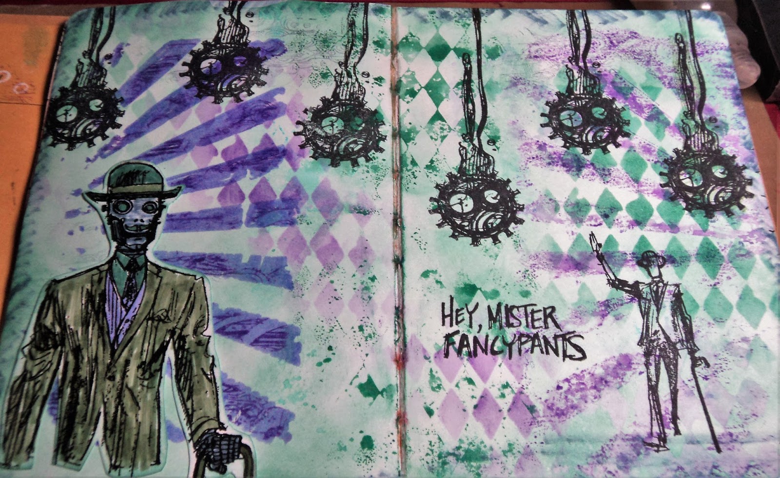
FancyPants:  Did I mention I'm on a robot kick this summer? I love this stamp set from Stamper's Anonymous called Dandy Robot. It's challenging to use so I am often stumped with it.

This is the color palette inspiration for this spread: Flora Brights #1.
flora brights #1:

The colors I matched to the palette were: Evergreen Bough, Bundled Sage, Wilted Violet, Shaded Lilac, and Stormy Sky. (All Distress Ink colors.) I had Evergreen Bough and Wilted Violet in ink pads (mini) and the rest in markers. So I focused on Evergreen Bough...and I absolutely love this color. I just recently got the ink pad and like it much more than Cracked Pistachio for a really nice patina color. And since I was making that color my background, it made me think of the Dandy Robot stamp set. I often use copper embossing with this stamp set and that would look great with Evergreen Bough. BUT, I decided to stick to the palette. Copper was a color...not a neutral. I allow myself black and white but consider browns as a color.

Anyway, here's the Creative Chemistry part:
Layering Stencils:   The Challenge was to use two techniques with Layering Stencils. I used two stencils on this page. (My plan to add a third just never panned out.) I used the Rays and Harlequin. I used the Ink Monoprint with the Harlequin stencil down the middle of the page. I also used that technique with the Rays on the right side of the page. I had ink on the stencil from the other side so made a monoprint from that.
 
 Here's a close-up look at my Stamping through a Stencil. I used the Rays and stamped with Wilted Violet Distress ink through it. The edges weren't as defined as I wanted so I also used Sketching through a Stencil here. After I had stamped, I went in with a Shaded Lilac Distress marker to define the rays. It smeared the stamping a bit but I liked it.

I even, inadvertently, pulled some of the background color up with the Harlequin stencil. You can almost make it out in the very right bottom corner in the above photo.

So the background made good use of Wilted Violet, Evergreen Bough, and a touch of Shaded Lilac. I decided to incorporate the last two colors on the Robot.
I stamped and embossed the robot on white cardstock. I used Bundled Sage for this jacket and brought the Stormy Sky in on his face and hand. I discovered that my Stormy Sky marker was rather dry so I couldn't bring as much of that color into the layout as I originally intended. (I was hoping to use it with the stencils but it was on it's last legs. In fact, I've already pitched it.)

Stamping with Jet Black Archival ink rounded out the spread and I was really happy with it.

Now I have to get busy with more color palettes. Did I mention my Pinterest board is now up to 250 palettes? I think I added about three more yesterday...damn. If you want to check out the board, I have picked out my next several palettes. See if you can find them: Rainbow Spring #2, Dirty Pastels #3, and Mineral Hues #4.
Thanks for dropping by!
-Wy

Thursday, October 08, 2015

Some More Inspiration Journal

I've shared previous pages from this journal on this blog. You can find them HERE, and HERE. I thought I had shared many more than just these two posts but apparently, I haven't! So here's some pages that may pique your interest.


 Orange Julius Ceaser:  IW#14. The inspiration from Donna Downey's Inspiration Wednesday was to be playful and make a page that just was fun and made you happy. She used a hand drawn character named Julius that a student made in one of her classes. So I made my own version of Julius but mine became a play on words because I didn't feel comfortable drawing my own little guy. So with a head like an orange, a toga, a few columns, and a laurel crown, my Ceaser is ready for his debut.

Overall, I really like this page as compared to some of my others. I was disappointed with it when I first finished it as I had put down text pages as the background and forgot to water down the paint enough so that you'd be able to see it. But after some time, I just like my Julius.


Poseys:  IW#17. The inspiration was to use black gesso in the background and to not think too much about the page. Just work along quickly. I didn't have black gesso but I did just get black Dylusions paint at a rubber stamp show. So I used that as the background. I followed Donna's layout pretty close and just tried to use up more paint. The finishing touch was some neon splatters in the background.


Life is a Canvas:  If you couldn't tell, this was a mop-up page. I had cleaned a lot of stencils here and the background was very busy. But I decided to try a technique on it. The splatter bird (Lost Coast Designs) that is stamped in the middle is stamped onto tissue paper and decoupaged on. I wanted to test it out before I started using it on canvas. I learned a bit which made it worth the try. After that, I added a favorite quote of mine about life and art.


 Dream Steam:  I had a crazy idea to make the large fish stamp (Life size blue gill; 100 Proof Press) into a balloon. The basket is the bottom part of tag from my stash. This was also my page to add some lettering. It occurred to me that I didn't doodle enough in my journal or use hand-lettering. I like to do it but often I just get lazy and never go back to the page to do it. I like the colors in this page and I'll be using that fish often.


Hope you found a few things to inspire your journals. I've got a few more pages to share soon; they need a finishing touch here or there. Watch for an update on my Artist Journal as well. I'm on track to finish that puppy by the end of THIS year!

And I just bought a new Dylusions journal...the square black one! Super excited to start using my Starburst sprays, Izinks, gelatos, and paints in there!
--Wy
NOTE: No TBT here. I'm trying to look forward this week and not back. Maybe next week!

Sunday, February 01, 2015

My Planner...finally.

I decided since I was making this anyway, I'd link it up to the Simon Says Stamp Wednesday Challenge (Anything Goes!).

Here's what I made:

I haven't used a planner since college (um...some 20 years ago). Instead, I have always used just a small pocket calender to jot down an appointment or two. (It's true; I have no social life!) But this year, I saw all the cute little planners coming out at CHA and I have seen the Erin Condren planners...I thought they were such fun. (And I've developed a need to keep more deadlines and work schedules organized.) But there were 2 problems: 1. They were costly. 2. They weren't EXACTLY what I needed.

Most planners seemed to be WAY MORE than my little life required. Yet I was hesitant to make my own because I liked the "schedule" look of the lined pages. Sort of a calender, sort of a schedule. And some times of the year would be more busy than others. I also wanted it to double as a sort of sketchbook for random ideas with blank pages or graph paper or some other place to just doodle.

That's when I stumbled across this video on YouTube:  Sea Lemon Planner
I was totally excited about the template for the pages! That was exactly what I needed and she was sharing it. The size was perfect as well at 8.5 X 5.5, half a sheet of copy paper. So here's the planner I made this weekend. (Only a month into the year; not bad...better than waiting for something from CHA to hit the shelves!)


So the first thing I did was print out the sheets from the template, making sure they were double-sided. (If you're unsure of how to do that, or don't have a printer...with ink...just save the download on a flash drive and take it to a copy store. My local UPS Store can print it out while you wait and do it on a thicker paper, if you're particular about those things.) I just went with standard, cheap copy paper and amazingly I had just bought ink for my very old printer.

I cut those sheets in half as well as some blank copy paper and some graph paper. I stacked it all up as it would appear in the planner. I opted to put my blanks and my graph paper at the back of the book.

On to the covers! I just cut a piece of cardboard in half that had once been the backing of a scrapbook paper pack, I think. (I'm not certain because it came out of my HOARD of saved cardboard. I kept an ungodly amount in hopes of making journals. I'm still working on that...) You can use just some cereal boxes cut up!

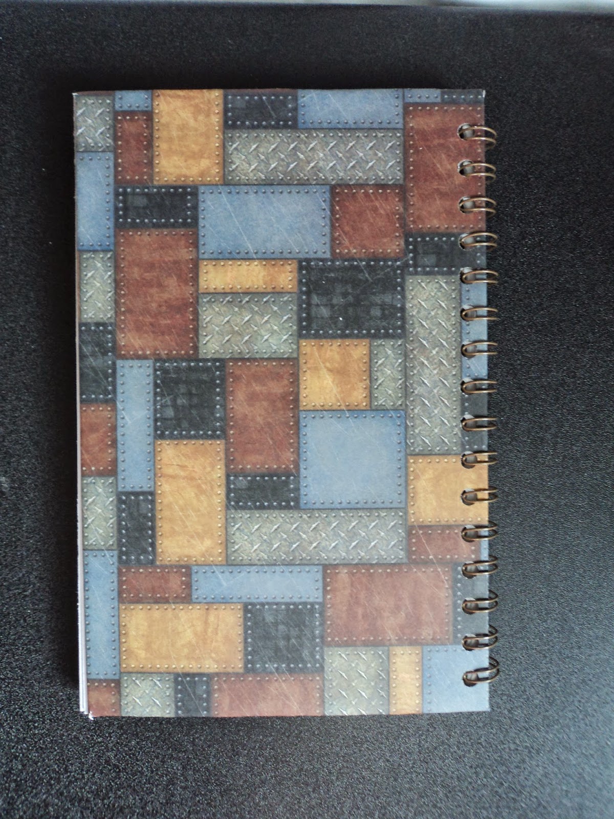
I decided on a theme from a new stamp set I had and some paper I loved so much, I hardly used it.


 Scrapbook paper: Hot off the Press, Steampunk. Stamp: Dandy Robot, Stamper's Anoynomous

I cut a 12 X 12 paper down to 12 X 9 and cut off the corners to wrap it around the cardboard. I used Scor-Tape to secure it. I cut another piece down to 8 X 5 to go on the inside of the covers.  I cut the banners at the top from scraps from the paper pack, matted them on black cardstock, and added some old typewriter numbers from my stash.


I stamped the robot onto white cardstock and colored it with Distress Markers. I used Perfect Pearls, Copper to color in the face and hand so he has a little shimmer. I went around the edge of the cover with a ColorBox black pigment ink and added embossing powder. (Lindy's Stamp Gang, Byzantine Bronze) Once I had the cover done, I decided to add a little something to the inside front cover.


I added two coin envelopes decorated with the same paper pack and a few rubber stamps from an old 7gypsies set (that doesn't impress me much). The top one that's horizontal lifts on the right to reveal the pocket while the bottom one is pretty straight-forward.

 
I didn't embellish the back as I want this to be usable. It will be slid in and out of my desk and stacked under projects and stuff. I wanted it to be flat and secure.

When I had everything the way I wanted it, I just used my Cinch binding machine and added the binding. It's a 1/2 binding wire in old bronze. (The Cinch is like a Bind-it-All and uses the exact same wire.)


So there's my new planner! Ain't she a Dandy?
I'll be giving it some work soon. I may need new pens...

Have a great week!
--Wy
"Candy is dandy but liquor is quicker."

Sunday, April 13, 2014

Gettin' Inky wit it!

Finally had some time to do a spread in my art journal that has been terribly neglected since I started my new job. All I needed was a nudge from The Aviary; Challenge Blog to Paper Wings Productions.
I'm trying more and more to make greeting cards with tags and background papers I have made from "inky" experiments but I don't get them done as much as I'd like. So I went with the old stand-by for inky fun for me...the Art Journal.


Fantasy Fish:  This spread started out with a layered ink background primarily from Dylusions inks; Fresh Lime, Cut Grass, and a touch of Vibrant Turquoise. I stenciled in the corners with London Blue and stamped with a bottle cap in Crushed Grape. I used two old background stamps and added those images with StazOn ink, both Timber Brown and Forest Green.


In trying to determine what this page was going to be about, I thought maybe more torn flowers and a garden since it was so green and I was tending toward cool colors. So I stamped the circles from Inkadinkado and ripped them from patterned paper. I had a dragonfly cut from a magazine but wasn't sure I wanted to use it. I wanted to stick with a rubber stamp theme. I went through some old stamps that I had carved and found my Steampunk Goldfish stamp. So I decided to go with an underwater garden.


The page spread turned out to be a combination of an earlier garden/flower spread in the journal and the canvas, "Goldfish Dream", found in an earlier post. I made the "seaweed" in the same manner and I added some gear bubbles to enhance the steampunk theme.

Just had a fun afternoon playing with lots of things and gettin all inky wit it!
--Wy
"Let me examine a purely speculative hypothesis which I am not going to put forward as anything other than fantasy."  --Quote taken from old book about UFOs.

Monday, July 29, 2013

The Time Machine


It all started in the little Flea Market on Main Street. There was a booth with old laser discs. At least, I think that's what they were called. They came and went just like 8-track tapes! I looked through the box, hoping to spot a movie I knew, and this popped out! The Time Machine. The label was a little worn but hey, it was all workable. What a perfect canvas for all my Steampunk embellishments!
(in case you were wondering, yes, the laser disc is still in there!)


At first, I thought I'd do both sides as the back of the disc was like the back of a book with a plot summary and such. But then, I reconsidered. It would be a piece that someone would hang on the wall, so I didn't bother with the back.


 The cover art was just neat and very steampunk style so I wanted to leave most of it intact. These close up shots reveal all the little idea-o-logy doodads I had been hoarding as well as various keys, copper brads, and a set of gears and cogs from a different source.


I cut out my papers first to go around the edges and they folded over to the back except the piece along the top. I wanted that to stay open in case the disc ever needed to come out. The papers are from Hot off the Press; Steampunk collection, I think. I tore the edge and inked it with Distress Vintage Photo. Just used Mod Podge, matte finish to get them on there.
For some grungy texture, I spotted some brown ink and some watered down black acrylic. Used the old paper towel roll to make some black circles. I attached some Tim Holtz film strip with multi medium, matte at the top.
All the metal embellishments went on with multi medium as well. (Multi Medium...gel medium...same thing. Sometimes I wish Ranger wouldn't rename all their materials.) I was going to leave the list of the Cast but it looked so unfinished that I decided to cover it. Put down some Washi tape with a steampunk vibe. (coated it with Mod Podge to keep it on) Then, looked up my quote from the book by HG Wells.

Overall, pretty happy with this one. It'll probably stay with me for awhile because I'll procrastinate about figuring out a hanger for the back. My favorite bits are all the coppery touches!

In case you were wondering, no, I never read the book. But I have seen this old movie...just not on laser disc!

--Wy
"The past is the beginning of the beginning and all that is and has been is but the twilight of the dawn." ---H.G. Wells, The Time Machine.

Featured Post

The Chocolate Game

 Let's talk about something sweeter than my other blog posts of late. Let's talk chocolate. But no guarantees that anything I want t...