Showing posts with label Lindy's Stamp Gang. Show all posts

Tuesday, August 29, 2017

Lindy's Challenge: Masquerade


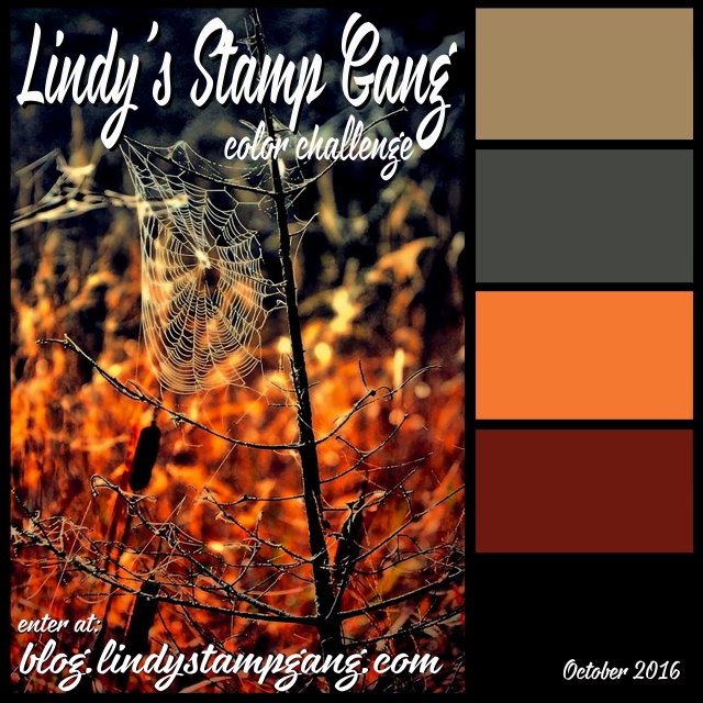
This post is to share my challenge project with everyone. The Lindy's Challenge happens every month and revolves around a particular color palette. (That's totally in my wheelhouse.) They also have a Facebook group for the Challenges.

I finally got mine done and in time for the Challenge, too! I just loved this color palette and I went ahead and ordered the special edition of sprays for this challenge. All I can say is that it's just fabulous. These colors go together so well...I mean, the Voodoo Violet Blue is amazing on it's own but add in a bit of the Amethyst and whoa: outta this world. In fact, I'm visualizing a few galactic backgrounds with this palette. But I digress, here's my project:
Masquerade:  This is an Art Journal page in my Large Dylusions journal. I was truly taken with the Voodoo Violet Blue Starburst Spray (released from retirement just for this challenge month!) and it reminded me of mystery. I wanted to use a face because I haven't done that in awhile and I need the practice. Upon examining the colors, I realized I had everything I needed: a soft pink for a flesh tone; coordinating accent colors; and a light color for a background.


I stenciled in my face first then masked it off while I sprayed Whale Watch Blue over the background. I added Voodoo Violet Blue with a brush around the outside for a frame. I used a paintbrush to dab Chateau Rose onto the face to give it some color. I used two coats. I sprayed another piece of paper with Voodoo Blue and Open Arms Amethyst, then cut out the mask. The medallions were also cut out separately from a piece covered in the Amethyst only. There was so much shimmer in it that my stamping got a little lost. I embossed the stamp details with Lindy's Prima Donna Purple Embossing Powder.

The heart was also a stamp and cut from watercolor paper covered in Bodacious Blush. The doily is also sprayed with a touch of that and more Chateau Rose. Chateau Rose is the first Flat Fabio I've tried. I like the very soft color it provides.

I just added some lettering and bling from my stash to finish it off. I simply couldn't get this song out of my head as I was doing the page so I added the line to fill in some space vertically. (If I had planned it out a bit better, the word "masquerade" would have been a bit closer to the face and I wouldn't have felt the need to fill the gap. As it is, I rather like the fact that I could fit the phrase on there. Serendipity.)  


This group of sprays is probably my new favorite palette. (that's saying a lot because I ADORE the Drop Dead Diva collection and all those bright, neony, sassy colors)
 
Thanks for dropping in for a peek. Hope you'll stop in again soon for more art journal pages and my month of Halloween projects throughout October!
-Wy
"Masquerade! Paper faces on parade. Masquerade. Hide your face so the world will never find you."
---"Masquerade", The Phantom of the Opera

Sunday, March 19, 2017

Art Journal Adventure: February 2017

Ok, so I totally forgot I was supposed to post for the month of February. Of course, since I took a vacation, I didn't really have time to catch up with all my prompts until this last weekend.
Overall, I like the pages I've got done. One page just doesn't float my boat but it's done.

Without further ado, here's pages from the AJA for February.

 Week #6: Use a Subtle Color Palette:  This page cannot be photographed by my amateur skills with any real success. Take my word for it; it's way prettier in person. I used all Lindy's Starburst sprays. I'm not entirely sure on the colors but I think Cosmopolitan Pink, Fuzzy Navel, and Edelweiss Green with a touch of Glory of the Seas Gold. In all honesty, I liked the way the background looked so much, I didn't want to mess it up. So I just used two stencils with the same colors and added in the rays and the tree.
It is REALLY subtle because you need to adjust the page to even see the patterns. I even wrote the word "peace" in white pen in the corner. It's just barely there. But it's a page you really have to look at and I like that.


Week #7: Use Text as the First Layer: I have often used dictionary pages as a background paper and wanted to try something different. I just wrote down the lyrics to songs that were playing as I worked. I didn't need to get all of them just the lines that I could scribble out in the time it took to fill the page. I've got about 4 songs in there in some form.

I've always like to do flowers on top of text so I decided to just go for that and use up some old gelatos. It was working ok until I added the black outline. Yuck. It seems too thick and too bold. Not quite what I had in mind. But it is what it is.

Week #8: Include a reference to Time:   This was a tough prompt for me as I didn't want to go down the path I always have. I didn't want to end up with clock faces all over my page. So in trying to meld this prompt with another project, (and with a little help from my sister) I remembered a poem of Poe. The Bells. I took that quote and ran with it.

 The entire poem is really about the advancement of Time through the tolling of various metal bells. Brazen bells, iron bells, silver bells, golden bells. The repetition of the poem is practically a chant, the progressive march of time over life. So this page with its three different bells is my interpretation of the poem. I was trying for the feel of the inside of a clock tower that chimes on the hour.
I was so happy with this background. I LOVE IT! I honestly didn't think it would turn out. But using Dylusion Black Marble paint with a Tim Holtz ink applicator was the key to success on this one. The paint dried quickly and the applicator allowed a thin coat that didn't seep under the stencil. The black paint also covered very well with just a couple coats. The coppery colored background is Lindy's Starburst sprays in various coppers and golds. It's hard to cover up the mica but the Dylusions paint did a pretty good job.
I tore the bells from scrapbook papers and went over the torn edges with gelato. (You know, my usual.) I'm not sure I spelled rythme correctly (it should be rhyme)...but I don't even care. This page is ranking high in my all time favorites!


Week #9: Transform one or more of your edges:  I never remember that I can alter the size of pages if I want. I never remember that I could just rip out half a page and work with the remainder. While this was a good reminder, I had trouble deciding what to do with the page. At first, I wanted to incorporate the edge into the design but I wasn't sure how to do that without going totally abstract. I decided to use a stamp I got a while back and hadn't yet used. (I showed it to my sister this past weekend and said, "I really need to use this." So hey, El, I did it!) The wavy edge would work for an underwater scene.
Initially, it was all going to be about those fish bones but I was reminded of the scene in Finding Dory where Dory is stuck in a bucket with a bunch of dead fish. I decided to go with the notion that these bones were what was left from some sea creature's lunch. I went with an octopus...because hey, Octopus! I didn't have room for the entire octopus but tentacles are the best part anyway.

I wanted the background to be more green than blue because I wanted to keep it a little creepy. I added the large pink circles of paint as a finishing touch as it seemed to need a pop of color. And let's face it, those circles look like the sucker marks of an octopus. Am I right?

So those are my February pages for the Art Journal Adventure. Here's to hoping the March pages will be just as satisfying!
-Wy
"To the moaning and the groaning of the bells."  --Edgar Allan Poe, "The Bells"

Sunday, December 04, 2016

Winter canvas: Flurries?


I was given a challenge/inspiration by my sisters. One sister posted a picture to my FB wall and the other commented that I could certainly make my own. While artists don't like to hear that their work can be easily duplicated, I always consider the challenge in it. I would never be able to duplicate it and no one ever really can. Everyone has differing tastes, styles, and supplies. I certainly didn't have the supplies the artist had used but I did have some motivation to get going.

And a blank canvas.

I wish I could show you the inspiration but without being able to link it to somewhere, namely the artist, I'd rather not. It was shared on FB by the Sizzix company because it used their dies. I couldn't find it in a blog post on their company site, nor could I find the direct link to the artist's blog. So I'll just move along...


Without getting into a whole lot of description, I am very pleased with the result. This canvas was probably one of my favorite background I've done. The soft blues were from Lindy's Starburst sprays and a couple stencils from Joggles. But the process of using my chipboard snowflakes (Creative Embellishments) as masks for the sprays got me really excited about the background. Because the Lindy's spray so fine a mist and the chipboard pieces were so detailed, the white "ghosts" of the snowflakes added an extra layer without anymore work. I will keep this in mind for future projects.

I went with a collage and just pulled out matching blue items from my stash. When I found the Santa, I decided this canvas would be a bit more than just "winter". I hesitate to call it "blue Christmas". I may settle for "Flurries".

Thanks for dropping in for a look!
-Wy

Sunday, November 06, 2016

Art Journal Adventure: Part 7

I was so far behind in this journal I never thought I'd get caught up before the end of the year. But after a kinda, maybe-ok weekend of "art" work, I'm only a week or two behind now.

This journal is inspired by prompts given at the Joggles Blog.

I left off in this journal with some not-so-satisfying pages. It's hard to get back into it when you leave in a bad spot. But if you don't jump back into it, you'll be stuck with blank pages. Even ugly pages are better than blank ones because at least, you've tried out something.

So here's the next set of pages, ugly ones and all!


Week 35: Outward The prompt was to design your page outward from the center. I immediately thought of my Rays stencil and used that. This was a simple page but really gave me a boost of energy to work on more pages without a feeling of dread.


Week 37: Not Quite Birds:  I skipped #36 because I wanted a 2 page spread. So moving to 37, the prompt was to add tissue paper to the background. I chose the only tissue paper I had close by which was colored and had been saved from a Donna Downey supply shipment. Once down, it seemed dark, so I went through my stuff to find matching colors in lighter shades. The butterflies were cut from a Joggles collage sheet and my alcohol ink colored a scrap of cardstock for the quote. A few touches of white and I moved on (or back) to Week 36.


Week 36 & 38: Circles  I decided to combine these two weeks into a two page spread. I thought it was done but looking back on it this week, I think I need to add the larger circles I had toyed with in my head. The two prompts were monoprinting and repeating a shape. Circles, spirals and curves are always my go-to shapes. I monoprinted this Bubble Blast stencil (Joggles) with a variety of soft colors from the Lindy's starburst sprays. I went ahead and outlined every circle with a matching color. I just can't leave it alone. I think I'll be adding some larger circles in there somewhere.


Week 39: Adventurous Cats:  This prompt was to use PINK. My original plan fell through when I realized I didn't have any Magicals in pink. (Magicals are from Lindy's Stamp Gang and I use them like the Brusho powders.) So I just sprayed and added some paint. I honestly didn't know what to do with the page. I wanted to stay all pink but I couldn't shake the need for black. So added my cats.


Week 43: Uglier: Again I was jumping around with the prompts. This prompt was to use stencils differently. I interpreted it as Just use stencils. It quickly became a hot mess then my effort to save it failed. So I did what any good art journaler would do and gessoed over most of it. I started with a very pink cobblestone, added green branches, then something purple. Anyway, you get it...it just got uglier. I thought maybe by adding a tree in black it would pop out from the page. Alas, the tree was too "branchy" and just got lost in all the background. The blue was an alphabet mask that I thought would tone down the background but there wasn't enough coverage to make that stand out either. So I just cut out a circle and gessoed everything around it. I thought the quote was appropriate and added some stars to round it out. Ew...this one was a rough time.


 Week 40: Ladybug Go Home:  Having learned not to stop on an ugly page, I went simple with the prompt for this week: Insects. I knew I had these really old stickers laying around and I wanted to use them. So I just went with a green Lindy's starburst spray background, added my stickers, and wrote a little something along the edge. This is certainly not what I'd call art but it does look good to me and it's something I like. The simple nature of this page is what I needed. I needed to see that things come together without too much thought or too many materials. In the end, I'm the only one who'll really be looking at this journal over and over again so I may as well put what I like in it. I can preserve those little scraps and stickers that I have hoarded over the years (those that were too precious to use) in a journal. This page will remind me of that.

Also getting caught up on my Inspiration Journal...that will be next post!
-Wy

Wednesday, October 26, 2016

Throwback Thursday: Sept 15, 2013

TBT is a day early so I can join in on some Challenges! You can see the original post HERE.

This year I was inspired by my golden pumpkin portrait aptly named, "Patchwork Jack". I was inspired not only by this canvas, but by two challenges.

My color palette was inspired by Lindy's Stamp Gang Challenge for October. You can find the details at their BLOG.
The products I used were: Hag's Wart Orange Magical (from this Halloween set);
Red Hot Poker Orange Starburst Spray; Fuzzy Navel Peach Starburst Spray; A Bit O'Bubbly Starburst Spray; and 3 embossing powders: Byzantine Bronze; Queen Sheba's Silver; Midnight Violet.  

I was inspired in composition by the October challenge at Creative Embellishments, HERE. They had this lovely inspiration:
pumpkin
 I used their chipboard gears in various sizes. (Here's a few of them.) I also used these jack o'lanterns.
 There was a twist to their challenge to add a touch of metal.
(If you like to create things...any things...check out these monthly challenges. You get an opportunity to win some quality products from their shops!)
 
So here is what I created:
Steampunkin':  This has been a vision in my head for a couple Halloweens now. This was the year to make it. It's a 12 X 12 canvas. I collaged a background of patch-worked papers in black and white. I used a large piece of watercolor paper as a "mother board" for all the orange. I used the Lindy's magical and Starburst sprays to get the color. I tore out my pumpkin and stamped the light bulbs. (Stamp image from Joggles.com)
Next comes the fun.
All those gears along the edge were embossed with a variety of the Lindy's powders. I used them in combination with each other and added in some copper (from Ranger) for the small pumpkins. I love that the Midnight Violet powder looks black but gives a purple hue in just the right light. That gold shimmer from the Starburst sprays added some great "glow" to both the lights and the pumpkin.
All the gears were embossed chipboard so I added my metal "twist" on the face. I used 2 metal bottlecaps as the base for my eyes and various keys for the mouth. All the pieces are attached with Multi Medium (Ranger). I also threw in some buttons, rhinestones, and little orange roses to fill in some gaps and add a touch more color.

Thanks for dropping by!
-Wy
"Amuck, amuck, amuck, amuck..."  --Hocus Pocus

Monday, July 18, 2016

Lost Coast Designs Challenge: ATCs

I wanted to practice with Alcohol Inks for Creative Chemistry 102 (from Online Card Classes.com) so I decided to pull out my Lost Coast Stamps to see how I could turn some backgrounds into finished cards. Since Lost Coast is having a Challenge with ATCs, I figured if they turned out pretty good, I'd have a challenge to cross off my list, too!
You can find the Challenge over at the Lost Coast Portal to Creativity HERE. (Psst, they just released some new stamps...BIRDS...oh my!)


I like these stamps because I can stamp them in a single color and they look fantastic. Make background, stamp, done! It's a great way to start a creative warm-up.

So here's what I made:
For this post, I'm focusing on the two on the ends as they show off the stamps best.

Dragon on Red:  I'm usually stumped with how to use this stamp but I just love dragons and had to own it. I LOVE the detail in this stamp and am usually hesitant to emboss it because some powders make a mess of fine detail. But I was so amazed with how well it worked...the dragon is clear and crisp...and embossed. I stamped it in Versamark over an alcohol ink background. (The colors are from Adirondack Alcohol ink; Watermelon, Red Pepper and Cranberry. I consider this a failed attempt at an ombre look. My Watermelon and Red Pepper were practically the same color so the light to dark effect was lost.) I used an embossing powder from Lindy's Stamp Gang: Midnight Obsidian Violet. If you haven't tried these powders...get them. They are all fine powders, no clumps or chunks, and they melt quickly with a heat gun. This powder, while basically black, has a lovely hint of purple when lit just right. To play that up, I colored the dragon with Distress markers, Seedless Preserves and Dusty Concord. Just touches of Liquid Pearls in the corners to finish it off. (This one's a keeper!)
Door to True Love:  The door stamp is another favorite of mine but unlike the dragon, I can always think of a way to use it. The moment I made my brown alcohol inked cards, I knew I wanted the door. I didn't emboss, just stamped with Jet Black Archival (Ranger). It's my go-to for stamping over alcohol ink. (I used to use only Stazon but got better results with Archival after learning that it stuck to glossy cardstock.) I wanted the door to open so I cut it with a craft knife and folded it back. I punched a small hole in the top to add the ribbon and key. (Stamp also by Lost Coast Designs.)
The key is embossed with Lindy's Stamp Gang powder, too. (Starbright Gold Green). I attached this top card to a bottom card and added my interior to the door.
I just wanted a pop of color and chose pink. I stamped the hearts on a separate piece of cardstock and cut them out. This card reminds me of the movie, The Princess Bride.

Remember the Challenge!
-Wy

Sunday, June 12, 2016

Summer of Creative Chemistry: Distress Stains

If you are interested in learning A LOT about your crafting supplies, especially inks, stamps, and Ranger products, you should take Online Card Classes Creative Chemistry. It's well worth the investment. I've learned far more than just how to use Ranger products, I've learned how they relate into everything I own.

For Challenge Week 2, I pulled out a little used product of mine: Distress Stains.


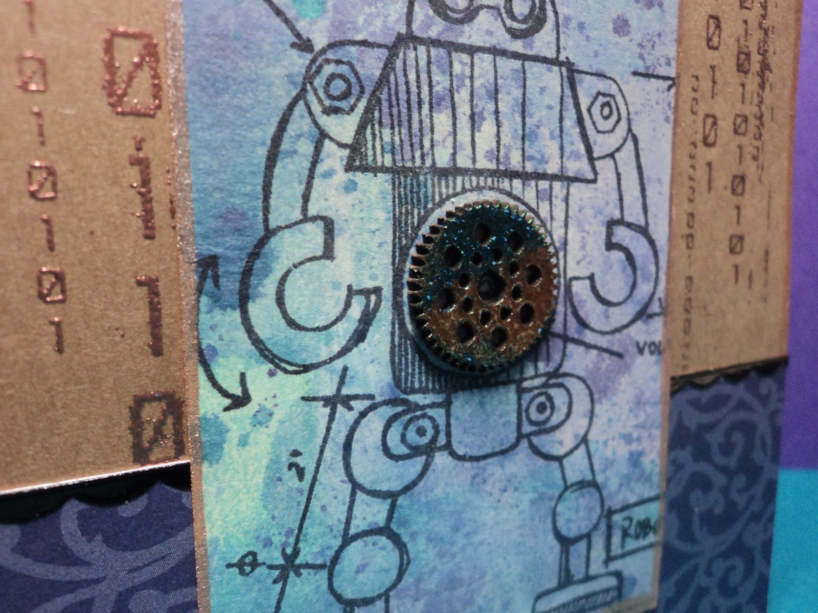
Binary: I made the tags with the marbled stain technique which is very similar to wrinkle free distress. This tag was made with Dusty Concord, Shaded Lilac, Broken China, and Picket Fence. It's edged with Bronze? I decided to keep the robot stamps out. (I think it might be a robot summer for me. I'm seeing them everywhere and adding computer code, circuitry, and gears to my extensive collection of supplies!) 
I used a stamp from Creative Embellishments (Binary) and Ranger Super Fine Copper embossing powder for the background. The gear in the center is also from CE. I embossed the chipboard with some powders from Lindy's Stamp Gang...it looks A-Mazing up close!

I really enjoyed this card but the color combo was one I had done in the past. I knew it would work well. So I decided to try something else as well.

After all, if the technique worked with Picket Fence (the "opaque" stain), it should work with any of the metallics, right? Yea, sort of.
Seahorse:  I made these tags by substituting the Bronze stain for the white. I used Broken China, Salty Ocean, and Cracked Pistachio. I like the result though the finished result resembles the wrinkle free distress look more than the marbled stain. But I realize that the difference is just as much about how you drag your tag through your stain as it is about which colors and how much you use.

The seahorse stamp is from 100 Proof Press and the seaweed is another chipboard offering from Creative embellishments. I used more Lindy's embossing powder on the seaweed. I like how the green seems to brighten the card.
 
There's a really intense shimmer with the metallic stains. Difficult to photograph but you can see a bit of it at the top.

I did some other backgrounds but have yet to finish the tags. Maybe tomorrow.
-Wy

Featured Post

The Chocolate Game

 Let's talk about something sweeter than my other blog posts of late. Let's talk chocolate. But no guarantees that anything I want t...