If you are interested in learning A LOT about your crafting supplies, especially inks, stamps, and Ranger products, you should take Online Card Classes Creative Chemistry. It's well worth the investment. I've learned far more than just how to use Ranger products, I've learned how they relate into everything I own.
For Challenge Week 2, I pulled out a little used product of mine: Distress Stains.
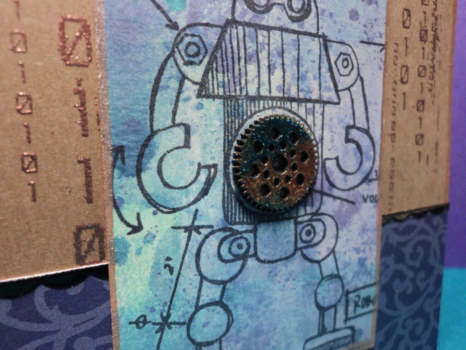
Binary: I made the tags with the marbled stain technique which is very similar to wrinkle free distress. This tag was made with Dusty Concord, Shaded Lilac, Broken China, and Picket Fence. It's edged with Bronze? I decided to keep the robot stamps out. (I think it might be a robot summer for me. I'm seeing them everywhere and adding computer code, circuitry, and gears to my extensive collection of supplies!)
I used a stamp from Creative Embellishments (Binary) and Ranger Super Fine Copper embossing powder for the background. The gear in the center is also from CE. I embossed the chipboard with some powders from Lindy's Stamp Gang...it looks A-Mazing up close!
I really enjoyed this card but the color combo was one I had done in the past. I knew it would work well. So I decided to try something else as well.
After all, if the technique worked with Picket Fence (the "opaque" stain), it should work with any of the metallics, right? Yea, sort of.
Seahorse: I made these tags by substituting the Bronze stain for the white. I used Broken China, Salty Ocean, and Cracked Pistachio. I like the result though the finished result resembles the wrinkle free distress look more than the marbled stain. But I realize that the difference is just as much about how you drag your tag through your stain as it is about which colors and how much you use.
The seahorse stamp is from 100 Proof Press and the seaweed is another chipboard offering from Creative embellishments. I used more Lindy's embossing powder on the seaweed. I like how the green seems to brighten the card.
There's a really intense shimmer with the metallic stains. Difficult to photograph but you can see a bit of it at the top.
I did some other backgrounds but have yet to finish the tags. Maybe tomorrow.
-Wy
Showing posts with label Ranger. Show all posts
Sunday, June 12, 2016
Friday, February 19, 2016
Distress Crayons VS Gelatos
This remarkable match-up reminds me of Godzilla vs. King Kong. (Not a kaiju fan? Skip to the next paragraph.) At the end of that movie, the audience is left to wonder who really won the battle? We see King Kong swimming away out to sea, supposedly back to his beloved Skull Island, but no where is Godzilla. But since Godzilla is seen in many more movies afterward, it would appear that Kong wasn't exactly a victor. In fact, how many movies has King Kong been in since that battle with Godzilla? One maybe two? So overall, maybe Godzilla was the real victor. This is precisely the situation I have with Distress Crayons vs Gelatos.
Gelatos are a product from Faber-Castell. They are/were very unique. Gelatos are a pigment stick that comes in a small tube that can be applied almost like a lipstick. They are very soft and creamy but look more like a crayon when applied dry. When they are wet, they look more like a paint. They can be blended together either with water or just with the smearing of your finger. They come in a variety of colors and in small or large tubes (Double Scoops), if you are applying it to a large area, such as a canvas.
Distress Crayons are a product from Ranger and Tim Holtz. These debuted at CHA 2016 this past January and there has been a lot of talk about them. These "crayons" are also a soft pigment stick that plays well with water and is "water-reactive" like all Distress products. They come in a pen-like tube that is narrower and longer that the standard Gelato tube. It is creamy and can be smeared/blended and comes in 18 colors (currently) that match the Distress palette also from Ranger.
So I did a little head-to-head comparison.
In this corner: Gelatos.
And in this corner: Distress Crayons.
Let the combat begin!
So I decided to just swatch the new crayons out on a single page in my Art Journal. I picked out Gelatos in colors that seemed most appropriate to match against the crayons. I will admit this was a little tough. The palette of the Distress line can be very unique and the set of crayons I had chosen were a bit more "earthy" in tone than most of the gelatos I owned seemed to be. But I did the best I could with what I had.
I used a large Dylusions journal and gessoed the page. Once dry, I split the page in half so it had a top and a bottom. On the top, I made swatches of the Gelatos, and on the bottom, I used Distress Crayons. My purpose was to test 3 things: 1. How well did they smear and blend? 2. How well did they work with water or how well the color moved with water? 3. Did they smear a lot when a finishing coat of ModPodge was used over the top of them?
I laid down some of the pigment stick in the upper half of each stripe first. After I laid down all 6 colors, I went back to blend with my finger. The middle portion of the stripe is where I used my waterbrush to lift the color and spread it with water. The bottom of each stripe is an experiment that presented itself and I'll touch on that in a bit.
First, Gelatos:
I am very familiar with this product and have been using it for over a year now. I am a big fan of it. The gelato applied very easily to the gessoed page and smeared/blended with ease. I used my finger to blend it and no water. It rubbed around without much effort depending on the color. The blue and purple seemed to require a bit more work than the others. The waterbrush lifted the pigment without trouble and moved it around to create a more "watercolor" type look. I may even have been able to wash the pigment off the gesso if I had wanted. When the top coat of ModPodge was applied, the gelato lifted a little but didn't smear too badly. I was using a light coat and a light touch. As you can see in this photo above, even after the Mod Podge, the white areas are still pretty white which tells me that the color didn't move much with the Mod Podge.
Next up, Distress Crayons:
This being a brand new product this year, I had relatively little info on it. (Only a few YouTube videos I had seen.) The Crayons applied very easily, and smoothly to the gessoed page. They had the same consistency of the gelato and at first application, they seemed more creamy than a gelato. I tried the smear/blending test first with my dry finger. Here's where the story gets a little long and weird.
I applied the crayons first and applied all the colors by just scribbling them on the top of a stripe. I blended the red and it seemed very similar to a gelato. This is when I decided to apply the rest of my colors before blending. It seemed a better plan than blending and wiping off fingers then applying and repeating. So I left the crayons unsmeared until after I completed the gelato application and smearing. Here's the weird thing that happened: when I came back to the crayons to blend them with my dry finger, they didn't want to blend. They didn't want to smear. They didn't want to leave the lines of color they were currently in. At first, I thought maybe it was just the Rusty Hinge color. But all of them reacted the same. Even on the gessoed surface, they were very stubborn about being rubbed. In fact, I was left with streaked colors...as in you could tell where the lines had been. It was much worse than the above photo portrays. This was an instant turn-off for me. Blending and smearing with a dry finger was the main way I used gelato and if these crayons weren't any good at that, they were dead to me.
BUT, I had smeared the Festive Berries rather well when it had first been applied. So that led me to believe that perhaps, you needed to rub the crayons soon after application or they dried too much to blend later. This became my unforeseen 4th experiment at the very bottom of each stripe. I went back and applied each crayon color again at the bottom ONE AT A TIME and smeared it immediately. Each one worked rather well with similar results to a gelato. To be fair, I went back and applied the gelato colors to the bottom of their respective stripe and let them sit for about the same time as the crayons had. After they had had time to "dry", I tried to blend them with my dry finger. They blended just like they had when first applied. Hmmm...
The Distress Crayons were just like the gelatos when I used the waterbrush on them and the color was easy to lift. The Mod Podge test was a bit different than the gelato but not unexpected. The Mod Podge applied lightly with a light touch really caused the crayons to "bleed". I assume this is because of the crayons "water-reactive" properties. This is why the photo shows the crayons smeared better than they actually did. With water, these crayons move very well and the Mod Podge lifts a bit of that and evens it out. This happens to gelato but to a much lesser extent.
HERE'S THE HEAD-TO-HEAD:
Both products are very similar but your choice will depend on your personal preference mostly. It will also depend on the application and technique you want to use it for.
Both products are soft and creamy and are applied from a tube. Both can be used directly onto a surface or lifted with a waterbrush to create a watercolor or softer look. Both work on a gessoed surface and can be coated, lightly, with Mod Podge to "seal" them in.
Distress Crayons come in an interesting pen-like tube that is easy to grip and makes application more precise for small areas.
Gelatos are in small, more rotund tubes that are easier to use for large background areas.
Distress Crayons must be blended almost immediately upon application or the blend-ability disappears unless you add water.
Gelatos are much easier to smear and blend without the application of water.
Distress Crayons come in 18 colors. Though more may be added, they will remain in the confines of the Distress color palette. If these colors, don't appeal to you, you're screwed. Gelatos come in 52 colors some of which have a "shimmer" to them or a metallic sheen, if you will. But if that doesn't interest you, no big deal.
I have learned from other sources of these two differences as well:
Distress Crayons have the water-reactive property that allows them to splay out from the source as the pigment follows the water.
Gelatos don't do that.
Distress Crayons can NOT be used directly onto rubber stamps for stamping. Because of the above reactive property with water, they cannot be rubbed onto a rubber stamp then misted and stamped.
Gelatos can be applied directly to a rubber stamp, misted lightly with water, and stamped to produce a decent image. (and because you've used gelato, it becomes a resist to inks.)
THE VERDICT:
The winner is...wait for it...
Gelatos!
Or is it...could it be...
Distress Crayons!
For ME, the winner is Gelatos. I already own a bunch and they have never let me down. I adore smearing them with a dry finger and using them around the edges of paper I have collaged down. When the Distress Crayons wouldn't blend after a given time frame, I lost the new product excitement. I rarely get excited about Distress products "water-reactive" nature. In this instance, it means very little to me. If I wanted to use these with water, I'd just reach for a paint or an ink or a watercolor. I never use my gelatos like a paint...I use them like chalk or crayons. I don't want to water them down. I want that strong color.
I DO LIKE the Distress Crayons for the colors. I have a few favorite colors in this palette that don't have a comparable counter-part in a gelato...like Peeled Paint or Seedless Preserves. I DO LIKE the pen-like packaging they come in, though it doesn't lend itself well for how I smear that stuff over a background. It's just kinda cute, ya know? I doubt I'll buy any more of them. I've got what works for me and I'll stick with it.
So what's the winner for you?
Depends on what you want to use it for and how you work.
Hope this helps you narrow it down!
--Wy
Gelatos are a product from Faber-Castell. They are/were very unique. Gelatos are a pigment stick that comes in a small tube that can be applied almost like a lipstick. They are very soft and creamy but look more like a crayon when applied dry. When they are wet, they look more like a paint. They can be blended together either with water or just with the smearing of your finger. They come in a variety of colors and in small or large tubes (Double Scoops), if you are applying it to a large area, such as a canvas.
Distress Crayons are a product from Ranger and Tim Holtz. These debuted at CHA 2016 this past January and there has been a lot of talk about them. These "crayons" are also a soft pigment stick that plays well with water and is "water-reactive" like all Distress products. They come in a pen-like tube that is narrower and longer that the standard Gelato tube. It is creamy and can be smeared/blended and comes in 18 colors (currently) that match the Distress palette also from Ranger.
So I did a little head-to-head comparison.
In this corner: Gelatos.
And in this corner: Distress Crayons.
Let the combat begin!
So I decided to just swatch the new crayons out on a single page in my Art Journal. I picked out Gelatos in colors that seemed most appropriate to match against the crayons. I will admit this was a little tough. The palette of the Distress line can be very unique and the set of crayons I had chosen were a bit more "earthy" in tone than most of the gelatos I owned seemed to be. But I did the best I could with what I had.
I used a large Dylusions journal and gessoed the page. Once dry, I split the page in half so it had a top and a bottom. On the top, I made swatches of the Gelatos, and on the bottom, I used Distress Crayons. My purpose was to test 3 things: 1. How well did they smear and blend? 2. How well did they work with water or how well the color moved with water? 3. Did they smear a lot when a finishing coat of ModPodge was used over the top of them?
I laid down some of the pigment stick in the upper half of each stripe first. After I laid down all 6 colors, I went back to blend with my finger. The middle portion of the stripe is where I used my waterbrush to lift the color and spread it with water. The bottom of each stripe is an experiment that presented itself and I'll touch on that in a bit.
First, Gelatos:
I am very familiar with this product and have been using it for over a year now. I am a big fan of it. The gelato applied very easily to the gessoed page and smeared/blended with ease. I used my finger to blend it and no water. It rubbed around without much effort depending on the color. The blue and purple seemed to require a bit more work than the others. The waterbrush lifted the pigment without trouble and moved it around to create a more "watercolor" type look. I may even have been able to wash the pigment off the gesso if I had wanted. When the top coat of ModPodge was applied, the gelato lifted a little but didn't smear too badly. I was using a light coat and a light touch. As you can see in this photo above, even after the Mod Podge, the white areas are still pretty white which tells me that the color didn't move much with the Mod Podge.
Next up, Distress Crayons:
This being a brand new product this year, I had relatively little info on it. (Only a few YouTube videos I had seen.) The Crayons applied very easily, and smoothly to the gessoed page. They had the same consistency of the gelato and at first application, they seemed more creamy than a gelato. I tried the smear/blending test first with my dry finger. Here's where the story gets a little long and weird.
I applied the crayons first and applied all the colors by just scribbling them on the top of a stripe. I blended the red and it seemed very similar to a gelato. This is when I decided to apply the rest of my colors before blending. It seemed a better plan than blending and wiping off fingers then applying and repeating. So I left the crayons unsmeared until after I completed the gelato application and smearing. Here's the weird thing that happened: when I came back to the crayons to blend them with my dry finger, they didn't want to blend. They didn't want to smear. They didn't want to leave the lines of color they were currently in. At first, I thought maybe it was just the Rusty Hinge color. But all of them reacted the same. Even on the gessoed surface, they were very stubborn about being rubbed. In fact, I was left with streaked colors...as in you could tell where the lines had been. It was much worse than the above photo portrays. This was an instant turn-off for me. Blending and smearing with a dry finger was the main way I used gelato and if these crayons weren't any good at that, they were dead to me.
BUT, I had smeared the Festive Berries rather well when it had first been applied. So that led me to believe that perhaps, you needed to rub the crayons soon after application or they dried too much to blend later. This became my unforeseen 4th experiment at the very bottom of each stripe. I went back and applied each crayon color again at the bottom ONE AT A TIME and smeared it immediately. Each one worked rather well with similar results to a gelato. To be fair, I went back and applied the gelato colors to the bottom of their respective stripe and let them sit for about the same time as the crayons had. After they had had time to "dry", I tried to blend them with my dry finger. They blended just like they had when first applied. Hmmm...
The Distress Crayons were just like the gelatos when I used the waterbrush on them and the color was easy to lift. The Mod Podge test was a bit different than the gelato but not unexpected. The Mod Podge applied lightly with a light touch really caused the crayons to "bleed". I assume this is because of the crayons "water-reactive" properties. This is why the photo shows the crayons smeared better than they actually did. With water, these crayons move very well and the Mod Podge lifts a bit of that and evens it out. This happens to gelato but to a much lesser extent.
HERE'S THE HEAD-TO-HEAD:
Both products are very similar but your choice will depend on your personal preference mostly. It will also depend on the application and technique you want to use it for.
Both products are soft and creamy and are applied from a tube. Both can be used directly onto a surface or lifted with a waterbrush to create a watercolor or softer look. Both work on a gessoed surface and can be coated, lightly, with Mod Podge to "seal" them in.
Distress Crayons come in an interesting pen-like tube that is easy to grip and makes application more precise for small areas.
Gelatos are in small, more rotund tubes that are easier to use for large background areas.
Distress Crayons must be blended almost immediately upon application or the blend-ability disappears unless you add water.
Gelatos are much easier to smear and blend without the application of water.
Distress Crayons come in 18 colors. Though more may be added, they will remain in the confines of the Distress color palette. If these colors, don't appeal to you, you're screwed. Gelatos come in 52 colors some of which have a "shimmer" to them or a metallic sheen, if you will. But if that doesn't interest you, no big deal.
I have learned from other sources of these two differences as well:
Distress Crayons have the water-reactive property that allows them to splay out from the source as the pigment follows the water.
Gelatos don't do that.
Distress Crayons can NOT be used directly onto rubber stamps for stamping. Because of the above reactive property with water, they cannot be rubbed onto a rubber stamp then misted and stamped.
Gelatos can be applied directly to a rubber stamp, misted lightly with water, and stamped to produce a decent image. (and because you've used gelato, it becomes a resist to inks.)
THE VERDICT:
The winner is...wait for it...
Gelatos!
Or is it...could it be...
Distress Crayons!
For ME, the winner is Gelatos. I already own a bunch and they have never let me down. I adore smearing them with a dry finger and using them around the edges of paper I have collaged down. When the Distress Crayons wouldn't blend after a given time frame, I lost the new product excitement. I rarely get excited about Distress products "water-reactive" nature. In this instance, it means very little to me. If I wanted to use these with water, I'd just reach for a paint or an ink or a watercolor. I never use my gelatos like a paint...I use them like chalk or crayons. I don't want to water them down. I want that strong color.
I DO LIKE the Distress Crayons for the colors. I have a few favorite colors in this palette that don't have a comparable counter-part in a gelato...like Peeled Paint or Seedless Preserves. I DO LIKE the pen-like packaging they come in, though it doesn't lend itself well for how I smear that stuff over a background. It's just kinda cute, ya know? I doubt I'll buy any more of them. I've got what works for me and I'll stick with it.
So what's the winner for you?
Depends on what you want to use it for and how you work.
Hope this helps you narrow it down!
--Wy
Friday, November 13, 2015
New Distress Color November: Lucky Clover
You can see my predictions in this POST.
The new Distress Color for November is...Lucky Clover. Um...ok?
I can see the Christmas time value of this color and it seems to complement the new Cracked Pistachio quite well. I didn't predict this and it's not much of a "November" color to me. November always whispers brown to me but since Ground Espresso had already come along, I'm guessing December won't be brown.
My close guess was "Succulent Seaweed", a shade of green that would complement Mowed Lawn. My guess was definitely more of a truer green with a leaning towards yellow. Lucky Clover is indeed a blue tinged green.
So I'll have to call this a miss for me. Well-played, Ranger.
The score stands thusly: (remember I only started predictions in March...so I'm out of 10 not 12)
Ranger: 4
Wyvern: 5
I'm fairly certain this will end up in a tie. Looking at my list, I'm not seeing a nice wintry color with the exception of Powder Puff, the extremely pale blue.
All things considered, I'm surprised I got this many right.
See ya next month, Ranger.
-Wy
"But I was going into Toshe Station for some power converters..." --Luke Skywalker, Star Wars
Sunday, September 13, 2015
New Distress color for September: Wilted Violet!
(You can see my predictions for the year on this POST. Sorry for any pictures that don't show anymore...links disappeared!)
Annnnddddd guess what? I called it!
Yuppers...on my predictions I wanted a Shy Violet (even got part of the name right). This is a great color to add in, especially with the other "brights" Tim was adding to the line.
This one will go next to my Twisted Citron in the category of "investing in a full ink pad". I have been rediscovering my love for ink blending recently and the large pads are just what I like to use.
On another front, I have decided that I need more practice or patience with the Distress Markers. They are quite the drama queens...very particular about what surfaces they like and don't like. I got so frustrated today in trying to color in some images on watercolor paper that I gave up on one image and have vowed to only use the markers "indirectly". By that I mean, I will scribble them onto a block and lift the color with water to "water color" with them. AND if I'm going to use them that way, I might as well just invest in an ink pad! My other solution is to use them on glossy paper where I seem to have more "blending" time.
I'm not sure what I'm suddenly doing wrong as I've used these markers successfully before. My only answer is perhaps the watercolor paper I am using is not "true" watercolor paper. The ink will just not move once it's down and I'm ending up with harsh lines. Back to the drawing board...
Ok...so...back to the score board:
It looks like this now:
Out of 7 releases...Ranger: 3.....Wyvern: 4
Have a great day!
-Wy
Monday, June 08, 2015
Hickory Smoke Distress: Called It!
Those who are fans of Distress Inks, Tim Holtz, or Ranger Products know what's happening every month this year. Every month a new color is released and added to the Distress Ink line of products. I made my predictions back in February after the second color was released. You can see those predictions HERE.
So for June this is the new color:
Holy Smoke! Umm...I mean, Hickory Smoke! It's another gray!
So guess what? CALLED IT! In fact, this wasn't even a gray area like last month's color, Twisted Citron.
My very first prediction was for another shade of gray. Here's what I wrote for a color I called "Wet Clay":
"I predicted in one of my past posts that a new color to the line would be in the grey area...literally. So that's my first pick. This Distress color would be a darker shade of gray than Pumice Stone. Perfect for shadows and shading or even just stamping an outline without the BLACK!"
Where do I stand now for the half way point of predictions? (Well, not really half-way. I started late so I'm only predicting 10 out of 12 colors.)
I'm sitting pretty with 2 out of 4 currently. I may have 3 out of 4, if Twisted Citron turns out to be an accurate prediction. (See this POST for reference.) The only one that didn't work out was Mermaid Lagoon.
Hickory Smoke is less of a "whoopee" color and more of a staple that was needed to the line. Pumice Stone is a decent gray neutral but if you just wanted to stamp with it, you could lose detail to it's light color. Hickory Smoke looks like it will make a good stamping ink without being BLACK.
I'm trying to add all the new colors to my marker collection but am picking and choosing what other forms to get. This may be one that I'll invest in the inkpad for the reason listed above.
Thanks for dropping in!
--Wy
So for June this is the new color:
Holy Smoke! Umm...I mean, Hickory Smoke! It's another gray!
So guess what? CALLED IT! In fact, this wasn't even a gray area like last month's color, Twisted Citron.
My very first prediction was for another shade of gray. Here's what I wrote for a color I called "Wet Clay":
"I predicted in one of my past posts that a new color to the line would be in the grey area...literally. So that's my first pick. This Distress color would be a darker shade of gray than Pumice Stone. Perfect for shadows and shading or even just stamping an outline without the BLACK!"
Where do I stand now for the half way point of predictions? (Well, not really half-way. I started late so I'm only predicting 10 out of 12 colors.)
I'm sitting pretty with 2 out of 4 currently. I may have 3 out of 4, if Twisted Citron turns out to be an accurate prediction. (See this POST for reference.) The only one that didn't work out was Mermaid Lagoon.
Hickory Smoke is less of a "whoopee" color and more of a staple that was needed to the line. Pumice Stone is a decent gray neutral but if you just wanted to stamp with it, you could lose detail to it's light color. Hickory Smoke looks like it will make a good stamping ink without being BLACK.
I'm trying to add all the new colors to my marker collection but am picking and choosing what other forms to get. This may be one that I'll invest in the inkpad for the reason listed above.
Thanks for dropping in!
--Wy
Thursday, April 09, 2015
April Distress Color: Did I get one right?
If you'd like to see my whole post on my predictions for the new colors that will be added this year into the Distress Ink line by Ranger, go HERE.
So far these colors have been released:
These colors are Cracked Pistachio (January), Abandoned Coral (February), and Mermaid Lagoon (March).
I started my predictions in mid-February after Abandoned Coral came out. The newest Distress Color was just announced for April and I think I called it.
The newest Distress color is Fossilized Amber:
"I have no better way to describe the yellow-orange color I think this line needs than "school bus". It is a unique color certainly. It would bridge a gap for those looking to smoothly blend the markers of Marmalade and Mustard. It might make a good transitional color between Mustard and Honey and from the yellows into the browns."
Fossilized Amber is described as a grungy yellow; a yellow with a brown undertone that almost makes it "muddy".
I think I got this one right...and so did Tim Holtz and Ranger. The Distress line really needed this color and I'm anxious to have it in my marker collection! (I'm also anxious to get Cracked Pistachio. I bought the stain and do really like it's soft color!) I'm seeing some pretty yellow wildflowers and sunflowers in my future coloring.
So far I've got one wrong (Mermaid Lagoon really through me for a loop.) and I got this one right. Only 8 more to go!
How many do you think I'll get right? What do you think the next Distress colors will be? Let me know in the comments. I love talking colors!
--Wy
"Star light, star bright. First star I see tonight. I wish I may. I wish I might have the wish I wish tonight."
Tuesday, February 17, 2015
A Rant about Distress Marker Colors (Seasonal)
I have to admit that I own all the Distress Markers with the
exception of these two newest releases. (Cracked Pistachio and Abandoned Coral) The "Seasonal" colors that were
added to the line a few years back are my least used. Of those colors, I use Salty Ocean and Picked Raspberry quite a bit. Seedless Preserves, the
red-violet color that I thought I'd use a lot, remains practically brand
new. The brown color, Gathered Twigs, which I thought I'd never use; I
use all the time.
Here's my theory: I don't use the seasonal colors because they don't blend well with the other colors in the line. If you want shading, you have to use it like a watercolor and blend the color out with water. I prefer to use at least three colors to get a good blend...like Copic coloring. I'll even settle for two. And while Seedless Preserves is a great color, it has no lighter tone to match. (Milled Lavender just seems too blue.)
I'm particular about my colors...I hate to blend Festive Berries into Barn Door...they are NOT the same reds...they are a red-blue and a red-orange. Just as Mowed Lawn, which is a beautiful green, doesn't blend into Forest Moss or Crushed Olive. When I say "blend", I mean coloring without having that irritating marker line between colors. I want one color to blend into the next without that ugly seam. It does take a bit of a technique but it's also about how close your colors are to each other to start. I think this is why I don't reach for these colors much. So many of them are stand-alone colors that don't really fit into any of the color families that the Distress line has already established.
On the other hand, Peacock Feathers works quite well with many colors in the established line. It also works well with the other seasonal color, Evergreen Bough. As well, Gathering Twigs works within the other browns to make it more useful as a marker.
Don't misunderstand me; I really like these colors, all of them. I tend to use them as its own set. The "seasonal" colors would seem to be the "bright" Distress colors as the rest of the line seems to be the "natural" colors. That's how I tend to view them and that's basically how I use them.
So my hopes are high for the new colors coming out this year! (See my predictions in this post!)
--Wy

Here's my theory: I don't use the seasonal colors because they don't blend well with the other colors in the line. If you want shading, you have to use it like a watercolor and blend the color out with water. I prefer to use at least three colors to get a good blend...like Copic coloring. I'll even settle for two. And while Seedless Preserves is a great color, it has no lighter tone to match. (Milled Lavender just seems too blue.)
I'm particular about my colors...I hate to blend Festive Berries into Barn Door...they are NOT the same reds...they are a red-blue and a red-orange. Just as Mowed Lawn, which is a beautiful green, doesn't blend into Forest Moss or Crushed Olive. When I say "blend", I mean coloring without having that irritating marker line between colors. I want one color to blend into the next without that ugly seam. It does take a bit of a technique but it's also about how close your colors are to each other to start. I think this is why I don't reach for these colors much. So many of them are stand-alone colors that don't really fit into any of the color families that the Distress line has already established.
On the other hand, Peacock Feathers works quite well with many colors in the established line. It also works well with the other seasonal color, Evergreen Bough. As well, Gathering Twigs works within the other browns to make it more useful as a marker.
Don't misunderstand me; I really like these colors, all of them. I tend to use them as its own set. The "seasonal" colors would seem to be the "bright" Distress colors as the rest of the line seems to be the "natural" colors. That's how I tend to view them and that's basically how I use them.
So my hopes are high for the new colors coming out this year! (See my predictions in this post!)
--Wy
Friday, February 13, 2015
New Distress Colors: Predictions
DISCLAIMER: I am a lover of colors. I love to see them classified, identified, and categorized. Paint chips excite me. I'm anal about it.
For anyone who "follows" Tim Holtz or loves his Distress Inks from Ranger, you know that new colors are on the horizon. Each month in 2015, will have the release of a new color in the Distress ink line. This mystery color will be revealed on the first Friday of each month and will be available in all Distress forms except for the mini pad. (Mini pads will be released in a set of 4 during the year, then made available as open stock next year.)
January's color is Cracked Pistachio, which I'd describe as a muted teal. It's a very patina color. At first, I wasn't thrilled as someone described it as a "mint" color. Patina is a better description and doesn't give me the heebie-jeebies. It's definitely a good color to add.
February's color was just announced! The newest color is Abandoned Coral. (Maybe the name will grow on me.) It's best described as a "pink-orange". It's more pink than Barn Door but more orange than Worn Lipstick. It's well...it's coral. It seems to pair well with some of the brighter colors in the line like Squeezed Lemonade and Picked Raspberry. I'll have to see it up close myself to determine if it's a color I'll likely use. I need colors that will have a compatible blending partner...if it'll blend into Ripe Persimmon, it'll be more versatile to me. Otherwise, it might be another stand-alone color that I don't need in ink pad form.
So this gets me to thinking...what's next? What other colors does the Distress line really lack? Tim Holtz still wants to keep it very retro and vintage. I have high hopes for these new releases...higher certainly than for the "Seasonal" colors that came out several years ago. (I'll save that rant for another post. Not a complaint just an observation as to why I don't reach for THOSE colors much.)
So my predictions for the next 10 colors of Distress Ink are based on possible expansions of color families as well as newer trends that seem to be popular this year.
Here are my predictions for the remaining 10 months in no particular order. (Yes, I decided to try my hand at giving them a name. With the announcement of Abandoned Coral, I don't feel so shy about my names...honestly...abandoned coral? Sheez.) This was harder than I thought it would be and I changed my mind a few times but here's what I'll say:
1. Wet Clay:
I predicted in one of my past posts that a new color to the line would be in the grey area...literally. So that's my first pick. This Distress color would be a darker shade of gray than Pumice Stone. Perfect for shadows and shading or even just stamping an outline without the BLACK!
2. Succulent Seaweed:
3. Lucky Mint:
4. Sweet Hydrangea:
5. Shy Violet:
While we're on purples, why not add a lighter tint of Seedless Preserves? Of the two lighter purples we've already got, neither goes easily with Seedless Preserves. Add the middle road; the color on the right.
6. Powder Puff:
With the various blues and teals already in the line, I was hesitant to predict another. However, there is only one light blue; Tumbled Glass. This color is versatile but there is room for one more. My predicted blue would be light but not a teal or turquoise...it would be a true blue that would be a tint lighter than Salty Ocean. In fact, it would round out a nice trio of marker blending between Salty Ocean and Tumbled Glass.
7. Rich Merlot: I admit this one is totally off the hook. However, I will predict that Ranger will try it's hand at adding a similar color to the Pantone color of 2015; Marsala.
While the Distress line does have the Aged Mahogany; it needs a lighter tint to make it harmonize with Victorian Velvet. This new Distress color would also pair nicely with the deep browns of the line as well as the metallics in the stains and sprays.
8. Flashing Neon:
9. School Bus:
10. Playful Shoreline:
These color examples I picked look good on my computer screen but I realize that can vary greatly between machines. And naturally, nothing beats seeing it in person in a nice natural light setting.
So those are some predictions of mine. I wonder if any of them will come to pass. Certainly, though, I predict new Distress markers and a few ink pads in my future!
--Wy
"Rainbows apologize for angry skies." --Sylvia Voirol
Subscribe to:
Posts (Atom)
Featured Post
The Chocolate Game
Let's talk about something sweeter than my other blog posts of late. Let's talk chocolate. But no guarantees that anything I want t...