Showing posts with label challenge. Show all posts

Wednesday, March 10, 2021

Dare2BArtzy Challenge Project

 Dare 2B Artzy is one of my favorite small stamp/paper craft companies. They have a challenge going on over on their blog and I decided to link up a project I got done with some of their newest stamps and papers. (Their paper is the BEST. It's double sided and thick enough to use in interactive cards without resorting to cardstock. It die cuts or punches very well. For this paper addict, this is the good stuff.)

Anyway, here's a card I made with my newest favorite paper collection and stamp set.


I made up a slimline card. I've been working the last 2 weekends on using up my pile of scraps and I managed to use up some small pieces on this card. I just couldn't let this stamp set sit unused for any longer. (Raccoon Party stamp set)


Have a great week!
-Wy

Monday, May 25, 2020

The New Normal: My Sister's Challenge Envelope

A couple weeks ago, my sister delivered to me a Challenge envelope. We like to make cards together and it's fun to throw ideas around at the table. But since Covid-19, we haven't been able to get together. This envelope contained all sorts of scraps, stickers, and bits that were left over on her craft table one day. She gave it to me to see if I could make some cards with it all. I finally finished the challenge.

I made 5 cards with everything in the envelope. I provided the card bases and a few little embellishments like foil or glitter glue. I also added sentiments or greetings on them. I'm going to add some details here about how I approach using up scraps to get a finished product and hope that maybe you'll find it helpful for using up the leftovers on your craft desk.

The very first thing I do with random bits and bobs is to sort them out by color family. This really allows me to see if I have enough of one color to make a card or if I'll need to draw in another color to have enough for a card front. Patterned papers are great for bridging color families and adding some visual texture to a card front. Scraps are small enough that you don't have to fuss too much with the pattern being too busy.

Let's look at the first card I made from the envelope.

Bottom's Up!  The blue scraps in the envelope were various tones and the largest piece was blue vellum. I'll note here that I hate vellum and I never use it so I wanted to use it up in one big chunk. I figured the best way to do that was as a background. The scrap of water paper paired with the frog part allowed me to make a focal element that matched the vellum. The top part of the card was simply done to cover up the tape behind the vellum. I provided most of that scrap from the pile on my desk in order to tie in the two small leaf stickers I had in the envelope.

By sorting the scraps out by color first, I could easily see how much I had to work with and where I would need more and where I would have plenty. 

So then,

Nobody Sweeter  I still had some blue stuff left but since I wasn't sure how to put them together, I moved on to the pink pile. The pink family had these great patterned papers and a stamped image that was already colored in. I played around with the placement and finally decided to make the floral into a cake topper. The paper scraps were used up on a single card and I used some light bluish line stickers to define the tiers of the cake. The foam dot on the little butterfly was falling off anyway so I just removed it and glued it down flat. This one came together quickly because I could make the focal image from the scraps themselves.

After this, I decided to see what I could make from what I considered the gold family.


The gold family had only a couple stickers in it and I tried to pair the gold family with the green family. But somehow the shades of the patterned paper in the green family weren't quite vibrant enough for this brightly colored butterfly sticker. I had been provided with this green vine still on the Xyron sticker paper. When I pulled off the top part to expose the sticker, I noticed that a lot of the adhesive was stuck in the leaf portions. So I decided to foil it and see what happened. Then the copper colored foil would bridge the gap between the green and the gold families. 

Since the fence piece was white, it would match anything and I put my greeting beneath it as it looked weird just hanging there. I pulled in some paper from the blue family as I decided that the butterfly looked best on the turquoise cardstock. The blue family also had the largest scraps of paper left. 

So after I sort the scraps by color, I then look at their size. Will it fit the length or width of a card front? How big is it in relation to the other scraps I've got? 
So sort by color first, then by size.
Then this happened,

This stamped image of a seed packet was in the envelope, already colored in purple and pink.  Remember what I said about size? This element was the biggest thing I had left but I already used all my pink stuff for the "nobody sweeter" card. I was going to pair it with the blue family but I didn't have a lot left. The green patterned paper was double sided. It had a rusty orange color on the back (which might have worked well with the butterfly sticker) but I really liked this plaid pattern better. It seemed to match some of the deeper green tones in the leaves so I framed out the stamped image with it and added the word that was also in the envelope. The Hope word matched the green plaid and also covered up the gap between the thin scraps along the edge. 

Then I was left with the leftovers from the leftovers. Now all I had was one or two things from different color families. These truly were scraps as I now had nothing to use as a focal image that had come in the envelope. So I pulled in a focal of my own to make it work.


What I had left was the patterned paper from the blue family and the metallic gingko leaves from the gold family. I could match the patterned paper with a turquoise base but I was unsure if I could get the leaves on there. They seemed very out of place with the paper. After putzing around with it, I finally decided to use the stickers as a cluster and I just grabbed the focal element that I had already finished laying on my desk. The metallic of the embossed image on the focal tied the leaves into the card  so they didn't look so haphazard. 

On the inside of this card, I used up the last strip of blue vellum that I had cut off the first card and put a sentiment over it to cover up the tape. 

Now in conclusion, do I like all the cards? Not really. But I had a lot of fun and they're not all bad. I love the pink one and the last two. I'm not a fan of the first card because I just couldn't think of a greeting to go well with it. The yellow butterfly one seems a little "thrown together" to me. While I love that the foiling turned out so well, I wish I could have done a better job with the fence. That fence or gate was actually the back of a sticker so the side that is facing up is the shiny side...the side that nothing sticks to! So I couldn't stamp on it like I had planned to. I just overthought it.

Anyway, I hope this long wordy post was worth it for ya!
For those who are still locked down, keep it up, you're almost there! Stay at home and stay safe.
For those who are re-opening, stay safe and wear your mask for others beside yourself.
For those in New York State, we're getting there, people! Keep up the good work! Phase 2 will be here before you know it because we got this thing down!

-Wy

Saturday, August 24, 2019

Dare2BArtzy Challenge: August

I'm playing along with the Dare2BArtzy Challenge found over on their blog.

You can find the challenge and rules right HERE.


I was trying to use up my paper scraps on my table. I just made a stack of strips and split them up by color. I used the Bee-utiful Stamp set and colored the floral image with Zig Real Brush markers to match the papers. I just love that quote.

I love the matching colors and the simplicity of design. It came together so quickly that I stared at it for a while wondering what else it needed but less was more.

Thanks for stopping in!
-Wy

Thursday, May 16, 2019

6x6: Caught Up

These pages finally caught me up on this project! And some of them are pretty good.


Week 58: Nesting Time: Egg  I just couldn't bring myself to use the rubber stamp I have of a lovely little bird's nest with three eggs in it. So I tore up paper. Some of the background colors were splash over from the other side so I just rolled with it. I think I like this page more than it deserves. Mostly because of the colors.


Week 59: Doors:  Do Not Open     This page expressed the anxiety I was feeling at the time. I had some things on my plate that were stressing me out. I just wanted to slam the door on them. But it always manages somehow to creep back in through the cracks.


Week 60: Magical:   I shared this photo already but will add it in here. I was inspired by a Lindy's challenge for the color palette and by this challenge for the theme. More details about this page can be found in it's own blog post.


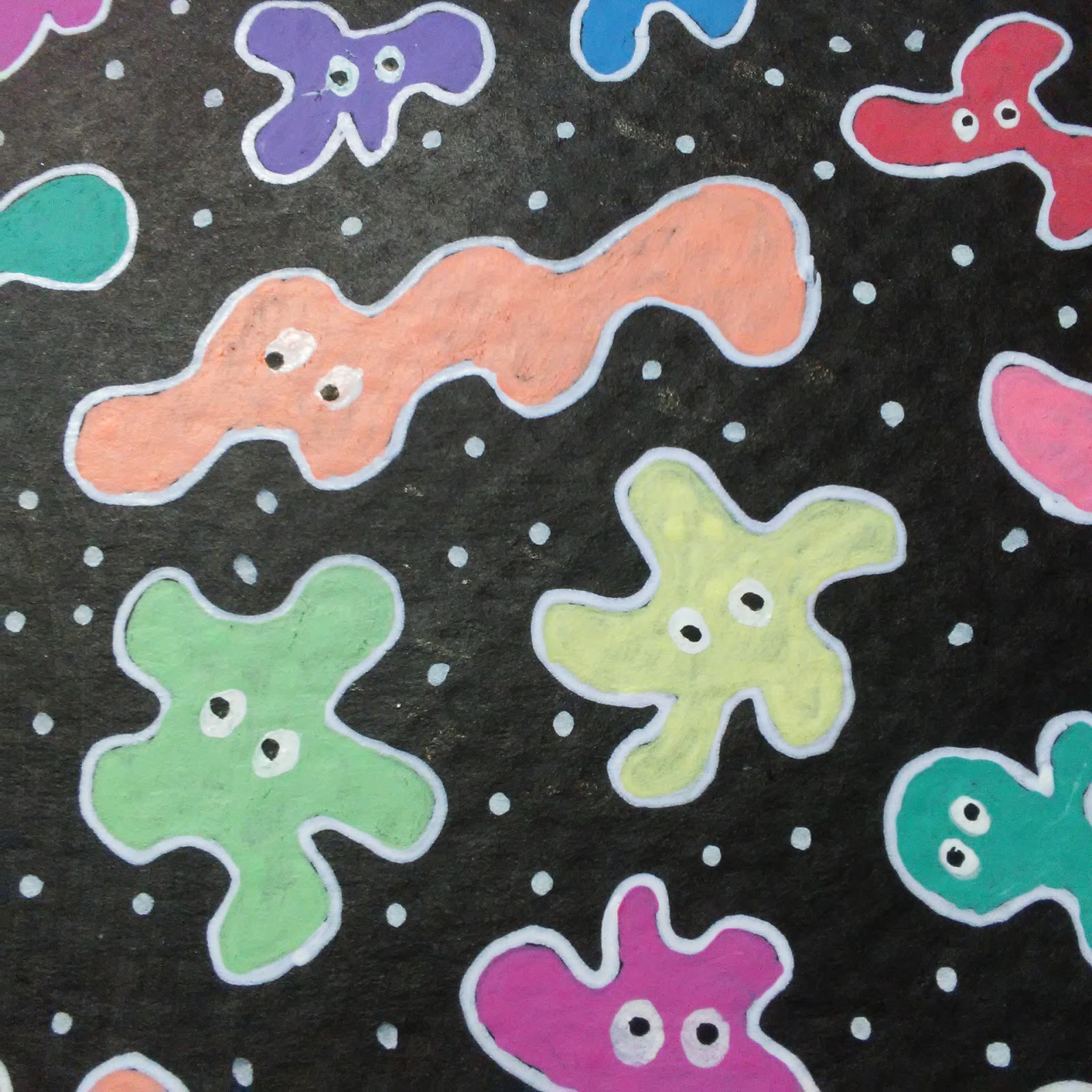
Week 61: Patterned Paper: Germs    I don't know where I caught a little cold but I had a rotten cough for a few days. But inspiration comes from the weirdest places and my patterned paper turned out to be doodled germs. I've doodled these guys before and they've been called many names including amoebas, bugs, doodleys, slimers, and splats. It's very relaxing to just take out a pen and make some shapes, color them, and add some eyeballs. This page was a bit different as I decided to make the background black before doodling over it with gelly roll pens. Love these guys!


Now I am officially caught up with the blog, too!
I won't jinx it with any predictions so I'll just say I'll see ya when I see ya.
-Wy

Friday, May 10, 2019

Lindy's Challenge: Magical

This post is an entry to the Lindy's Monthly Challenge. You can find details about how to add your own project on their BLOG. You can also find their challenge group on Facebook under Lindy's Creative Gang.

No photo description available.

I used this color palette for a 6x6 journal page (#artfulevidence) that I was also doing in another group.


The theme in the 6x6 group was Magical and all I could think of was Lindy's product called Magicals and how this color palette lent itself toward a pretty little unicorn.

I used Lindy's Magicals in Witch's Potion Purple, Hi Maintenance Magenta, and Prima Donna Purple (just a touch as I liked the blue notes in the Witch's Potion better). I used the powders dry and applied touches to a wet page. Then, I added more water from a spray bottle over the top to get the colors to blend a bit more. I like the splotchy appearance of the Magicals so I try not to overblend. Over that background, I added a stencil with Glory of the Seas Gold Starburst spray. It's hard to see in the photos as it only really shows as you move the piece toward the light but it gives a nice layer to the background. To give the background a touch more metallic, I also splattered gold metallic paint over the top.


The unicorn image is a rubber stamp image from Unity Stamps colored with Mermaid markers. The gold accents including the key and ATCoin are chipboard pieces from Creative Embellishments and I painted them with gold paint. Then I just bulked up the collage with a lot of bling I had in my stash.

I really like the way this page turned out and I may be using more gold in my work as it makes a nice pop with these pinks and purples. I tend toward silver with these colors but the gold lends a nice warmth to the piece. I'm excited to add this Magical page to my 6x6 collection!

Thanks for stopping by!
-Wy

Sunday, March 10, 2019

6 X 6: More

Playing catch up.
Here's a few more pages. Enjoy!

Week 50: Music: Night Music.  All I knew is that the music paper strips were going on there. I was feeling like spraying some ink.


Week 51: Crowns: King Fish.  This is the back side of the week 50 page and it was so inky that I just decided to cover it all up with black paint. I had a peice of paper that I had wiped my brushes off on when I did all my fluorescent colors for the mosaic page. I figured a large stamp might look good on it. My choice was butterfly or fish...I was in a fishy mood.


Week 52: Inspired. Spring Tree. I completed a whole year of the 6 X 6 challenge! This theme was to be inspired by someone else in the group. I took a look back through some of the albums whose themes I had really enjoyed and selected a work from the Greenery album. Rosemary had done a wonderful tree with a swing on it. I switched out the "swing" for "spring" and left my tree a little sparse. I really enjoyed this little peice.

Whew! A whole year of 6 X 6! But not the last as I just started my little 6x6 journal. These pages are the start so you'll be seeing more of them.

-Wy

Wednesday, January 23, 2019

Sixers

I have fallen deeply in love with the 6 X 6 format of  "art journal". I am currently working with  just loose paper so it's not a bound book but I take the same approach as I would my art journal pages. Most are inspired by the #artfulevidence challenge by Rachel Black. (Find her on YouTube for videos for some of the challenge themes.)

I find myself doing other pages that aren't based on the challenge. So decided to just share pages as I do them without regard to any "theme".

Here's a few of late:

Bright Colors: Dyan Reaveley style. I used my much loved but little used Gelatos for the background. I need to use them more.


 I was inspired by the photos shared on social media about the "super blood wolf moon" eclipse or whatever they were calling the Lunar Eclipse this time. Particularly this one   by Dick Beery.


I had this idea back when I did my Silhouette ATCs. The silhouette is Poe and he's taking in The Starry Night. The starry night is a stamp (Technique Junkies) as well as Poe's head (Carmen's Veranda). I added the frame and quote from Poe. Not much work on my part but I love it.

See ya.
-Wy
"Silence isn't empty; it's full of answers."

Friday, January 18, 2019

Silhouettes

This post is for a challenge at Lost Coast Designs.
The Challenge theme is: Silhouettes.


I looked through my Lost Coast stamps and realized I actually had a few silhouettes. So I decided to use this tree that's scaled to ATC size. (I may be using the others later. I had a couple different ideas I'm going to explore.)

I used Distress Oxide inks for the blended background. The owl is from Rubber Stamp Tapestry. I just loved how his size fit right on that upper branch.

I love using these types of stamps as I can focus on the background for all the work and then just stamp the image over the top.

Thanks for looking!
-Wy


Thursday, January 10, 2019

Challenge Page 6X6

No photo description available.


This 6X6 page was inspired by the new Challenge at Lindy's Creative Gang.

Here's my journal page:

I used Lindy's products for the background colors. For the brown color, I used Distress ink Vintage Photo. The Lindy's Starburst sprays are: Edelweiss Moss Green, a fresh light green with gold shimmer; My Mojito Green, a dirty green color with silver shimmer; Whale Watch Blue, a soft blue-gray color with pearl shimmer. I often use Whale Watch blue as a gray or a neutral because it seems to go with everything. There's only a dab of Mojito Green up in a corner as I wanted to test it out to see if it was too dark for what I had in mind.


I just needed to get my #artfulevidence project in the bag to really start off my new year right.
Thanks for dropping by!
-Wy

Thursday, January 03, 2019

6X6 (12)

Happy New Year! Welcome 2019!

My posts for December were few and far between but I'm hoping to get back on track with the New Year.
So to kick it off, here's the final pages of my 6 X 6 challenge with Rachel Black. #artfulevidence
This ends out 2018 and I hope to continue into 2019 but I don't know how much I'll share on the blog.


Week 41: Bees: Make Life Big  I just wanted to use up stuff. It ain't my best but it works.


Week 42: Holly: Holly.  I felt like doing an all-over pattern. I love Holly but any stamps I have of it are tiny. Didn't have a stencil either. So I figured I'd draw a Holly leaf then use it as a pattern to draw them on my paper. I had fun coloring them with my markers but then I wanted a touch of gold. I embossed the letters and added the frame via embossing powder and double stick tape.


Week 42: Glitter: Winter Snowflakes. I'm not much a fan of glitter. I did have some Stickles lying around but it was pink/orange. I decided to use it anyway. This came together fast and furious to say I had it done before the new year. Not a favorite of mine but I used up stuff and that's ok.

If you're wondering, why there are only 42 weeks, it's because the challenge didn't start at the top of the year. It started in February last year so a full year will bring us around to that time in 2019. I'm hoping to stick it out till then anyway.

Happy New Year!
-Wy

Thursday, December 06, 2018

6 X 6 (11)

Wow, December is just rolling along, ain't it?

Here's another batch of 6 X 6 "art journal" creations. Be sure to check out inspiration from Rachel Black at her YouTube channel. #artfulevidence

Week 37: Stars: Untitled.   I decided to just make a companion piece to the previous week which was Diamonds. I went with a fluorescent pop and the nuvo drops I used on the background stars actually glow in the dark.


Week 38: Dragonflies: Bright Dragonfly.  I was making cards at the time and found these luscious colors in my scrap pile. I sketched out the dragonfly and cut it out from a leftover background paper. I cut it out in three pieces and just glued it all together. It turned out way better than I had imagined when I started it.

Week 39: Rust: Electric Bee.   I often fall back to steampunk themes when a prompt is "rust". But I wanted something different that the steampunk page I had already done. Then, I was inspired by a Jennifer McGuire video about how to make a faux metallic look with texture paste and embossing powder. (You can see the video here.) I decided to try the technique with this page. The hexagons are the texture paste with a combination of embossing powders. To tone it down a bit more, I used some distress ink around the edges as well as some gelato to really get between the shapes. I knew I wanted a bee but the stamp image I had seemed too small so I made the bee from die-cut gears and a couple flower petals. I drew in the outlet and cord because a bee goes "buzz" and that was pretty damn close to the sound of electricity. (you know, bzzt) Anyway, this was another page that surprised me.


Week 40: Winter: Birch.  I knew the theme was coming but I wasn't sure what to do with it. I figured I'd go with a "first snow" page. As I was rifling through my stencils for the previous page (rust), I saw the Birch tree stencil from Tim Holtz in my bag. I told myself to remember that because it would come in handy with some of the Christmas stamps I had. So I just laid down the stencil and went over it with a grey ink. I didn't want black as the background so I planned to color in the parts of the trees with a black sharpie. After I saw the gray, I decided to add in a navy blue to make the sky appear more wintery. I ditched the stencil then and just tried to make the birches look realistic.(which is not really my strong suit) Once I had the pen work done, I thought about my snow idea and decided against it. I just wanted a horizontal element to round out the trees and found a quote to add. This ranks as my new favorite. I may even frame it.


So thanks for joining me. Hope you have an awesome week. My Christmas project is on hold and I doubt it will get finished this year. My mojo needs some recharging and some simple playtime with no expectations. But if I manage to get the advent calendar done, you'll be the first to see it.

If you're still looking for a unique gift, check out my Etsy store! I've got Divination Decks in stock as well as Postcards featuring Edgar Allan Poe. Or just drop in to favorite an item!

Peace,
-Wy

Featured Post

The Chocolate Game

 Let's talk about something sweeter than my other blog posts of late. Let's talk chocolate. But no guarantees that anything I want t...