Showing posts with label art journal. Show all posts

Sunday, May 30, 2021

The Art Journal: Uk'otoa

 So I watch a show on Twitch/YouTube called "Critical Role". It's a bunch of voice actors playing D&D. It doesn't sound like much of a show but it is, even if you don't know anything about D&D. It's a good story telling time.

Anyway, they recently released a new game and the promo that goes with it just stuck in my head as an earworm. (as good promotions will) So I decided to make an art journal spread about it. I'm pretty happy with it even though the song is still stuck in my head. (if you want the song stuck in yours, too, you can find it HERE.)

I did another video scan over of the spread since it's so large. It's uploaded to YouTube so I can embed it here. But I've got some still photos below that. This spread is done with mostly spray inks but there is some acrylic paint in there. This is in a large Dylusions journal, the flip style that is landscape, mostly. I mainly was ripping pages out of this to use as single sheets but now I'm just trying to do up the journal as I don't really like this long landscape format. (I should have just ripped it ALL apart but I already had done some pages so....) 


Have a great weekend!

-Wy

Tuesday, May 18, 2021

The Color Palette Journal: Red or Pink?

 I finished another spread in the Color Palette Journal. I will be randomly selecting the next one from my Pinterest Board.

My main problem with this palette was the dark red/pink/coral color. I couldn't decide what color it actually was. I thought, at first, a dark coral...more orange than red. But when placed next to the pink, it appeared more like red or a dark pink. I mention this because these are usually the hang-ups that prevent me from getting a layout done in good time. I begin to fixate on finding the "perfect" match and then I get nothing accomplished. I often forget that I'm the one setting the rules, so I can be the one to break them!

So here's what I made. It's simple and straight forward mostly for the reason mentioned above. I wanted to focus on the water droplets in this photo but completely forgot about that aspect in my quest for the perfect color. 

Here's the Color Palette that I had selected:


Here is my journal page:


Despite my color confusion, I had a great time making the spread. The red color is a neon shade that I thought would look more pinkish. But I still like it and it made me happy. It gave me a chance to use up some scraps and play with some newer supplies in my stash. (Karin Markers and neon ink pads)

On to the next...

-Wy

Friday, April 23, 2021

The Color Palette Journal: Fabric or Feathers?

 The random palette selected this time had a photo that was difficult to say what it was exactly. At first, I thought it was fabric but on closer inspection, it might be feathers. In any case, I took neither of these to heart.


This palette is difficult for me as many of these colors are ones that I rarely, if ever, use. Reddish purples aren't my faves and the dusty colors aren't in my wheelhouse. I managed to scrounge together some ink pads and markers that came close to this palette and I just did a simple watercolor background. 


The completed pages aren't any masterpiece, but I like the final outcome. Hey, it's just a journal page and now that it's done, I can get on to a different set of colors. Hopefully, ones that are more inspirational. 

-Wy

Monday, March 29, 2021

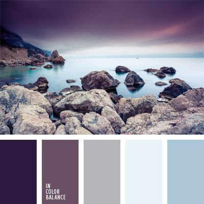
The Color Palette Journal: Cold Stone

 Hey, I finally got back to my Color Palette Journal! I often forget how much I enjoy working in this journal until I sit down to do a page spread.

Here is the randomly selected Color Palette:


I named it Cold Stone but my journal page doesn't quite reflect that.

My pages began with me pulling out my Distress inks to match some colors in the palette. Dusty Concord and Speckled Egg. I found some solid cardstocks to match the light blue and gray as well as some scraps on my table that matched the purples.

But my plan didn't come together until I found a scrap of paper in my "scrap file" that was exactly what I needed. The paper was of two deer on a snowy day looking off to the distance. It had the purple tones I wanted as well as the steel blues. I had saved this paper (it was the top of a small notepad) because I did love the image so much. So I knew I had a scene on my hands (again) but what to put in the background? I was onto Spring things, not Winter snow. That's when I decided to look through the stamps sets that I hadn't used yet. I found one from Altenew with a layered cloud, rain and lightning. Yup, lightning struck!

Here's the page spread without much more exposition.


Overall, I really like it. It ain't perfect, it ain't great art. But it has some of my favorite colors, a favorite sheet of paper is now preserved, and I learned a few things. All my ideas didn't come to fruition but then again a lot of this page spread came about through serendipity. 


Thanks for stopping in for a look! I will be randomly selecting another Color Palette for my next spread from my Pinterest board. Take a look over there if you need some color inspiration!

-Wy

Sunday, March 21, 2021

A Few Art Journal Pages

 Just sharing a little playtime fun. I just was having a hard time with another project and needed an escape from what wasn't working.

Enjoy the photos!


As you can see, I was trying to use up scraps that have been sitting around on my table for far too long. I'm also working on a post that shows what I've done with a lot of my card-making paper scraps. Coming soon.

Happy Spring!

-Wy

Wednesday, February 24, 2021

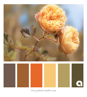
Color Palette Journal: Warmth

 This palette reminded me of Autumn with it's warm colors and dull yellow. Here in NY, it's still winter. But the past few days have been above freezing so that means: Spring is coming! 

So the inspiration for my journal was to take these Autumn colors and turn them into Spring.

Here's the Color Palette that was randomly selected from my Pinterest board:

My inspiration came as I was art journaling (a different journal) and looking through my large stencils. I found an old stencil that was spring and Easter themed. It's one of those stencils that you were supposed to use to draw shapes. It had all kinds of flower petals and leaves, grass, a couple bunnies, an egg, and a carrot. Yuppers...carrots are orange. And I could use the browns for chocolate bunnies. 

So here's what it turned out to be:


The page seems a bit plain and bare of pattern but I do like it. I had to add a little yellow Peep in with my chocolate bunnies. It's another scene which is a common theme in this journal. Still, this journal is one of my favorites.

So I'm off to randomly select another Color Palette from the 200+ pins on my Pinterest Board. Let's see what I get for next time!

-Wy

Sunday, February 14, 2021

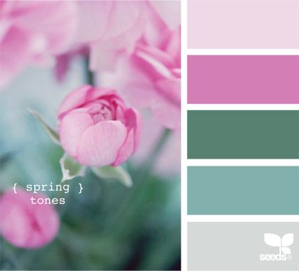
Color Palette Journal: Spring Tones

 I'm back playing in the Color Palette Journal!

This palette seems familiar and I think I may have done it before...or one that is very similar. In flipping through my journal, I see that my panda page used the same colors basically. But I don't mind.

So here's the current palette:

Called Spring Tones, I like the cool blue-greens and the pure pinks. A touch of gray never hurt.

So here's what I did with it.


I've been doing a lot of scenes lately and decided to stick with that as I enjoy doing them. I've also wanted to do some birds like I've seen in Amber K. Creative youtube videos.

I also got a new background stamp of birch trees. I've been wanting a stamp like this because I have a stencil of birch trees that I love. The problem is that I want the stencil to be in the reverse; in essence a stamp image. This one is pretty dang close.

I like how it came out and it satisfied a lot of art cravings this time.

I'll be doing my random draw from my Color Palette Pinterest board soon for my next spread! I'm kinda hoping for bright colors this time!

Stay safe.
-Wy

Wednesday, February 03, 2021

Color Palette Journal: Reflection

 I've finally done another page in my Color Palette Journal. I've had the idea for a while but never quite got around to executing it. 

My Color Palette Journal is inspired by my Color Palette Pinterest Board. I randomly choose a palette and do a page in this particular journal with those colors. I may or may not be inspired by the photo attached with the palette. Once a palette is done in my journal, I blog it and remove the palette from my Pinterest Board so I will not repeat the exact same palette. (I do have very similar palettes on the board with different photos. Those stay.) 

So this was the inspirational Color Palette this time. Simply called: Reflection.


I have done artworks of lotus and water lilies in the past so I was not anxious to do one again. I have also experimented with mirror images and didn't think I wanted to take that route. So my journal page ended up being a simple theme I had wanted to add to the journal using these colors. The most challenging part of this palette was the lack of green. I did a scene and found it hard to work around the green/blue combo that I typically use for a landscape.


I changed my mind about where the "color" would go. I was going to have black dragons and a twilight background featuring the lighter purple color. I ditched the idea because the dragon stamps would lose their details. (Stamps and castle die-cut by Lawn Fawn.)

I rather like how this turned out. I also flipped through this journal as I hadn't looked at it in awhile. Once it's finished, I think I'll be making a video flip-through of it as I really like most of the pages. Don't hold your breath; I still have plenty of pages to complete!

Cheers to more creativity this year!

-Wy

Sunday, January 31, 2021

Quick Journal Flip

 The constant motion of life has swept me away from the blog. But now that February is upon us, I will attempt to add more content. I often lose my path during December and January so thank you for your patience.

Here's what I have accomplished amidst all the crap I haven't finished. I did a Dyalog journal for the Holidays. From Thanksgiving through New Year's. Here's a little flip through of it.

It is what it is. My main goal was to finish it and use up some Christmas themed stickers and ephemera I had in my stash for a long time. Mission accomplished. I'm only just learning the video side of things and this was filmed on my phone. It's a learning process there, too.


If you're wondering about my YouTube channel, it's not anything I'm pursuing right now. I'm basically using it to upload longer video clips to this blog and elsewhere. When I feel more comfortable with the video process, I may be uploading more content there. I'm hoping to film at least one thing a month and upload it, just to get comfortable with the process. Then, I may start a YouTube channel under my brand name. (Hey, ya gotta have goals, right?)

I often lose my motivation during February so I hope you'll stick with me this year. Crossing my fingers it will be better than the last.

Cheers,

Wyvern

Sunday, October 25, 2020

Halloween Art Journal: Part 2

 As promised, it's part 2 of the Halloween Journal. Still black Dylusions square journal. Lot's of paint and collage.

Here we go...


Happy Haunting: I always try to sort my stash before I purchase anything new. This page came out of that sort. But it didn't stop me from buying new stuff this year. LOL.


Haunted Honeymoon:  Another page from the "stash". These scraps of paper from the Abandoned collection (Tim Holtz) were leftovers from the vignette boxes I was making. These little rectangles reminded me of vintage luggage or trunks. 


Fall Array:  I like to take my scraps of paper and stick them to a larger piece of paper then cut shapes out of them. These large shapes are done that way. I have stencils from way back, (the time before stencils were cool and people only used them on walls and furniture. True story.) After I created the "motherboard" paper (from the scraps), I traced the stencil and cut the shapes out.


BTW, I put all these large shapes on this spread because I didn't really like the background I had. I was experimenting with gold paint. While it worked well, I couldn't figure out what to do with it. So I covered it all up, mostly. (pro tip)


A Good Night's Work:  I had a starry background, old book paper, and a mop-up sheet of glossy cardstock that was silvery gray. I channeled those neon colors and made my bats really stand out. (Again with the ancient stencil!) 

Hope you're getting your Halloween on however you can this year!

Don't forget if you need any Halloween wall art, I've got original artwork/collage for sale in my Etsy shop. 

-Wy

Featured Post

The Chocolate Game

 Let's talk about something sweeter than my other blog posts of late. Let's talk chocolate. But no guarantees that anything I want t...