Hey, I finally got back to my Color Palette Journal! I often forget how much I enjoy working in this journal until I sit down to do a page spread.
Here is the randomly selected Color Palette:
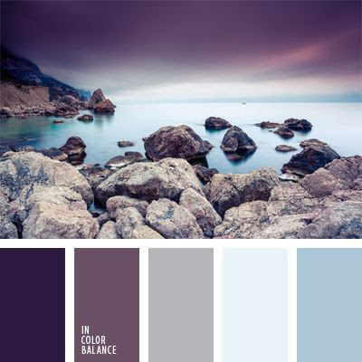
I named it Cold Stone but my journal page doesn't quite reflect that.
My pages began with me pulling out my Distress inks to match some colors in the palette. Dusty Concord and Speckled Egg. I found some solid cardstocks to match the light blue and gray as well as some scraps on my table that matched the purples.
But my plan didn't come together until I found a scrap of paper in my "scrap file" that was exactly what I needed. The paper was of two deer on a snowy day looking off to the distance. It had the purple tones I wanted as well as the steel blues. I had saved this paper (it was the top of a small notepad) because I did love the image so much. So I knew I had a scene on my hands (again) but what to put in the background? I was onto Spring things, not Winter snow. That's when I decided to look through the stamps sets that I hadn't used yet. I found one from Altenew with a layered cloud, rain and lightning. Yup, lightning struck!
Here's the page spread without much more exposition.


Overall, I really like it. It ain't perfect, it ain't great art. But it has some of my favorite colors, a favorite sheet of paper is now preserved, and I learned a few things. All my ideas didn't come to fruition but then again a lot of this page spread came about through serendipity.

Thanks for stopping in for a look! I will be randomly selecting another Color Palette for my next spread from my Pinterest board. Take a look over there if you need some color inspiration!
-Wy

Looking for the best place to sell scrap gold? Choose SMP Bullion And Diamonds! We pay competitive rates for your unwanted gold, ensuring transparency every step of the way. Broken chains, outdated designs, or mismatched earrings—bring it all! Our quick process means you’ll walk away satisfied and cash in hand.
ReplyDelete