Showing posts with label Distress. Show all posts

Sunday, June 07, 2020

The New Normal: Phase 2: Day 9

Whew! What a week.

I have been staying away from the news once again but I still don't consider the week a good one for me personally. If I had to classify it, I'd say it was frustrating and annoying.

But I tried to get it out of my system with an art journal page.
You know the drill: Color Palette Journal, Pinterest Board inspiration.

Here's the Palette I tentatively called "Purple Mountain Majesty".

When I see a palette with black in it, I immediately think that black will be my background. I do like to work on black paper and substrates. However, I decided to keep the black to a bit of splatter and focus on the delightful combination of teal and purple.


I thought I'd do purple flowers on a teal background but as my need to scream grew in intensity, I changed my plan to go with bugs. Bugs, those little devilish ingrates that get under your skin and burrow into your thoughts to cause that frustrating itch that you cannot scratch. It was the heart of my mood.
The page seemed a bit empty after I had all my bugs in place but a bit of washi tape solved that problem. I framed the opposite corners with some phrases found in a Tim Holtz stamp set (along with the bugs). 


Despite the negative mood in which this was conceived, I am rather enamored with the page. I love the touches of washi.

Time to choose another palette. This journal is beyond it's halfway point, certainly not enough to finish the 250 odd pins on the board, so expect to see another Color Palette Journal after this one.

Black Lives Matter
Wear Your Mask
Save lives.
Be Kind.
-Wy

Friday, May 29, 2020

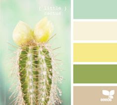
Color Palette Journal: Little Cactus

When I randomly selected this color palette from my Pinterest board, I knew exactly what I wanted to do. It's not all the time that I have an instant idea. It's also not very likely that my idea stays the same throughout the process. I usually make changes along the way, compromises. But this one was pretty much start to finish just like that first fresh inspiration.

So here's the color palette:
As you can see, it's labeled, "Little Cactus". In my original pin, I listed it as "sea hues" with a beach theme in mind, apparently. But no, I was too inspired by the cactus. We were going with that.

Here's the page spread I made.


Little Cactus:  This was the scene I pictured. It was just a matter of figuring out the media I'd use. I knew I had all these possible colors in inks so I decided to go for a watercolor look. I'm not good at watercolor but I like the way it turned out. I was very tempted to outline the cacti in black but I held off because I wanted a very delicate, washed out look. I loved the tall cactus too much to mess them up with an outline.

I added the sun when the sky looked a bit empty and I put stickles glitter glue over the top of it for some shine. 
I used the following colors: 
Distress inks; Peeled Paint, Evergreen Bough, Antique Linen
Altenew inks: Citrus Burst, Pink Pearl. 
In my notes, the bottom color was noted to have a pinkish/mauve quality but here it looks very tan. In any case, the Pink Pearl blended well with the Antique Linen to create the sand. 

Follow my Pinterest for more color palettes and see what I might be choosing next. I delete the palettes I've already done so I don't end up doing them twice. 

Remember to Wear a Mask and Wash Your Hands!
Stay home when ya can. 
-Wy

Friday, January 18, 2019

Silhouettes

This post is for a challenge at Lost Coast Designs.
The Challenge theme is: Silhouettes.


I looked through my Lost Coast stamps and realized I actually had a few silhouettes. So I decided to use this tree that's scaled to ATC size. (I may be using the others later. I had a couple different ideas I'm going to explore.)

I used Distress Oxide inks for the blended background. The owl is from Rubber Stamp Tapestry. I just loved how his size fit right on that upper branch.

I love using these types of stamps as I can focus on the background for all the work and then just stamp the image over the top.

Thanks for looking!
-Wy


Tuesday, October 10, 2017

The Cover that Wasn't

This post kicks off my Day of the Dead trilogy of posts.

I attempted to make a cover for RubberStampMaddness. This was back months ago because magazines put out their calls for submissions far in advance.
My submission was inspired by stamps from Lost Coast Designs and they were new at the time. So I just went ahead and did what I liked figuring if I didn't think it was great, I didn't have to send it in.

I liked it. So I sent it in. Unfortunately, another cover was chosen. (A very nice work, BTW.)  But this is the important part: I got a very nice note about how my work made the decision a tough call. That was just as good as a cover to me. Never underestimate the power of telling someone how close it came even if the end result isn't good news. The fact the this piece was "good enough" for someone else made a world of difference.

Rejection is always hard to swallow. The writing of an encouraging "let-down" note has to be an art form. Every little positive thing makes a huge difference to artists who can't find value in their work...yet. Every little negative thing is one more reason to keep working the day job and submitting to the little practical voice inside your head that insists you'll never be good.

Every piece of art has a little story behind it,  or a little mystery, or a little whoopsy. Those little things that may or may not be evident in the work itself adds another layer of depth to the work. I'm coming to understand that it's this layer, this not-so-evident layer that separates good from great. That layer is what some people can see or feel and that's what calls to them, draws them in. That's where we all come together in artwork. I'm only scratching the surface of this layer so far but I'm falling in deeper as the practice goes on.


The Cover that Wasn't:  I decided to use the skeleton angel and a couple crows from Lost Coast Designs. I knew I wanted the angel to stand out from the rest and draw the eye in to the center. I knew the top part had to be pretty empty to accommodate the header of the magazine. I attempted a couple trials to figure out the placement of the birds and finally decided on two rather than three. It dawned on me to add gravestones. Where else would this angel appear but in a cemetery? The background of birch trees and feathers allowed the work a bit of depth. The two large feathers just added a nice arch above the angel.

I wanted the crows to be dark but I didn't want to color them so dark that the pattern got lost. Purple seemed to work best.


The background is ink blended Distress Ink. I moved out from the center after having masked off all my stamps. I also laid down a stencil of the birch trees before I inked. The colors were Twisted Citron, Peeled Paint, Pumice Stone, and Hickory Smoke. I wanted to light the angel as if the green crown was the light source. Before I lifted the stencil, I also stamped all the little feathers in the background. That's how I got some to look like they are behind the tree trunks. After I lifted the stencil, I stamped a few over the top so they appeared in front of the trunks as well. The large feathers are a layering stamp.


I practiced the coloring of the angel to see how I wanted it to look. I needed to try out where the color would go and what to highlight. The only white I wanted to see was her skull and arms. I knew I wanted to use neon colors because...they're awesome. But I was unsure about doing the rest of her in gray. I considered a deep blue or purple but I just liked the look of the gray. The pops of black allowed a lot of the detail of this stamp to shine.


Though I did this project some time ago, I think you can see why I saved it till October.

Even though this piece didn't make a cover, I may have other plans for it.
-Wy
"Soft may the worms about her creep."  --Edgar Allan Poe

Sunday, October 08, 2017

ABC Tags of Halloween: Part 1

I figured sharing a post about the whole alphabet would be pretty long so I broke it down. Watch for Part 2 later this month.

When I was writing down all my ideas for Halloween projects, I ran across a list I had started about a Halloween alphabet. That is, words related to the holiday in alphabetical order. I was stuck on several letters and not the ones that you might think. Eventually, I copped out on some of them and found a word that was "good enough".

I initially was going to make ATCs but after I saw my TAG HOARD, I figured this was a good way to use them. My TAG HOARD is large and consists of mop-up tags that are somewhat complete backgrounds. I told myself I'd try to use them as the focal point for cards but I haven't been good about following through with that. (Shameless Plug: There is a set of Halloween cards in my Etsy shop that do feature tags as the main image. Check them out HERE.)

So here we go:


All the backgrounds were basically already done so I can't tell you how I might have made them. I did have several words to pick from for some letters but I just went with one that struck my fancy at the time or that would look good on one of the tags I had.

A is for Alien:  True, not necessarily Halloween, but this was a hard letter. And whaddya know? I had a tag with alien green embossing paste on it. That alien head is a hand-carved stamp of mine.

B is for Bats:  I love this stamp image from Rubbernecker stamps and I'll make any excuse to use it. I masked off the moon and used Distress inks for the night sky.

C is for Cat:  I had good intentions with this tag. I don't like how the cat seems to get lost in the background. I tried some white gel pen to outline it but I'm not so sure it was a success. I loved the background of this tag and I was delighted to use up some Halloween ceramic buttons I've had in my stash for decades...yes, I'm pretty sure, decades.


D is for Dracula:  I had these rubber stamps of trick-or-treater heads. I figured I could just fake a body. I added purple paper then inked a stencil over the whole shebang before added Dracula on top.

E is for Eyeball:  If anyone knows me well, they know I have a fascination with eyeballs. Just be thankful I didn't glue googly eyes to the whole thing!

F is for Frankenstein:  I repeated my trick from the "D" tag. BTW: the letters are just an old alphabet sticker set. For most tags, I tried to frame them in a circle but some, like this one, I added in a space that seemed to need a little something.


G is for Ghost:   A similar background to "C", it must have been made at the same time. The backward numbers gave it an otherworldly feel...like what you'd see in the mirror. More of those stashed ceramic buttons have appeared.

H is for Haunted House:  Now don't get me wrong, I have several stamps of Haunted Houses that I just love. But I'm also trying to de-stash some of my Halloween stuff. This house was sitting in a stack of "use it or lose it" papers. Besides it matched my background.

I is for Invisible:  This was another hard letter. The other word I had come up with was just as difficult to translate visually. But hey, I think this one is kinda funny!


J is for Jack O'Lantern:  Naturally. Not ceramic buttons but I'm using up my stash!

K is for Kraken:  This was another hard letter. I struggled to find something other than this as I don't really equate this with Halloween. But it is a monster of mythic proportions and the source of many a nightmare. So what the hell? These tentacles of Dyan Reaveley's are just awesome! I'm gonna be using these all over the place. (along with a lot of eyeballs)

L is for Leaf:  And another hard letter. I did have another word but I found these tags that already had leaves on them. That background is very much the same as tag "J". The leaves are metallic gold and copper but for the life of me I can't remember what I used to create them. I know I used a Tim Holtz stencil but I don't own any texture pastes that are those colors. I either tinted a pearl paste or it's Inka Gold forced through the stencil. So at least the mystery of this tag relates it to Halloween. :)

M is for Mummy:  I bought a couple collage sheets from Joggles.com and this Mummy was one of them. I couldn't resist. This tag was a pretty basic yellow color so I added the hieroglyphics with a background stamp. I think that really pulls it all together.

Ok, so that's half of the alphabet. Later on in the month, I'll share the last half!
Stay tuned.
Remember every Sunday, Tuesday, and Thursday will have a new Halloween project featured here on the blog!
Thanks for hanging out with me this month!
-Wy
"Nobody saw where she went? That's a lot of eyeballs doing nothing."  --Marlin, "Finding Dory"

Sunday, August 07, 2016

Creative Chemistry 103: Day 4

Day 4 was Crayon day! I tried 3 of the techniques and will have to go back and review a video or two about a couple others. I can't seem to wrap my head around the printed directions. Maybe it's creativity overload!

Once again, nothing is a finished project but these backgrounds will be used for cards eventually.
Blended Background:  I was not a big fan of this technique. I thought I would be...it seems simple enough. I think I will give this one another go on a different watercolor paper. The crayon just didn't seem to want to move even with water and brushing. I will be attempting this technique again with a different paper. I also don't like the colors I currently have for this technique. I like the colors separately but when I start putting them all together, I get a mess. Which means I either have to 1. invest in more crayons, or 2. just stop using them. Hmm...

Gesso Fresco:  This technique is very cool and rather fun to do. The crayons smudge pretty well but because they do dry pretty quickly, I didn't end up making too much mud as I had with the Blended Background technique. Overall, I don't know if it'll be a "back pocket" technique for me, but I will keep it in the back of my mind.


Textured Resist:  This was my favorite technique that I tried out today with the Distress Crayons. I guess I just like resist techniques the best...they seem like magic!

I feel a bit more comfortable with Distress Crayons but I'm still on the fence as to whether they are for me. They are fun to play with and do give interesting resists but I can also achieve the same look with my other mediums. Paints will resist, pastes will resist, embossing powder will resist. I'm leaning toward using what I've got and resisting the urge to buy more.

I'll see if I can try out the other techniques from Day 4 tomorrow. Perhaps, therein lies the spark that makes me fall in love. But for now, Distress Crayons, you're just a friend.
-Wy
"The soul that can speak through the eyes can also kiss with a gaze". ~Gustavo Adolfo Becquer

Creative Chemistry 103: Day 2

Putting up some fast blog posts for Creative Chemistry 103! I'm starting a Hell of a Week at work on Tuesday so won't have much more time to play with the class. So today and tomorrow were days to get a few techniques under my belt.

Here's what I "accomplished" out of Day 2's class:

Paint Resist:  I tried this technique mostly to play with my new Distress Paints. (I just bought 4 colors of Distress Paints when they were on sale at SimonSaysStamp. I have Abandoned Coral, Fossilized Amber, Lucky Clover, and Mermaid Lagoon. I highly recommend these colors for starting out! They mix and blend well together.) Overall as a technique, cool. I can see myself using this for more cards as the finished product is very flat, it gives layers with bulk.
Paint Lifting:  I enjoyed this technique as well except I didn't have Picket Fence Distress Paint. I used Gesso underneath the paint. I will be experimenting more with this technique with different colors of paint as the bottom layer as well as using Black. I want to use the above stencil to take a layer of black off of a multi-colored bottom layer. I guess I'll be buying Black Distress Paint next!

I didn't finish any projects but these will probably show up on some cards soon. Backgrounds like the one above tend to stump me as to how to use them. But I'll think of something...someday.

-Wy

Wednesday, August 03, 2016

Creative Chemistry 103: Day One

So over at Online Card Classes is a class taught by Tim Holtz, creative director for Ranger. It's the third installment of Creative Chemistry. It's amazing how much you can learn about, not just Ranger products, but ALL your art/craft products.

So here's a look at my technique "Tags". I'm not doing tags...I'm doing card fronts, mostly. Or just experimenting with scrap paper. I've got lifetime access to this info so no worries about forgetting info.


This card front combines a couple of techniques: Picket Fence Highlight and Off-Set Stamping. I wasn't sure about the highlight but it really comes out nice. I have been wanting to do more cards on kraft cardstock but I was always turned off by the fact that my inks (I own mostly dye ink pads.) never seemed bright.

This front is not finished. I'll most likely add some smaller stamp images to fill in a bit of the background and maybe some bling. But I'm pretty happy with these results. It really opens up my options for a lot of the new Layering Stamp sets I've been buying.

-Wy

Sunday, July 24, 2016

Creative Chemistry: Week 8: Embossing and Distress

Just a quick post to share a card I made for the Summer of Creative Chemistry: Week 8. You can still sign up for the next installment, Creative Chemistry 3, with Tim Holtz.

This week was about using Distress products with embossing techniques. I tried one that I hadn't before and really liked the results.

Here's my card:
Gear Up!:   I used the Tarnished Silver embossing technique for the chipboard gears. WOW. I really like how they came out. I liked the silver ones so much that I decided to try to do some copper ones. (Cuz you know, it's my favorite metal!) They turned out wonderfully pitted and so I tried out my new Distress Paint, Lucky Clover over them. Love.


The robot was stamped with Black Soot Distress ink and smudged to fade it out some. I colored it in with Cracked Pistachio Distress Stain mixed with Perfect Pearls (Turquoise and Interference Green). After coloring it in, I decided that he was too faded and went over the lines (only on the robot) with a Sakura Glaze pen.

Not bad for a day.
-Wy
"Robot Roll Call: Cambot, Gypsy, Tom Servo, Crooooowwww!" (It's official welcome MST3K to Netflix!)

Sunday, July 10, 2016

Creative Chemistry Week 6: Color Palette Journal

I had a revelation this week when I decided to pull out some tags and "finish" them. I use tags to "mop up" extra ink or paint when I'm working on a project in my basement. When the tag has sufficient color to it, or I don't want to junk it up anymore, I bring it upstairs to my bedroom where my "crafting/card making" space is. (My basement has most of my "art" supplies while my bedroom holds my card making supplies. Hence, I make trips up 2 flights of stairs when I begin to move things from one space to another. It's a great work-out and inspirational tool...if I'm too lazy to go back upstairs for a supply, I make do with what's on hand. That can make for some interesting results.) The tag then gets thrown aside until I feel like finishing it with perhaps a stamped image or scrapbook paper or whatever.

So my revelation was that I had WAY TOO MANY UNFINISHED TAGS! This has bolstered my resolve to STOP making tags that won't get finished in a timely manner. So this Creative Chemistry lesson was not a tag.

Or even a card.

I paired up the techniques of Week 6 (Layering Stencils) with my Color Palette Journal. It's been a while since I worked in this journal but I did make a change that seems to help with my productivity. I have written out the palette I want to use in terms of colors that I may actually own...like the names of Distress Inks. That gives me an instant starting point for the colors, at least.

So here's the next spread in this journal, courtesy of Creative Chemistry:


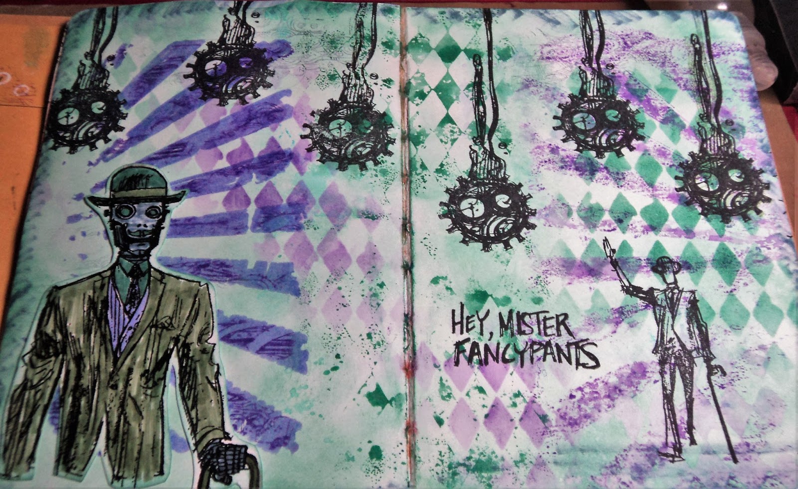
FancyPants:  Did I mention I'm on a robot kick this summer? I love this stamp set from Stamper's Anonymous called Dandy Robot. It's challenging to use so I am often stumped with it.

This is the color palette inspiration for this spread: Flora Brights #1.
flora brights #1:

The colors I matched to the palette were: Evergreen Bough, Bundled Sage, Wilted Violet, Shaded Lilac, and Stormy Sky. (All Distress Ink colors.) I had Evergreen Bough and Wilted Violet in ink pads (mini) and the rest in markers. So I focused on Evergreen Bough...and I absolutely love this color. I just recently got the ink pad and like it much more than Cracked Pistachio for a really nice patina color. And since I was making that color my background, it made me think of the Dandy Robot stamp set. I often use copper embossing with this stamp set and that would look great with Evergreen Bough. BUT, I decided to stick to the palette. Copper was a color...not a neutral. I allow myself black and white but consider browns as a color.

Anyway, here's the Creative Chemistry part:
Layering Stencils:   The Challenge was to use two techniques with Layering Stencils. I used two stencils on this page. (My plan to add a third just never panned out.) I used the Rays and Harlequin. I used the Ink Monoprint with the Harlequin stencil down the middle of the page. I also used that technique with the Rays on the right side of the page. I had ink on the stencil from the other side so made a monoprint from that.
 
 Here's a close-up look at my Stamping through a Stencil. I used the Rays and stamped with Wilted Violet Distress ink through it. The edges weren't as defined as I wanted so I also used Sketching through a Stencil here. After I had stamped, I went in with a Shaded Lilac Distress marker to define the rays. It smeared the stamping a bit but I liked it.

I even, inadvertently, pulled some of the background color up with the Harlequin stencil. You can almost make it out in the very right bottom corner in the above photo.

So the background made good use of Wilted Violet, Evergreen Bough, and a touch of Shaded Lilac. I decided to incorporate the last two colors on the Robot.
I stamped and embossed the robot on white cardstock. I used Bundled Sage for this jacket and brought the Stormy Sky in on his face and hand. I discovered that my Stormy Sky marker was rather dry so I couldn't bring as much of that color into the layout as I originally intended. (I was hoping to use it with the stencils but it was on it's last legs. In fact, I've already pitched it.)

Stamping with Jet Black Archival ink rounded out the spread and I was really happy with it.

Now I have to get busy with more color palettes. Did I mention my Pinterest board is now up to 250 palettes? I think I added about three more yesterday...damn. If you want to check out the board, I have picked out my next several palettes. See if you can find them: Rainbow Spring #2, Dirty Pastels #3, and Mineral Hues #4.
Thanks for dropping by!
-Wy

Featured Post

The Chocolate Game

 Let's talk about something sweeter than my other blog posts of late. Let's talk chocolate. But no guarantees that anything I want t...