So here's the color palette:
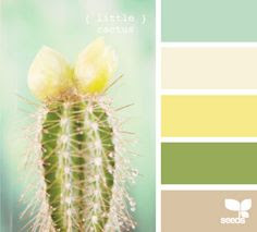
As you can see, it's labeled, "Little Cactus". In my original pin, I listed it as "sea hues" with a beach theme in mind, apparently. But no, I was too inspired by the cactus. We were going with that.
Here's the page spread I made.


Little Cactus: This was the scene I pictured. It was just a matter of figuring out the media I'd use. I knew I had all these possible colors in inks so I decided to go for a watercolor look. I'm not good at watercolor but I like the way it turned out. I was very tempted to outline the cacti in black but I held off because I wanted a very delicate, washed out look. I loved the tall cactus too much to mess them up with an outline.
I added the sun when the sky looked a bit empty and I put stickles glitter glue over the top of it for some shine.
I used the following colors:
Distress inks; Peeled Paint, Evergreen Bough, Antique Linen
Altenew inks: Citrus Burst, Pink Pearl.
In my notes, the bottom color was noted to have a pinkish/mauve quality but here it looks very tan. In any case, the Pink Pearl blended well with the Antique Linen to create the sand.
Follow my Pinterest for more color palettes and see what I might be choosing next. I delete the palettes I've already done so I don't end up doing them twice.
Remember to Wear a Mask and Wash Your Hands!
Stay home when ya can.
-Wy

No comments:
Post a Comment