I'm using a Large Dylusion journal for my AJA this year.
(The Art Journal Adventure can be followed on the Joggles Blog or you can join the Facebook Group to share your adventure with the rest of us!)
After not really feeling the cover, I've managed to enjoy the next few weeks.
Sorry for some of the crappy photos. I can never seem to take really nice photos of my art journals!
WARNING: This is a long post because I've got loads of photos and this covers the whole month of January.
(I'm hoping to keep up with this journal on a monthly basis anyway so watch for these long posts toward the end of every month.)
Week 2. Prompt: Texture. If there is one thing I am sure about in my art journal, it's that I don't like texture. At least, not a lot of it. Some embossing paste, or chipboard embellishments...OK. Fabric, burlap, heavy embellishments...not OK. When this prompt showed up, I wasn't a happy camper. But Visual Texture is a different thing so that's the route I took. This page was simple, straight-forward and the beginning of an idea. It all started with me wanting to play with my heavy body arcylics. I've made flowers with them before and just love doing it.
It might not seem like much, but this page got me going creatively. I liked it so much that I went ahead and did it on a large canvas.
(that's not quite done yet. It needs that Something.) My texture is really in the flower.
Week 3. Prompt: Mug Shot. Followers of the blog know that I was wrapped up in Poe Appreciation Day this month and it literally consumed me. I did only a single page and thought that I'd add another mug shot to the opposing page. I'm not sure as I added a bunch of texture paste to that page and it's thrown me for a loop. Not sure how to incorporate a face over all that texture.
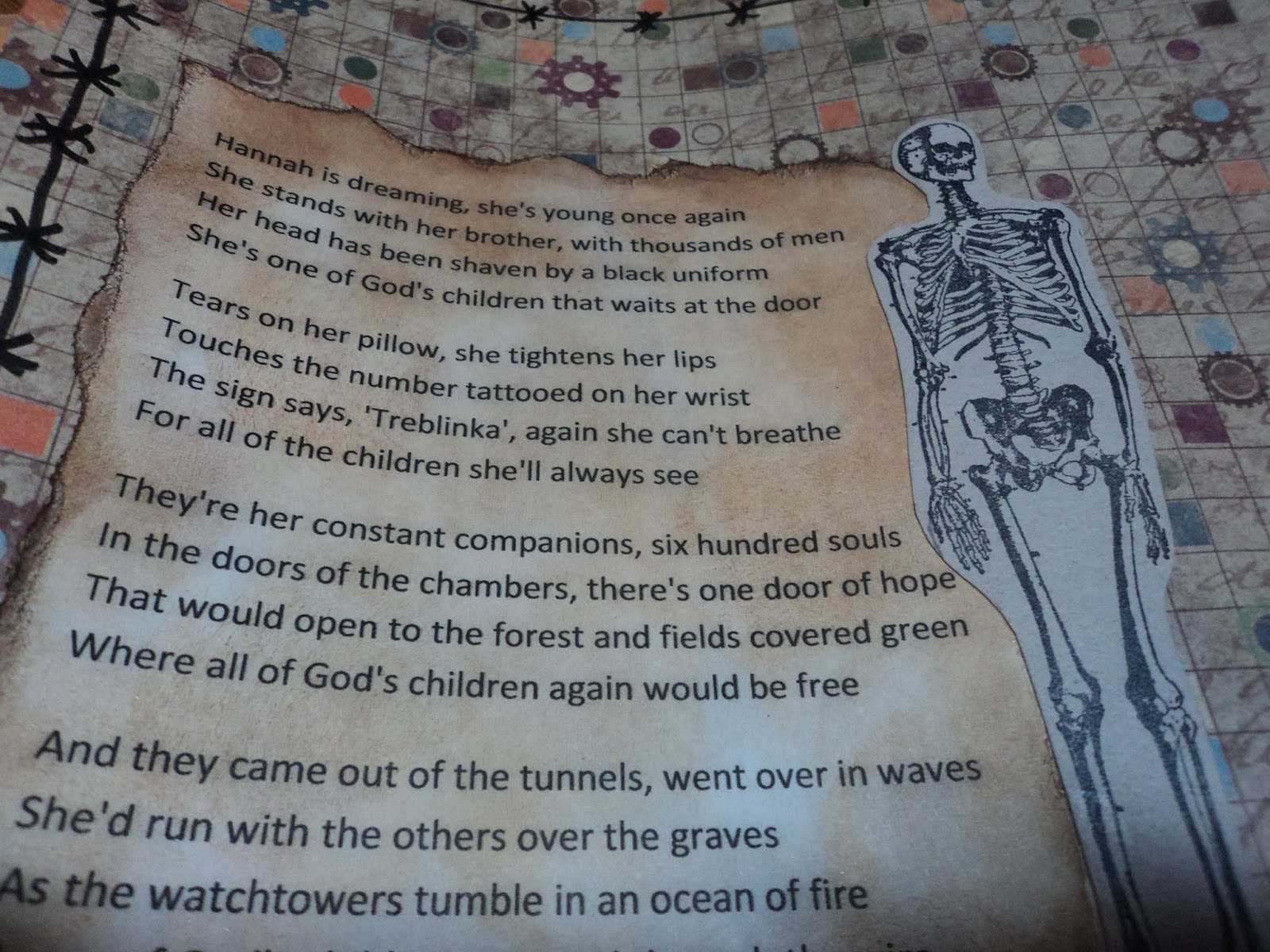
Week 4. Prompt: Add a Door. I had a lot of ideas for this one. I knew I wanted to make a door/s that would actually open because I just love those little interactive elements in altered books. I also knew my door would be wooden. Beyond that, not sure. I let some ideas percolate but then my Facebook newsfeed came to the rescue. This week was the week of Holocaust Remembrance Day. I was actually surprised that it seemed to have slipped under the radar. My newsfeed was full of Trump and only a couple things regarding Holocaust Remembrance Day. This triggered the memory of a song I knew called "The Door" by Martin Page. It dealt with the Holocaust. So I went with that.


Since I "knew" what I wanted my door to look like, I started with that. I used a whole journal page to create the door. I stamped the image in the circles then cut them out. I drew a door shape and cut it out with a knife leaving the side near the spine intact. The door could now fold open. I wanted to be able to see through part of the door but I also wanted it to be part of the door.
(Does that make sense?) I used this stamp to accomplish this. Anyway, I used a woodgrain background stamp to cover the page and then used Distress ink to color it in several shades of brown.
Then, I had to think a bit. I wanted the "bad" on one side of the door and the "good" on the other. The "good" was defined in the song; "a forest with fields covered green." But how to depict a Nazi prison camp? Yuck.
So I printed out the lyrics to the song, found a piece of paper that seemed to color match, and started there. The paper had little gears on it and I felt that was representative of the war machine of the Nazis. I pulled the raven image from the song and the skeletons were added. So many photos of the victims starved to skin and bone...
I considered adding the swastika to the page but decided against it. I will not glorify it.
When the door opens, you see the forest. I'm okay with the forest even though it didn't come out as I'd hoped. It is bright, colorful, and peaceful. It's the perfect opposite to the other side of the door.
I even finished off the other side of the door.
(You can see it better in the first photos.) I made it like it would open into the prison camp...that door would be metal...dark, sinister, and foreboding. It would be a door you would fear to open. I positioned the skeletons so that two can be seen through the circles when the door is opened. I used acetate in the door circles so that I could have that stamp image there.
(And that was a royal pain because I screwed it up. I glued down the acetate before I cut my holes in the black paper...ugh! It was hard to get it to line up! Another story!)
Rather proud of this spread.
Still with me?
Week 5. Prompt: Here Comes the Sun. After Week 4, I needed to make a spread that didn't require a whole lot of thinking. Something that just makes me happy to look at. I think I got it.
Remembering my
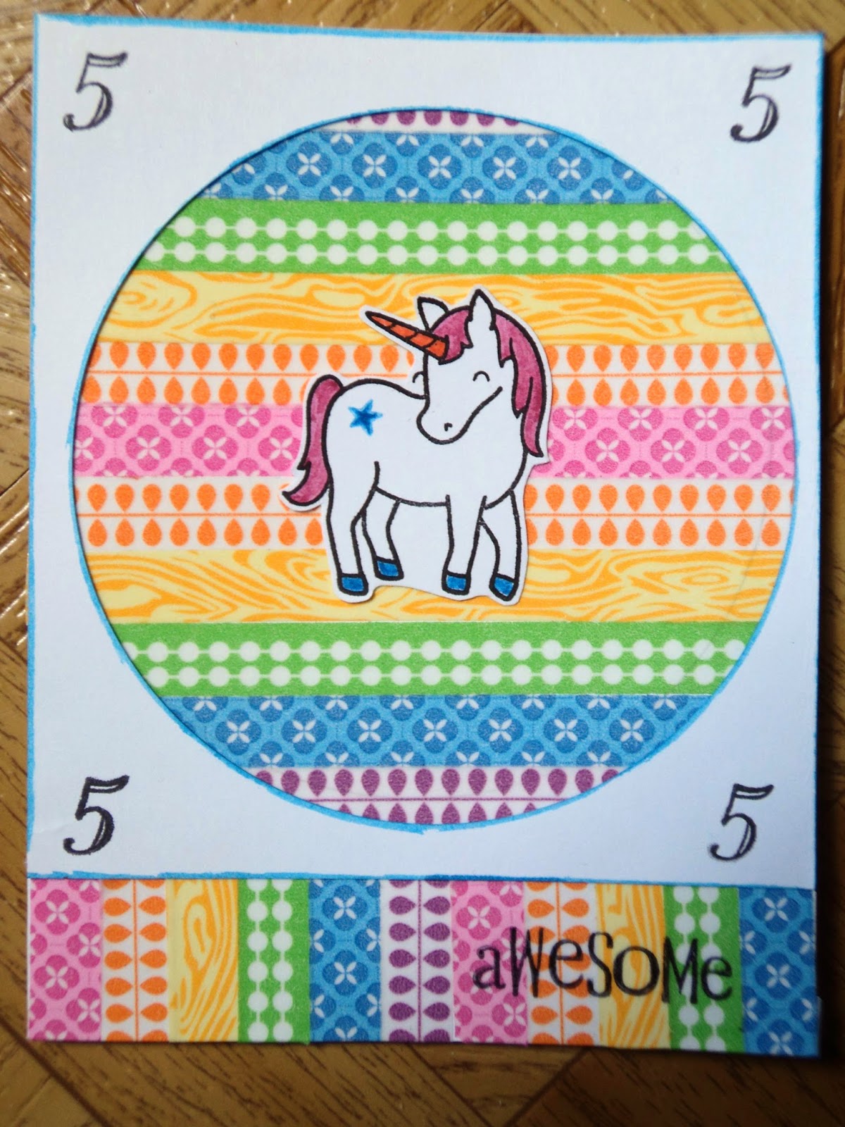
Rainbow Maiden I decided to repeat it here. Because I have to use up Washi Tape.
(I have to use it up so I can buy more. Tim Holtz is coming out with some beautiful stuff! Arggh!)
I did draw the eyes myself and they aren't too bad. The mouth is red washi tape.
I outlined the sun and her rays with a PITT brush pen (light flesh). I just didn't want the outline to be too contrasting. I did stencil the background before I put down the tape. I just used a large plastic plate to determine where my sun would be. I penciled in a line so I could use it as a guide for the tape. I used the Joggles stencil; Here Comes the Sun and Blue Hawaiian Lindy's spray. I placed the stencil down first then just lined up my plate over the top to mask the circle. I sprayed lightly and then repeated that on the other side. The plate was a great mask and I didn't have to fuss with cutting a circle that large.

The other little trick to this page is the eyes. I needed them large but I suck at getting the shape right. The washi tape also doesn't take water-based media very well so I was hesitant to freehand something with a permanent marker. So I used the Fearless Face stencil. If you turn the heads on the side, you get a nice little egg shape. It makes a good eye. So I traced two of the smallest heads, cut them out of paper, turned them on their sides, and voila...eyeballs. I colored them in with PITT pens (ice blue) to match the background.
Really like this happy page! Honestly, how can you go wrong with Washi tape!!!
Thanks for hanging with me to the end of the post. AJA will return at the end of February if all goes well!
Peace,
--Wy
"In the doors of the chambers, there's one door of hope." --Martin Page, "The Door" song