Showing posts with label inspiration journal. Show all posts

Sunday, August 27, 2017

Inspiration Wednesday: July

Yuppers, it's more ugly from the Inspiration Wednesday Journal. sigh.

I'm beginning to think that I'm releasing my subconscious stress and unhappiness in the particular journal. I like little bits of pages here and there but overall, there are few that make me happy. Few that make me proud of my skills.

These two pages seem to reflect that trend.


BeeLieve:  I had a good picture in my head and this isn't it. I liked the idea of leaving a little window for color. It really went wrong with the glaze. I probably should have gone a more yellowish tone to reflect my honeycomb but tried working with Raw Umber again. (I have decided never to use a raw umber glaze again. I never seem to like it.) I wasn't liking the page as it was so decided to draw my own bumblebees. (I mean, hey, I don't like what I got so try some stuff out, right?) Not quite sure about them. I think they are whimsical when I should have gone for more realistic. This might be a page that grows on me.


Garden Disaster:  I'm not quite sure how I feel about this page either. Donna used old paint skins for flowers but I don't keep that stuff. So I decided to just make a rainbow garden and draw it myself. I'm probably being overly critical but I'm not in love with it. I thought about pulling out a black pen and detailing/outlining some of it but I decided I'd like it even less that way. So this might be another page that will grow on me. (Note to Self: I think I'd like it more if the flowers were more "painterly". A blend of brushstrokes and colors.)

Sigh. Wow, this was a disappointing post. Here's the silver lining: I keep practicing stuff that I don't think I can do and I don't think I'll like. You never know what might happen along the creative process. You'll never find It, if you don't look. You'll never learn from your mistakes if you're afraid to make them.

-Wy

Sunday, August 13, 2017

Inspiration Wednesday Journal: April - June

I'm not really sure what to think of my next batch of journal pages in the Inspiration Wednesday Journal. (I've been following along with Donna Downey's class. You can find it HERE.) I'm not in love with any of them, really. I find bits and pieces that I like in some of them and others just seem to be a mess or somehow incomplete.

On a positive note, I have found that a couple pages that I thought were downright ugly at the time I created them, have grown on me. I have come to rather like them...still not love but certainly a friendship. Whether that denotes that I just needed to step back from them for a time or whether the other pages are simply MORE ugly, I can't be certain. :)

I'll let you have a look at them anyway. Maybe you'll find something in them. They may not be high-quality artwork but they were good teachers.

If you'll recall from last time (way back in March), I had ended on quite a thrilling page. The whales had left me feeling very good about the way the journal was heading. Ah, then...crash....burn...


Argh, Flowers! or JG401028:  My red "flowers" were a disaster. I disliked them so much I covered them up mostly with a medallion stamp. I think that one step did wonders for this spread. I actually rather like it. I can see several layers, which I always struggle with and it has that black polka dot. I have no idea why I love that pattern so much. This was tough page to let go of.


Pick Two:  Another still life lesson; this one was about Value. I picked two colors of paint and added white to see what I can create. My colors were Primary Cyan and Quinacrodone Nickel Azo Gold. I thought this was ruddy terrible. Looking back on it, it's ok. I like the painterly look of the background and the deep shading I was able to achieve behind the vase. Mostly the only thing I learned that's positive is that when you mix those two colors, you get Viridian green...one of my favorite colors. But hey, remember these two pages...you may have deja vu later.


Loosen Up:  I had high hopes for this page but it turned on me. It's sort of a lesson in painting the negative space and leaving an image in the unpainted part. I think I may have chosen a poor subject. I hated painting this page...I think it shows. It doesn't seem too bad now but I really didn't like painting during this week's inspiration. Maybe I didn't want to paint around it...I wanted to paint it. Ah well.

Pocketful of Posies:  From the last spread, I needed this one to get me back on a positive vibe. This was just what I wanted. I laid down tissue paper underneath with this similar pattern. Then, just painted over it...like a coloring book almost. Since I was going to be painting over the blue background somewhat, I didn't mind painting all that blue. I could allow the flowers to extend out over it so I didn't have to be precise. I thought about adding a quote but liked it just the way it is. Still seems incomplete, though.

Not Again!: Deja Vu? Me, too. This page started out much like the first spread in this post minus the ugly red flowers. I just couldn't get anything to come together with this inspiration. I'm not sure what happened, really. Usually the colors make me happy anyway and there is my black polka dot in there, but this seems to lack something vibrant...something focused. I admit that I just gave up on it. Maybe I'll come back to it later...way later. Unlike the top spread, where I came to like it, this one just lets me down.


Deja Vu 2:  This one look familiar? Kinda like that lesson on Value, huh? This one was a bit more fun. I laid down gelatos first then added line work with paint markers. It looks a bit messy for me but I do like all the bright colors in it. Surprisingly, the other vase page seems "better" to me. I think it's because I lacked shading in here and it looks very flat to me. I really like the flowers better in this one, though. Meh.


OMG! No Blue!:  Finally did a spread without teal or blue in it. I admit I was getting worn out with those colors. This is an indifferent page. The part of the inspiration that I found the coolest, I totally forgot about and never put in! Anyway, the collage is so-so...mostly just putting together leftovers. It's the paint that I don't like. The contrasting colors aren't so terrible (I'm actually a huge fan of purple and yellow!) but I couldn't get a good blend on them. The purple just really seems to stick out in a messy way. Learned a lot about contrast here.


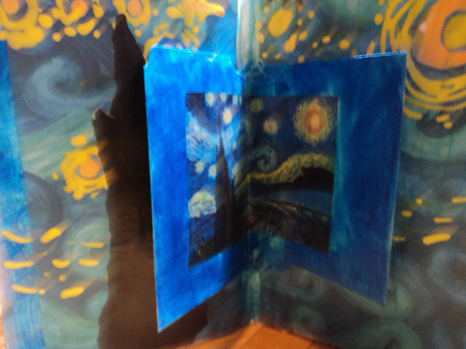
Tribute to Van Gogh:  I can't say as I have a favorite classic artist...I'm not well educated there. But I do have favorite works of art and Starry, Starry Night is one of them. This inspiration simply had to be this work for me. My image transfer went to hell in a hand basket and not even Jesus was resurrecting it. So I found one of my favorite sheets of paper...that blue wave pattern in the background. Guess why I like it? Guess? It reminds me of Starry Night. So I just went with it. Easy peasy page that I just had to have...a simple, playtime to remind me that it's just an Art journal...it ain't a masterpiece.

And once again, the Inspiration Journal confounds me. I hate it. I love it. But once again I can close out this post on a high note.
Having also started the next segment of this Inspiration Journal, I can honestly tell you...it sinks once again. sigh.

Thanks for hanging in there till the end of the post! (How did this end up with so many pages? I might have had a leftover from the first three months in there. Oops.)
Anyway, have a great summer! I'll see ya in the fall for more with this journal.
-Wy


Monday, March 27, 2017

Inspiration Wednesday Journal: Jan-March

Thought I'd share my Inspiration Wednesday Journal with ya'll.
Inspiration Wednesday is a "class" I'm taking on-line with Donna Downey. I've done it the last two years so if you want to go back through old blog posts you can see pages from my past journals. You can still sign up for this. Just go to Donna's site and buy it. It's really fun. I am working in one of her handmade journals that she sells in her shop. This journal tends to be mainly acrylic and collage work.

But anywho, here's the journal. I'll be making this pretty brief as I am still 2 weeks behind in this and I don't remember much about the specifics of the pages. But hey...pretty pictures? right?


First Page:  Does this look familiar? Yup. For the first page I decided to go with texture paste through a stencil. I admit I fell in love with this stencil and now I'm using it everywhere. I was going for the vintage seed packet look. Didn't really pull it off here but it was good practice.

Courage in a Cup:   Trying to be more "painterly", as Donna put it. I rather surprised myself and found the "painting" to be rather enjoyable. I was almost certain the finished page would look like a toddler fingerpainting but I'm very pleased with it. I chose my word for the journal: Courage. 


3 Lemons:  A theme was beginning to develop. I admit I'm not a fan of still life. I understand using it for practice but I've never liked it. This was where I began to fall behind as I dreaded doing the page. But after watching the video about 50 times, I sucked it up and gave it a shot. Amazing! I think this spread turned out fabulous. Way better that I had given myself credit for. Do I now like still life? Not a chance but this was a wonderful confidence booster. COURAGE was definately the word to pick!

Mixed Media Lemons:  I could also call this page, "Donna proves a point", but I won't get into that. So far my pages are looking a bit similiar but techniques were different. So back to the lemons. I could have changed up the fruits a bit but I honestly felt good about the lemons. I was focusing my attention on shading. I can do shading but sometimes I don't think I get the real 3-D kind of look I'd like. So I practiced more.

Both lemons were done a bit differently. The one on the top (or left page) has a base of washi tape. I created the lemon out of colored tape then added touches of acrylic over it. It's hard to see in the photo but the shadow of the lemon shows the washi tape (it has gears on it) beneath the paint. The lemon on the bottom (or the right page) was torn from brown paper and glued down. I used gelato over the top of it to color it.


At this point in my journal, things were starting to look the same. I was learning things but the pages had no excitement for me. Lemons, baby, were not my thing. Easy to practice with but seriously, these pages don't hold anything of me in them. But had I not done those pages, and learned those things, I don't think the next pages would have been so good.


Whales:   I'll just say that I love these pages. I honestly did not think this would work. But from pushing through the other pages and knowing it's all practice, I got this magnificence. Maybe you don't see it, but I do. It was scary in a couple different ways. First, the basis was image transfer and I have limited success with it and limited experience with it. Second, it was a minimal page. So every small thing I did would be obvious, so not much room for error. Donna said, "image transfer is always a crapshoot" and mine certainly was. The background text transfered rather well for what I wanted. But the whales...ugh...I couldn't get a nice solid or dark transfer. I think I may have been using too much medium. I set that aside. So the images weren't perfect. They didn't have to be. Onto the color.

Ah...color. That's my jam, my comfort zone. I needed a watercolory look more transparent than not. All I knew was that I couldn't use all blue. Honestly, I had enough blue backgrounds and I needed to add another color. I pulled three fluid acrylics: Cobalt Turquoise, Payne's Gray, and Viridian Green. In other words; watery teal, midnight blue, and Godzilla green. I painted the background first and used lots of water to pull the paint out from around the whales. Then, I added layers of paint to get the deeper shades where I needed them.
Because my image transfer had left behind some paper, I got splotches of color in the whales where the paper soaked up the paint. I was too lazy to try and "fix" the image transfer and peel off the little stray bits of paper. I liked it. Who knew my laziness would pay off? For all the apparent simplicity of this spread, I'm in love with it. It's something you don't really see up close but after you walk away for a bit and come back...yeah, baby.
I may be going to canvas with this one.


I was hesitant to share this journal as it didn't speak to me...until today.
Perhaps my courage will continue to speak in these pages.
Have a great week.
-Wy

Monday, December 26, 2016

Inspiration Journal: Finale 2016

I have finished my Inspiration Journal 2016. I followed along with Donna Downey for some Inspiration Wednesdays this past year and amazingly, didn't fall too far behind in my work.

I don't like all the pages and some are downright ugly but that's really the point to an art journal. I needed to play with things to see what I like and what doesn't really float my boat. Because what excites Donna Downey doesn't always excite me. That shows up big-time in these pages.

So here's the big finale!


UGH! Texture!:  Donna used baby wipes to create these round wells that would hold pouring medium. I don't use baby wipes much and I certainly didn't have pouring medium. So I used a few baby wipes and some paper towels. But I detest the "messy" look the baby wipes create. I tried to clean it up, so to speak, on the other side of the spread (where I have the two wells) but decided I really didn't like either of them. I used a clear gel glue to substitute for pouring medium and I thought it was working well until I let it sit overnight. When I came back to it, there were tiny bubbles throughout the glue that distort the image underneath it. It adds another layer of texture I don't like. So I gave up early on this page and wrote my frustration on the insert. Moving on...

Magic Foil:   This spread diverged from Donna's quite a bit. She put chipboard beneath the foil and then gessoed over the top to sand it all back to bring out touches of the silver. After the fiasco with the spread above (and the discovery that I don't like THAT much texture in my journal), I was hesitant to use chipboard. I thought I might be able to create texture with white glue but it sank into the paper and didn't stay 3-D. So I had these foam stickers and all the letters to spell out MAGIC. I then applied the foil over that trying hard not to get too much glue on the foil.
See, here's my take on using aluminum foil: let it show. Foil has such a wonderful metallic shimmer why would you gesso over that? Paint will stick to foil. And fluid acrylics are mostly transparent (depending on the color) so the shimmer shows through it. The end effect is similar to metallic/mica paints. Aluminum foil is also a "white" surface and allows the true pigment color to show. So with all these things that I liked about foil, why not just paint it right on there and skip sanding it all together.

The foam stickers aren't prominent but you can tell what it spells in person. I added the black stars because they looked magical. The black also really allows those colors to pop.

Sing for Spring:  Donna used pan pastels. Nope, don't own them. The very word "pastel" translates in my brain as "chalk" and yucko for chalk. So I knew I'd be using my gelatos for this spread. I liked Donna's colors but when it came time to do the page, my color choice was determined by the birds. I didn't have a flower stamp large enough and I didn't feel like drawing one or waiting for paint to dry. So these little collage image birds dictated my colors. I realized I had gelatos that matched rather well.

I did seal the gelato with ModPodge so I could stamp over the top of it. The colors seemed very wintry to me so decided to stay on that theme. On the back of the inclusion, I wrote, "Keep Spring in your heart" to tie it all together.

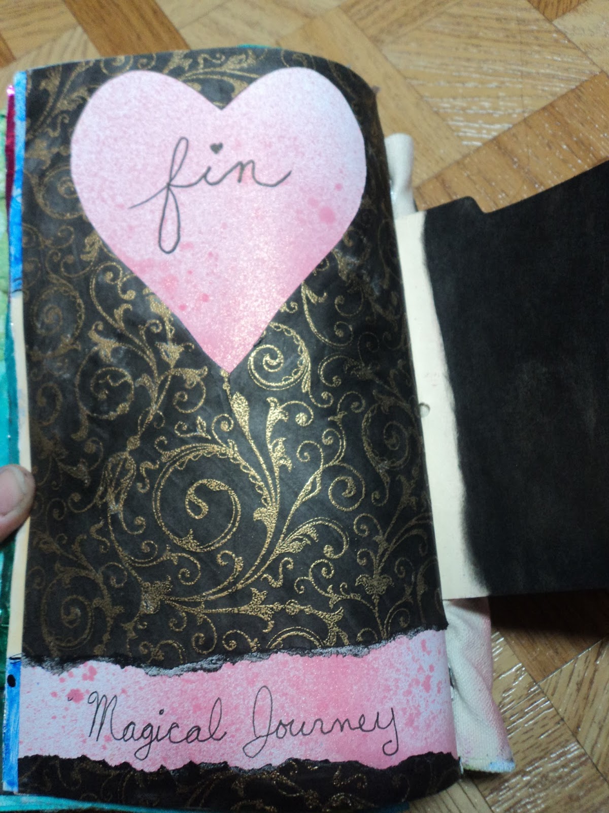
Fin:  My last page was to use up the paper I had cut the heart out of on the above spread. I colored it black and kept it super simple. Done!

I discovered a love for simplicity in these last pages. That wasn't exactly how this journal started out. It's finished, though, and the last pages were fun for me. I may not like them best but they were exactly what I wanted when I wanted it.
In 2017, I will once again be following Donna Downey's Inspiration Wednesday.
For Good or for Ugly.
-Wy

Sunday, November 20, 2016

Inspiration Journal: Part 6

I admit to neglecting the blog for a bit. But honestly, I've had few things to share...at least, things I was willing to photograph.

But I have done a few more layouts in my Inspiration Wednesday Art Journal. Inspiration provided via Donna Downey.


Washi:  This layout is all washi tape. I had fun with it. I really love the teal. The insert is a found "poem" from a torn page from an Edgar Allan Poe story.
"A Predicament. I was not sorry my body made its way into the middle of the street. My feelings were mysterious, perplexing. I imagined the body was the proper identity but, upon getting it, my peculiar deficiency made me astonished at my circumstance. While I ran along the main building, the loss of independence was not only irritating but was also inconvenient. However, I was forced to blink the other eye. In truth, I was very glad to get rid of a little bit of skin. My sensations felt disagreeable."


Flower Can:  I can't decide whether I like this or not. I like the left side better than the right. I'm not sure what happened here. My flowers seem very stiff. I think the yellow might have been too bright or I just don't have enough blending. The black splatter helped me "stop".


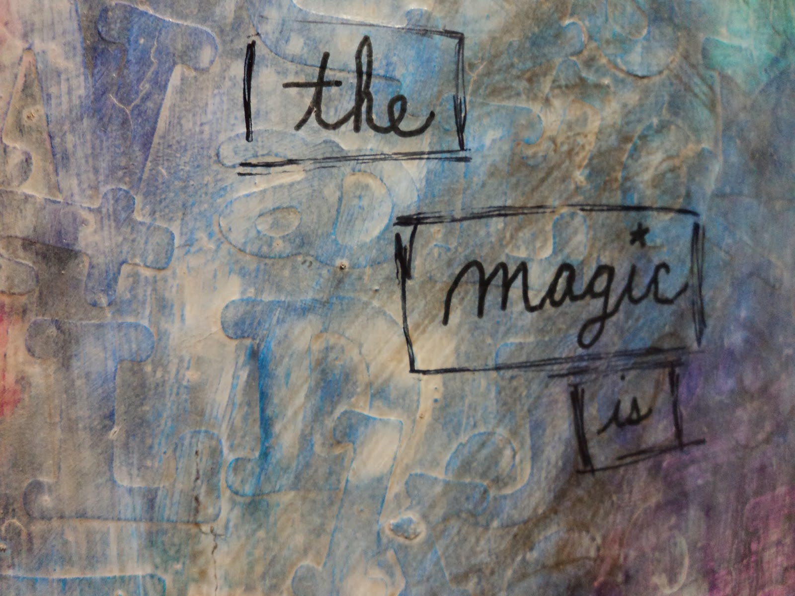
Magic...Ugh:  I had great aspirations with this layout but it just came out ugly. I laid down alphabet stickers then gessoed over them. Then, added paint. The paint seemed a bit bright so I thought maybe another light coat of gesso. I think thats where it went wrong. By this time, the texture of the letters was kinda lost and when I glazed with raw umber, it didn't have much to catch on to. I decided to just leave it and learn from the mistake. I should have went with my gut...raw umber wasn't the color.


#236:  This layout came out the way I wanted it, despite my reservations. My numbers got a little lost in the background but I don't even mind. For me, the circuit board pattern was where this spread was at. I truly like that pattern at the bottom. I'm going to remember that for future projects.


Thanks for taking a look-see. Inspiration Wednesdays continue on in 2017 and I'm all signed up. I hope to be a bit more diligent about it next year!
-Wy
"There is a crack in everything. That's how the light gets in."  --Leonard Cohen (RIP)

Featured Post

The Chocolate Game

 Let's talk about something sweeter than my other blog posts of late. Let's talk chocolate. But no guarantees that anything I want t...