Showing posts with label acrylic. Show all posts

Saturday, October 31, 2020

Annabel Lee: Edgar Allan Poe Series

 Last year, I brainstormed a bunch of ideas for the works of Edgar Allan Poe. I hashed through a few of them so I'd have a starting point if I got behind the 8-ball come October. Guess what? Behind the 8-ball!

Out of the three ideas I started, I chose the poem, "Annabel Lee". I felt that I would be able to work this into the "collection" with relative ease. I had been trying to keep my works within a certain color way and I had not yet done blue. The references in this poem to the sea inspired me that way.

While the year 2020 certainly lent itself to be the year of the "Red Death", I didn't have that one fleshed out enough to get it done for October. But I may work on it now that my Halloween projects are completed and I am not yet inspired for Christmas. 

Here's what I made:


If you recall, I do have a few parameters that I try to meet in each of these canvases in order to keep them somewhat cohesive. They all must display the title, they all must have a picture of Poe, they all must have a torn paper background (mostly). I try to keep it looking rather "vintage" but that's a loose rule.


The poem inspired certain elements; the tomb that opens into the sea, the moon, and the bride. 


I like how "the tomb" seems to be a doorway into a new realm and how the eye is drawn into it.


This canvas is complete enough for me to make a digital file of it. But I do intend to add more 3-D elements to it, specifically small seashells along the very bottom. Since those would not scan very well, I have left them off until I have a good digital rendering. 

This makes the 6th piece in the Poe collection. (I may be ready to do a set of notecards.) The others in this series can also be seen here on the blog in various October posts or search by label "Edgar Allan Poe". They are, in order of completion; The Raven, The Black Cat, The Tell-Tale Heart, Morella, The Haunted Palace, and now, Annabel Lee.

Have a very Happy Halloween and Stay Safe! Today of all days is the time to Wear a Mask!

-Wy

Sunday, June 02, 2019

A Quickie

A quick post to share a few art journal pages from the large Dylusions journal.


Chuck It!:  I just pulled a magazine cut-out from my folder and went for it. Acrylic paint makes the galaxy background and paint pens for the out lining and circle. 


GOT:  I never watched a single episode. I don't subscribe to HBO but I liked the magazine ad when it first debuted. Figured I should add it in for posterity. 


I am the Lorax:  I've always liked Dr. Seuss and The Lorax is a favorite of mine. I started with the notion of another flower page but the "flowers" looked so much like the trees from the Lorax that I decided to just move that way. While the background is pretty similar to GOT above, this page was done ages ago and I just recently added the little gel pen details that finished it off. 

See ya soon!
-Wy

Sunday, June 10, 2018

A New Eye

Creative makers will find this familiar, no doubt.

I have advised this to many and have had this advice passed on to me from many.
"If you aren't sure whether you like it, get new eyes."

It means to set that project aside. Get up from the table and go for a walk. Check in on your phone for a minute. Start something else. But under no circumstance do you go back to that project. Not until you haven't looked at it for awhile.

How long is awhile? That depends on how creatively stuck you are. If you feel you've just begun, then take longer than if you feel you're close to finished. (that's my personal policy) The point of setting it aside is to reset your mind frame and develop a new way to look at it. It works when writing, too. Write it all down as it comes to you, then push it aside for the day. When you come back tomorrow, read it through and edit as necessary.

Let's face it, some days are better than other for creative minds. If it's true that we are our own worst critic, then let's shut off that negative voice for a bit and get on with something else. Once we're out of that "moment", we can go back to the piece with a fresh pair of eyes. We can see things in it that we didn't when we were in the "moment"...we were too close.

That is this piece:

This work has no title. It started out as an experiment in using my fluid acrylics. I was influenced by the melting crayon trend. I had no intentions of making anything with this but as it dried, I was taken with it. I loved how the drips had slid down the paper and how the colors had slightly mingled on the overlaps. After going back to it, I figured I could use it for something because I liked it so much.

And herein lies the sword...that double-edged weapon of yore. I liked it so much that it became the one project that I never seemed to be able to complete. I could stamp on it, collage, or perhaps add more color. Every idea I threw out, I choked on. I couldn't lift my hand to mess with it.

So I took the advice of many. I set it aside.

And there it stayed for a very long time. I would see it when ruffling through handmade background papers and pause. Should I use this? No, a very soft voice would whisper, don't walk that path right now. You'll get lost.

I finally pulled it out earlier this year where I finally decided that it needed nothing. I had never used it or embellished it further because it didn't need it. I realized that I was happy with it just as it was. I enjoyed it because of the white space and small speckles. I was happy that the primary colors were still distinctive and yet mingling with their neighbors. I liked it in all its abstractness. (and I admit to not liking a lot of abstract art)

I even like the fact that it has no title. I can't think of what to call it and that rounds out it's artsy perfection.

What will become of it now? It will become a month in a calendar that I am planning. I actually have a prototype made up but am still struggling with cost as well as final details.

Sometimes art just pops up before you. It appears right under your nose. You can only see it with New Eyes.

-Wy

Hope you liked the story behind the art. Please follow my Facebook page to be alerted when Blog Posts go live and for any Etsy shop news.

Tuesday, December 26, 2017

Inspiration Wednesday: Finale 2017

I managed to finish the Inspiration Wednesday Journal...and before the turning of the new year.

OMG! I can hardly believe it.

The long Christmas weekend sure did help out though. I just realized that I haven't posted photos from this journal since July so I've skipped a few pages. (You didn't miss anything fabulous, really.)

So here's the end of the book.

Fishy, Fishy:  Lots of texture pastes and random stencils. Decided to give a raw umber glaze one last try over the fishes. My dislike is confirmed...repeat...I don't like a raw umber glaze under any circumstance. Lesson learned.


Flowers:  Decided to try my hand at covering the pages with a single color. It was as close as I could come to the Donna lesson. Tried out my new copper paint and overall, it helped me to like the page.


Junk on a Page:  I was a little stuck on this one. After the background paper was down, I had little creativity left for collage elements. Decided the common factor was that all the stuff needed to be used up. I like the colors and the washi tape. The inclusion is my favorite part. (below)


More Flower Vases:  Another flower and vase attempt. This one is using new colors. Decided to just see how they mixed. It definitely went faster this time but I don't like the background color. But overall, I think I progressed with this page.

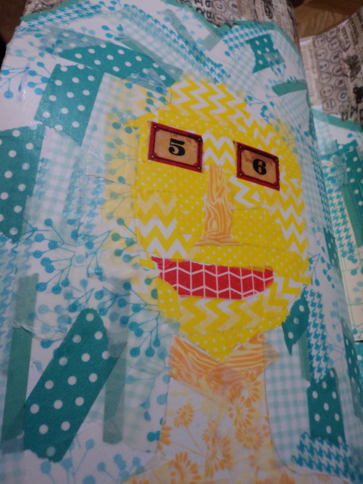
Washi Tape Face:  I thought about using a stencil for the face but I ended up just using it for the basic shape of head and neck. For once, the thought of tearing up little pieces of paper wasn't all that appealing, so I went with washi tape. (I had no desire to pull out the ModPodge for this page. Just no.) I knew the face would be "challenging" but I figured I'd stretch out into something abstract. I had a lot of fun with this page and I like it.


Winter Trees:  This is one of my favorite pages in this journal. I just love how my trees turned out. I finally found a satisfying way to use Raw Umber! I also tried out another "new" paint that added a glaze coat of glitter over the entire page. It doesn't photograph but it there. Also very happy with the background color.

The Final Vase:   The last vase turned out rather well, I think. My flowers aren't all that but I do love that they are done with heavy body acrylic so have a great texture. And the final ode to the lemon came out good. Also happy with this page and nice to end the journal on a high note.


Can't say whether I'll do another Inspiration Wednesday Journal or not. I like the size of it and it makes a great source for acrylic painting. I hate to do that in my other journals because I feel like I'm under-utilizing the paper. (paper that is meant more for inks and watercolor)

I guess we'll just have to see next year.
Good bye, Inspiration Wednesday.
-Wy

Sunday, August 27, 2017

Inspiration Wednesday: July

Yuppers, it's more ugly from the Inspiration Wednesday Journal. sigh.

I'm beginning to think that I'm releasing my subconscious stress and unhappiness in the particular journal. I like little bits of pages here and there but overall, there are few that make me happy. Few that make me proud of my skills.

These two pages seem to reflect that trend.


BeeLieve:  I had a good picture in my head and this isn't it. I liked the idea of leaving a little window for color. It really went wrong with the glaze. I probably should have gone a more yellowish tone to reflect my honeycomb but tried working with Raw Umber again. (I have decided never to use a raw umber glaze again. I never seem to like it.) I wasn't liking the page as it was so decided to draw my own bumblebees. (I mean, hey, I don't like what I got so try some stuff out, right?) Not quite sure about them. I think they are whimsical when I should have gone for more realistic. This might be a page that grows on me.


Garden Disaster:  I'm not quite sure how I feel about this page either. Donna used old paint skins for flowers but I don't keep that stuff. So I decided to just make a rainbow garden and draw it myself. I'm probably being overly critical but I'm not in love with it. I thought about pulling out a black pen and detailing/outlining some of it but I decided I'd like it even less that way. So this might be another page that will grow on me. (Note to Self: I think I'd like it more if the flowers were more "painterly". A blend of brushstrokes and colors.)

Sigh. Wow, this was a disappointing post. Here's the silver lining: I keep practicing stuff that I don't think I can do and I don't think I'll like. You never know what might happen along the creative process. You'll never find It, if you don't look. You'll never learn from your mistakes if you're afraid to make them.

-Wy

Friday, June 16, 2017

Canvas: The Deep

It should come as no surprise that I had this canvas with a background on it that I really liked. So much so that I almost didn't want to cover it up. That's always a problem. I'm not an abstract artist and I don't understand abstract art. So when I make a background or cover a canvas, it's with the intention of adding more on top of it. But sometimes I find myself just loving the colors and the movement of them and I have a hard time envisioning what should go on top.

This was a canvas like that. I had no intention of falling in love with the background. In fact, the background was like several I had done before only with different media. And I was just using up stuff. I had these Izinks laying around and I wanted to just use them up so I could pitch them. I wasn't going to buy more, I found a different line of similar products that I liked better. But in the process of throwing them on a canvas and messing around with them to create a bit of texture, I re-discovered why I had bought them in the first place: I loved the color! The blue was my absolute favorite and I just couldn't bear to cover it all up.

So a sea-scape it is!

The canvas is 18 X 24 and the background is composed of three colors of Izinks, which is a form of acrylic ink. I finally decided to mimic an art journal page I had done with tentacles and fish bones.

Because I loved the background so much, I didn't want to make it the background, if that makes sense. I wanted it to have equal "eye" time as my elements. I decided to use the fish bones stamp on tissue paper so the background would show through them. I highlighted them with white gelato to give them a ghostly essence. I wasn't sure what color to do the tentacles but went with contrast over my original thought of purple.
I added some embellishment with bubble like rhinestones. I had planned to draw in the little suckers on the tentacles but thought of my extensive button hoard. I added some neutral colors and some pearl buttons that fit the size of the tentacles and really liked the way they draw your attention right into that corner.

This canvas was selected to be displayed in a local art gallery this coming summer. This, along with my small canvas, Moisture, will be on display at the Gibson Gallery located on the SUNY Potsdam campus in Potsdam, NY. Moisture was the canvas I shared here a few posts ago:
This canvas will be part of a card deck I'm currently working on.
I'm still deciding on whether The Deep will appear in my future Calender project! (I'm thinking it will but can't decide what month!)
If anyone is in the area, stop in to see them in person. The photos never do them justice.
Take it easy,
-Wy

Sunday, May 21, 2017

Not so Secret Project

I believe I mentioned at the beginning of the year that I was going to try to get two things done. These two things were left over from the previous year and never completed despite my written goal. One was a calendar of my artwork and the other was to finally complete a version of my Divination Cards.

I can report that I have several calendar pages completed.

I can also report that I am half-way done with my Divination Deck. There are two I need to finish up with little details and I have a pretty solid idea of how I want two more to look. I just haven't really had time to apply them. That's not too bad since it's not quite half way through the year. I also redid/reworked about three of the cards. I just didn't like my initial version.

One came out so well that I'm going to share it here. But sssshhhh...it's a secret. I won't be sharing a lot of these but I just loved how this came together. (Thank goodness for stencils, huh?)


Have a great day!
-Wy

Monday, March 27, 2017

Inspiration Wednesday Journal: Jan-March

Thought I'd share my Inspiration Wednesday Journal with ya'll.
Inspiration Wednesday is a "class" I'm taking on-line with Donna Downey. I've done it the last two years so if you want to go back through old blog posts you can see pages from my past journals. You can still sign up for this. Just go to Donna's site and buy it. It's really fun. I am working in one of her handmade journals that she sells in her shop. This journal tends to be mainly acrylic and collage work.

But anywho, here's the journal. I'll be making this pretty brief as I am still 2 weeks behind in this and I don't remember much about the specifics of the pages. But hey...pretty pictures? right?


First Page:  Does this look familiar? Yup. For the first page I decided to go with texture paste through a stencil. I admit I fell in love with this stencil and now I'm using it everywhere. I was going for the vintage seed packet look. Didn't really pull it off here but it was good practice.

Courage in a Cup:   Trying to be more "painterly", as Donna put it. I rather surprised myself and found the "painting" to be rather enjoyable. I was almost certain the finished page would look like a toddler fingerpainting but I'm very pleased with it. I chose my word for the journal: Courage. 


3 Lemons:  A theme was beginning to develop. I admit I'm not a fan of still life. I understand using it for practice but I've never liked it. This was where I began to fall behind as I dreaded doing the page. But after watching the video about 50 times, I sucked it up and gave it a shot. Amazing! I think this spread turned out fabulous. Way better that I had given myself credit for. Do I now like still life? Not a chance but this was a wonderful confidence booster. COURAGE was definately the word to pick!

Mixed Media Lemons:  I could also call this page, "Donna proves a point", but I won't get into that. So far my pages are looking a bit similiar but techniques were different. So back to the lemons. I could have changed up the fruits a bit but I honestly felt good about the lemons. I was focusing my attention on shading. I can do shading but sometimes I don't think I get the real 3-D kind of look I'd like. So I practiced more.

Both lemons were done a bit differently. The one on the top (or left page) has a base of washi tape. I created the lemon out of colored tape then added touches of acrylic over it. It's hard to see in the photo but the shadow of the lemon shows the washi tape (it has gears on it) beneath the paint. The lemon on the bottom (or the right page) was torn from brown paper and glued down. I used gelato over the top of it to color it.


At this point in my journal, things were starting to look the same. I was learning things but the pages had no excitement for me. Lemons, baby, were not my thing. Easy to practice with but seriously, these pages don't hold anything of me in them. But had I not done those pages, and learned those things, I don't think the next pages would have been so good.


Whales:   I'll just say that I love these pages. I honestly did not think this would work. But from pushing through the other pages and knowing it's all practice, I got this magnificence. Maybe you don't see it, but I do. It was scary in a couple different ways. First, the basis was image transfer and I have limited success with it and limited experience with it. Second, it was a minimal page. So every small thing I did would be obvious, so not much room for error. Donna said, "image transfer is always a crapshoot" and mine certainly was. The background text transfered rather well for what I wanted. But the whales...ugh...I couldn't get a nice solid or dark transfer. I think I may have been using too much medium. I set that aside. So the images weren't perfect. They didn't have to be. Onto the color.

Ah...color. That's my jam, my comfort zone. I needed a watercolory look more transparent than not. All I knew was that I couldn't use all blue. Honestly, I had enough blue backgrounds and I needed to add another color. I pulled three fluid acrylics: Cobalt Turquoise, Payne's Gray, and Viridian Green. In other words; watery teal, midnight blue, and Godzilla green. I painted the background first and used lots of water to pull the paint out from around the whales. Then, I added layers of paint to get the deeper shades where I needed them.
Because my image transfer had left behind some paper, I got splotches of color in the whales where the paper soaked up the paint. I was too lazy to try and "fix" the image transfer and peel off the little stray bits of paper. I liked it. Who knew my laziness would pay off? For all the apparent simplicity of this spread, I'm in love with it. It's something you don't really see up close but after you walk away for a bit and come back...yeah, baby.
I may be going to canvas with this one.


I was hesitant to share this journal as it didn't speak to me...until today.
Perhaps my courage will continue to speak in these pages.
Have a great week.
-Wy

Featured Post

The Chocolate Game

 Let's talk about something sweeter than my other blog posts of late. Let's talk chocolate. But no guarantees that anything I want t...