Showing posts with label artist journal. Show all posts

Thursday, June 18, 2020

The New Normal: Phase 3 Day 7

This week so far has been pretty good. New York is looking good and the summer weather is here. Still a little strange not to be able to really do anything besides go to work and get groceries. Yes, stores are opening but I'm not really at the point where I want to go to a store for Non-essentials yet. I'm not much of a shopper anyway so "shopping" is more of a chore for me or an errand. 

I do, however, miss the movie theater and the casino. I miss dining in a restaurant. While restaurants are opening in reduced capacity with masks essential for service, I'm not brave enough yet. I'll continue the take-out ordering for now. I'm not so leery of my area as case numbers are practically non-existent but I am concerned with travelers from other areas of the country. Are all the snowbirds home from Florida? If they come now, will they quarantine or at least get tested?

But I think I'll get over that soon enough. I may have more to worry about from Canadian traffic when the border reopens than from snowbirds.

Anyway, this week is feeling more like the old normal for me. The mask situation is a bit better so I may be getting used to it. Though sometimes when I'm just sitting here at home, I can still feel it on my face. Creepy.

So I made another Color Palette Journal Page. You can see more Color Palettes on my Pinterest Board. I just added a few new ones this week. sigh. I'll never get these all done. But I'm sure gonna have some fun trying.

So here's the palette I called "Autumn Leaves"

The only minor change I made was in the darker burgundy color. I ended up using a product that I thought looked like burgundy but once it was out of the bottle, it was much more a dark red. It lacked the purple vibe that burgundy is known for. But I stuck with it.


This spread all began with the paper. I was going to try to paint or ink the background in dark brown but decided to look through the paper stash first. Glad I did because this pattern inspired the steampunk butterfly and the feel of the pages.


I accomplished what I wanted with the pages and that was to do something that wasn't Autumn themed. So there's that.

Have a great weekend!
Wear your Mask, We ain't out of this yet.
-Wy

Tuesday, May 19, 2020

The New Normal: Phase One: Day 5

I finished up a journal page in the Color Palette Journal yesterday which means I get to pick a new palette this week!

I am coasting right along in this little journal that I have neglected for a couple of years. Feeling pretty good about it now as looking back, I like most of what I have put in there.

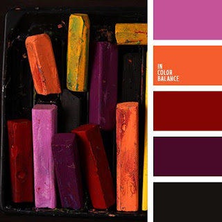
So here's the Color Palette that was randomly selected from my Color Palette Pinterest Board. I call it Artist's Pastels. As always, I delete the Palettes as I use them so I don't duplicate.


I was excited about this palette as it has some dark colors in it. I did take a bit of liberty with the tones of red and burgundy but I do like the end result. In fact, I liked the background so much, I changed my original idea so I wouldn't cover so much of it up. I honestly stalled out for a week because I just loved the background of burgundy and black.

Here's my page spread:


Hey, people, it's a pandemic! It ain't all whimsy and snarky.
Personally, I love it.

Wear your mask!
Wash your hands!
Stay Safe!
-Wy

Monday, March 27, 2017

Inspiration Wednesday Journal: Jan-March

Thought I'd share my Inspiration Wednesday Journal with ya'll.
Inspiration Wednesday is a "class" I'm taking on-line with Donna Downey. I've done it the last two years so if you want to go back through old blog posts you can see pages from my past journals. You can still sign up for this. Just go to Donna's site and buy it. It's really fun. I am working in one of her handmade journals that she sells in her shop. This journal tends to be mainly acrylic and collage work.

But anywho, here's the journal. I'll be making this pretty brief as I am still 2 weeks behind in this and I don't remember much about the specifics of the pages. But hey...pretty pictures? right?


First Page:  Does this look familiar? Yup. For the first page I decided to go with texture paste through a stencil. I admit I fell in love with this stencil and now I'm using it everywhere. I was going for the vintage seed packet look. Didn't really pull it off here but it was good practice.

Courage in a Cup:   Trying to be more "painterly", as Donna put it. I rather surprised myself and found the "painting" to be rather enjoyable. I was almost certain the finished page would look like a toddler fingerpainting but I'm very pleased with it. I chose my word for the journal: Courage. 


3 Lemons:  A theme was beginning to develop. I admit I'm not a fan of still life. I understand using it for practice but I've never liked it. This was where I began to fall behind as I dreaded doing the page. But after watching the video about 50 times, I sucked it up and gave it a shot. Amazing! I think this spread turned out fabulous. Way better that I had given myself credit for. Do I now like still life? Not a chance but this was a wonderful confidence booster. COURAGE was definately the word to pick!

Mixed Media Lemons:  I could also call this page, "Donna proves a point", but I won't get into that. So far my pages are looking a bit similiar but techniques were different. So back to the lemons. I could have changed up the fruits a bit but I honestly felt good about the lemons. I was focusing my attention on shading. I can do shading but sometimes I don't think I get the real 3-D kind of look I'd like. So I practiced more.

Both lemons were done a bit differently. The one on the top (or left page) has a base of washi tape. I created the lemon out of colored tape then added touches of acrylic over it. It's hard to see in the photo but the shadow of the lemon shows the washi tape (it has gears on it) beneath the paint. The lemon on the bottom (or the right page) was torn from brown paper and glued down. I used gelato over the top of it to color it.


At this point in my journal, things were starting to look the same. I was learning things but the pages had no excitement for me. Lemons, baby, were not my thing. Easy to practice with but seriously, these pages don't hold anything of me in them. But had I not done those pages, and learned those things, I don't think the next pages would have been so good.


Whales:   I'll just say that I love these pages. I honestly did not think this would work. But from pushing through the other pages and knowing it's all practice, I got this magnificence. Maybe you don't see it, but I do. It was scary in a couple different ways. First, the basis was image transfer and I have limited success with it and limited experience with it. Second, it was a minimal page. So every small thing I did would be obvious, so not much room for error. Donna said, "image transfer is always a crapshoot" and mine certainly was. The background text transfered rather well for what I wanted. But the whales...ugh...I couldn't get a nice solid or dark transfer. I think I may have been using too much medium. I set that aside. So the images weren't perfect. They didn't have to be. Onto the color.

Ah...color. That's my jam, my comfort zone. I needed a watercolory look more transparent than not. All I knew was that I couldn't use all blue. Honestly, I had enough blue backgrounds and I needed to add another color. I pulled three fluid acrylics: Cobalt Turquoise, Payne's Gray, and Viridian Green. In other words; watery teal, midnight blue, and Godzilla green. I painted the background first and used lots of water to pull the paint out from around the whales. Then, I added layers of paint to get the deeper shades where I needed them.
Because my image transfer had left behind some paper, I got splotches of color in the whales where the paper soaked up the paint. I was too lazy to try and "fix" the image transfer and peel off the little stray bits of paper. I liked it. Who knew my laziness would pay off? For all the apparent simplicity of this spread, I'm in love with it. It's something you don't really see up close but after you walk away for a bit and come back...yeah, baby.
I may be going to canvas with this one.


I was hesitant to share this journal as it didn't speak to me...until today.
Perhaps my courage will continue to speak in these pages.
Have a great week.
-Wy

Sunday, April 24, 2016

Art Journal Adventure Part 2

Remember that sneak peek?
I finished the page for my Art Journal Adventure. (See THIS POST for the beginning details.)


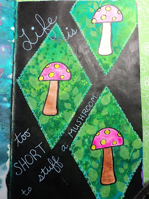
Week 13: Stuff a Mushroom:  This is the completed page from the sneak peek. This week's theme was to illustrate a quote. I decided to go to the old tried and true method of making a really busy background and then just blacking out most of it. I used Dylusions spray inks and paint. I stamped, colored, and cut-out the mushrooms then just attached in a window. My quote, "Life is too short to stuff a mushroom." Not a big fan of my own writing on this one but hey, I like the mushrooms!

Week 14: ????:  This weeks idea was to use deli paper in the layout. I don't use deli paper so I just substituted scrapbook paper of which I have a never-ending supply. I used gesso and Dylusions paint on the background to cover up a splattery mess on the pages. I wanted something very soft...and oops...too much Bubblegum Pink! I tried to add some copper acrylic ink over it but it didn't seem to dull it...AT ALL. Ah, well, I added the paper anyway but now am totally stuck for an idea. Every time I look at it, I see that scene in Star Wars where Obi-Wan battles Anakin with all that lava. Sigh....this might end up being my geeky indulgence.

And here's a sneak peek at the Week 15 page, which is coming along so much better that the above pages.
Week 15 was all about Funky Flowers. I didn't really want to use stamps as I can draw flowers pretty well. I also got some practice this week as I had to sit in a waiting room for 3 hours...guess what I drew? Yuppers, all kinds of flowers. All this spread needs is a few more doodles and then coloring.

I was thinking I was pretty caught up in this journal but then realized that tomorrow is Monday which means a new AJA over at Joggles! I'm gonna try to catch up tomorrow.
Have a great week!
--Wy
"This is what it sounds like when doves cry."  ---Prince, RIP

Thursday, January 07, 2016

Artist Journal: The Grand Finale

Over Christmas and New Year's, my modem died. So I used the time "off-line" to finish my Artist Journal.

Yup...FINISHED.

Do I like all the pages? Not especially. But are they done? Yup. The Artist Journal was never about making great art or even sharing it with others; it was about trying out some ideas to see if they'd pan into anything. It was always about just sitting and decompressing from the rigors of the day. Art journaling is my escape whether or not anything comes from it.

So here's the final pages of the Artist Journal: (I apologize for some of the fuzzy photos. I was trying to rush to get the pages photographed to share and didn't want to retake them.)


Feathers:   Being stuck for ideas, this page came about from the decision to used Hot Pink and Bright Blue paint. I cut out the little photos on the back of an extra bird calendar to use as collage. I've used them on a few other pages but picked out the ones with a mostly pink color to match the background. Stenciling with blue and some bright orange dots added for layering. I ripped some extra patterned paper into feather shapes and glued them down but not on the edges so the feathers have some dimension. Black spatters to finalize the page. (I'm going to remember the torn paper feathers. They were easy to make and have a great look.)


Life is Art: Next decision was to play with some "new" Lindy's Stamp Gang Magicals. I wondered if they would work in the same fashion that I've seen Brusho work. I wondered if they would give similar results to the pigmented watercolor so I just tapped some on and sprayed with water to see what would happen. Results were very attractive so I just added some collage elements to finish it off. The large butterfly is a stamp from Stampin Up, the quote is a stamp from my stash, the tag was a mop-up leftover sitting nearby, and the music was the only thing I actually went looking for. (I think I might have been going to use some song lyrics on this page but when I found the quote stamp, I went a different route.)


 Fluffy Yellow Birds:  Added music paper to the page then added white gesso to prime it. I used three pale shades of gelato (Faber Castell) to make the wide striped background. I had these scraps of brown paper strips that I used for the branches and a coral shade of cardstock to use for one of my favorite quote. More torn scrap paper (a soft yellow bubble pattern from the stash) to form my little birds. I cannot believe how well this page turned out. I originally planned only three birds but the paper was tearing so well that I figured I could get 5 out of the scrap. I just added the little faces and feet then defined the wings. I used Glue-N-Seal (Ranger) to adhere them and outlined them with a soft yellow gelato. (Butter is the color, I think.) Definitely one of my favorite all-time pages! (This year might be the pastel year for me. I find myself more attracted to it lately.)


 Never Forget:  I was stuck for ideas and just told myself to go with what I know. I love how black makes colors pop...especially a rainbow of colors. To a gessoed page, I made three rainbow circles from the bright set of gelatos. I scribbled the color directly onto the page then blended it with my finger. (This is my favorite way to use gelatos. It keeps the color bright but they still blend over a gessoed surface.) I didn't add any sealer over that because I knew I was going to add the black. I decided to go with the Glossy Embossing Paste in Black from Dreamweaver. I wanted the glossy shine to contrast with the matte finish of the gelato. I applied it through a stencil and let it dry overnight. Then, I was stuck again. I added a black tag (I just took a manilla tag and painted it black.) with colorful circle stickers that seemed to match. Then doodled with a white Signo pen. The tag covers up a bit of mess I made with the stencil which is good. But adding the tag with Matte medium probably wasn't so good. The Matte finish dulls the embossing paste along the edges of the tag. But...I don't really notice it that much. Still love the page!

Here's a few of the pages that helped to complete the journal, but would be more of an Honorable Mention:


 More rainbow gelato fun.


I had to use up paper that was taking up space in my work area! Flying fish bones!


Trying my hand at something more abstract as well as using stamp images inside of smaller shapes. Meh.

A mess of a page. The black acrylic paint went horribly wrong with the small stencils I was using on a terribly non-flat surface. So I threw on the last of some stickers and just decided to leave it a mess. I share the ugly pages, too. They ain't all masterpieces!

Fin:  The last page in the journal but not the last page that I completed. The background is actually packaging from one of Dyan Reaveleys stencils or art journals. Added my torn paper flowers and a strip of washi tape to hide a seam. Complete. Finished. Done. Fin.

Here's the chunky journal that has been TWO YEARS in the making:


Thanks for hanging in to the end of this massive post! But I wanted to just GET IT DONE!
Happy New Year!
-Wy
"The cares of tomorrow can wait till this day is done."  --The Irish Rovers, "Come By the Hills"

Sunday, December 20, 2015

Artist Journal: More

A few more pages done!

 Soar:  Still playing with old paint. I was using Golden Fluid acrylics here. (I've had these particular paints for years since I wasn't really sure how to use them. I'm starting to get the hang of it and some YouTube time with Donna Downey always helps. Once these are used up, I'll be investing in more. And it is an investment...whew, these paints aren't the cheapies!) Found a couple collage images but really couldn't tie it together any more than that. It's a colorful page but seems discombobulated. (Wow, seriously, SpellCheck, that's a word? And I spelled it right? Hmm.)

I did try the transparent texture paste again. You can kinda see the bubbles here. Still on the fence about it. When I use it, I always have the urge to go over it with something to make it pop. But if I want it to pop, why am I using TRANSPARENT paste! Seriously, I think this product is for specific occasions. Either way, it didn't really help this page.


Midnight Meditation:  I took a crappy photo of this page, my apologies. But it's amazing what a small image in an advertisement in a magazine will inspire. Just paint, image, and stickers but I like it. The little "white" dots you see are actually a light reflection off the epoxy star stickers in the background. They are black on black so they don't photograph real well for me.


The Butterfly Effect:  The whole page came together in a grand finale when I added the butterflies/moths. I was just collaging "circular" elements, then added in the air mail and "journey/travel" elements. More little stickers to use up brought the whole theme together. One small thing here can lead to one big thing somewhere else: the Butterfly Effect.

This journal is getting pretty STUFFED! I can't wait to play with more paint!
--Wy
"Everything has Beauty but not everyone sees it." --Confucius

Thursday, December 17, 2015

Artist Journal: Closing In on the Finish?

Artist Journal Update: I've got 13 more pages to go before the end of the year to meet my goal. Wish me luck because my work schedule looks CRAZZZZZYYYYYY right up to Christmas. Time, once again, is not on my side!

But I did get a few more pages done (you know, for the most part. LOL!) this weekend.
Sea Horse:  Jellyfish and Sea Horses make me happy! These are stamp images from 100 Proof Press. Just using up some little stickers, too.


One in a Million:  Another set of eyes. I was stumped as to how to bring it all together after I had the eyes glued down. Added in the lightning strike and decided on drippage since the background whispered stormy sky to me. Reminds me of the old days of mascara running down women's faces when they cried. Close up of the lightning below.


Bloom:  Again, my attempts at using up heavy body paint led me to more flower experiments. I think I'm addicted. I very much love them. I thought, at first, these were not very good but after the paint dried, I was in love. I don't know what kind of flower they are but who cares? Tried using gelatos as a background rather than paint. Yup, it works.

Have a great day!
--Wy
"To be beautiful means to be yourself. You don't need to be accepted by others. You need to accept yourself."  --Thich Nhat Hanh

Featured Post

The Chocolate Game

 Let's talk about something sweeter than my other blog posts of late. Let's talk chocolate. But no guarantees that anything I want t...