Wow, I thought for sure I had already blogged about some of these pages! I must be getting old...er.
I bought a small Dylusions journal to begin the Art Journal Adventure over at one of my favorite on-line stores,
Joggles. On the
Joggles Blog, every Monday, Barb posts about a page or page spread she's done in her Art Journal. She gives out the story of the page, products she's used, and encourages people to make their interpretation of her "theme".
(I'm also in the Facebook group where you can share your pages with others and get even more inspiration and variations on the theme!)
So I decided to follow along, but having a black square journal already, I wasn't comfortable with the square journal Barb was using. I went with a smaller one. I'm not gonna lie...I think my choice is a double-edged sword.
(More later.)
Let's get to some photos, eh?
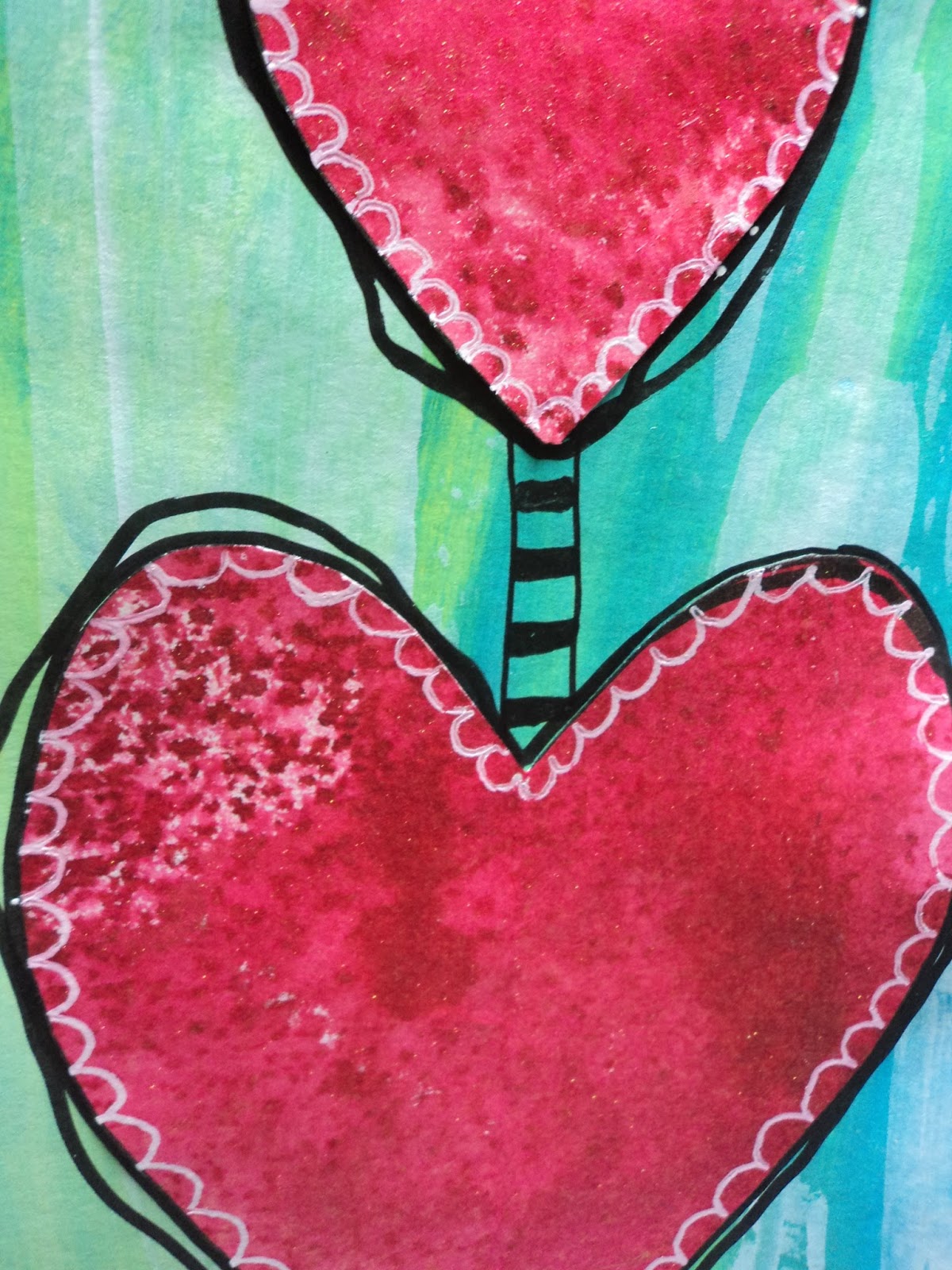
Week 4: Dangling Hearts: I really liked Barb's page spread with the exception of the soft colors. I'm trying to get myself to use more pastel colors and I'm trying to step out of my typical comfort colors this year. But this page spread allowed me to try out my Dylusions paint as a background. I just loved the doodling Barb does and I wanted to recreate the lines. I just played around and had a bit of fun on this page. The hearts were cut from an inked piece of paper that I already had lying on my table. The background does seem a bit plain and I may end up going back to it with a black pen to add some more doodles.
Week 5: Rainbow Owls: Barb's page featured gnomes with lots of Stickles glitter glue. I'm not much for glitter...though I do love shimmer, and those are not the same thing to me. Anywhoooooo, I saw this as an opportunity to use some cute owls and give them googly eyes. The owl stamp is actually the pair connected together. I just stamped them out and cut them apart to make a "girl" and "boy" half to the tree. They are colored with Crayola markers. Yup...I was too lazy to go two flights of stairs for my Distress Markers. And these worked fine despite my limited color palette. The background was my second attempt to use Dylusions spray ink over the paint.
(My first attempt was very wet and the ink didn't seem to dry.) This attempt confirmed my suspicion: I was spraying too much ink. A light spray worked extremely well. You can see it in my numbers and the very light leaf like design. The white is paint on bubble wrap.
The tree was more or less just something for the owls to sit on and anchor them in a the scene. The trunk is washi tape and the limbs were just drawn with a marker. I really like this page spread. If you open the book to this page, the googly eyes are all facing inward...so it appears the girls are staring at the boys and the boys are staring right back!
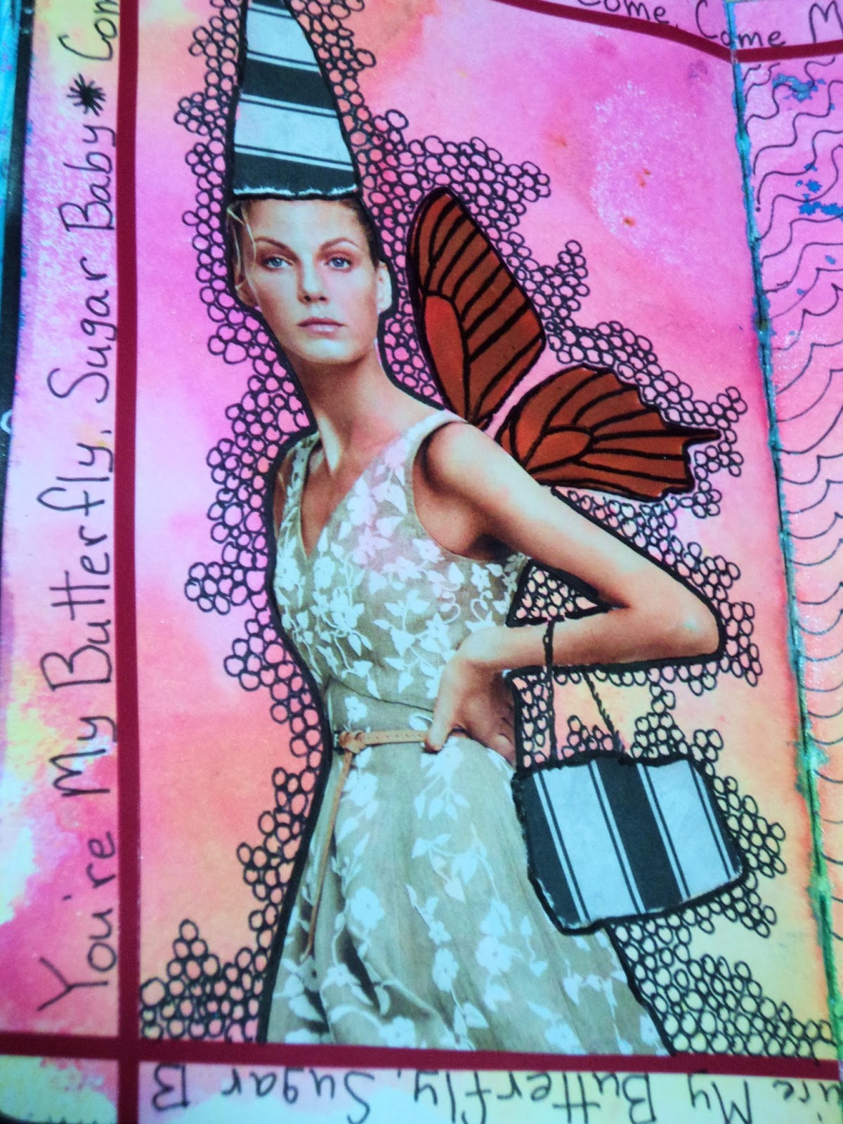
Week 7: Sugar Baby: This week was about paying homage to
Teesha Moore. I admit I wasn't familiar with her work but click that link and see all the wonderful artwork she does. Awesome! I started this spread with my bright Lindy's sprays. I had too many cool colors in the journal and wanted something bright and '80's looking.
(If you love '80's colors, this spray set from Lindy's Stamp Gang is my fave!) Once that was established, I added a frame with sticker borders and found my fashion girls. After fussy cutting them the way I wanted, I decided to just embellish them a bit...mainly with accessories because I liked the "white" space they provided. I knew I'd doodle the backgrounds so I didn't mess with stenciling or stamping before gluing it all down.
The butterfly wings are an acetate piece colored with copper acrylic ink. I stamped it with StazOn ink, colored the opposite side, then went over the lines with a Sharpie marker. This is where the song got stuck in my head and I added the chorus around the outside frame.
Despite the bleed-through, I still think this is my favorite spread in the journal. Those background colors make me so happy! Definitely be using that combo again...if I can remember what it was. Ack!
Week 9: Spring: The theme was thinking of spring and I just needed to do something fast and furious. I have been hard-pressed to keep up every week with the Adventure so I tend to do several weeks at a time. This week was a single page so I decided to go with the growing flower. It gave me the chance to try out some more acrylic inks...the fluorescent pink to be precise! Honestly for a quick page, I love it!
Week 10: Vines: This week's theme was to use colored texture paste. Barb had made a page full of flowers with a stencil but I don't have a flower stencil. But I did have this branches stencil which is one of my favorite stencils. I used a transparent texture paste from Ranger and colored it green. I think I used Dylusions spray ink but I can't remember! Anyway, I totally love it. It has a great transparent quality. Then, I added some spiral flowers and colored them with Inktense pencils.
I debated as to whether to color the background as Barb had done after all that. But decided to go for it. I kinda wish I hadn't. The blue seems too much and the green paste is a bit lost. I added glossy accents over the flowers to help them pop and then a coat of Silks acrylic (Ice) over the background to add some shimmer. Now I'm debated on whether to go around the vines with a black pen.
(Art Journal pages are never really finished, are they, Peeps.)
Week 11: Kindness: This week was about featuring a word. I stayed very close to Barb's page spread because I just got tired of thinking on it. You know, I can think of a million cool words but nothing jumped out to use on a page as a centerpiece. So I went with Barb's word and it's a great word. I saw this as an opportunity to practice my doodles as I always want to do more but never seem to make it happen. Not sure this is really finished...again...I may add some more doodles.
(You can see more bleed-through on the right page...a bit of random teal.)
Week 12: Twilight Butterflies: This week was to use a tag on the page. Since my journal was small and it was a single page, I opted just to use one tag that I already had lying around. I just stamped more butterflies and added them on. They are colored with Distress Crayons. The background was Lindy's Stamp Gang Magicals in Tainted Love Teal and Screamin' Banshee Black. The Magicals are a powder and I used them like those watercolor powders that are hot right now. I sprinkled a bit of each on a dry page and then sprayed water over them. It takes quite a bit of water to dissolve bigger clumps so I tried to be very light handed with the powder. But I still got bleed-through as seen on Week 11.
Speaking of bleed-through, that's what I mentioned at the beginning of the post. That this journal seemed to be a double-edged sword. The size of the journal is great and definitely in my wheelhouse.
But I don't know what I'm doing wrong with the pages bleeding through to the other side. I had no such problems with the large Dylusions journal. I don't feel like I'm using anymore water than usual but I'm getting so much spotting with this one. Especially when I'm using blues and dark colors. I guess I'll have to cut back on the water. I had been wetting the page with water first, then adding ink, then a touch more water. But this little journal doesn't seem to like the page being wet first. The paper doesn't seem to like all the water...which I can't figure out because this is the method I was using in the large journal last year. It's also a bugger that the pages curl like they do. I don't remember the large journal pages curling this much.
Anyway, I'll start cutting back on the water and see if that helps my problem.
There's the start of the Art Journal Adventure! Hope the long post was worth it to the end!
--Wy
"Come my lady. Come, come my lady, you're my butterfly. Sugar, baby."


No comments:
Post a Comment