Over Christmas and New Year's, my modem died. So I used the time "off-line" to finish my Artist Journal.
Yup...FINISHED.
Do I like all the pages? Not especially. But are they done? Yup. The Artist Journal was never about making great art or even sharing it with others; it was about trying out some ideas to see if they'd pan into anything. It was always about just sitting and decompressing from the rigors of the day. Art journaling is my escape whether or not anything comes from it.
So here's the final pages of the Artist Journal:
(I apologize for some of the fuzzy photos. I was trying to rush to get the pages photographed to share and didn't want to retake them.)
Feathers: Being stuck for ideas, this page came about from the decision to used Hot Pink and Bright Blue paint. I cut out the little photos on the back of an extra bird calendar to use as collage. I've used them on a few other pages but picked out the ones with a mostly pink color to match the background. Stenciling with blue and some bright orange dots added for layering. I ripped some extra patterned paper into feather shapes and glued them down but not on the edges so the feathers have some dimension. Black spatters to finalize the page.
(I'm going to remember the torn paper feathers. They were easy to make and have a great look.)
Life is Art: Next decision was to play with some "new" Lindy's Stamp Gang Magicals. I wondered if they would work in the same fashion that I've seen Brusho work. I wondered if they would give similar results to the pigmented watercolor so I just tapped some on and sprayed with water to see what would happen. Results were very attractive so I just added some collage elements to finish it off. The large butterfly is a stamp from Stampin Up, the quote is a stamp from my stash, the tag was a mop-up leftover sitting nearby, and the music was the only thing I actually went looking for.
(I think I might have been going to use some song lyrics on this page but when I found the quote stamp, I went a different route.)
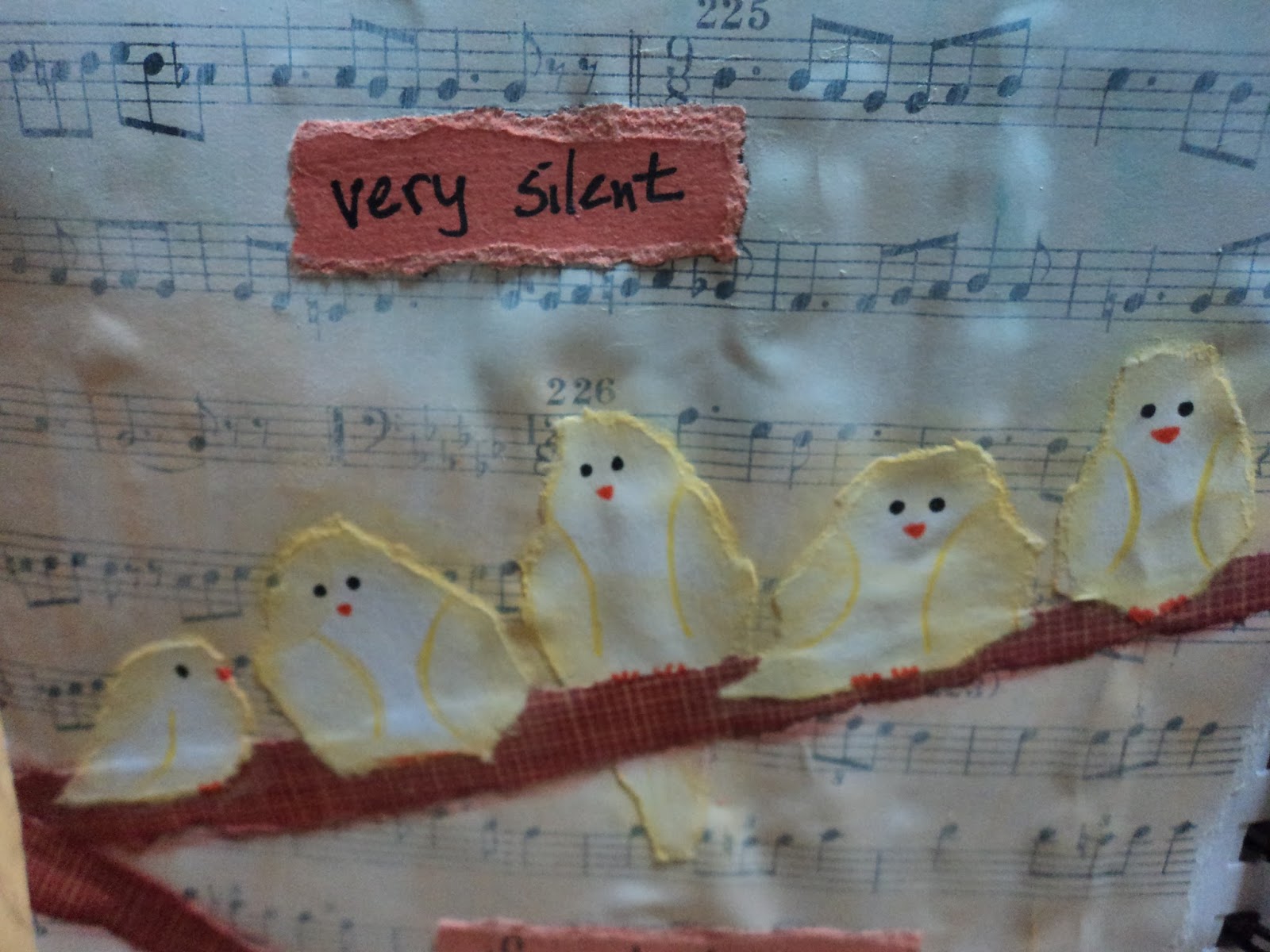
Fluffy Yellow Birds: Added music paper to the page then added white gesso to prime it. I used three pale shades of gelato (Faber Castell) to make the wide striped background. I had these scraps of brown paper strips that I used for the branches and a coral shade of cardstock to use for one of my favorite quote. More torn scrap paper
(a soft yellow bubble pattern from the stash) to form my little birds. I cannot believe how well this page turned out. I originally planned only three birds but the paper was tearing so well that I figured I could get 5 out of the scrap. I just added the little faces and feet then defined the wings. I used Glue-N-Seal (Ranger) to adhere them and outlined them with a soft yellow gelato.
(Butter is the color, I think.) Definitely one of my favorite all-time pages!
(This year might be the pastel year for me. I find myself more attracted to it lately.)
Never Forget: I was stuck for ideas and just told myself to go with what I know. I love how black makes colors pop...especially a rainbow of colors. To a gessoed page, I made three rainbow circles from the bright set of gelatos. I scribbled the color directly onto the page then blended it with my finger.
(This is my favorite way to use gelatos. It keeps the color bright but they still blend over a gessoed surface.) I didn't add any sealer over that because I knew I was going to add the black. I decided to go with the Glossy Embossing Paste in Black from Dreamweaver. I wanted the glossy shine to contrast with the matte finish of the gelato. I applied it through a stencil and let it dry overnight. Then, I was stuck again. I added a black tag
(I just took a manilla tag and painted it black.) with colorful circle stickers that seemed to match. Then doodled with a white Signo pen. The tag covers up a bit of mess I made with the stencil which is good. But adding the tag with Matte medium probably wasn't so good. The Matte finish dulls the embossing paste along the edges of the tag. But...I don't really notice it that much. Still love the page!
Here's a few of the pages that helped to complete the journal, but would be more of an Honorable Mention:
More rainbow gelato fun.
I had to use up paper that was taking up space in my work area! Flying fish bones!
Trying my hand at something more abstract as well as using stamp images inside of smaller shapes. Meh.
A mess of a page. The black acrylic paint went horribly wrong with the small stencils I was using on a terribly non-flat surface. So I threw on the last of some stickers and just decided to leave it a mess. I share the ugly pages, too. They ain't all masterpieces!
Fin: The last page in the journal but not the last page that I completed. The background is actually packaging from one of Dyan Reaveleys stencils or art journals. Added my torn paper flowers and a strip of washi tape to hide a seam. Complete. Finished. Done. Fin.
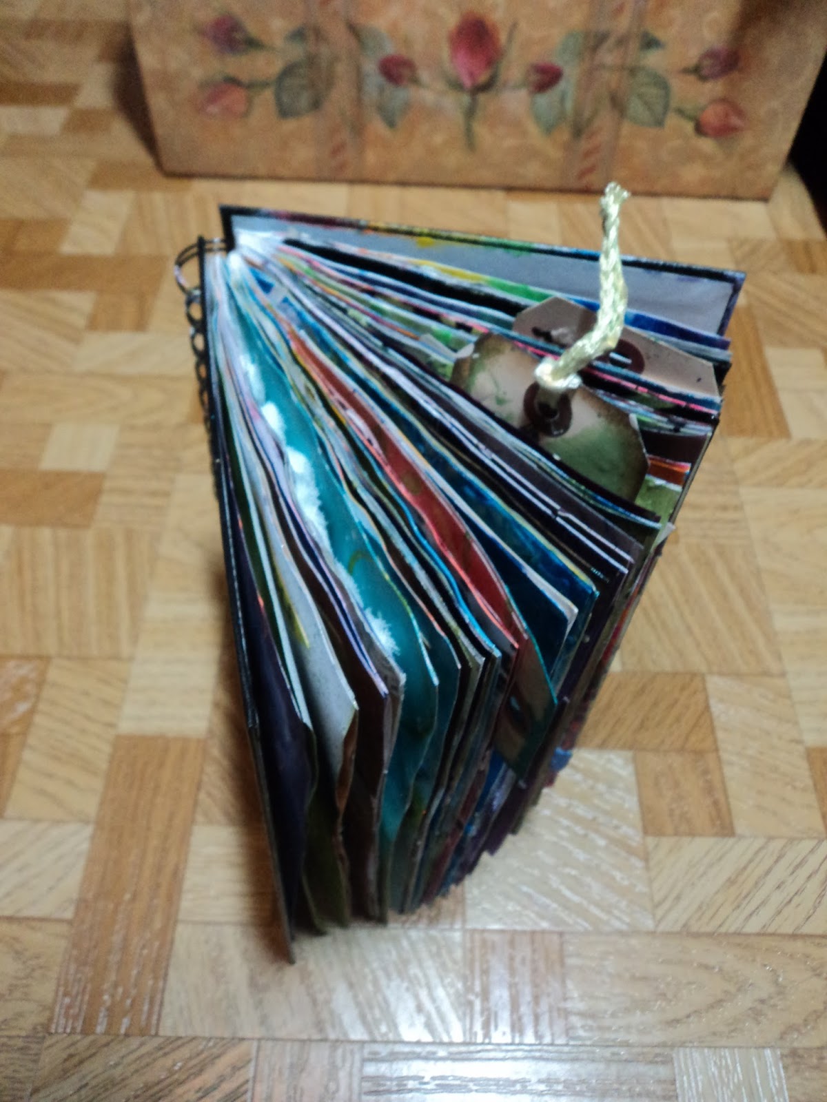
Here's the chunky journal that has been TWO YEARS in the making:
Thanks for hanging in to the end of this massive post! But I wanted to just GET IT DONE!
Happy New Year!
-Wy
"The cares of tomorrow can wait till this day is done." --The Irish Rovers, "Come By the Hills"