Ok, so I'm making pocket letters. Sort of. Haven't heard of them? Check YouTube or go HERE to learn more.
I'm not really doing any swaps, just making them for family. I might work my way up to some swaps. Who knows? I love ATC size or playing card size but pocket letters also seem to involve little "gifts" that I'm not so much interested in. It's also an offshoot of pen pal-ing which I never had an interest in.
So I decided to do a pocket letter for each month of the year for my niece. I've got the first 4 months done and she might even get them before Easter. LOL! I don't put too many "gifts" in the pockets...mostly just stamp images that are fussy cut or colored and maybe some stickers.
I have discovered that it's a great way to use up little scraps or to make a small stamp image be a cool focal element. I also like how you can stick to making each card different or linking some of them together to be a larger image. It has it's own challenges. Like do you cover the back of the card or not? I do mostly, unless it's practically spotless on the reverse side. But I like the consistent look of the reverse side when it's all covered with a similar color or paper.
So here we go:
January: Mostly this was inspired by the background paper. It's a mop-up page from my Art journal. It just looked cool and wintry. I was going to make cards with it but it cut up into 7 cards. I used a leftover bit for another card and just a plain white cardstock for the last. I wanted some consistency throughout the months so I knew one card would be the name of the month and the year and there would be a card or two for any major holidays. I, then, established a little personal touch by adding a card with "3Things I like to do in January". The rest of the cards just match the winter theme, and color. (I added some gifts to the back of the pocket like a cut-out of the yeti and penguin stamp image. I also had some acrylic snowflakes and some build-your-own snowman stickers. Lastly, I added some small blue beads in a little ziploc bag.)
Winter Fun Penguin: I got this small stamp set from Hot off the Press as a mistake. (Instead of shipping me my order a while back, I got some stamping kit of the month. They were kind enough to let me keep it. This little set was cute but I wasn't a fan of the bigger set. It'll probably go out to a second hand store.) I used the background to guide my stamping so that the words seem framed by the swirls.
New Year: These stamps are also from a set from Hot off the Press; a new steampunk set. I had been making a card for a friend and had them out. The sentiment seemed worthy of a New Year's occasion. I added some green Distress ink around the edges of this one to bring out some of the green splatters in the background of some of the cards.
February: With Valentine's Day in this month, I knew I had to have some pink. It's my niece's favorite color. But I added the purple because it looks neat and amethyst is the birthstone this month. I might have overdone it with the purple but I screwed up a pink card and couldn't save it. The pink paper was only a scrap and I didn't have any more of it. (The gifts in the back of this pocket letter were just some cut-outs of the stamped images. I added a skunk and a few of the owls with added google eyes! I also threw in some heart stickers.)
Sweetheart Owls: This stamp is one of those from Studio G that you find in the dollar bins at Michael's. I love to cut out the owls separately and back them with patterned paper. I added some Liquid Pearls (Platinum) to the heart in the girl owls wings. These owls also look super cute with googly eyes!
Quote: I thought it would be fun to add a quote. This one is from Helen Keller. (Unfortunately, I just didn't add any more to the next months...too many other ideas!) It wouldn't fit horizontally so I went with a vertical layout. Those roses are from a hand-carved stamp I made and they are about the size of a penny.
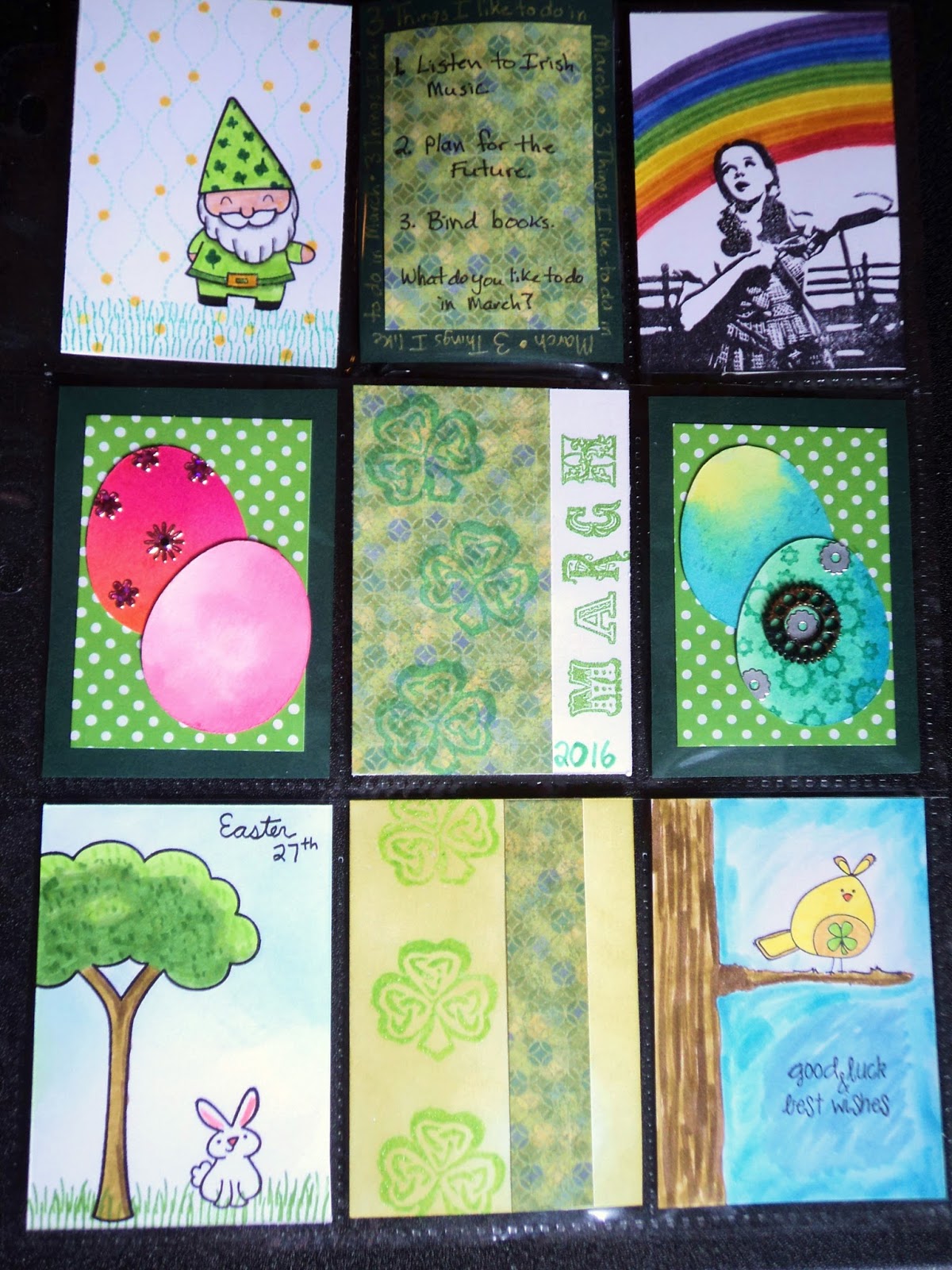
March: I wanted each month to be specific to 2016 which means that March contains both St. Patrick's Day and Easter. This made the composition a little more complex. I decided to go mostly with St. Patrick's Day with just some touches of Easter. (For little gifts in the back pockets, I added some Easter eggs like you see on the cards in the middle, some shamrocks, a few rainbow stickers, and a small journal that I bound from scrap papers.)
Leprechaun: I admit that I may be addicted to Lawn Fawn stamps! I bought the set Gnome Sweet Gnome a while ago when they had a big sale but I hadn't used it yet. I thought the Gnome could be used for several different things besides a garden gnome. (Like this leprechaun or a Santa.) So I used the grass in the set to set a lawn and used the wavy dotted line to make it appear like coins were raining down.
Over the Rainbow: I figured what went better with St. Patrick's Day than a rainbow? So I found this old stamp that had been hand-carved by JackBear Stamps. I added the rainbow behind Dorothy with Distress Markers. I decided that this card didn't need much because that stamp is so cool.
Easter Bunny: More Lawn Fawn stamps! This is from Critters in the Burbs set. I went with a clean and simple approach and I like it that way.
April: Without Easter to contend with, April was looking pretty empty for "occasions". While April Fool's Day was an idea, it didn't seem to fit with where I wanted to take this page. I focused on April Showers and Earth Day. So ended up with lots of birds in yellows and blues. (For little gifts, I just added a lot of homemade stickers made from the chick stamp and the kite stamp. I left them white so my niece can color them.)
Rainy Day Owl: This is a stamp from Unity Stamps. I came in this set and I adore it! I colored him in after I had all the other cards finished so I could make sure he matched my color scheme. He's colored in with Distress Markers.
Marching Chicks: You can see I used my new Feathers stamp set here from Hot off the Press. The cute chicks are from Unity Stamps. I colored them and cut them out some time ago and just pulled them out of my stash. I like to stamp many images at once and color them up or just have them cut out and ready to go. I wanted the two cards to mash together to make a nice block at the bottom of the page.
That's what I've got done for the year for now. I'll be starting the next 4 months soon! Stay tuned.
-Wy
Showing posts with label LTC. Show all posts
Sunday, March 06, 2016
Sunday, April 05, 2015
Red Carpet Studio Challenge #97: Field of Dreams
"If you build it, he will come."
The newest challenge over at Red Carpet Studios revolves around one of my favorite movies:
Field of Dreams!
The Challenge: Create your own background.
I'm always trying to create my own backgrounds. It's one of my favorite things to do. (But most times, I just gotta use up the paper stash, ya know?!) So I decided to share a little ATC that I made for a swap.
ATC is short for Artist Trading Card. An ATC is a standard size (2.5" X 3.5") and they are traded among like-minded souls. (I mostly trade mine with Letterboxing folks and they require a hand-carved stamp image to be featured on the card.)
So here's the background I created before I added the images.
The background is created from Dylusions Ink spray in Cut Grass, Fresh Lime, and Polished Jade. I tore a couple pages out of a Dylusions journal and laid down all the green colors. Then, I cut the paper down to my ATC size. Once cut, I stenciled over the top with London Blue and White Linen to add a secondary layer. (I did the stenciling after I cut the cards so I could be sure that each card would have some stencil on it.) The cards do warp with that much spray but I planned on attaching them to another layer of cardstock to hide the messy inky backside.
Dylusional ATC: The theme of our swap was to make a card in Dyan Reaveley's style. Her style is quite distinctive with bright colored backgrounds, significant doodling, and a touch of snarky remarks. Our swap group was directed to use some of her products but to carve our own stamp as a focal image.
Soooo, I carved a toadstool. (A mushroom, I suppose, but Dyan calls them toadstools and I have no objections.) I also used a smaller rubber stamp that I carved a couple years ago. Here they are on the card before completion:
I stamped the image onto book paper with Jet Black Archival Ink (Ranger). (This is my permanent black ink of choice for paper!) I colored in the tops with Distress Markers. (I could have colored them in with more Dylusions ink but those were two floors down and the markers were within reach!) I mainly used the bright colors of Distress from the Seasonal line and tried to focus on warmer colors to contrast against my green background. I cut these all out to attach to the cards with a tape runner. I used tape here because a liquid glue will reactivate the ink beneath and if it oozes out the sides, it can lift the ink around the image.
So here's the ATC all completed:
I added the doodled border around the outer edge with a black ultra-fine tipped Sharpie and a white Uniball Signo pen. I taped down the words to finish it off. (I would have liked to come up with something truly snarky but it also needed to fit into my small space! I find this amusing anyway.)
I'm a big Dyan Reaveley fan and I had a smashing time making up these little ATCs. If you like them, you'll love her work so please check her out and get inspired."Go the distance."
And don't forget to share any projects you make over at Red Carpet Studios! It's the first challenge of April so you've got lots of time to make something! (Challenges for the whole month don't end until May 7th!) I'd love to see all your cool projects, snarky or not!
--Wy
"You may not have lost all your marbles but there's definitely a hole in the bag." ---One of Dyan's stamps from Laugh till you Leak set.
Sunday, September 30, 2012
Halloween's Coming!
My favorite holiday of all is Halloween. (Followed by Christmas and Independence Day) I love the Autumn Season, my birthday is in there, and the leaves are beautiful in the Adirondacks. I like the fact that the daylight gets less and there's more darkness to the world. More time to light my candles and enjoy the flickering light. It's an excuse to read Edgar Allan Poe and watch my favorite movies like The Nightmare Before Christmas, The Corpse Bride, VanHelsing, and any Godzilla flick.
More than any other, though, it's that time of year when I break out Ray Bradbury's The Halloween Tree for a wonderful read. I first read it only two years ago when I found a copy of it in a book sale. It was a hardcover book with wonderful black and white line drawings. I had heard of it, never read it. But it was only a buck and I figured I would alter it...you know, rip out some pages here and there, draw, paint, stamp, and ink over the rest to design a Halloween inspired artwork. But as with many of the books I buy with plans to alter, I sometimes end up reading a bit of them. Most times, they never draw me in and I find it easier to rip out pages. But this time was different. This time, the words dripped off the page and the poem of the Tree made my heart flutter.
"The stars they turn, the candles burn
and the mouse-leaves scurry on the cold wind bourne,
and a mob of smiles shine down on thee
from the gourds hung high on the Halloween Tree."
It was a delightful tale that summoned all the spirit of Halloween, all it's mystery and indefinable something. It smelled of caramel apples and candy corn. It tasted like sugary cupcakes that Mom always baked with the little Halloween picks in them; chocolate with chocolate buttercream. It was everything of youth. Like The Night Before Christmas evokes that vision of Christmas Eve, so this tale made Halloween Night come alive. And the guide through the tale, the teacher of things and keeper of souls was Moundshroud; Carapace Clavicle Moundshroud. A wizard, a reaper, an angel of death. He keeps the history of Halloween wrapped up in his old house and the souls of the dead light his tree.
There was no way I was going to rip up this book!
I'm completely enamoured with the tale. It's visions are vast and unique. I discovered after reading it that the copy I had purchased was a First Edition from 1972. The illustrations within it were done by Joseph Mugnaini in pen and ink. So wonderfully detailed...so amazing to look at. I simply had to have an image to use. Jackbear Stamps came through for me and carved me a portion of one of the illustrations in the book; the one of Moundshroud. I love it.
Stamped in Jet Black Stazon onto glossy white cardstock, I tried various ways of adding color. I finally settled on a combination of Distress Markers (Dusty Concord and Spiced Marmalade), and Derwent Inktense Pencils (Apple Green and Sun Yellow). I then added a touch of glitter pen (Sakura) to his eyes and to highlight the stripes of the swirling star behind him. Moundshroud remains in black and white. It's ATC sized but the actual stamp is a touch larger. This image is a portion of the entire image that appears in the book.
I hand carved this second image. It is the face that appears on Chapter One. Each chapter in the book has a mask and I liked the graphic aspect of this one.
What will I do with it? That image of Moundshroud? I will treasure it.
Wy
"A man is a very small thing, and the night is very large and full of wonders."
---Edward Plunkett
Friday, July 18, 2008
Clue: LTC Style
So I have this idea on how to play the game of Clue by LTCs. Personally, I think it might work out and it would have a different level rather than that of just a swap.
Firstly, it would play like the board game Clue...it will actually be a game of Clue. Participants aren't just committing to making a LTC but also to trying to solve the mystery or at the very least, answering other people's e-mails or AQ mails concerning the mystery. Here's what would happen:
1. Everyone would make a single LTC. They would choose either a suspect, a weapon, or a locale.
2. They send 25 copies to the swap leader (me) before, or on, the launch date. Any other copies should NOT be traded until the game is complete in order to avoid confusion!
3. I (swap leader) randomly selects one of each type of card to hold out. (Like in Clue...this becomes the solution).
4. I split the rest into 3 groupings of cards and send them out to all participants. By this I mean, I will sort cards into a set for everyone (with the solution cards in a separate envelope). Then, I will break the 24 participants into 3 groups: Group A, Group B, Group C. All members in a Group will get the same 7 cards. The 7 cards will consist of 2 suspects, 2 weapons, and 3 locales. So if a boxer from Group A contacts another member of Group A, she won't get much since Member2 holds all the same cards she does. So not only must you figure out the solution, you've got to contact the members in the opposite groups. I think this will be easier since then you don't have to potentially contact 23 separate boxers...only 16, maybe. Unless you just want to keep asking the same person a bunch of questions!
5. Participants then have to solve the mystery by giving me the correct Suspect, Weapon, and Locale that I kept out of the mix.
6. So now, they have to find out, by the process of elimination, the solution. Which means, they need to contact others in the swap to see which cards they can eliminate. This part would play just like Clue...you send a message to Boxer1 "I think Mr. Green did it in the Dining Room with the Knife." Boxer1 replies (within 3 days) "It's not Mr. Green."
8. When someone contacts me with the correct ACCUSATION. "I accuse Mr. Green of killing Boxer in the Dining Room with the Knife." Then, the game is over. I mail out what is left of the cards including the solution. The winner receives a special LTC.
This swap would have to be for chatterboxes and those who check their e-mail or AQ mail on a regular basis. It wouldn't have to be daily but at least, twice a week. There would be no discussion on the boards about which specific cards you have but you could discuss how the game is progressing like "How close is anyone to solving this crime?" That's acceptable but you couldn't post "I've figured out that Mr. Green did it but I don't know the other stuff." or "I've got the Statue of Liberty card so that's not it."
A tracker would be set up on AQ, but no one would be allowed to log ANY finds until the mystery is solved! I would probably make it a limited tracker just so that I can keep track of how many suspects, weapons, and locales I can get. Since I need a limited number of each one, I wouldn't want a bunch of people to sign up all thinking they are going to do a weapon!
It also requires the honor system. You can't tell people you've got a card when you don't or that you don't have a particular card that you do. And just like in Clue if you have two cards that proves someone wrong, you can choose which one to reveal.
And me, as swap leader, would know all the cards. So if someone gets frustrated because e-mails are going unanswered for a week, then I can step in and answer the question for them. I wouldn't make an actual LTC for the game but I'd be responsible for making the "Prize" LTC, the tally sheets, and the solution envelopes.
Participants would have to mail me enough postage for 2 mailings. The first mailing would be in a regular envelope and would include their 7 cards and a tally sheet to keep track of what they know, if they want to use it. The second mailing would be in a bubble mailer with the remaining balance of cards, the solution with envelope, and to the Winner, their Prize LTC. I would ask that participants send their contribution of 25 LTCs in the Bubble mailer with enough postage for the two mailings. I would provide the envelope for the first mailing.
So participants would be responsible for:
1. Making a LTC. Either a Suspect (7), a Weapon (7), or a Locale (10)
2. Mailing 25 copies of this LTC to swapleader in a bubble mailer along with enough postage to cover both mailings.
3. Being available to answer e-mails or AQ mail regarding the mystery. I wouldn't expect daily but at least, twice a week.
Swap leader would be responsible for (besides the regular swap leader responsiblities):
1. Providing Tally Sheets
2. Answering AQ mails concerning the mystery.
3. Making solution envelopes and Prize LTC.
4. Mailing out all cards in 2 separate mailings.
I think that does it for my brain storm, reference list. I wonder if anybody is up for it?
Firstly, it would play like the board game Clue...it will actually be a game of Clue. Participants aren't just committing to making a LTC but also to trying to solve the mystery or at the very least, answering other people's e-mails or AQ mails concerning the mystery. Here's what would happen:
1. Everyone would make a single LTC. They would choose either a suspect, a weapon, or a locale.
2. They send 25 copies to the swap leader (me) before, or on, the launch date. Any other copies should NOT be traded until the game is complete in order to avoid confusion!
3. I (swap leader) randomly selects one of each type of card to hold out. (Like in Clue...this becomes the solution).
4. I split the rest into 3 groupings of cards and send them out to all participants. By this I mean, I will sort cards into a set for everyone (with the solution cards in a separate envelope). Then, I will break the 24 participants into 3 groups: Group A, Group B, Group C. All members in a Group will get the same 7 cards. The 7 cards will consist of 2 suspects, 2 weapons, and 3 locales. So if a boxer from Group A contacts another member of Group A, she won't get much since Member2 holds all the same cards she does. So not only must you figure out the solution, you've got to contact the members in the opposite groups. I think this will be easier since then you don't have to potentially contact 23 separate boxers...only 16, maybe. Unless you just want to keep asking the same person a bunch of questions!
5. Participants then have to solve the mystery by giving me the correct Suspect, Weapon, and Locale that I kept out of the mix.
6. So now, they have to find out, by the process of elimination, the solution. Which means, they need to contact others in the swap to see which cards they can eliminate. This part would play just like Clue...you send a message to Boxer1 "I think Mr. Green did it in the Dining Room with the Knife." Boxer1 replies (within 3 days) "It's not Mr. Green."
8. When someone contacts me with the correct ACCUSATION. "I accuse Mr. Green of killing Boxer in the Dining Room with the Knife." Then, the game is over. I mail out what is left of the cards including the solution. The winner receives a special LTC.
This swap would have to be for chatterboxes and those who check their e-mail or AQ mail on a regular basis. It wouldn't have to be daily but at least, twice a week. There would be no discussion on the boards about which specific cards you have but you could discuss how the game is progressing like "How close is anyone to solving this crime?" That's acceptable but you couldn't post "I've figured out that Mr. Green did it but I don't know the other stuff." or "I've got the Statue of Liberty card so that's not it."
A tracker would be set up on AQ, but no one would be allowed to log ANY finds until the mystery is solved! I would probably make it a limited tracker just so that I can keep track of how many suspects, weapons, and locales I can get. Since I need a limited number of each one, I wouldn't want a bunch of people to sign up all thinking they are going to do a weapon!
It also requires the honor system. You can't tell people you've got a card when you don't or that you don't have a particular card that you do. And just like in Clue if you have two cards that proves someone wrong, you can choose which one to reveal.
And me, as swap leader, would know all the cards. So if someone gets frustrated because e-mails are going unanswered for a week, then I can step in and answer the question for them. I wouldn't make an actual LTC for the game but I'd be responsible for making the "Prize" LTC, the tally sheets, and the solution envelopes.
Participants would have to mail me enough postage for 2 mailings. The first mailing would be in a regular envelope and would include their 7 cards and a tally sheet to keep track of what they know, if they want to use it. The second mailing would be in a bubble mailer with the remaining balance of cards, the solution with envelope, and to the Winner, their Prize LTC. I would ask that participants send their contribution of 25 LTCs in the Bubble mailer with enough postage for the two mailings. I would provide the envelope for the first mailing.
So participants would be responsible for:
1. Making a LTC. Either a Suspect (7), a Weapon (7), or a Locale (10)
2. Mailing 25 copies of this LTC to swapleader in a bubble mailer along with enough postage to cover both mailings.
3. Being available to answer e-mails or AQ mail regarding the mystery. I wouldn't expect daily but at least, twice a week.
Swap leader would be responsible for (besides the regular swap leader responsiblities):
1. Providing Tally Sheets
2. Answering AQ mails concerning the mystery.
3. Making solution envelopes and Prize LTC.
4. Mailing out all cards in 2 separate mailings.
I think that does it for my brain storm, reference list. I wonder if anybody is up for it?
Monday, May 12, 2008
Alcohol Inks
When I make LTCs, I have a secret weapon. If I feel the need for a cool background, I use Ranger Alcohol Inks and I always get someone who asks, "how did you do that?". So I decided to try and write a little explanation as to how this product works and my experiments with it.
First of all, alcohol inks are a specific product made by Ranger, the makers of Tim Holtz products, Distress Inks, and Adirondack Ink pads. Alcohol inks come in a small bottle and look like a stamp pad refill inker. However, these little gems are much different. These inks are intended to be used on "glossy" surfaces, ie. non-porous surfaces. These are used like a paint/wood stain. You can use them on glossy paper, dominoes, metal tins, the plastic "ghost" images, even buttons. Alcohol inks come in a variety of colors as well as several "metallic mixatives" that allow a bit of a sparkle or shine into the finished project. These inks are generally found in packs of three bottles but some places do carry individual colors. (like this site, http://www.articusstudiodesign.com/id133.html) I found that purchasing a 3 pack was the best way to start since then I had different colors with which to experiment. But then I added on with mostly individual colors and a metallic mixative to see how those worked and what made them so special.
If you read any idea books or articles by Ranger, they have a whole line of stuff to use with these inks. They have a special applicator and felt squares. They recommend the use of their special craft mat (to which nothing sticks). But I didn't want to invest in all this stuff if I didn't like the ink or it was too much of a hassle to use. I like simple and quick techniques. I hate waiting around for stuff to dry! Man oh Man, did this stuff fit the bill!
So don't buy all the fancy crap from Ranger. All you need is a couple alcohol inks (whatever colors! I started with the Browns to get a distressed, worn look), blending solution, some cotton balls and your ready to go. The blending solution doesn't have to be used but it allows the ink to remain wetter for longer so you can smear it over large portions of your project before it dries. You will definitely need it when you use the metallic mixatives.
Starter Technique:
So here's how I started. I had my glossy cardstock all cut into the standard LTC/ATC size. I applied several drops of the alcohol ink onto a cotton ball and swiped it over the card. In seconds, the ink was dry and my card was now "stained" with the ink color. After drying, I applied a different color of ink (another shade of brown) and it layered over it but not in a way I liked. I discovered that by dropping both shades onto the cotton ball then swiping it gave me a much more dimensional effect and the colors seemed to stay more "separate". I then, experimented with different swirls, swipes, and brush strokes with the cotton ball. Each gave a different look. It was super fun and I liked the look of it but in the end, I felt that I could have done the same type of thing with watercolor or acrylic paint. I was still trying to figure out why these inks were different than paints or directly inking from a stamp pad!
Moving On:
So then I tried to play with the blending solution. I had mostly bought the stuff because it said on the label that it could be used to clean up after the alcohol ink...it would take it off your hands. But then, I realized that it should be used on the surface first. I think someone on the AQ boards mentioned it first then I saw it in an idea book on how to get started with the inks.
So I applied a generous amount of blending solution to the glossy card and made sure it covered the card by moving it into the corners with my finger. Then, I dropped the alcohol ink into it. I got big raindrop type circles of color. I tilted the card to move the ink around and I got watery streaks of color. I waited for it to dry.
Then, I tried to apply a second color. I had read that you should let the inks dry before applying a second or third color or the colors would muddy. So I did that and I didn't like the look. I was probably doing something wrong but I just didn't like the way the blending solution washed out the first ink and then the second ink looked so vibrant. So I broke the "rule".
I applied blending solution to my card then dropped one color of ink then another color of ink. I tilted the card around and swirled the colors. I tried not to get too many overlaps because the color did just run together. But I liked this effect better than the other way. My colors formed a watery line between them and when it dried the effect stayed. So the background looked like it was melting somewhat...it had a very distinctive "water" look or stained look. So I decided that this blending solution was much more than a simple cleaner!
Metallics:
Now that I was using the blending solution, the metallic mixative that I had purchased made more sense. I had invested in the pearl and am so glad I did. It gave my paper a steel look. In other words, it looked like my LTC had been cut out of tin then inked with color. The pearl lended the metallic look without compromising the color of the ink.
I applied blending solution to the card and smeared it around to get it to all the corners. While wet, I dropped a color of ink then some of the Pearl Metallic Mixative. Swirled around, the mixative practically disappeared into the colored ink and left it looking glittery. When dried, the sheen was impressive. It worked just as well with several colors!
I haven't yet experimented with the gold and silver that I have but they work they same way. I assumed, they will stand out a bit more with bits of gold and silver rather than the simple sheen of the pearl.
Experiments:
Do your own experiments with these inks. They are so fun! And so quick to dry that you can get those projects done in a flash. But here's a couple experiments that had good results for me so far.
Blue/Green: The denim blue and bottle green make a wonderfully watery, submerged effect. You can use the pearl metallic to make it a bit more grand but these two colors are great together. Swirl to your heart's content. (Great look for my Thanks LTC.)
Pearl/Pitch Black: I never thought I'd have a use for the Pitch Black alcohol ink. I mean, who wants stuff stained black? But when you add the Pearl metallic, you get a wonderful night sky look. It's the color of that hot KITT car on Knight Rider without so much black...it's hard to describe. When you throw in a third color like Eggplant or Denim Blue, you've got twilight and Meteor Shower night skies! You'll love this combination!(Used this for tags in my altered book, A is for Astronomy.)
Cranberry/Terra Cotta: You may think of Terra Cotta as a brown but in the alcohol ink, it is much more of a warm orange. It's not extravagant like a pumpkin but a nice warm friendly orange. When you swirl this with Cranberry, you get the flame-colored background that is perfect for fire, volcanoes, and explosions. It's a burst of color but not bright or loud. Even try adding a bit of Ginger, for that yellowy look. It works well without the metallic mixes but I can't wait to try it with a bit of gold! (I used this look on some of the Deadly Nightshade LTCs!)
Layered swirls: Without using the blending solution, apply Pitch black to a cotton ball and apply it to the top half of an LTC. Twist the cotton ball as you move it over the card making little swirls. Let it dry. Then, below the black apply Eggplant. Don't overlap the colors; just make uneven bands of swirls. Let it dry. Then, add Denim at the very bottom. It gives the background of space and it's what I used on my first LTC Music of the Spheres.
Wood stain: If you use either Ginger or Latte with the darker, what's it called, you can get the faux look of wood. Just apply a few drops of the lighter color to a cotton ball and apply to the LTC using long swipes. Try to make long stripes of color. You can overlap the same color and get a darker shade where they touch. After this dries, apply the darker color in a similar manner but don't cover the card. Just make a narrow band to offset where the background ink has overlapped. It gives a nice illusion of wood stain.
You can dream up your own combinations and I have plenty that I have yet to try.
I hope this helps anyone who was wondering about those backgrounds on my LTCs and gives you some info on where to start.
First of all, alcohol inks are a specific product made by Ranger, the makers of Tim Holtz products, Distress Inks, and Adirondack Ink pads. Alcohol inks come in a small bottle and look like a stamp pad refill inker. However, these little gems are much different. These inks are intended to be used on "glossy" surfaces, ie. non-porous surfaces. These are used like a paint/wood stain. You can use them on glossy paper, dominoes, metal tins, the plastic "ghost" images, even buttons. Alcohol inks come in a variety of colors as well as several "metallic mixatives" that allow a bit of a sparkle or shine into the finished project. These inks are generally found in packs of three bottles but some places do carry individual colors. (like this site, http://www.articusstudiodesign.com/id133.html) I found that purchasing a 3 pack was the best way to start since then I had different colors with which to experiment. But then I added on with mostly individual colors and a metallic mixative to see how those worked and what made them so special.
If you read any idea books or articles by Ranger, they have a whole line of stuff to use with these inks. They have a special applicator and felt squares. They recommend the use of their special craft mat (to which nothing sticks). But I didn't want to invest in all this stuff if I didn't like the ink or it was too much of a hassle to use. I like simple and quick techniques. I hate waiting around for stuff to dry! Man oh Man, did this stuff fit the bill!
So don't buy all the fancy crap from Ranger. All you need is a couple alcohol inks (whatever colors! I started with the Browns to get a distressed, worn look), blending solution, some cotton balls and your ready to go. The blending solution doesn't have to be used but it allows the ink to remain wetter for longer so you can smear it over large portions of your project before it dries. You will definitely need it when you use the metallic mixatives.
Starter Technique:
So here's how I started. I had my glossy cardstock all cut into the standard LTC/ATC size. I applied several drops of the alcohol ink onto a cotton ball and swiped it over the card. In seconds, the ink was dry and my card was now "stained" with the ink color. After drying, I applied a different color of ink (another shade of brown) and it layered over it but not in a way I liked. I discovered that by dropping both shades onto the cotton ball then swiping it gave me a much more dimensional effect and the colors seemed to stay more "separate". I then, experimented with different swirls, swipes, and brush strokes with the cotton ball. Each gave a different look. It was super fun and I liked the look of it but in the end, I felt that I could have done the same type of thing with watercolor or acrylic paint. I was still trying to figure out why these inks were different than paints or directly inking from a stamp pad!
Moving On:
So then I tried to play with the blending solution. I had mostly bought the stuff because it said on the label that it could be used to clean up after the alcohol ink...it would take it off your hands. But then, I realized that it should be used on the surface first. I think someone on the AQ boards mentioned it first then I saw it in an idea book on how to get started with the inks.
So I applied a generous amount of blending solution to the glossy card and made sure it covered the card by moving it into the corners with my finger. Then, I dropped the alcohol ink into it. I got big raindrop type circles of color. I tilted the card to move the ink around and I got watery streaks of color. I waited for it to dry.
Then, I tried to apply a second color. I had read that you should let the inks dry before applying a second or third color or the colors would muddy. So I did that and I didn't like the look. I was probably doing something wrong but I just didn't like the way the blending solution washed out the first ink and then the second ink looked so vibrant. So I broke the "rule".
I applied blending solution to my card then dropped one color of ink then another color of ink. I tilted the card around and swirled the colors. I tried not to get too many overlaps because the color did just run together. But I liked this effect better than the other way. My colors formed a watery line between them and when it dried the effect stayed. So the background looked like it was melting somewhat...it had a very distinctive "water" look or stained look. So I decided that this blending solution was much more than a simple cleaner!
Metallics:
Now that I was using the blending solution, the metallic mixative that I had purchased made more sense. I had invested in the pearl and am so glad I did. It gave my paper a steel look. In other words, it looked like my LTC had been cut out of tin then inked with color. The pearl lended the metallic look without compromising the color of the ink.
I applied blending solution to the card and smeared it around to get it to all the corners. While wet, I dropped a color of ink then some of the Pearl Metallic Mixative. Swirled around, the mixative practically disappeared into the colored ink and left it looking glittery. When dried, the sheen was impressive. It worked just as well with several colors!
I haven't yet experimented with the gold and silver that I have but they work they same way. I assumed, they will stand out a bit more with bits of gold and silver rather than the simple sheen of the pearl.
Experiments:
Do your own experiments with these inks. They are so fun! And so quick to dry that you can get those projects done in a flash. But here's a couple experiments that had good results for me so far.
Blue/Green: The denim blue and bottle green make a wonderfully watery, submerged effect. You can use the pearl metallic to make it a bit more grand but these two colors are great together. Swirl to your heart's content. (Great look for my Thanks LTC.)
Pearl/Pitch Black: I never thought I'd have a use for the Pitch Black alcohol ink. I mean, who wants stuff stained black? But when you add the Pearl metallic, you get a wonderful night sky look. It's the color of that hot KITT car on Knight Rider without so much black...it's hard to describe. When you throw in a third color like Eggplant or Denim Blue, you've got twilight and Meteor Shower night skies! You'll love this combination!(Used this for tags in my altered book, A is for Astronomy.)
Cranberry/Terra Cotta: You may think of Terra Cotta as a brown but in the alcohol ink, it is much more of a warm orange. It's not extravagant like a pumpkin but a nice warm friendly orange. When you swirl this with Cranberry, you get the flame-colored background that is perfect for fire, volcanoes, and explosions. It's a burst of color but not bright or loud. Even try adding a bit of Ginger, for that yellowy look. It works well without the metallic mixes but I can't wait to try it with a bit of gold! (I used this look on some of the Deadly Nightshade LTCs!)
Layered swirls: Without using the blending solution, apply Pitch black to a cotton ball and apply it to the top half of an LTC. Twist the cotton ball as you move it over the card making little swirls. Let it dry. Then, below the black apply Eggplant. Don't overlap the colors; just make uneven bands of swirls. Let it dry. Then, add Denim at the very bottom. It gives the background of space and it's what I used on my first LTC Music of the Spheres.
Wood stain: If you use either Ginger or Latte with the darker, what's it called, you can get the faux look of wood. Just apply a few drops of the lighter color to a cotton ball and apply to the LTC using long swipes. Try to make long stripes of color. You can overlap the same color and get a darker shade where they touch. After this dries, apply the darker color in a similar manner but don't cover the card. Just make a narrow band to offset where the background ink has overlapped. It gives a nice illusion of wood stain.
You can dream up your own combinations and I have plenty that I have yet to try.
I hope this helps anyone who was wondering about those backgrounds on my LTCs and gives you some info on where to start.
Friday, January 18, 2008
Letterbox Trading Cards
Letterbox Trading Cards (LTCs) are an off-shoot of Artists Trading Cards (ATCs). An ATC has the dimensions of a playing card, 2.5 X 3.5 inches. An LTC is the same thing with one exception: the LTC must have the image of a hand-carved stamp on it. That's what seems to make it a part of letterboxing. Though hardly a replacement for true, traditional "Get out there and box" letterboxes, it does pass the time on a snowy winter's day. It spurs my idea machine into thinking about what I can plant in the spring, new ways of doing up clues, and makes me carve stamps which happens to be one of the hardest parts about planting for me.
But back to LTCs. I find the hardest part about this is figuring out what will be the focal point of the card. Whether it will be the stamp image itself or something else. I can usually come up with a card "design" before I think about the stamp. The stamp almost becomes an afterthought...oh yeah, I gotta put a stamp on it somewhere...
But now that I am getting some ideas about what I might want to do, I can figure the stamp into the design better. My first LTC was with a UFO stamp that I had lying around from the Northern NY Gathering. It was small so I had to design the card with a different focal point than just the stamp. Overall, the design turned out really well. I thought they were great cards and in fact, am a bit disappointed that I didn't make more of them!
I feel that when trading for cards I want as singles, I need to send a card that makes me proud to put my sig stamp on the back. I have several cards right now that I am proud of and a couple that are "okay" in my opinion but not as great as they might have been. I am very proud of the retired "Music of the Spheres". Well, almost retired. As soon as the ring rolls around and the cards are distributed, it will be retired. I am also very proud of the "Shamrocks Everywhere" contribution I have just completed. Called "Shamrock Knot", I did make some extra to trade as singles but they are not exactly like the ones that will go into the ring. But the stamp turned out really good and I like my design concept for the card overall. I even experimented with some leftover scraps I had for another design and liked that one as well...more of a quilt block pattern. I may be using that "design" for a different card in the future.
I'm not so proud of my "Wyvern's Signature" but I wasn't out to make something really fancy. I wanted something simple, easily reproducible, and with no real fancy embellishments. Since the card is intended to be traded at gatherings or traded for other signature cards as well as being Unlimited (as in I'll always be willing to make them), I wanted something that I could make fast and in a pinch. The finished design is good and I like the look of it but I think I polished the look with the "Shamrock Knot" card I did after. See...I'm learning...
Also not so great, in my opinion, is my "Snips, Scraps and Splotch" set. But then this is more of a concept type card than something that can be replicated. The concept is for me to clean off my craft desk every so often. So I use the paper scraps and little odd ball stickers and embellishments that are cluttering up the desk to make an LTC. I figure every batch will be a new set of "Splotch" cards. I call them Splotch because that's the handmade stamp I put on it to make it an LTC. Originally called "The Protozoan" this stamp also was lying around waiting to be planted or used. It was so small, I wasn't certain what to do with it...HH, cootie, urban box...so because it's a stamp that was sitting on my cluttered desk near all my scrap paper, Splotch became the mascot of these cards. I liked some of the cards I made with my first batch but some others just seemed too plain even with Splotch stamped on there. But then, I am at the mercy of my scraps pile...I want to stick to the concept I created. I can ONLY use the papers in the scraps pile to decorate the cards.
So my LTC adventure is continuing with lots of new ideas springing up all the time. But I'll add that as another blog entry.
But back to LTCs. I find the hardest part about this is figuring out what will be the focal point of the card. Whether it will be the stamp image itself or something else. I can usually come up with a card "design" before I think about the stamp. The stamp almost becomes an afterthought...oh yeah, I gotta put a stamp on it somewhere...
But now that I am getting some ideas about what I might want to do, I can figure the stamp into the design better. My first LTC was with a UFO stamp that I had lying around from the Northern NY Gathering. It was small so I had to design the card with a different focal point than just the stamp. Overall, the design turned out really well. I thought they were great cards and in fact, am a bit disappointed that I didn't make more of them!
I feel that when trading for cards I want as singles, I need to send a card that makes me proud to put my sig stamp on the back. I have several cards right now that I am proud of and a couple that are "okay" in my opinion but not as great as they might have been. I am very proud of the retired "Music of the Spheres". Well, almost retired. As soon as the ring rolls around and the cards are distributed, it will be retired. I am also very proud of the "Shamrocks Everywhere" contribution I have just completed. Called "Shamrock Knot", I did make some extra to trade as singles but they are not exactly like the ones that will go into the ring. But the stamp turned out really good and I like my design concept for the card overall. I even experimented with some leftover scraps I had for another design and liked that one as well...more of a quilt block pattern. I may be using that "design" for a different card in the future.
I'm not so proud of my "Wyvern's Signature" but I wasn't out to make something really fancy. I wanted something simple, easily reproducible, and with no real fancy embellishments. Since the card is intended to be traded at gatherings or traded for other signature cards as well as being Unlimited (as in I'll always be willing to make them), I wanted something that I could make fast and in a pinch. The finished design is good and I like the look of it but I think I polished the look with the "Shamrock Knot" card I did after. See...I'm learning...
Also not so great, in my opinion, is my "Snips, Scraps and Splotch" set. But then this is more of a concept type card than something that can be replicated. The concept is for me to clean off my craft desk every so often. So I use the paper scraps and little odd ball stickers and embellishments that are cluttering up the desk to make an LTC. I figure every batch will be a new set of "Splotch" cards. I call them Splotch because that's the handmade stamp I put on it to make it an LTC. Originally called "The Protozoan" this stamp also was lying around waiting to be planted or used. It was so small, I wasn't certain what to do with it...HH, cootie, urban box...so because it's a stamp that was sitting on my cluttered desk near all my scrap paper, Splotch became the mascot of these cards. I liked some of the cards I made with my first batch but some others just seemed too plain even with Splotch stamped on there. But then, I am at the mercy of my scraps pile...I want to stick to the concept I created. I can ONLY use the papers in the scraps pile to decorate the cards.
So my LTC adventure is continuing with lots of new ideas springing up all the time. But I'll add that as another blog entry.
Subscribe to:
Posts (Atom)
Featured Post
The Chocolate Game
Let's talk about something sweeter than my other blog posts of late. Let's talk chocolate. But no guarantees that anything I want t...