Note: This post was originally written last Fall but I didn't post it. Since I'm short on time, I'll post it now. Enjoy!
This is so EASY. I love how these paper lanterns can be hung up ANYWHERE. Seriously, a paper lantern that glows on a battery so you don't have to worry about cords or lines. Hang 'em outside in a tree for a great backyard party!
I have always loved paper lanterns and when they light up, I get all giddy inside! I used the components from the Starter Kit at Chibitronics to make a super simple circuit that you can slide inside the lantern to light it up with battery power! The best part is that the circuit is super simple, it can slide in and out of the lantern, and the top binder clip becomes a hook that you can attach a line to to string it up!
You'll need these items to get started and this makes ONE paper lantern.
Paper lantern (with metal frame)
cardstock
copper tape
5 LED stickers (white)
3V lithium flat battery (1)
binder clip
exacto knife
ruler
pencil
I bought my paper lanterns at Oriental Trading Company. I got blue but they come in a variety of colors and the small ones are about 5" in diameter. These paper lanterns come flat and they have a metal frame that gets inserted down the center to hold it open. This metal frame has a loop extension (used to attach a string to hang it up) and this is the important part. This loop is what is going to hold your circuit inside the lantern.
See that metal loop in there? That's what you need. I'm not sure if all brands or sizes of paper lanterns have this so be sure its there. It makes this project quick and easy. Here's how it works:
1. From the cardstock, cut a piece that's just smaller in width than your metal frame, about 1 inch wide and 1 1/2" longer than the frame. You want a piece of cardstock that will nestle inside the frame but be longer so you can fold over the top to hold the battery. Like this:
These are the front and the back of the cardstock with the circuit already on it.
2. You need to make your fold at the top of the cardstock to hold the battery. Just tuck the battery in there and fold over it. Then, remove the battery and crease the cardstock well.
3. Make a slit in the cardstock with an exacto knife. The slit should be big enough for that metal loop to slide through and it should be positioned just under the flap when closed. (You can see it in the second photo above. It's that hole just to the right of where the copper tape ends.)
4. Make your circuit. Using the copper tape and LED stickers from Chibitronics, assemble your circuit. This is a straight forward circuit, nothing fancy. Just lay the copper tape from the negative side in a straight line and fold over to the back. Do the same with the positive battery line. Just make sure the tape doesn't cross or touch anywhere.
Once you have added the LED stickers, just add the battery and fold over the flap. Add a binder clip to hold it closed and the lights should come on. (If they don't, or one or two are flickering, you just need to make a better connection between the light and the tape. I press them down with a bone folder to make sure the stickers are stuck on. I may need to add another piece of copper tape over the top of the sticker if my gap between the parallel lines of tape is a bit too big.)
5. Now that you have this piece, it's just a matter of assembly. Put the metal frame into the paper lantern. Add your circuit by slipping the cardstock down the center and sliding the metal loop at the top of the lantern through the slit in your cardstock. The binder clip is now your hangar and the lights will stay on as long as the clip is in place.
REMEMBER: if you remove the clip, the battery will fall out as it is not attached to anything!
To disassemble the lantern, just remove the circuit first. Unhook it from the loop and then pull it out of the lantern. Once removed, you can take off the binder clip and remove the battery from it. Then, you can remove the metal frame from the lantern to fold it back down flat. All these pieces can then be stored away and used again!
Wasn't that easy?!
Now you can really get creative! You can decorate the outside of the lanterns for extra pop. You can dangle streamers from the bottom of the lanterns for a bit of movement or to make these small lanterns seem larger. These would liven up any party! Personally, I'm thinking of orange ones with jack o' lantern faces for Halloween!
You can find the light stickers and circuit supplies at Chibitronics to turn your ordinary paper lanterns into something extraordinary.
Have a great week!
-Wy
Showing posts with label crafts. Show all posts
Wednesday, January 27, 2016
Tuesday, September 08, 2015
Chibitronics: The Glass Bowl
I'm not quite sure what to call this home decor creation. I REALLY like it. WARNING: This is a lengthy post with directions as to how I made this...or you can just look at the photos by scrolling down. The basics: Alter/color clear glass bowl; add circuit and battery inside; glue to clear candlestick holder; add glass pebbles inside; tie ribbons around the top lip; done. Here's what I made:
You may want to add the pebbles all together in a bag so it's easier to get them out to add/change the battery. So long as the pebbles are in there holding down the top of the battery pack, the lights will be on. It also helps to protect the LED stickers from getting dislodged or broken. The pebbles can be any color but the clear ones reflect the lights very well!
This wasn't too difficult to make so long as you have little hands! :) The lights and the copper tape are toward the bottom of the bowl on the inside and there's just no good tool to get it in there except your hands. The LED stickers and copper tape are from Chibitronics. Love these stickers. There's no cord to plug in which means this decorative bowl can sit ANYWHERE. And no candle or open flame to worry about.
This piece is actually two separate pieces glued together and decorated. I got both of them at a thrift store and garage sale for about a buck each. The bowl was just clear glass and the "pedestal" is actually a candle holder.
So here's how I started:
1. The Glass Bowl: I learned a technique for frosting glass and adding crackle texture. I used it on the bowl. I covered the bowl first with Glue-N-Seal from Ranger. (This is like a decoupage medium. I have heard you can do this with other things like ModPodge but I haven't tried it.) I put on a thick coat but not so thick that it would run or clump while it dried. It's pretty thick stuff and clings very well. Once that coat was dry, (I let it dry overnight.) I added Distress Crackle Paste (Rock Candy) which is a clear crackle medium. To get good "cracks", apply a coat like you did with the Glue-N-Seal. This stuff is a bit thinner and will tend to pool so check on the bowl periodically to turn it over. I let it sit on it's bottom then shifted it to sit on the top and kept flipping it as it dried. When it dries clear, you'll see the crackled pattern and notice that the glass doesn't look as "frosted" as it did after you applied the glue.
NOTE: You may notice at the lip of the bowl the glue seemed to start to peel away. That's due to the crackling medium. It is still attached but if you scape at it, I'm sure it will come off. So this is a "handle with care" piece! (I wasn't too concerned as I planned to cover it up anyway.)
2. Add Color: After the bowl was completely dry, I added alcohol inks to color it. (I used Adirondack alcohol inks from Ranger.) I went with a few blues to give it an ombre look. You need to add the ink to the outside because it won't stick to the glass on the inside. It only sticks to the mediums that you've applied.
3. Add circuit: To make the bowl light up, you need to add a battery, copper tape, and LED stickers to make a circuit. (All can be found as part of the Starter Kit from Chibitronics.)
The photo above shows the completed circuit inside the bowl. I created a battery "pack" from a folded piece of cardstock. I glued a strong magnet to the underside so it will hold the battery in just the right spot. I just added the tape from that to the sides of the bowl. I added my white light stickers and then the battery to test it out. When the flap is down, the lights come on!
4. Attach bowl to candle stick holder. As I stated, the pedestal is just a clear glass candle stick holder. After I was sure the circuit worked, I attached the bowl to the top of the candle holder with E6000 glue. I applied it generously and let it cure overnight. I had to keep the bowl stable on it's open top and add some weight on the whole thing to be sure of a good bond. (I just used an acrylic stamping block to balance a bag of glass pebbles on it. So the bowl was upside down with the glue holding the candle holder, then I put a large acrylic block on the bottom of the candle stick. Then, I balanced a baggie of glass pebbles on the block for weight.)
5. Add some weight. In order to hide the battery pack and to keep it lit, the bowl should be filled with some glass pebbles. You can find the clear ones in just about any dollar store or in a craft store with the fake flowers. I got mine in a thrift store for under a buck.
You may want to add the pebbles all together in a bag so it's easier to get them out to add/change the battery. So long as the pebbles are in there holding down the top of the battery pack, the lights will be on. It also helps to protect the LED stickers from getting dislodged or broken. The pebbles can be any color but the clear ones reflect the lights very well!
6. Add some ribbon. As a finishing touch, I glued down several different ribbons around the top edge of the bowl. I made one long enough to tie into a bow.
When lit, you can see the light reflect off the pebbles and the color of the ink. You can see some of the copper tape and the back of the lights as small yellow dots. I love how it looks all lit up in the evening.
So check out your local thrift store for some clear glass to alter and color. You can match your own home decor and then make it light up!
Have a great week!
-Wy
Sunday, March 22, 2015
Red Carpet Studio Challenge #96: Ella Enchanted
This week's challenge for Red Carpet Studio is based on the movie: Ella Enchanted!
Our sponsor for the month of March is:
A random participant will win a $15 gift certificate to their on-line store! Check them out HERE!
For this challenge I wanted to do something different from a card. The theme is one that gets me excited so I decided to do a project I had been putting off for too long; an altered box!
I've had several old cigar boxes hanging around just waiting for me to work on them. But I just never got to them and when I put them away in my closet...well, you know the story...once its put away; out of sight, out of mind!
I didn't take photos of it along the way but here's plenty of the completed box:
Secret Fairy Box:
The front side is repeated on all four sides. It's scrapbook paper (Once Upon a Time from DCWV) with green heavy body acrylic stenciled over it. (Stencil from Joggles: Branches)
Not too impressive...but here's the top and that's the part you'll always see:
All of this stuff was in my stash with the packaging long gone. It's lace and pearls, buttons and rhinestones. I did alter the glittery flowers. They were originally white and I sprayed them with some Lindy's Stamp Gang spray. It's a permanent spray ink. I also transformed the metal butterflies from gold to silver with the help of some silver metallic Adirondack Alcohol ink (Ranger). Great stuff.
All of the embellishments are glued down with Ranger Multi-medium. And they are on there GOOD!
Yup, even did the inside. More green paint and some scrapbook paper.
The inside of the lid seems finished...not sure. I like it but it does seem a bit empty. Anyway, more scrapbook paper and the lace trim wrapped around from the front. I just added a bit of leftover bling. The ribbon at the top that is the "handle" was the first thing I did so I could layer everything else over it to hide it. It's also colored with the Lindy's spray that I used on the flowers. (The spray soaked in better to the ribbon and saturated it better than the flowers, hence the ribbon came out much darker than the flowers!)
Overall, it came out very well! I did prime the box with Gesso then added a layer of paint...pink, of course. Just so I didn't have to worry about covering every centimeter with paper; the paint would provide coverage.
This project took me about a week to complete and most of that was drying time. Every time I stenciled, I had to wait for it to dry completely before moving on. I let it dry overnight to be sure I wouldn't smear it all over the box.
I love getting a project like this all completed...a project I had been thinking about for awhile but never felt motivated enough to start it. Yippee!
So be sure to share your paper craft project over at Red Carpet Studios! I'd love to see what you create!
--Wy
"Once upon a time..."
The theme is to make a project that inspires a fairy tale. Make it magical!
Our sponsor for the month of March is:
A random participant will win a $15 gift certificate to their on-line store! Check them out HERE!
For this challenge I wanted to do something different from a card. The theme is one that gets me excited so I decided to do a project I had been putting off for too long; an altered box!
I've had several old cigar boxes hanging around just waiting for me to work on them. But I just never got to them and when I put them away in my closet...well, you know the story...once its put away; out of sight, out of mind!
I didn't take photos of it along the way but here's plenty of the completed box:
Secret Fairy Box:
The front side is repeated on all four sides. It's scrapbook paper (Once Upon a Time from DCWV) with green heavy body acrylic stenciled over it. (Stencil from Joggles: Branches)
Not too impressive...but here's the top and that's the part you'll always see:
All of this stuff was in my stash with the packaging long gone. It's lace and pearls, buttons and rhinestones. I did alter the glittery flowers. They were originally white and I sprayed them with some Lindy's Stamp Gang spray. It's a permanent spray ink. I also transformed the metal butterflies from gold to silver with the help of some silver metallic Adirondack Alcohol ink (Ranger). Great stuff.
All of the embellishments are glued down with Ranger Multi-medium. And they are on there GOOD!
Yup, even did the inside. More green paint and some scrapbook paper.
The inside of the lid seems finished...not sure. I like it but it does seem a bit empty. Anyway, more scrapbook paper and the lace trim wrapped around from the front. I just added a bit of leftover bling. The ribbon at the top that is the "handle" was the first thing I did so I could layer everything else over it to hide it. It's also colored with the Lindy's spray that I used on the flowers. (The spray soaked in better to the ribbon and saturated it better than the flowers, hence the ribbon came out much darker than the flowers!)
Overall, it came out very well! I did prime the box with Gesso then added a layer of paint...pink, of course. Just so I didn't have to worry about covering every centimeter with paper; the paint would provide coverage.
This project took me about a week to complete and most of that was drying time. Every time I stenciled, I had to wait for it to dry completely before moving on. I let it dry overnight to be sure I wouldn't smear it all over the box.
I love getting a project like this all completed...a project I had been thinking about for awhile but never felt motivated enough to start it. Yippee!
So be sure to share your paper craft project over at Red Carpet Studios! I'd love to see what you create!
--Wy
"Once upon a time..."
Wednesday, March 11, 2015
It Makes Me Happy
Go HERE to see the latest Red Carpet Studio Challenge Post! (50 Shades of Grey)
I decided to experiment with something last weekend because of several things.
1. I ran out of TAPE RUNNER. Both of my tape runners just ran dry and I was too lazy to haul my butt to the nearest JoAnn's (a 45 minute drive). I am particular about tape runners because I like my cards to stay together! I've tried some that just don't work. Glue sticks are okay for some things but I don't trust them to stay stuck, either.
2. I am down to 2 "art journals". I promised myself that I wouldn't buy another blank journal because I still have the Artist Journal and my new large format Dylusions journal. I am having withdrawal! I'm still getting used to the larger size of my "Inspiration Journal" and the Artist Journal (as I've mentioned before) just doesn't do INK.
3. Both of the above meant that I had to turn my attention to a few canvases. I did one, then another. Realized that I was out of Multi Medium. I use that stuff to adhere 3-D elements 'cuz....well, see #1; I like things to stay stuck.
Those three things conspired against me and unleashed my Experimental Self. I have been meaning to try a little something but never really had the notion to just experiment and see how it worked. What is it?
Melting crayons.
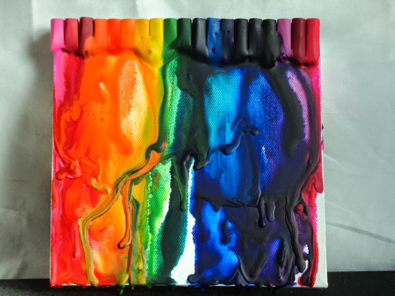
You've seen the photos on Pinterest of those melted colorful rainbows dripping down canvas, right? I have wanted to try it for a long time. So I finally did.
Crayon Canvas: I had this 6X6 "canvas" that my sis bought at a garage sale. (It was a black and white abstract thing that I just primed with white gesso.) It had been sitting on my table for at least 6 months so I used it for the experiment. I also had a large box of Crayola crayons (A special Millenium assortment with a bit of everything from neons to metallics.) that needed to be used. I chose a rainbow of colors with a few to transition and broke off an end. I peeled off the label and glued them to the top of the canvas. (No special glue here just white craft glue.)
After the glue had dried, I just used my heat gun to melt the crayons. I tipped the canvas to let it drip. I just love the drips! This was SO MUCH FUN!
I thought maybe just let it drip in little rivers of color but once I got going, I just needed to see the swirls. The best part was that if I didn't like it, I just kept heating it and let it run right off the canvas and added more from the top. The worst part was that there was no way to control where these drips were going and what colors they would end up mingling with. My green got a little friendly with my orange which wasn't what I wanted but hey, it's only an experiment!
So it made me HAPPY! This was so fun and I got a few more ideas about how to use it. I'd like to do some dots of wax, melt the wax enough that I can sketch in it or write a few words.
I have NO IDEA what I'm going to do with this canvas or how to complete it. It seems unfinished to me. But I really don't care. It was just plain fun!
Hope you try something new soon!
-Wy
"If it makes you happy, it can't be that bad." -Sheryl Crow
Wednesday, March 26, 2014
The Pocket Box
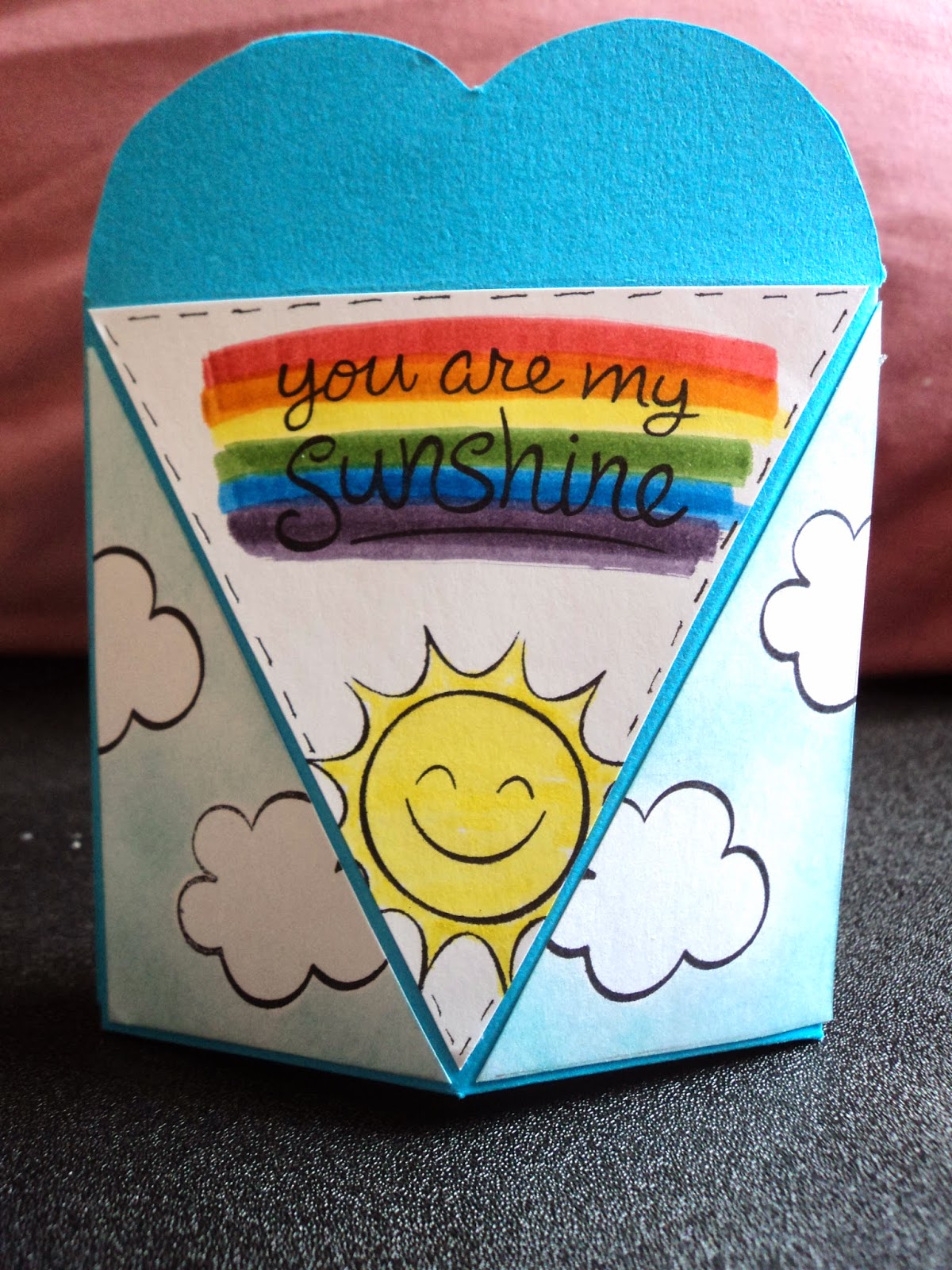
Pocket of Sunshine: Giving credit where credit is due: This little pocket favor "box" is from a template designed by the Hot off the Press DT and can be found (as a free download) among their webisodes at paperwishes.com. Wanna see it? Go HERE! Want the download? Go HERE and see page 6 and 7 of the file!
It was super easy. I printed off the template to a sheet of white cardstock in order to reuse it, rather than printing the pattern directly onto my turquoise cardstock. (Now that I have the template cut out, I only have to trace around it and score it onto whatever I want to make the box.) There's even patterns for the triangles so you don't have to measure them! Be sure to print out those, too!
I placed the template over my turquoise cardstock and traced it. Then, I cut it out and scored it according to the template with a bone folder and a ruler. I used Scor-Tape to assemble the "box". Scor-Tape has a great hold and you need to use an adhesive that has great STICK so the flaps at the bottom won't give way when you add something inside! The Scor-Tape 1/8th inch was perfect for the job.
I cut the triangles out of white cardstock. I used the set "Sunny Skies" from Lawn Fawn to embellish the triangles. I stamped out my clouds first then masked them. I applied Broken China Distress Ink over the background with a sponge. I wasn't looking for total coverage just a hazy sky. The clouds pop out once the masks are removed. I stamped the sun and the sentiment from the same set. The sentiment is highlighted with the rainbow created by Distress Markers.
I decided to leave the embellishment there. But you can adapt this template to suit almost any occasion. I'm sure my niece would love to find these decorated with snowflakes and Olaf the snowman from the movie Frozen. They would make great Easter decoration/favor boxes, too, as the middle triangle could be made into a carrot or Easter bunny head!
The box just pops open at the top and really need no closure as it stays shut of it's own accord. That I like! These are just perfect to hold a little tea bag, chocolate truffle, coins, a gift card, small crafty gifts or jewelry! And no one says you have to add those triangles on...you could just decorate it then assemble. :)
Whatever your desire, try it out. ITS FUN!!!!
--Wy
"Raindrops on roses and whiskers on kittens..." --A Few of My Favorite Things, Sound of Music
| Front |
It was super easy. I printed off the template to a sheet of white cardstock in order to reuse it, rather than printing the pattern directly onto my turquoise cardstock. (Now that I have the template cut out, I only have to trace around it and score it onto whatever I want to make the box.) There's even patterns for the triangles so you don't have to measure them! Be sure to print out those, too!
| Back |
I placed the template over my turquoise cardstock and traced it. Then, I cut it out and scored it according to the template with a bone folder and a ruler. I used Scor-Tape to assemble the "box". Scor-Tape has a great hold and you need to use an adhesive that has great STICK so the flaps at the bottom won't give way when you add something inside! The Scor-Tape 1/8th inch was perfect for the job.
I cut the triangles out of white cardstock. I used the set "Sunny Skies" from Lawn Fawn to embellish the triangles. I stamped out my clouds first then masked them. I applied Broken China Distress Ink over the background with a sponge. I wasn't looking for total coverage just a hazy sky. The clouds pop out once the masks are removed. I stamped the sun and the sentiment from the same set. The sentiment is highlighted with the rainbow created by Distress Markers.
I decided to leave the embellishment there. But you can adapt this template to suit almost any occasion. I'm sure my niece would love to find these decorated with snowflakes and Olaf the snowman from the movie Frozen. They would make great Easter decoration/favor boxes, too, as the middle triangle could be made into a carrot or Easter bunny head!
The box just pops open at the top and really need no closure as it stays shut of it's own accord. That I like! These are just perfect to hold a little tea bag, chocolate truffle, coins, a gift card, small crafty gifts or jewelry! And no one says you have to add those triangles on...you could just decorate it then assemble. :)
Whatever your desire, try it out. ITS FUN!!!!
--Wy
"Raindrops on roses and whiskers on kittens..." --A Few of My Favorite Things, Sound of Music
Monday, May 12, 2008
Alcohol Inks
When I make LTCs, I have a secret weapon. If I feel the need for a cool background, I use Ranger Alcohol Inks and I always get someone who asks, "how did you do that?". So I decided to try and write a little explanation as to how this product works and my experiments with it.
First of all, alcohol inks are a specific product made by Ranger, the makers of Tim Holtz products, Distress Inks, and Adirondack Ink pads. Alcohol inks come in a small bottle and look like a stamp pad refill inker. However, these little gems are much different. These inks are intended to be used on "glossy" surfaces, ie. non-porous surfaces. These are used like a paint/wood stain. You can use them on glossy paper, dominoes, metal tins, the plastic "ghost" images, even buttons. Alcohol inks come in a variety of colors as well as several "metallic mixatives" that allow a bit of a sparkle or shine into the finished project. These inks are generally found in packs of three bottles but some places do carry individual colors. (like this site, http://www.articusstudiodesign.com/id133.html) I found that purchasing a 3 pack was the best way to start since then I had different colors with which to experiment. But then I added on with mostly individual colors and a metallic mixative to see how those worked and what made them so special.
If you read any idea books or articles by Ranger, they have a whole line of stuff to use with these inks. They have a special applicator and felt squares. They recommend the use of their special craft mat (to which nothing sticks). But I didn't want to invest in all this stuff if I didn't like the ink or it was too much of a hassle to use. I like simple and quick techniques. I hate waiting around for stuff to dry! Man oh Man, did this stuff fit the bill!
So don't buy all the fancy crap from Ranger. All you need is a couple alcohol inks (whatever colors! I started with the Browns to get a distressed, worn look), blending solution, some cotton balls and your ready to go. The blending solution doesn't have to be used but it allows the ink to remain wetter for longer so you can smear it over large portions of your project before it dries. You will definitely need it when you use the metallic mixatives.
Starter Technique:
So here's how I started. I had my glossy cardstock all cut into the standard LTC/ATC size. I applied several drops of the alcohol ink onto a cotton ball and swiped it over the card. In seconds, the ink was dry and my card was now "stained" with the ink color. After drying, I applied a different color of ink (another shade of brown) and it layered over it but not in a way I liked. I discovered that by dropping both shades onto the cotton ball then swiping it gave me a much more dimensional effect and the colors seemed to stay more "separate". I then, experimented with different swirls, swipes, and brush strokes with the cotton ball. Each gave a different look. It was super fun and I liked the look of it but in the end, I felt that I could have done the same type of thing with watercolor or acrylic paint. I was still trying to figure out why these inks were different than paints or directly inking from a stamp pad!
Moving On:
So then I tried to play with the blending solution. I had mostly bought the stuff because it said on the label that it could be used to clean up after the alcohol ink...it would take it off your hands. But then, I realized that it should be used on the surface first. I think someone on the AQ boards mentioned it first then I saw it in an idea book on how to get started with the inks.
So I applied a generous amount of blending solution to the glossy card and made sure it covered the card by moving it into the corners with my finger. Then, I dropped the alcohol ink into it. I got big raindrop type circles of color. I tilted the card to move the ink around and I got watery streaks of color. I waited for it to dry.
Then, I tried to apply a second color. I had read that you should let the inks dry before applying a second or third color or the colors would muddy. So I did that and I didn't like the look. I was probably doing something wrong but I just didn't like the way the blending solution washed out the first ink and then the second ink looked so vibrant. So I broke the "rule".
I applied blending solution to my card then dropped one color of ink then another color of ink. I tilted the card around and swirled the colors. I tried not to get too many overlaps because the color did just run together. But I liked this effect better than the other way. My colors formed a watery line between them and when it dried the effect stayed. So the background looked like it was melting somewhat...it had a very distinctive "water" look or stained look. So I decided that this blending solution was much more than a simple cleaner!
Metallics:
Now that I was using the blending solution, the metallic mixative that I had purchased made more sense. I had invested in the pearl and am so glad I did. It gave my paper a steel look. In other words, it looked like my LTC had been cut out of tin then inked with color. The pearl lended the metallic look without compromising the color of the ink.
I applied blending solution to the card and smeared it around to get it to all the corners. While wet, I dropped a color of ink then some of the Pearl Metallic Mixative. Swirled around, the mixative practically disappeared into the colored ink and left it looking glittery. When dried, the sheen was impressive. It worked just as well with several colors!
I haven't yet experimented with the gold and silver that I have but they work they same way. I assumed, they will stand out a bit more with bits of gold and silver rather than the simple sheen of the pearl.
Experiments:
Do your own experiments with these inks. They are so fun! And so quick to dry that you can get those projects done in a flash. But here's a couple experiments that had good results for me so far.
Blue/Green: The denim blue and bottle green make a wonderfully watery, submerged effect. You can use the pearl metallic to make it a bit more grand but these two colors are great together. Swirl to your heart's content. (Great look for my Thanks LTC.)
Pearl/Pitch Black: I never thought I'd have a use for the Pitch Black alcohol ink. I mean, who wants stuff stained black? But when you add the Pearl metallic, you get a wonderful night sky look. It's the color of that hot KITT car on Knight Rider without so much black...it's hard to describe. When you throw in a third color like Eggplant or Denim Blue, you've got twilight and Meteor Shower night skies! You'll love this combination!(Used this for tags in my altered book, A is for Astronomy.)
Cranberry/Terra Cotta: You may think of Terra Cotta as a brown but in the alcohol ink, it is much more of a warm orange. It's not extravagant like a pumpkin but a nice warm friendly orange. When you swirl this with Cranberry, you get the flame-colored background that is perfect for fire, volcanoes, and explosions. It's a burst of color but not bright or loud. Even try adding a bit of Ginger, for that yellowy look. It works well without the metallic mixes but I can't wait to try it with a bit of gold! (I used this look on some of the Deadly Nightshade LTCs!)
Layered swirls: Without using the blending solution, apply Pitch black to a cotton ball and apply it to the top half of an LTC. Twist the cotton ball as you move it over the card making little swirls. Let it dry. Then, below the black apply Eggplant. Don't overlap the colors; just make uneven bands of swirls. Let it dry. Then, add Denim at the very bottom. It gives the background of space and it's what I used on my first LTC Music of the Spheres.
Wood stain: If you use either Ginger or Latte with the darker, what's it called, you can get the faux look of wood. Just apply a few drops of the lighter color to a cotton ball and apply to the LTC using long swipes. Try to make long stripes of color. You can overlap the same color and get a darker shade where they touch. After this dries, apply the darker color in a similar manner but don't cover the card. Just make a narrow band to offset where the background ink has overlapped. It gives a nice illusion of wood stain.
You can dream up your own combinations and I have plenty that I have yet to try.
I hope this helps anyone who was wondering about those backgrounds on my LTCs and gives you some info on where to start.
First of all, alcohol inks are a specific product made by Ranger, the makers of Tim Holtz products, Distress Inks, and Adirondack Ink pads. Alcohol inks come in a small bottle and look like a stamp pad refill inker. However, these little gems are much different. These inks are intended to be used on "glossy" surfaces, ie. non-porous surfaces. These are used like a paint/wood stain. You can use them on glossy paper, dominoes, metal tins, the plastic "ghost" images, even buttons. Alcohol inks come in a variety of colors as well as several "metallic mixatives" that allow a bit of a sparkle or shine into the finished project. These inks are generally found in packs of three bottles but some places do carry individual colors. (like this site, http://www.articusstudiodesign.com/id133.html) I found that purchasing a 3 pack was the best way to start since then I had different colors with which to experiment. But then I added on with mostly individual colors and a metallic mixative to see how those worked and what made them so special.
If you read any idea books or articles by Ranger, they have a whole line of stuff to use with these inks. They have a special applicator and felt squares. They recommend the use of their special craft mat (to which nothing sticks). But I didn't want to invest in all this stuff if I didn't like the ink or it was too much of a hassle to use. I like simple and quick techniques. I hate waiting around for stuff to dry! Man oh Man, did this stuff fit the bill!
So don't buy all the fancy crap from Ranger. All you need is a couple alcohol inks (whatever colors! I started with the Browns to get a distressed, worn look), blending solution, some cotton balls and your ready to go. The blending solution doesn't have to be used but it allows the ink to remain wetter for longer so you can smear it over large portions of your project before it dries. You will definitely need it when you use the metallic mixatives.
Starter Technique:
So here's how I started. I had my glossy cardstock all cut into the standard LTC/ATC size. I applied several drops of the alcohol ink onto a cotton ball and swiped it over the card. In seconds, the ink was dry and my card was now "stained" with the ink color. After drying, I applied a different color of ink (another shade of brown) and it layered over it but not in a way I liked. I discovered that by dropping both shades onto the cotton ball then swiping it gave me a much more dimensional effect and the colors seemed to stay more "separate". I then, experimented with different swirls, swipes, and brush strokes with the cotton ball. Each gave a different look. It was super fun and I liked the look of it but in the end, I felt that I could have done the same type of thing with watercolor or acrylic paint. I was still trying to figure out why these inks were different than paints or directly inking from a stamp pad!
Moving On:
So then I tried to play with the blending solution. I had mostly bought the stuff because it said on the label that it could be used to clean up after the alcohol ink...it would take it off your hands. But then, I realized that it should be used on the surface first. I think someone on the AQ boards mentioned it first then I saw it in an idea book on how to get started with the inks.
So I applied a generous amount of blending solution to the glossy card and made sure it covered the card by moving it into the corners with my finger. Then, I dropped the alcohol ink into it. I got big raindrop type circles of color. I tilted the card to move the ink around and I got watery streaks of color. I waited for it to dry.
Then, I tried to apply a second color. I had read that you should let the inks dry before applying a second or third color or the colors would muddy. So I did that and I didn't like the look. I was probably doing something wrong but I just didn't like the way the blending solution washed out the first ink and then the second ink looked so vibrant. So I broke the "rule".
I applied blending solution to my card then dropped one color of ink then another color of ink. I tilted the card around and swirled the colors. I tried not to get too many overlaps because the color did just run together. But I liked this effect better than the other way. My colors formed a watery line between them and when it dried the effect stayed. So the background looked like it was melting somewhat...it had a very distinctive "water" look or stained look. So I decided that this blending solution was much more than a simple cleaner!
Metallics:
Now that I was using the blending solution, the metallic mixative that I had purchased made more sense. I had invested in the pearl and am so glad I did. It gave my paper a steel look. In other words, it looked like my LTC had been cut out of tin then inked with color. The pearl lended the metallic look without compromising the color of the ink.
I applied blending solution to the card and smeared it around to get it to all the corners. While wet, I dropped a color of ink then some of the Pearl Metallic Mixative. Swirled around, the mixative practically disappeared into the colored ink and left it looking glittery. When dried, the sheen was impressive. It worked just as well with several colors!
I haven't yet experimented with the gold and silver that I have but they work they same way. I assumed, they will stand out a bit more with bits of gold and silver rather than the simple sheen of the pearl.
Experiments:
Do your own experiments with these inks. They are so fun! And so quick to dry that you can get those projects done in a flash. But here's a couple experiments that had good results for me so far.
Blue/Green: The denim blue and bottle green make a wonderfully watery, submerged effect. You can use the pearl metallic to make it a bit more grand but these two colors are great together. Swirl to your heart's content. (Great look for my Thanks LTC.)
Pearl/Pitch Black: I never thought I'd have a use for the Pitch Black alcohol ink. I mean, who wants stuff stained black? But when you add the Pearl metallic, you get a wonderful night sky look. It's the color of that hot KITT car on Knight Rider without so much black...it's hard to describe. When you throw in a third color like Eggplant or Denim Blue, you've got twilight and Meteor Shower night skies! You'll love this combination!(Used this for tags in my altered book, A is for Astronomy.)
Cranberry/Terra Cotta: You may think of Terra Cotta as a brown but in the alcohol ink, it is much more of a warm orange. It's not extravagant like a pumpkin but a nice warm friendly orange. When you swirl this with Cranberry, you get the flame-colored background that is perfect for fire, volcanoes, and explosions. It's a burst of color but not bright or loud. Even try adding a bit of Ginger, for that yellowy look. It works well without the metallic mixes but I can't wait to try it with a bit of gold! (I used this look on some of the Deadly Nightshade LTCs!)
Layered swirls: Without using the blending solution, apply Pitch black to a cotton ball and apply it to the top half of an LTC. Twist the cotton ball as you move it over the card making little swirls. Let it dry. Then, below the black apply Eggplant. Don't overlap the colors; just make uneven bands of swirls. Let it dry. Then, add Denim at the very bottom. It gives the background of space and it's what I used on my first LTC Music of the Spheres.
Wood stain: If you use either Ginger or Latte with the darker, what's it called, you can get the faux look of wood. Just apply a few drops of the lighter color to a cotton ball and apply to the LTC using long swipes. Try to make long stripes of color. You can overlap the same color and get a darker shade where they touch. After this dries, apply the darker color in a similar manner but don't cover the card. Just make a narrow band to offset where the background ink has overlapped. It gives a nice illusion of wood stain.
You can dream up your own combinations and I have plenty that I have yet to try.
I hope this helps anyone who was wondering about those backgrounds on my LTCs and gives you some info on where to start.
Subscribe to:
Posts (Atom)
Featured Post
The Chocolate Game
Let's talk about something sweeter than my other blog posts of late. Let's talk chocolate. But no guarantees that anything I want t...