Showing posts with label alcohol ink. Show all posts

Thursday, May 31, 2018

Throwback Thursday: Feb. 18, 2014

Here's the old post: Feb. 18, 2014

What is so intriguing about this old post is that I have absolutely no idea where these altered cards ended up. I'm not sure if I still have them, if I used them on a project, if they were given away, if they were trashed...


I'm not really sure why I stopped making these cards. Maybe I hit a block and couldn't come up with more ideas. Maybe I was stuck with what I'd do with them. (Not that practicality has ever stopped me.) It is certainly a great way to use up little bits and pieces.

The odd thing about selecting this post is that I was just playing with alcohol inks yesterday. I had bought a few of the new colors from Ranger and decided to swatch out my collection. I tried them out using a straw, canned air, and two kinds of Yupo paper. I made...nothing. I was just playing around with them. I finally just tried some techniques I have seen to see what results I can get. Some were good, some were ugly. But the point is that I played. This playing has sparked a new interest and perhaps enough motivation to use up the inks I have. (or at least use enough that I don't feel like I've wasted money on supplies I'll never use) I'm fairly certain that I won't be investing in alcohol inks any more.

So this Throwback Thursday has reminded me to get back to making altered playing cards and to use up my alcohol ink stash. Not bad for a play date.

-Wy

Monday, July 18, 2016

Lost Coast Designs Challenge: ATCs

I wanted to practice with Alcohol Inks for Creative Chemistry 102 (from Online Card Classes.com) so I decided to pull out my Lost Coast Stamps to see how I could turn some backgrounds into finished cards. Since Lost Coast is having a Challenge with ATCs, I figured if they turned out pretty good, I'd have a challenge to cross off my list, too!
You can find the Challenge over at the Lost Coast Portal to Creativity HERE. (Psst, they just released some new stamps...BIRDS...oh my!)


I like these stamps because I can stamp them in a single color and they look fantastic. Make background, stamp, done! It's a great way to start a creative warm-up.

So here's what I made:
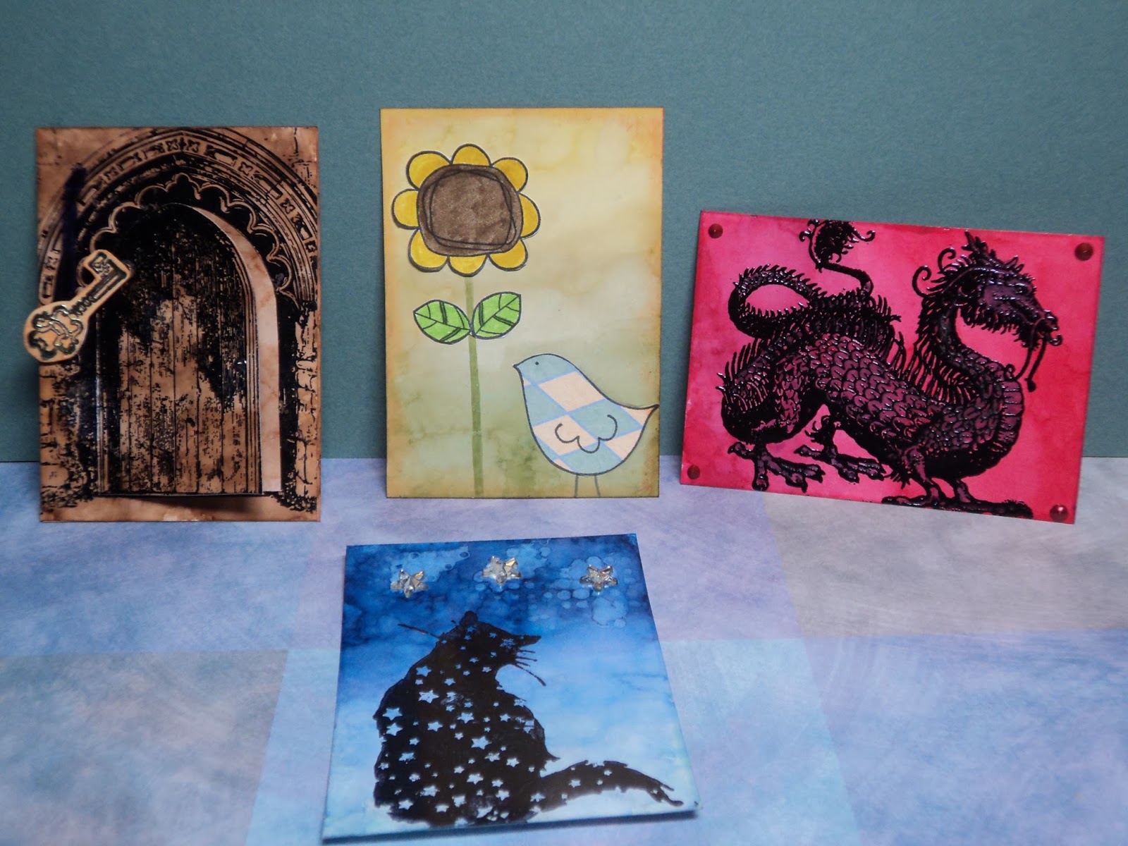
For this post, I'm focusing on the two on the ends as they show off the stamps best.

Dragon on Red:  I'm usually stumped with how to use this stamp but I just love dragons and had to own it. I LOVE the detail in this stamp and am usually hesitant to emboss it because some powders make a mess of fine detail. But I was so amazed with how well it worked...the dragon is clear and crisp...and embossed. I stamped it in Versamark over an alcohol ink background. (The colors are from Adirondack Alcohol ink; Watermelon, Red Pepper and Cranberry. I consider this a failed attempt at an ombre look. My Watermelon and Red Pepper were practically the same color so the light to dark effect was lost.) I used an embossing powder from Lindy's Stamp Gang: Midnight Obsidian Violet. If you haven't tried these powders...get them. They are all fine powders, no clumps or chunks, and they melt quickly with a heat gun. This powder, while basically black, has a lovely hint of purple when lit just right. To play that up, I colored the dragon with Distress markers, Seedless Preserves and Dusty Concord. Just touches of Liquid Pearls in the corners to finish it off. (This one's a keeper!)
Door to True Love:  The door stamp is another favorite of mine but unlike the dragon, I can always think of a way to use it. The moment I made my brown alcohol inked cards, I knew I wanted the door. I didn't emboss, just stamped with Jet Black Archival (Ranger). It's my go-to for stamping over alcohol ink. (I used to use only Stazon but got better results with Archival after learning that it stuck to glossy cardstock.) I wanted the door to open so I cut it with a craft knife and folded it back. I punched a small hole in the top to add the ribbon and key. (Stamp also by Lost Coast Designs.)
The key is embossed with Lindy's Stamp Gang powder, too. (Starbright Gold Green). I attached this top card to a bottom card and added my interior to the door.
I just wanted a pop of color and chose pink. I stamped the hearts on a separate piece of cardstock and cut them out. This card reminds me of the movie, The Princess Bride.

Remember the Challenge!
-Wy

Creative Chemistry: Week 7: Alcohol Inks

I will not lie. I find alcohol inks hard to work with. It shouldn't seem difficult; it never looks difficult. Yet, I admit that I only use them for a couple different things and don't like the result I get from most other techniques.

The challenge for Week 7 in Creative Chemistry 102 is to use alcohol inks. So I stuck to the techniques I really like: Ombre and Faded Layers.

Here's what I made:


These are all the ATCs I made with alcohol ink. Two were failed attempts and two gave me satisfying results on the techniques. (Another post will focus on the "failed" attempts.)
Here's the two that worked:
Little Bird and Sunflower:   This card features the Ombre look. I used Lemonade, Willow, and Pesto for colors. I added paper-pieced stamp images (Unity Stamps) and distressed the edge with Rusty Hinge Distress ink. 

Starry Cat:  A favorite stamp of mine from Lost Coast Designs is this cat. The ATC features the Ombre background done with Cloudy Sky, Stone-Washed, and Sail Boat Blue...then Denim. Here's what happened...it would seem my Stone-Washed isn't as bright as I thought it was. It had less of a true-blue and more of a indigo...blue-violet thing going on. So I went over the Sail Boat Blue with Denim...effectively replacing the old color with something more violet. (I'm still working with very old Adirondack Alcohol ink. Though the color isn't supposed to "change", both of these are no longer the color of the original swatch I created...years ago. I've also noticed a color switch in some of the reds, particularly Watermelon. With Ranger now releasing new colors into the line, I may opt in to buying fresh stock. For awhile, it seemed like they may discontinue the stuff as it was neglected, in my opinion, for several years.) 
I also tried the Faded Layers technique here and it worked marginally well. It takes some practice to get this one right. I had way too much blending solution on my sponge so ended up with blobs more than a distinct pattern. But no complaints, it still looks cool.

Like tags, I usually end up using ATCs for card fronts. I may, however, save some of my better ones for Pocket Letters as they are the same size.
One more thing to add to my project list!
Thanks for popping in.
--Wy
"Just a spoonful of sugar makes the medicine go down." --Mary Poppins

Tuesday, September 08, 2015

Chibitronics: The Glass Bowl

I'm not quite sure what to call this home decor creation. I REALLY like it. WARNING: This is a lengthy post with directions as to how I made this...or you can just look at the photos by scrolling down.  The basics: Alter/color clear glass bowl; add circuit and battery inside; glue to clear candlestick holder; add glass pebbles inside; tie ribbons around the top lip; done. Here's what I made:


This wasn't too difficult to make so long as you have little hands! :)  The lights and the copper tape are toward the bottom of the bowl on the inside and there's just no good tool to get it in there except your hands. The LED stickers and copper tape are from Chibitronics. Love these stickers. There's no cord to plug in which means this decorative bowl can sit ANYWHERE. And no candle or open flame to worry about.

This piece is actually two separate pieces glued together and decorated. I got both of them at a thrift store and garage sale for about a buck each. The bowl was just clear glass and the "pedestal" is actually a candle holder.
So here's how I started:
1. The Glass Bowl:  I learned a technique for frosting glass and adding crackle texture. I used it on the bowl. I covered the bowl first with Glue-N-Seal from Ranger. (This is like a decoupage medium. I have heard you can do this with other things like ModPodge but I haven't tried it.) I put on a thick coat but not so thick that it would run or clump while it dried. It's pretty thick stuff and clings very well. Once that coat was dry, (I let it dry overnight.) I added Distress Crackle Paste (Rock Candy) which is a clear crackle medium. To get good "cracks", apply a coat like you did with the Glue-N-Seal. This stuff is a bit thinner and will tend to pool so check on the bowl periodically to turn it over. I let it sit on it's bottom then shifted it to sit on the top and kept flipping it as it dried. When it dries clear, you'll see the crackled pattern and notice that the glass doesn't look as "frosted" as it did after you applied the glue. 
NOTE: You may notice at the lip of the bowl the glue seemed to start to peel away. That's due to the crackling medium. It is still attached but if you scape at it, I'm sure it will come off. So this is a "handle with care" piece! (I wasn't too concerned as I planned to cover it up anyway.)

2. Add Color:  After the bowl was completely dry, I added alcohol inks to color it. (I used Adirondack alcohol inks from Ranger.) I went with a few blues to give it an ombre look. You need to add the ink to the outside because it won't stick to the glass on the inside. It only sticks to the mediums that you've applied.
3. Add circuit:  To make the bowl light up, you need to add a battery, copper tape, and LED stickers to make a circuit. (All can be found as part of the Starter Kit from Chibitronics.)

The photo above shows the completed circuit inside the bowl. I created a battery "pack" from a folded piece of cardstock. I glued a strong magnet to the underside so it will hold the battery in just the right spot. I just added the tape from that to the sides of the bowl. I added my white light stickers and then the battery to test it out. When the flap is down, the lights come on!

4. Attach bowl to candle stick holder.  As I stated, the pedestal is just a clear glass candle stick holder. After I was sure the circuit worked, I attached the bowl to the top of the candle holder with E6000 glue. I applied it generously and let it cure overnight. I had to keep the bowl stable on it's open top and add some weight on the whole thing to be sure of a good bond. (I just used an acrylic stamping block to balance a bag of glass pebbles on it. So the bowl was upside down with the glue holding the candle holder, then I put a large acrylic block on the bottom of the candle stick. Then, I balanced a baggie of glass pebbles on the block for weight.)
5. Add some weight.  In order to hide the battery pack and to keep it lit, the bowl should be filled with some glass pebbles. You can find the clear ones in just about any dollar store or in a craft store with the fake flowers. I got mine in a thrift store for under a buck.

You may want to add the pebbles all together in a bag so it's easier to get them out to add/change the battery. So long as the pebbles are in there holding down the top of the battery pack, the lights will be on. It also helps to protect the LED stickers from getting dislodged or broken. The pebbles can be any color but the clear ones reflect the lights very well!

6. Add some ribbon.  As a finishing touch, I glued down several different ribbons around the top edge of the bowl. I made one long enough to tie into a bow.

When lit, you can see the light reflect off the pebbles and the color of the ink. You can see some of the copper tape and the back of the lights as small yellow dots. I love how it looks all lit up in the evening.


So check out your local thrift store for some clear glass to alter and color. You can match your own home decor and then make it light up!

Have a great week!
-Wy

Tuesday, March 11, 2014

QKR Stampede: #78 Green Color Challenge

My inspiration for this card was just the fact that I wanted to use up my green ombre panel with something that WASN'T for St. Patrick's Day.

This is for the Green Color challenge over at QKR Stampede. I LOVE color challenges!


Owl on branch:  The background on the owl is much more leafy green than the photo. For some reason my computer wants it to be very yellowy...
Owl stamp by Studio G and branch by Hot off the Press (Wildflowers set). The owl was stamped on gray striped paper then adhered to the alcohol inked background.
I debated as to whether to add a sentiment but decided just to leave it alone.

Doing lots of challenge cards this week as I had a mini vacation from work! I'm trying to pin them to my board on Pinterest as well. (You can follow my board there: My Cards.)

--Wy
"Life is the hyphen between matter and spirit." --Augustus & Julius Hare

Sunday, March 09, 2014

Red Carpet Studio Challenge #65: The Lucky Ones

New Challenge at Red Carpet Studios! The movie is "The Lucky Ones" and the challenge is to use green in your card/layout/project! It's an ode to St. Patrick's Day, the wearing of the green, or anything that makes you feel LUCKY. If you want to see all the details of the Challenge and how to link up your project; go to Red Carpet Studios.

Our sponsor for this challenge is:

 
You can be selected randomly to win an awesome prize from Handmade Harbour. Go HERE to see some of their great digi-stamps! (This is one of my FAVES!)
 
Now on to my card!


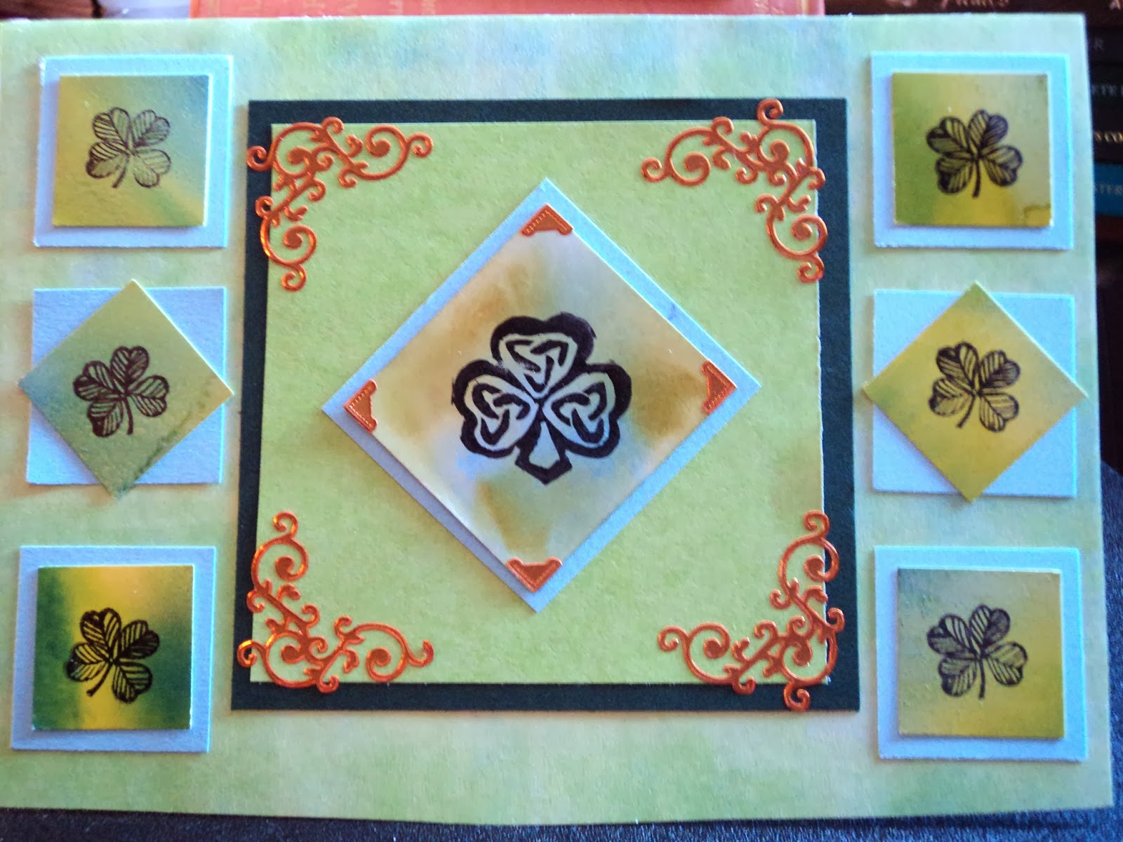
Celtic Knot Shamrock:  My card is about 5" X 6.5" but I trimmed it down just a touch. Once again, I'm cleaning off my craft table so many of the squares were punched from cardstock laying around. I find great satisfaction is using up little pieces of paper probably because it means less waste. I was raised by parents who "know the value of a dollar" so frugality is second nature to me.


The green squares: The green squares on the card were punched from a larger piece of glossy cardstock that I had colored with alcohol ink (Ranger). The small squares around the outside came from a piece that also had a metallic mixative added in to give it some glimmer. (Pearl Metallic mixative) The center, larger "square" had a touch of turquoise so I matted the squares with a shade of cardstock to match. (also scrap sitting on my table)

Copper:  The metallic stickers are from Hot off the Press, Dazzle stickers and I just like the way the flourishes add a little detail to the corners.

Stamps:  The center stamp was hand-carved by me several years ago when I needed something Celtic. The shape of the shamrock with the knot incorporated into it was just what I was looking for so I carved it. It's probably about 1.5" wide. The smaller 4-leaf clovers are from a set from Crafty Secrets.


I hope you like the card and it inspires you to Go Green. Whatever you may make, be sure to share it over at Red Carpet Studios so I can take a peek at it! I love to see what other crafters and artists are doing!

--Wy
"May ya be 'alf an hour in heaven before the Devil knows yer dead."--Will Millar of The Irish Rovers

Monday, February 24, 2014

Lawnscaping Challenge #76: Dust 'em Off!

Of the 4 sets of Lawn Fawn stamps that I currently own, there is one that always gets shoved to the back of the line. My Sunny Skies set just hasn't seen a whole lotta love recently.


But the Lawnscaping Challenge is about taking out what hasn't been used in awhile and making something with it. So here's what I did and I'm now stoked to make more with this wonderfully versatile set.


Kite Card:  this simple card is just a happy little pick-me-up for a friend. The kite was stamped onto scrap green patterned paper and cut out. The background blue is a glossy cardstock covered with alcohol inks to produce an ombre effect.

Quick easy, sweet and simple. Lawn Fawn stamps are just perfect for clean and simple cards!
--Wy
"With tuppence for paper and strings, you can have your own set of wings. With your feet on the ground, you're a bird in flight. With your fist holding tight to the string of your kite."
     --"Let's Go Fly a Kite" from Mary Poppins

Sunday, February 23, 2014

ABC Challenge: "F" is for Flowers

A quickie post as I start to move a bunch of cards I've done in the last week to my stash.
This card is for the challenge over at ABC Challenges. The theme is Flowers and I love the many flower stamps that I own. I didn't start out making a card for this challenge but when my little scrap papers came together, I knew a flower had to be the focal point.


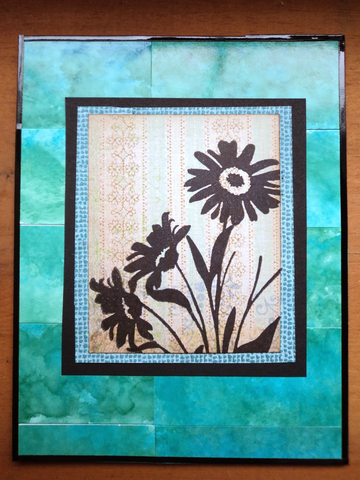
Flower Silhouette: This card is A2 sized and it's background is all from my "scraps" pile. I did some Tarot sized cards on a background of alcohol ink and I just couldn't throw away my leftover pieces.(The color ink I used was a combination of Stream and Bottle both Adirondack Alcohol Ink by Ranger.) Once attached, they resembled marbled tiles and I loved that look. So I just framed out the card with black thin line Dazzles (Hot off the Press) and added my focal element.


The patterned papers are also scraps from my pile and the stamped image is from the Wildflowers stamp set also by Hot off the Press (paperwishes.com). I wanted the flower to be very simple and I'm highly attracted to silhouettes of flowers.

Since I've been doing so many cards that have involved my "scraps" pile, I'll fill you in on how I start and finish a card. So if you'd like to keep reading...please do...otherwise have a great week!


My scraps:
As I work on cards, paper projects, gifts, or altered things, I inevitably end up with scraps of paper that I just can't throw away.At the time, they are organized by size. Scraps larger than an A2 card will go into my file folder. Smaller scraps go into the "scrap pile" in case I can use it up in my next projects.  I always seem to keep little squares and rectangles that would make good mats for stamped images or can be arranged easily together. I also keep long strips for no better reason than I like lines. This scrap pile sits on the side of my table until it reaches the point where it is in my way. That's when I use it. That's when I organize it.

I sort the scrap pile by color. For patterned papers with many colors, I see if it matches any colors I've already sorted and it goes in with that pile. For example, on this card, the patterned paper was double-sided with pink roses on the other side...since this side matched my teals so well, I put it in this stack rather than with the pinks. (I just decided that I liked this side better and I had other colors to match it.) Once sorted, I pick out a pile and spread it out to see what I've got and how it can be arranged into a background. If I have any bits that might make up a small collage, I pull them out to see how they'd fit on the front of a card. Mostly, I try to use up the scraps as a patchwork background, then collage elements or lines, then I incorporate my stamps or other focal elements to make a completed card. If I have lots of little bits but nothing that would fill the background of a card, thats when I pull out my file folder and find larger pieces to match the color scheme I have.

I find it very relaxing. If I screw something up, it's no big deal because they were just scraps to begin with. And it's kind of like trying to put a puzzle together by figuring out just where the most little pieces will fit. My cards done this way tend to be monochromatic unless I have a patterned paper that ties several of my color piles together. Once I get down to just a few bits of each color, though, I start mixing them up. I don't usually end up with too many of those.

When does a bit of paper hit the recycling bin? When I'm tired of looking at it and it's just too small to go into the file folder.

So this card is basically the entirety of my Teal scraps. I just added in the black to make it pop and to accent the silhouette I knew I was going to use.

I've got lots of challenges this week that I hope to complete so many more posts to come!
Thanks for reading!
--Wy
"Success is the ability to go from one failure to another with no loss of enthusiasm."
           --Winston Churchill

Saturday, January 18, 2014

Goldfish Dream: Canvas


This 8 X 10 canvas started with the kernel of an idea I had been toying with for awhile; using aluminum foil colored with alcohol ink for a background. That was my start.

I tested a few scraps of foil for how the alcohol ink would look, stick, and what would rub it off. I experimented with how to attach it to the canvas and if Mod Podge (my "glue" of choice) would affect the surface if I was extra messy with it. Did I like the foil more crumpled or more flat?

After some fun, I made a few decisions including the main focal elements. I wanted a deep sea view using my favorite jellyfish stamp (from 100 Proof Press ) and I wanted the canvas to be very transparent/metallic. I didn't want to cover much of the colored foil with paper elements or cut-outs as I wanted that look of gazing through water.


So using a blue palette of alcohol inks, I colored the foil and liked the metallic look it retained. But since it was already attached to the canvas, it was impossible to stamp directly on it and get a clear impression. So I decided to stamp on clear acrylic sheets and cut them out. In addition to the jellyfish, I added a school of fish (Lost Coast Designs) and a spore in the left corner. (This was part of another idea that I trashed early on of using the spore as a Sunlight source shining a ray into the depths...scrapped it.)

I attached the stamped images with gel medium. It dried clear and invisibly and I was careful not to use too much as it seemed to affect the alcohol ink beneath it.

The canvas still looked quite plain so I added the middle line of "bubbles" using very old epoxy circles that have been in my stash for way too long. I debated about putting some kind of paper under them, like dictionary, but wanted to stay true to my original idea of a see-through look.

This is where I originally decided the canvas was complete: Deep Dive.


But I didn't like it. It didn't look finished. I tried adding purple fluid acrylic around the edge to frame it out but it didn't help. I kept staring at it wondering what it needed.

It needed a foreground and it would have to be something that stood out. I thought I'd cut out some seaweed to add; stamped images that would be cut from paper then attached. But then I pulled out some embossing powder; and man, did things change!

I'm becoming a big fan of torn paper and I'm using it a lot in my stuff. Since I had wanted to highlight the bubbles with dictionary paper, I decided to tear my seaweed from that. Then, I sprayed it with Dylusions ink, Cut Grass. And here's where I got excited!
I had in my stash from several years ago some of the Moon Glo embossing powders from Lindy's Stamp Gang. My sisters and I bought a few colors after seeing some amazing techniques done with them. Naturally, after we got home, we forgot about them and how to really maximize their usage. I was on the verge of getting rid of them. I decided to give them a whirl on my seaweed to make the paper look glossy and wet.

So glad I did! I used a Starlight Gold/green powder mostly but added in some Desert Moon/ ??  (sorry I forgot the other color in the mixture. Each embossing powder from Lindy's is a two-toned powder!) I inked the whole face of the paper with Versamark ink and sprinkled the powder on. As it melted it curled the edges of the paper, but what a great look for me. The translucent nature of these colors allowed the paper to show from underneath as well as the green ink. And the touch of brown you see in the photo is from the embossing powders. These powders also give a pearlescent sheen to the paper making it reflect similarly to the foil on the background. I LOVE IT!


After adding my seaweed (squeal) with gel medium, I wanted just one more element; something to tie it all together. I added my goldfish. I thought about that movie "Finding Nemo" where the fish in the tank all dream of getting to the ocean. Nothing fancy about him, just cut out, attached, and outlined with a subtle hint of gold gelato.

So now...finally...this canvas is finished. "Goldfish Dream" is a new favorite of mine.
--Wy
"Just keep swimming." --Dori from "Finding Nemo"
Note: After my paper curled up from the embossing, I did manage to uncurl it mostly. The very edges remained curled but that was the look I wanted, very 3-D. I just needed enough of the surface to make contact with the canvas so that it stayed attached.


Friday, November 22, 2013

The Serendipity Canvas: Bling

One important thing I've learned from watching art videos on YouTube is that: if you're not happy with the canvas, just paint over it. This canvas was just that.

This canvas was going to be a neon/fluorescent skull more or less like Day of the Dead but it never started good and went nowhere fast. The neon paints I had were very cheap craft store paints and were too "watered down" to give really good coverage to the canvas, especially the green and I wanted to use lots of that color. I rolled with it and applied several coats to get it where I wanted. It wasn't perfect but most would be covered anyway.

I had a vision of using black acrylic over these bright colors to "frame" the focal of a stencil skull which would also be done in black. I added black acrylic around the edges of the taped down stencil then went to work on the skull. Well...

I intended to simply draw it through the stencil with an Extra Fine Sharpie (oil-based) but the stencil had such small details that even the Extra Fine tip wouldn't fit through the openings! Damn it! So I decided to dab black acrylic through the stencil with a sponge. It still wouldn't work. I either couldn't get it through the openings or it seeped under the stencil leaving a very undefined look which I didn't like.

I didn't even finish half of the stencil when I gave up on it. Stenciling really isn't my thing. I need so much more practice, I guess. (Back to chemistry 102 for some more lessons) So now I'm stuck with a neon colored canvas with a black acrylic outline and a half-stenciled "skull" which mostly looks like a couple black blobs that might be daisies.

Solution: Cover it all with black.
Problem: Now what? I have such a hard time working on black. I LOVE the look of a black background but it takes me forever to figure out what to do with it when it's blank like that, staring at me. For a light canvas, I can simply add color, any color, but a dark canvas requires more thought.
Solution: Try something I had been meaning to do...throw on some aluminum foil and drop alcohol ink to make a background.

I just used some of my favorite colors: wild plum, stream, bottle, and cranberry. I think I put a little lettuce green in there. As I dropped and dripped it, I picked out what I liked about it. The stream and the wild plum looked great with a touch of the bottle. The cranberry and other green...not so much. With blending solution, I fixed what I could. But because the aluminum foil was very crinkled ( I did that for texture) the ink pooled and was hard to remove.

Problem: I had no idea what I was going to do with this mess. While I liked the colors, I didn't like the way they were so haphazard across the canvas. It was very busy and I wasn't sure what to put over it.
Solution: Let it sit.
And sit. And sit.
I finally came up with an idea to make it a Deep Dive canvas. I would use my jellyfish stamp (100ProofPress), stamp it onto clear acetate and attach it to the canvas with clear pop dots so they would almost hover above the canvas.
Problem: After stamping and cutting the jellyfish, I discovered that the images were too indistinct with the pattern of alcohol ink behind them. Even popped up from the canvas, you couldn't see the stamps. Damn it!
Solution: Leave it alone. Let it sit...again. Work on the other canvas and notebook. Work in the art journal.

So here's why this canvas became my Serendipity Canvas. As I was thumbing through my hoard of magazine clippings for a page in my art journal, I found an image that matched the canvas perfectly. The young woman stood tall in a wild plum skirt and a blue top that both held this wonderful metallic sheen. She was fashion, she was material, she was bling.

So I cut her out and set her free. She crowns the canvas with her "accessories". I currently debate whether this canvas is finished yet. I had an idea today to outline the collage elements with white pen and add little jewels.


Perhaps not entirely finished, but it is serendipity.
--Wy
Serendipity means a "happy accident" or "pleasant surprise"; a fortunate mistake. Specifically, the accident of finding something good or useful while not specifically searching for it.

Saturday, October 12, 2013

Creative Chemistry: Finished Cards

So I did manage to finish up a few cards based on stuff I learned in Creative Chemistry 102 with Tim Holtz. You can still take this class at your own pace at http://www.onlinecardclasses.com/
You just have to complete 101 first! Totally worth it!


Chemistry Card:  I knew when I saw the Shattered Glass technique I had to do a few little bottles to see how they'd turn out. I loved them so much I colored them Halloween colors with alcohol ink and put them on my very fitting Chemistry card. (I LOVE this set from Tim!) I tried to smudge the background but apparently I forgot the technique because it didn't work. Not that it matters, it's really just to show off the bottles! They are attached to the card with glue dots as I wasn't sure if I wanted the permanent application of glossy accents. Check out the close up!


Happy Day Card: I managed to use my favorite tag and technique on this card. I took the stamping through stencils technique a bit further by using it to create the reverse background on this card.


I used an ink monoprint of the stencil to create the vines in the background and after it dried, I placed the dry stencil back over it. I lined it up and stamped with blue. The flower accents are fragments stamped on the back and then colored with alcohol ink.


Ombre Thank You:  I used my tag from the first day which had a paint resist on it and a piece of the ombre look I created on day 4 with alcohol ink. I colored most everything with Distress inks.


I had a great time learning new stuff and I still have plenty of techniques yet to try. I'm set for the winter!

Have a great weekend!
--Wy
"I was only killing time and it'll kill you right back." --Meatloaf, "Out of the frying pan"

Friday, October 11, 2013

Creative Chemistry 102: Alcohol Inks

Okay so I skipped a day...so much stuff to learn and not enough materials or time to do it!

So I moved along to my favorite plaything: Alcohol Ink.

Here's my card I made with the Ombre Technique.


The Red piece is the alcohol background. I used Watermelon, Red Pepper, and Cranberry. This technique was pretty straight-forward but you do need an eye for color. Ombre to me is a very subtle shifting of color from light to dark or vice versa. Some of the color families in my stash didn't have all the shades I needed to make a good ombre. Red turned out well (when I decided to eliminate the pink colors) and so did my Green combo. I did a yellow/orange which was okay but my blue was awful. I just didn't have a good "middle" blue...the bright color seemed too bright against my Cloudy Blue light color. So I may need to see the other options available in inks that I don't own to create a good blue.

This card isn't perfect as my stamped image didn't come out well when I stamped it. Then, I made the mistake of trying to touch it up with a Distress Black Soot Marker...oops! The marker has a matte finish against the rest of the glossy background and can be discerned from the original stamped (with Archival ink) image. Oh well, someone in my family will like it anyway! And it's easy enough to replicate.

I played with some monoprinting and faded layers with the alcohol ink as well. I liked Monoprinting  better than I thought I would but I will be more careful of what colors I select and not so much mixative in the blend. Faded layers sort of worked but I didn't have great luck. I did do sort of an alcohol ink reverse monoprint which turned out rather cool. So I will do more with that technique when I find some blending foam!

Have a great weekend!
--Wy
"I have decided that one useless man is called a disgrace; that two are called a Law Firm; and that three or more become a Congress! And by God, I have had THIS Congress...."  1776, John Adams


Sunday, November 25, 2012

Lawn Fawn Challenge (My splurge!)

Front of card: Stormy Skies

Inside of card: Sunny Skies


Whole card with backlight


I have seen many youtube videos from Lawn Fawn and have fallen in love with their cute little stamps! I have been wanting to purchase a set or two and finally last week, I splurged! I saw their blog post about submitting entries for photos to be in their new catalog and have a card displayed at CHA! So I decided to get to work.

The stamp set featured above is Sunny Skies.

Other supplies: Adirondack Alcohol Ink: Cloudy Blue and Stonewashed
Transparency sheet (acetate)
Distress ink pad: Black Soot
Distress Markers: Stormy Sky, Pumice Stone, Mustard Seed, Spiced Marmalade, Faded Jeans, Barn Door, Spun Sugar
Blue twine/thread
white cardstock card (5 X 6 1/2")
StazOn Jet Black
Ranger Archival Ink: Black
scraps of white glossy cardstock
solid blue cardstock
adhesive (I used double stick tape/tape runner.)


So here was my grand idea:
My goal was to have a multi-layer card. The front would be like a window to the inside. But then, I thought, why bother to have a front at all if you can see everything through it? So I decided to cover up the elements by cutting the clouds out of glossy white cardstock rather than stamping them directly onto the acetate. So the front ending up being my Cloudy Sky and the inside was my Sunny Sky!

I cut the oval out of the front. Stained some acetate with alcohol ink and attached it to the inside front of the card. I used a solid blue cardstock to line the inside front over the acetate to hide the edges. Because I started with a white card, I inked the front lightly with Black Soot to get a nice gray color. I stamped the inside of the card with the elements I wanted from the set in Archival Black and water colored them with Distress markers. I colored the words "you are my" in blue then used orange and yellow for "Sunshine". I stamped the clouds in StazOn onto glossy cardstock and colored them with Distress markers. I cut them out and positioned them on the acetate so they would conceal the colored elements on the inside. I attached the clouds to the acetate and tied a blue thread around the bottom front.

I thought the card turned out really well. I intend to try this style of card with the other stamp set I purchased, "Critters Under the Sea". It would make a lovely ocean scene!

Posting more cards from this challenge in subsequent posts.
Hope you enjoyed!
Wy
"All of my blue skies are waltzing to gray." ---song lyric, Susquehanna String Band

Monday, May 12, 2008

Alcohol Inks

When I make LTCs, I have a secret weapon. If I feel the need for a cool background, I use Ranger Alcohol Inks and I always get someone who asks, "how did you do that?". So I decided to try and write a little explanation as to how this product works and my experiments with it.

First of all, alcohol inks are a specific product made by Ranger, the makers of Tim Holtz products, Distress Inks, and Adirondack Ink pads. Alcohol inks come in a small bottle and look like a stamp pad refill inker. However, these little gems are much different. These inks are intended to be used on "glossy" surfaces, ie. non-porous surfaces. These are used like a paint/wood stain. You can use them on glossy paper, dominoes, metal tins, the plastic "ghost" images, even buttons. Alcohol inks come in a variety of colors as well as several "metallic mixatives" that allow a bit of a sparkle or shine into the finished project. These inks are generally found in packs of three bottles but some places do carry individual colors. (like this site, http://www.articusstudiodesign.com/id133.html) I found that purchasing a 3 pack was the best way to start since then I had different colors with which to experiment. But then I added on with mostly individual colors and a metallic mixative to see how those worked and what made them so special.

If you read any idea books or articles by Ranger, they have a whole line of stuff to use with these inks. They have a special applicator and felt squares. They recommend the use of their special craft mat (to which nothing sticks). But I didn't want to invest in all this stuff if I didn't like the ink or it was too much of a hassle to use. I like simple and quick techniques. I hate waiting around for stuff to dry! Man oh Man, did this stuff fit the bill!

So don't buy all the fancy crap from Ranger. All you need is a couple alcohol inks (whatever colors! I started with the Browns to get a distressed, worn look), blending solution, some cotton balls and your ready to go. The blending solution doesn't have to be used but it allows the ink to remain wetter for longer so you can smear it over large portions of your project before it dries. You will definitely need it when you use the metallic mixatives.

Starter Technique:
So here's how I started. I had my glossy cardstock all cut into the standard LTC/ATC size. I applied several drops of the alcohol ink onto a cotton ball and swiped it over the card. In seconds, the ink was dry and my card was now "stained" with the ink color. After drying, I applied a different color of ink (another shade of brown) and it layered over it but not in a way I liked. I discovered that by dropping both shades onto the cotton ball then swiping it gave me a much more dimensional effect and the colors seemed to stay more "separate". I then, experimented with different swirls, swipes, and brush strokes with the cotton ball. Each gave a different look. It was super fun and I liked the look of it but in the end, I felt that I could have done the same type of thing with watercolor or acrylic paint. I was still trying to figure out why these inks were different than paints or directly inking from a stamp pad!

Moving On:
So then I tried to play with the blending solution. I had mostly bought the stuff because it said on the label that it could be used to clean up after the alcohol ink...it would take it off your hands. But then, I realized that it should be used on the surface first. I think someone on the AQ boards mentioned it first then I saw it in an idea book on how to get started with the inks.

So I applied a generous amount of blending solution to the glossy card and made sure it covered the card by moving it into the corners with my finger. Then, I dropped the alcohol ink into it. I got big raindrop type circles of color. I tilted the card to move the ink around and I got watery streaks of color. I waited for it to dry.

Then, I tried to apply a second color. I had read that you should let the inks dry before applying a second or third color or the colors would muddy. So I did that and I didn't like the look. I was probably doing something wrong but I just didn't like the way the blending solution washed out the first ink and then the second ink looked so vibrant. So I broke the "rule".

I applied blending solution to my card then dropped one color of ink then another color of ink. I tilted the card around and swirled the colors. I tried not to get too many overlaps because the color did just run together. But I liked this effect better than the other way. My colors formed a watery line between them and when it dried the effect stayed. So the background looked like it was melting somewhat...it had a very distinctive "water" look or stained look. So I decided that this blending solution was much more than a simple cleaner!

Metallics:
Now that I was using the blending solution, the metallic mixative that I had purchased made more sense. I had invested in the pearl and am so glad I did. It gave my paper a steel look. In other words, it looked like my LTC had been cut out of tin then inked with color. The pearl lended the metallic look without compromising the color of the ink.

I applied blending solution to the card and smeared it around to get it to all the corners. While wet, I dropped a color of ink then some of the Pearl Metallic Mixative. Swirled around, the mixative practically disappeared into the colored ink and left it looking glittery. When dried, the sheen was impressive. It worked just as well with several colors!

I haven't yet experimented with the gold and silver that I have but they work they same way. I assumed, they will stand out a bit more with bits of gold and silver rather than the simple sheen of the pearl.

Experiments:
Do your own experiments with these inks. They are so fun! And so quick to dry that you can get those projects done in a flash. But here's a couple experiments that had good results for me so far.

Blue/Green: The denim blue and bottle green make a wonderfully watery, submerged effect. You can use the pearl metallic to make it a bit more grand but these two colors are great together. Swirl to your heart's content. (Great look for my Thanks LTC.)

Pearl/Pitch Black: I never thought I'd have a use for the Pitch Black alcohol ink. I mean, who wants stuff stained black? But when you add the Pearl metallic, you get a wonderful night sky look. It's the color of that hot KITT car on Knight Rider without so much black...it's hard to describe. When you throw in a third color like Eggplant or Denim Blue, you've got twilight and Meteor Shower night skies! You'll love this combination!(Used this for tags in my altered book, A is for Astronomy.)

Cranberry/Terra Cotta: You may think of Terra Cotta as a brown but in the alcohol ink, it is much more of a warm orange. It's not extravagant like a pumpkin but a nice warm friendly orange. When you swirl this with Cranberry, you get the flame-colored background that is perfect for fire, volcanoes, and explosions. It's a burst of color but not bright or loud. Even try adding a bit of Ginger, for that yellowy look. It works well without the metallic mixes but I can't wait to try it with a bit of gold! (I used this look on some of the Deadly Nightshade LTCs!)

Layered swirls: Without using the blending solution, apply Pitch black to a cotton ball and apply it to the top half of an LTC. Twist the cotton ball as you move it over the card making little swirls. Let it dry. Then, below the black apply Eggplant. Don't overlap the colors; just make uneven bands of swirls. Let it dry. Then, add Denim at the very bottom. It gives the background of space and it's what I used on my first LTC Music of the Spheres.

Wood stain: If you use either Ginger or Latte with the darker, what's it called, you can get the faux look of wood. Just apply a few drops of the lighter color to a cotton ball and apply to the LTC using long swipes. Try to make long stripes of color. You can overlap the same color and get a darker shade where they touch. After this dries, apply the darker color in a similar manner but don't cover the card. Just make a narrow band to offset where the background ink has overlapped. It gives a nice illusion of wood stain.

You can dream up your own combinations and I have plenty that I have yet to try.
I hope this helps anyone who was wondering about those backgrounds on my LTCs and gives you some info on where to start.

Featured Post

The Chocolate Game

 Let's talk about something sweeter than my other blog posts of late. Let's talk chocolate. But no guarantees that anything I want t...