I will not lie. I find alcohol inks hard to work with. It shouldn't seem difficult; it never looks difficult. Yet, I admit that I only use them for a couple different things and don't like the result I get from most other techniques.
The challenge for Week 7 in
Creative Chemistry 102 is to use alcohol inks. So I stuck to the techniques I really like: Ombre and Faded Layers.
Here's what I made:
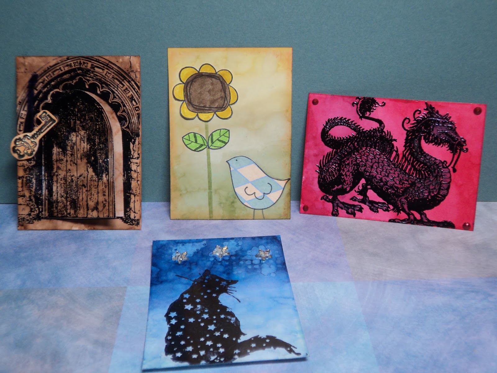
These are all the ATCs I made with alcohol ink. Two were failed attempts and two gave me satisfying results on the techniques.
(Another post will focus on the "failed" attempts.)
Here's the two that worked:
Little Bird and Sunflower: This card features the Ombre look. I used Lemonade, Willow, and Pesto for colors. I added paper-pieced stamp images (Unity Stamps) and distressed the edge with Rusty Hinge Distress ink.
Starry Cat: A favorite stamp of mine from Lost Coast Designs is this cat. The ATC features the Ombre background done with Cloudy Sky, Stone-Washed, and Sail Boat Blue...then Denim. Here's what happened...it would seem my Stone-Washed isn't as bright as I thought it was. It had less of a true-blue and more of a indigo...blue-violet thing going on. So I went over the Sail Boat Blue with Denim...effectively replacing the old color with something more violet.
(I'm still working with very old Adirondack Alcohol ink. Though the color isn't supposed to "change", both of these are no longer the color of the original swatch I created...years ago. I've also noticed a color switch in some of the reds, particularly Watermelon. With Ranger now releasing new colors into the line, I may opt in to buying fresh stock. For awhile, it seemed like they may discontinue the stuff as it was neglected, in my opinion, for several years.)
I also tried the Faded Layers technique here and it worked marginally well. It takes some practice to get this one right. I had way too much blending solution on my sponge so ended up with blobs more than a distinct pattern. But no complaints, it still looks cool.
Like tags, I usually end up using ATCs for card fronts. I may, however, save some of my better ones for Pocket Letters as they are the same size.
One more thing to add to my project list!
Thanks for popping in.
--Wy
"Just a spoonful of sugar makes the medicine go down." --Mary Poppins


No comments:
Post a Comment