Last technique I will be attempting for this course is Texture Paste Resist from Day 3.
I just started a quick spread in my Large Journal to test out the principles. I had both Transparent pastes, in matte and gloss. I own these because I WANT my paste to resist. I don't want my paste to be sucking up color from beneath it or from above it. But I hadn't actually used them with ink, only over collaged paper. So...time to experiment.
I decided to do a side-by-side comparison. The page on the left is the Matte transparent paste and the right side is the Glossy. I applied the matte to a blank page and the glossy to a page that already had some spray on it.
The matte side dried clear and so I decided to put spray ink over it. I knew it would resist the ink but I wasn't sure if the ink would seep under the paste through the paper. It did not. I was very impressed. So I decided to go all-in and try black ink spray over the Glossy one.
It worked perfectly. I was mindful of how much ink I was spraying at first and blotted it up too early. I actually blotted up all the ink that was in the fine lines between the paste. Ooops. So I did it again, this time I even added some water and it worked fine. I really thought after my first saturation that the ink would seep underneath the paste via the damp paper. It DIDN'T! Happy, happy!
Just look at that close-up! I'm going to be trying this out for several ideas. The black background was Dylusions spray ink then I went over it with Dylusions paint because I didn't want any of the other ink to show through. And I just adore the glossy sheen.
This definitely makes my back pocket!
-Wy
Showing posts with label Creative Chemistry. Show all posts
Monday, August 08, 2016
Creative Chemistry 103: Resistance is Futile
From the Crayon day...Day 4...in Creative Chemistry, I tried out the Watercolor Resist.
I admit, I am impressed. I like the way it works; the way it looks; the simplicity of the one-layer, if I wish to keep it so.
And of course, I tried it out with the Robot stamps!
Some photos:
Tim's Rusted Robots: Since I was cutting up watercolor paper, anyway, I cut up enough for mistakes and 2 sets of Robots. (See how confident I was? I cut up paper for mistakes.) After coloring in my first robot, I decided to make a Rusty set and a Brand New set. The cards with the brown backgrounds are my Rusty Robots.
After yesterday's experiments with Distress Crayons, I was thinking that I probably wouldn't need any more. However, I had a great deal of fun with this technique! It does have a learning curve and you have to embrace imperfection so it may not be for everyone. Honestly, it's changed my mind about "needing" more Crayons. I find them much more forgiving than the Distress Markers (with which I also have a Love/Hate relationship) and easier to get the blended results that I want.
Brand New Robots: I pretty much just colored these guys with the crayons, no blending or anything fancy. Again, these are unfinished card fronts. These came out great but I think I prefer the Rusty set over these.
Once again, I am loving the resist techniques best. And it may have just sold me on more Distress Crayons!
-Wy
I admit, I am impressed. I like the way it works; the way it looks; the simplicity of the one-layer, if I wish to keep it so.
And of course, I tried it out with the Robot stamps!
Some photos:
Tim's Rusted Robots: Since I was cutting up watercolor paper, anyway, I cut up enough for mistakes and 2 sets of Robots. (See how confident I was? I cut up paper for mistakes.) After coloring in my first robot, I decided to make a Rusty set and a Brand New set. The cards with the brown backgrounds are my Rusty Robots.
After yesterday's experiments with Distress Crayons, I was thinking that I probably wouldn't need any more. However, I had a great deal of fun with this technique! It does have a learning curve and you have to embrace imperfection so it may not be for everyone. Honestly, it's changed my mind about "needing" more Crayons. I find them much more forgiving than the Distress Markers (with which I also have a Love/Hate relationship) and easier to get the blended results that I want.
Brand New Robots: I pretty much just colored these guys with the crayons, no blending or anything fancy. Again, these are unfinished card fronts. These came out great but I think I prefer the Rusty set over these.
Once again, I am loving the resist techniques best. And it may have just sold me on more Distress Crayons!
-Wy
Sunday, August 07, 2016
Creative Chemistry 103: Day 4
Day 4 was Crayon day! I tried 3 of the techniques and will have to go back and review a video or two about a couple others. I can't seem to wrap my head around the printed directions. Maybe it's creativity overload!
Once again, nothing is a finished project but these backgrounds will be used for cards eventually.
Blended Background: I was not a big fan of this technique. I thought I would be...it seems simple enough. I think I will give this one another go on a different watercolor paper. The crayon just didn't seem to want to move even with water and brushing. I will be attempting this technique again with a different paper. I also don't like the colors I currently have for this technique. I like the colors separately but when I start putting them all together, I get a mess. Which means I either have to 1. invest in more crayons, or 2. just stop using them. Hmm...
Gesso Fresco: This technique is very cool and rather fun to do. The crayons smudge pretty well but because they do dry pretty quickly, I didn't end up making too much mud as I had with the Blended Background technique. Overall, I don't know if it'll be a "back pocket" technique for me, but I will keep it in the back of my mind.
Textured Resist: This was my favorite technique that I tried out today with the Distress Crayons. I guess I just like resist techniques the best...they seem like magic!
I feel a bit more comfortable with Distress Crayons but I'm still on the fence as to whether they are for me. They are fun to play with and do give interesting resists but I can also achieve the same look with my other mediums. Paints will resist, pastes will resist, embossing powder will resist. I'm leaning toward using what I've got and resisting the urge to buy more.
I'll see if I can try out the other techniques from Day 4 tomorrow. Perhaps, therein lies the spark that makes me fall in love. But for now, Distress Crayons, you're just a friend.
-Wy
"The soul that can speak through the eyes can also kiss with a gaze". ~Gustavo Adolfo Becquer
Once again, nothing is a finished project but these backgrounds will be used for cards eventually.
Blended Background: I was not a big fan of this technique. I thought I would be...it seems simple enough. I think I will give this one another go on a different watercolor paper. The crayon just didn't seem to want to move even with water and brushing. I will be attempting this technique again with a different paper. I also don't like the colors I currently have for this technique. I like the colors separately but when I start putting them all together, I get a mess. Which means I either have to 1. invest in more crayons, or 2. just stop using them. Hmm...
Gesso Fresco: This technique is very cool and rather fun to do. The crayons smudge pretty well but because they do dry pretty quickly, I didn't end up making too much mud as I had with the Blended Background technique. Overall, I don't know if it'll be a "back pocket" technique for me, but I will keep it in the back of my mind.
Textured Resist: This was my favorite technique that I tried out today with the Distress Crayons. I guess I just like resist techniques the best...they seem like magic!
I feel a bit more comfortable with Distress Crayons but I'm still on the fence as to whether they are for me. They are fun to play with and do give interesting resists but I can also achieve the same look with my other mediums. Paints will resist, pastes will resist, embossing powder will resist. I'm leaning toward using what I've got and resisting the urge to buy more.
I'll see if I can try out the other techniques from Day 4 tomorrow. Perhaps, therein lies the spark that makes me fall in love. But for now, Distress Crayons, you're just a friend.
-Wy
"The soul that can speak through the eyes can also kiss with a gaze". ~Gustavo Adolfo Becquer
Creative Chemistry 103: Day 3
Creative Chemistry 103 class Day 3was "Paste" day. Most techniques used some form of texture paste. I'll share the one that I finished but I'm still waiting for more paste to dry. Probably post that tomorrow if it works out.
Texture Paste Embossing: This was the technique I got excited about. I always love the look of thick embossing but can't ever get it with just embossing powder. What a great way to get the thick layer without all the extra heating. I used super fine copper EP from Ranger with a bit of EP from Lindy's Stamp Gang, sorry I forget the color...Reindeer Moss? This technique goes in the arsenal.
I'll probably get a couple Steampunk type cards out of these tags.
-Wy
Texture Paste Embossing: This was the technique I got excited about. I always love the look of thick embossing but can't ever get it with just embossing powder. What a great way to get the thick layer without all the extra heating. I used super fine copper EP from Ranger with a bit of EP from Lindy's Stamp Gang, sorry I forget the color...Reindeer Moss? This technique goes in the arsenal.
I'll probably get a couple Steampunk type cards out of these tags.
-Wy
Creative Chemistry 103: Day 2
Putting up some fast blog posts for Creative Chemistry 103! I'm starting a Hell of a Week at work on Tuesday so won't have much more time to play with the class. So today and tomorrow were days to get a few techniques under my belt.
Here's what I "accomplished" out of Day 2's class:
Paint Resist: I tried this technique mostly to play with my new Distress Paints. (I just bought 4 colors of Distress Paints when they were on sale at SimonSaysStamp. I have Abandoned Coral, Fossilized Amber, Lucky Clover, and Mermaid Lagoon. I highly recommend these colors for starting out! They mix and blend well together.) Overall as a technique, cool. I can see myself using this for more cards as the finished product is very flat, it gives layers with bulk.
Paint Lifting: I enjoyed this technique as well except I didn't have Picket Fence Distress Paint. I used Gesso underneath the paint. I will be experimenting more with this technique with different colors of paint as the bottom layer as well as using Black. I want to use the above stencil to take a layer of black off of a multi-colored bottom layer. I guess I'll be buying Black Distress Paint next!
I didn't finish any projects but these will probably show up on some cards soon. Backgrounds like the one above tend to stump me as to how to use them. But I'll think of something...someday.
-Wy
Here's what I "accomplished" out of Day 2's class:
Paint Resist: I tried this technique mostly to play with my new Distress Paints. (I just bought 4 colors of Distress Paints when they were on sale at SimonSaysStamp. I have Abandoned Coral, Fossilized Amber, Lucky Clover, and Mermaid Lagoon. I highly recommend these colors for starting out! They mix and blend well together.) Overall as a technique, cool. I can see myself using this for more cards as the finished product is very flat, it gives layers with bulk.
Paint Lifting: I enjoyed this technique as well except I didn't have Picket Fence Distress Paint. I used Gesso underneath the paint. I will be experimenting more with this technique with different colors of paint as the bottom layer as well as using Black. I want to use the above stencil to take a layer of black off of a multi-colored bottom layer. I guess I'll be buying Black Distress Paint next!
I didn't finish any projects but these will probably show up on some cards soon. Backgrounds like the one above tend to stump me as to how to use them. But I'll think of something...someday.
-Wy
Thursday, August 04, 2016
Creative Chemistry 103: Day One (cont)
Almost forgot to share my other card fronts from techniques I learned in Creative Chemistry 103.
These card fronts combine another two techniques: DIY Ombre Inkpad and Washed Watercolor. I admit that I've been itching to do the Washed Watercolor since I got my Distress Glaze but just never got around to it. Then, well...you know the story...supply gets "lost" on the craft table then gets "put away" and it's out of sight, out of mind. The leaf is from Unity Stamps (the Autumn Grunge set) and works very well for watercolor techniques.
I created the Ombre Inkpad with a Kaleidacolor blank stamp pad. I've had this thing for years and decided to try it out with Distress inks. It works. This ink pad is one that has a slider that pushes the inks together when you use it, and then pulls them apart for storage. Like the photo below.
So I picked these five Distress colors and made a Falling for Distress Palette: Seedless Preserves, Dried Marigold, Shabby Shutters, Scattered Straw, and Fossilized Amber. My leaf stamp wasn't big enough to hold all five colors but I did like just a touch of that purple on the edge, rather than double the golden colors on the other end.
I used my Distress Stains (dauber tops) for the color around the outside. I used: Barn Door, Abandoned Coral, Ripe Persimmon, and Fossilized Amber. I really like how these colors blended into each other.
These fronts aren't finished either. I'll definitely add some brown around the edges to tone down the ORANGE and no doubt stamp a sentiment beneath the leaf. Really like these results today.
-Wy
These card fronts combine another two techniques: DIY Ombre Inkpad and Washed Watercolor. I admit that I've been itching to do the Washed Watercolor since I got my Distress Glaze but just never got around to it. Then, well...you know the story...supply gets "lost" on the craft table then gets "put away" and it's out of sight, out of mind. The leaf is from Unity Stamps (the Autumn Grunge set) and works very well for watercolor techniques.
I created the Ombre Inkpad with a Kaleidacolor blank stamp pad. I've had this thing for years and decided to try it out with Distress inks. It works. This ink pad is one that has a slider that pushes the inks together when you use it, and then pulls them apart for storage. Like the photo below.
So I picked these five Distress colors and made a Falling for Distress Palette: Seedless Preserves, Dried Marigold, Shabby Shutters, Scattered Straw, and Fossilized Amber. My leaf stamp wasn't big enough to hold all five colors but I did like just a touch of that purple on the edge, rather than double the golden colors on the other end.
I used my Distress Stains (dauber tops) for the color around the outside. I used: Barn Door, Abandoned Coral, Ripe Persimmon, and Fossilized Amber. I really like how these colors blended into each other.
These fronts aren't finished either. I'll definitely add some brown around the edges to tone down the ORANGE and no doubt stamp a sentiment beneath the leaf. Really like these results today.
-Wy
Wednesday, August 03, 2016
Creative Chemistry 103: Day One
So over at Online Card Classes is a class taught by Tim Holtz, creative director for Ranger. It's the third installment of Creative Chemistry. It's amazing how much you can learn about, not just Ranger products, but ALL your art/craft products.
So here's a look at my technique "Tags". I'm not doing tags...I'm doing card fronts, mostly. Or just experimenting with scrap paper. I've got lifetime access to this info so no worries about forgetting info.
This card front combines a couple of techniques: Picket Fence Highlight and Off-Set Stamping. I wasn't sure about the highlight but it really comes out nice. I have been wanting to do more cards on kraft cardstock but I was always turned off by the fact that my inks (I own mostly dye ink pads.) never seemed bright.
This front is not finished. I'll most likely add some smaller stamp images to fill in a bit of the background and maybe some bling. But I'm pretty happy with these results. It really opens up my options for a lot of the new Layering Stamp sets I've been buying.
-Wy
So here's a look at my technique "Tags". I'm not doing tags...I'm doing card fronts, mostly. Or just experimenting with scrap paper. I've got lifetime access to this info so no worries about forgetting info.
This card front combines a couple of techniques: Picket Fence Highlight and Off-Set Stamping. I wasn't sure about the highlight but it really comes out nice. I have been wanting to do more cards on kraft cardstock but I was always turned off by the fact that my inks (I own mostly dye ink pads.) never seemed bright.
This front is not finished. I'll most likely add some smaller stamp images to fill in a bit of the background and maybe some bling. But I'm pretty happy with these results. It really opens up my options for a lot of the new Layering Stamp sets I've been buying.
-Wy
Sunday, July 24, 2016
Creative Chemistry: Week 8: Embossing and Distress
Just a quick post to share a card I made for the Summer of Creative Chemistry: Week 8. You can still sign up for the next installment, Creative Chemistry 3, with Tim Holtz.
This week was about using Distress products with embossing techniques. I tried one that I hadn't before and really liked the results.
Here's my card:
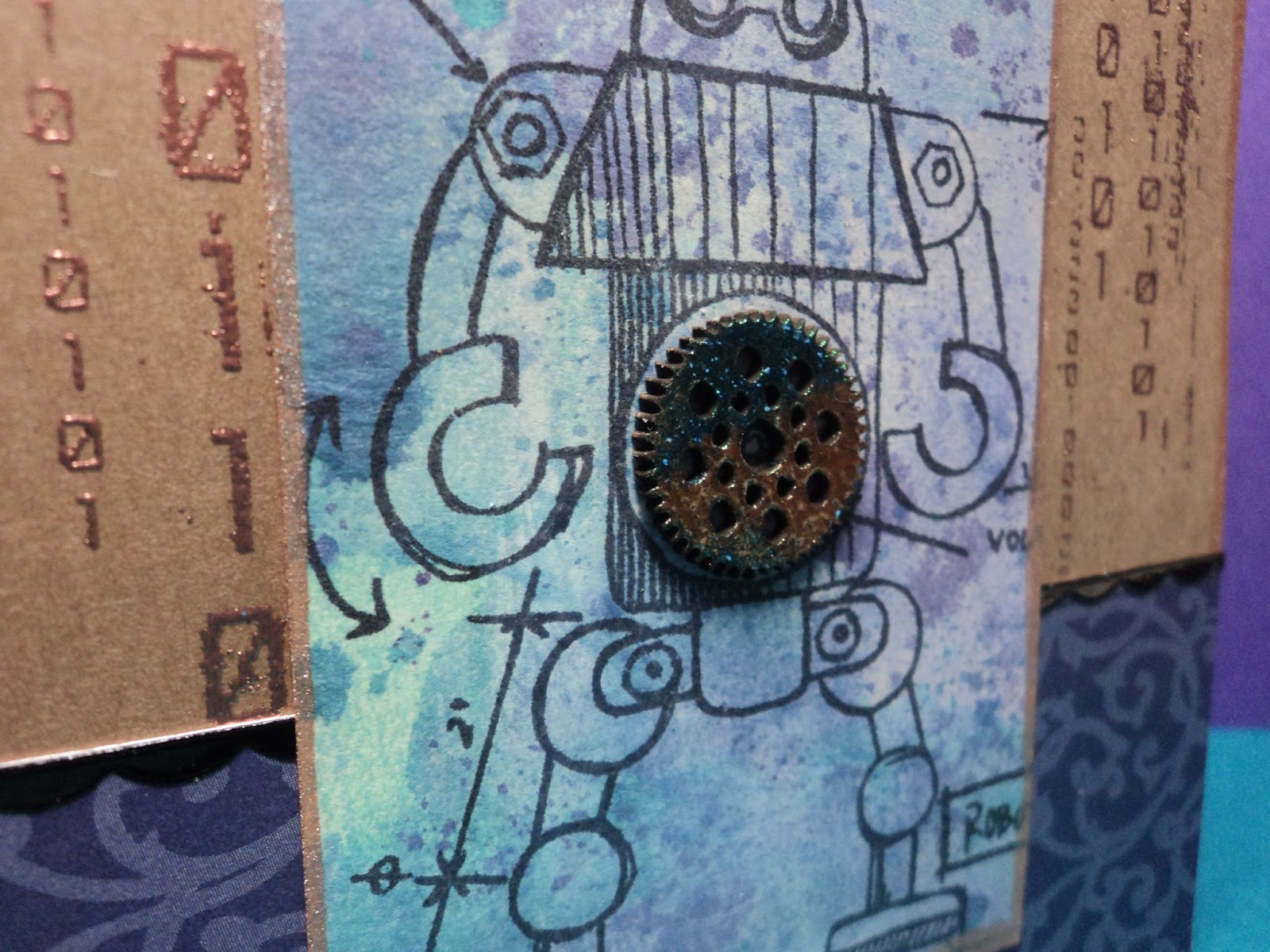
Gear Up!: I used the Tarnished Silver embossing technique for the chipboard gears. WOW. I really like how they came out. I liked the silver ones so much that I decided to try to do some copper ones. (Cuz you know, it's my favorite metal!) They turned out wonderfully pitted and so I tried out my new Distress Paint, Lucky Clover over them. Love.
The robot was stamped with Black Soot Distress ink and smudged to fade it out some. I colored it in with Cracked Pistachio Distress Stain mixed with Perfect Pearls (Turquoise and Interference Green). After coloring it in, I decided that he was too faded and went over the lines (only on the robot) with a Sakura Glaze pen.
Not bad for a day.
-Wy
"Robot Roll Call: Cambot, Gypsy, Tom Servo, Crooooowwww!" (It's official welcome MST3K to Netflix!)
This week was about using Distress products with embossing techniques. I tried one that I hadn't before and really liked the results.
Here's my card:
Gear Up!: I used the Tarnished Silver embossing technique for the chipboard gears. WOW. I really like how they came out. I liked the silver ones so much that I decided to try to do some copper ones. (Cuz you know, it's my favorite metal!) They turned out wonderfully pitted and so I tried out my new Distress Paint, Lucky Clover over them. Love.
The robot was stamped with Black Soot Distress ink and smudged to fade it out some. I colored it in with Cracked Pistachio Distress Stain mixed with Perfect Pearls (Turquoise and Interference Green). After coloring it in, I decided that he was too faded and went over the lines (only on the robot) with a Sakura Glaze pen.
Not bad for a day.
-Wy
"Robot Roll Call: Cambot, Gypsy, Tom Servo, Crooooowwww!" (It's official welcome MST3K to Netflix!)
Monday, July 18, 2016
Creative Chemistry: Week 7: Alcohol Inks
I will not lie. I find alcohol inks hard to work with. It shouldn't seem difficult; it never looks difficult. Yet, I admit that I only use them for a couple different things and don't like the result I get from most other techniques.
The challenge for Week 7 in Creative Chemistry 102 is to use alcohol inks. So I stuck to the techniques I really like: Ombre and Faded Layers.
Here's what I made:
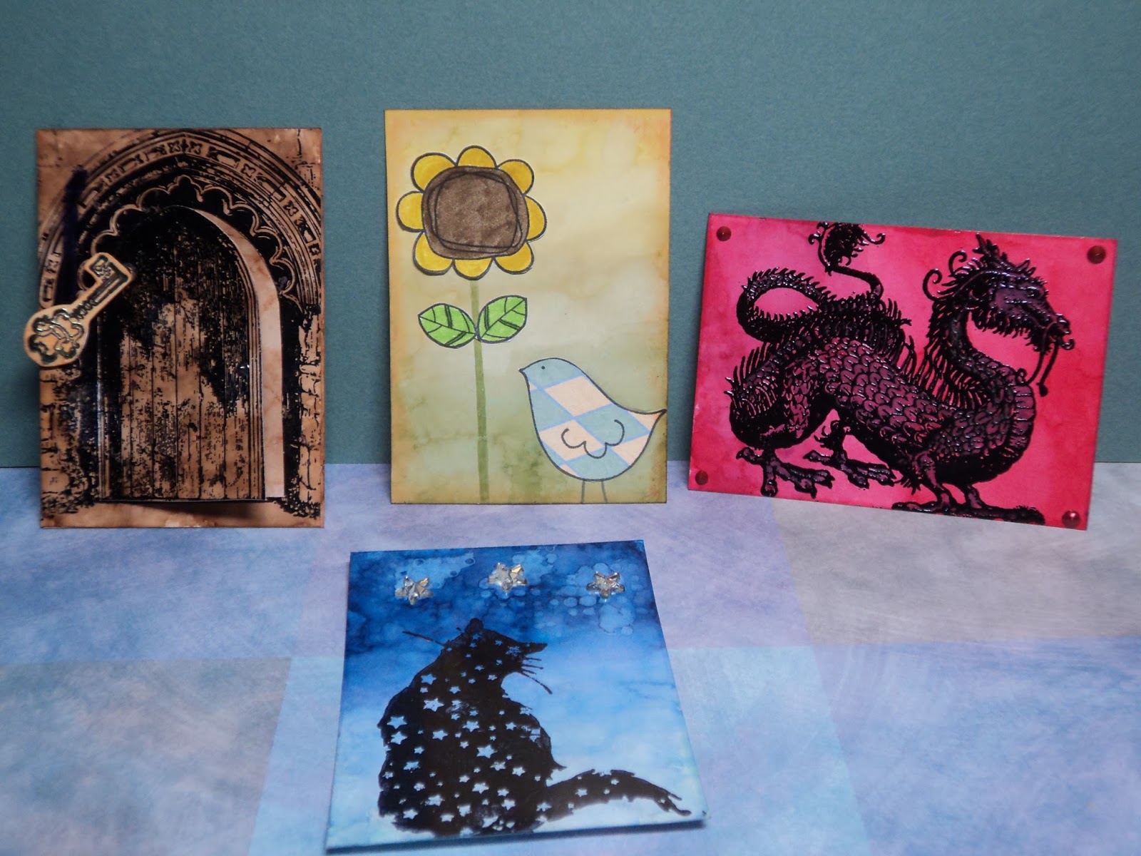
These are all the ATCs I made with alcohol ink. Two were failed attempts and two gave me satisfying results on the techniques. (Another post will focus on the "failed" attempts.)
Here's the two that worked:
Little Bird and Sunflower: This card features the Ombre look. I used Lemonade, Willow, and Pesto for colors. I added paper-pieced stamp images (Unity Stamps) and distressed the edge with Rusty Hinge Distress ink.
Starry Cat: A favorite stamp of mine from Lost Coast Designs is this cat. The ATC features the Ombre background done with Cloudy Sky, Stone-Washed, and Sail Boat Blue...then Denim. Here's what happened...it would seem my Stone-Washed isn't as bright as I thought it was. It had less of a true-blue and more of a indigo...blue-violet thing going on. So I went over the Sail Boat Blue with Denim...effectively replacing the old color with something more violet. (I'm still working with very old Adirondack Alcohol ink. Though the color isn't supposed to "change", both of these are no longer the color of the original swatch I created...years ago. I've also noticed a color switch in some of the reds, particularly Watermelon. With Ranger now releasing new colors into the line, I may opt in to buying fresh stock. For awhile, it seemed like they may discontinue the stuff as it was neglected, in my opinion, for several years.)
I also tried the Faded Layers technique here and it worked marginally well. It takes some practice to get this one right. I had way too much blending solution on my sponge so ended up with blobs more than a distinct pattern. But no complaints, it still looks cool.
Like tags, I usually end up using ATCs for card fronts. I may, however, save some of my better ones for Pocket Letters as they are the same size.
One more thing to add to my project list!
Thanks for popping in.
--Wy
"Just a spoonful of sugar makes the medicine go down." --Mary Poppins
The challenge for Week 7 in Creative Chemistry 102 is to use alcohol inks. So I stuck to the techniques I really like: Ombre and Faded Layers.
Here's what I made:
These are all the ATCs I made with alcohol ink. Two were failed attempts and two gave me satisfying results on the techniques. (Another post will focus on the "failed" attempts.)
Here's the two that worked:
Little Bird and Sunflower: This card features the Ombre look. I used Lemonade, Willow, and Pesto for colors. I added paper-pieced stamp images (Unity Stamps) and distressed the edge with Rusty Hinge Distress ink.
Starry Cat: A favorite stamp of mine from Lost Coast Designs is this cat. The ATC features the Ombre background done with Cloudy Sky, Stone-Washed, and Sail Boat Blue...then Denim. Here's what happened...it would seem my Stone-Washed isn't as bright as I thought it was. It had less of a true-blue and more of a indigo...blue-violet thing going on. So I went over the Sail Boat Blue with Denim...effectively replacing the old color with something more violet. (I'm still working with very old Adirondack Alcohol ink. Though the color isn't supposed to "change", both of these are no longer the color of the original swatch I created...years ago. I've also noticed a color switch in some of the reds, particularly Watermelon. With Ranger now releasing new colors into the line, I may opt in to buying fresh stock. For awhile, it seemed like they may discontinue the stuff as it was neglected, in my opinion, for several years.)
I also tried the Faded Layers technique here and it worked marginally well. It takes some practice to get this one right. I had way too much blending solution on my sponge so ended up with blobs more than a distinct pattern. But no complaints, it still looks cool.
Like tags, I usually end up using ATCs for card fronts. I may, however, save some of my better ones for Pocket Letters as they are the same size.
One more thing to add to my project list!
Thanks for popping in.
--Wy
"Just a spoonful of sugar makes the medicine go down." --Mary Poppins
Sunday, July 10, 2016
Creative Chemistry Week 6: Color Palette Journal
I had a revelation this week when I decided to pull out some tags and "finish" them. I use tags to "mop up" extra ink or paint when I'm working on a project in my basement. When the tag has sufficient color to it, or I don't want to junk it up anymore, I bring it upstairs to my bedroom where my "crafting/card making" space is. (My basement has most of my "art" supplies while my bedroom holds my card making supplies. Hence, I make trips up 2 flights of stairs when I begin to move things from one space to another. It's a great work-out and inspirational tool...if I'm too lazy to go back upstairs for a supply, I make do with what's on hand. That can make for some interesting results.) The tag then gets thrown aside until I feel like finishing it with perhaps a stamped image or scrapbook paper or whatever.
So my revelation was that I had WAY TOO MANY UNFINISHED TAGS! This has bolstered my resolve to STOP making tags that won't get finished in a timely manner. So this Creative Chemistry lesson was not a tag.
Or even a card.
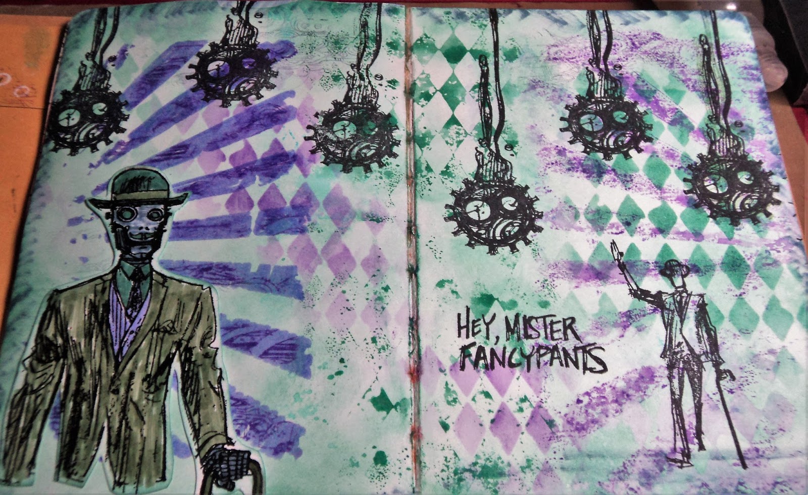
I paired up the techniques of Week 6 (Layering Stencils) with my Color Palette Journal. It's been a while since I worked in this journal but I did make a change that seems to help with my productivity. I have written out the palette I want to use in terms of colors that I may actually own...like the names of Distress Inks. That gives me an instant starting point for the colors, at least.
So here's the next spread in this journal, courtesy of Creative Chemistry:
FancyPants: Did I mention I'm on a robot kick this summer? I love this stamp set from Stamper's Anonymous called Dandy Robot. It's challenging to use so I am often stumped with it.
This is the color palette inspiration for this spread: Flora Brights #1.
The colors I matched to the palette were: Evergreen Bough, Bundled Sage, Wilted Violet, Shaded Lilac, and Stormy Sky. (All Distress Ink colors.) I had Evergreen Bough and Wilted Violet in ink pads (mini) and the rest in markers. So I focused on Evergreen Bough...and I absolutely love this color. I just recently got the ink pad and like it much more than Cracked Pistachio for a really nice patina color. And since I was making that color my background, it made me think of the Dandy Robot stamp set. I often use copper embossing with this stamp set and that would look great with Evergreen Bough. BUT, I decided to stick to the palette. Copper was a color...not a neutral. I allow myself black and white but consider browns as a color.
Anyway, here's the Creative Chemistry part:
Layering Stencils: The Challenge was to use two techniques with Layering Stencils. I used two stencils on this page. (My plan to add a third just never panned out.) I used the Rays and Harlequin. I used the Ink Monoprint with the Harlequin stencil down the middle of the page. I also used that technique with the Rays on the right side of the page. I had ink on the stencil from the other side so made a monoprint from that.
Here's a close-up look at my Stamping through a Stencil. I used the Rays and stamped with Wilted Violet Distress ink through it. The edges weren't as defined as I wanted so I also used Sketching through a Stencil here. After I had stamped, I went in with a Shaded Lilac Distress marker to define the rays. It smeared the stamping a bit but I liked it.
I even, inadvertently, pulled some of the background color up with the Harlequin stencil. You can almost make it out in the very right bottom corner in the above photo.
So the background made good use of Wilted Violet, Evergreen Bough, and a touch of Shaded Lilac. I decided to incorporate the last two colors on the Robot.
I stamped and embossed the robot on white cardstock. I used Bundled Sage for this jacket and brought the Stormy Sky in on his face and hand. I discovered that my Stormy Sky marker was rather dry so I couldn't bring as much of that color into the layout as I originally intended. (I was hoping to use it with the stencils but it was on it's last legs. In fact, I've already pitched it.)
Stamping with Jet Black Archival ink rounded out the spread and I was really happy with it.
Now I have to get busy with more color palettes. Did I mention my Pinterest board is now up to 250 palettes? I think I added about three more yesterday...damn. If you want to check out the board, I have picked out my next several palettes. See if you can find them: Rainbow Spring #2, Dirty Pastels #3, and Mineral Hues #4.
Thanks for dropping by!
-Wy
So my revelation was that I had WAY TOO MANY UNFINISHED TAGS! This has bolstered my resolve to STOP making tags that won't get finished in a timely manner. So this Creative Chemistry lesson was not a tag.
Or even a card.
I paired up the techniques of Week 6 (Layering Stencils) with my Color Palette Journal. It's been a while since I worked in this journal but I did make a change that seems to help with my productivity. I have written out the palette I want to use in terms of colors that I may actually own...like the names of Distress Inks. That gives me an instant starting point for the colors, at least.
So here's the next spread in this journal, courtesy of Creative Chemistry:
FancyPants: Did I mention I'm on a robot kick this summer? I love this stamp set from Stamper's Anonymous called Dandy Robot. It's challenging to use so I am often stumped with it.
This is the color palette inspiration for this spread: Flora Brights #1.

The colors I matched to the palette were: Evergreen Bough, Bundled Sage, Wilted Violet, Shaded Lilac, and Stormy Sky. (All Distress Ink colors.) I had Evergreen Bough and Wilted Violet in ink pads (mini) and the rest in markers. So I focused on Evergreen Bough...and I absolutely love this color. I just recently got the ink pad and like it much more than Cracked Pistachio for a really nice patina color. And since I was making that color my background, it made me think of the Dandy Robot stamp set. I often use copper embossing with this stamp set and that would look great with Evergreen Bough. BUT, I decided to stick to the palette. Copper was a color...not a neutral. I allow myself black and white but consider browns as a color.
Anyway, here's the Creative Chemistry part:
Layering Stencils: The Challenge was to use two techniques with Layering Stencils. I used two stencils on this page. (My plan to add a third just never panned out.) I used the Rays and Harlequin. I used the Ink Monoprint with the Harlequin stencil down the middle of the page. I also used that technique with the Rays on the right side of the page. I had ink on the stencil from the other side so made a monoprint from that.
Here's a close-up look at my Stamping through a Stencil. I used the Rays and stamped with Wilted Violet Distress ink through it. The edges weren't as defined as I wanted so I also used Sketching through a Stencil here. After I had stamped, I went in with a Shaded Lilac Distress marker to define the rays. It smeared the stamping a bit but I liked it.
I even, inadvertently, pulled some of the background color up with the Harlequin stencil. You can almost make it out in the very right bottom corner in the above photo.
So the background made good use of Wilted Violet, Evergreen Bough, and a touch of Shaded Lilac. I decided to incorporate the last two colors on the Robot.
I stamped and embossed the robot on white cardstock. I used Bundled Sage for this jacket and brought the Stormy Sky in on his face and hand. I discovered that my Stormy Sky marker was rather dry so I couldn't bring as much of that color into the layout as I originally intended. (I was hoping to use it with the stencils but it was on it's last legs. In fact, I've already pitched it.)
Stamping with Jet Black Archival ink rounded out the spread and I was really happy with it.
Now I have to get busy with more color palettes. Did I mention my Pinterest board is now up to 250 palettes? I think I added about three more yesterday...damn. If you want to check out the board, I have picked out my next several palettes. See if you can find them: Rainbow Spring #2, Dirty Pastels #3, and Mineral Hues #4.
Thanks for dropping by!
-Wy
Wednesday, June 22, 2016
Summer of Creative Chemistry: Week 4; Archival Ink
Honestly, I did do week 3: Perfect Pearls and Distress Ink but I didn't have time to finish off the project before the end of the challenge. So I'll be finishing them up later. But I did move right into Week 4 which was to use Archival Ink.
Allow me to post the disclaimer: I own only 3 Archival Ink pads (and one I just bought a couple months ago at a stamp show!). I own Jet Black, Tree Branch, and Watering Can...black, a brown, and a grey. For waterproof ink, I use mainly Stazon and I have the basic colors I need. Most of the stamps I own are like the one above...they only need to be stamped in black. I own silhouettes and outlines. I realized that I don't stamp images in color...I use color in the background or to color in the image.
I recently got interested in Layering stamps...those stamp sets that are 3 layers of the same image...Like AltNew's wonderful flowers. I have about three of them and see another that I love. For these sets of stamps, I will need colored inks. Since these are clear stamps, I'm also looking for an ink that works well with those types of stamps. I'll let you know how my recent Lawn Fawn purchase of orange inks works out!
So enough chat, here's the set of cards I made with Distress Inks and Archival Jet Black:
I decided to play around a bit with the background. I did the one in the lower left first, decided I didn't like it much. I was going for a small shadow (using Watering Can Archival behind the Jet Black) but I think I moved the card too much. The monochromatic brown (going for a vintage type look) wasn't floating my boat so I moved into my comfort zone: a night sky or sunset/rise.
The background stamp is from Technique Junkie and the sentiment is from Unity Stamps. I used Hickory Smoke and Pumice Stone for the foreground. The sunset is Ripe Persimmon, Fossilized Amber, Picked Raspberry, Broken China and Chipped Sapphire. Nothing fancy. Just background color strategically placed with a blending tool and an awesome silhouette stamp.
The night sky card was done the same way except I tried to work around the lightposts. I used Walnut Stain in the foreground (though I admit, I think I like the greys better). The background is Broken China, Dusty Concord, and Chipped Sapphire. I added the yellow to the lights with a Distress Marker (Squeezed Lemonade). I used the Blend and Flick technique to give the background a little Something. I used pearlized water rather than just plain to add a touch of shimmer.
I thought the quote was appropriate as the person in the image may be walking toward you or away from you.
That's it. Got my hands inky and had some fun!
-Wy
Allow me to post the disclaimer: I own only 3 Archival Ink pads (and one I just bought a couple months ago at a stamp show!). I own Jet Black, Tree Branch, and Watering Can...black, a brown, and a grey. For waterproof ink, I use mainly Stazon and I have the basic colors I need. Most of the stamps I own are like the one above...they only need to be stamped in black. I own silhouettes and outlines. I realized that I don't stamp images in color...I use color in the background or to color in the image.
I recently got interested in Layering stamps...those stamp sets that are 3 layers of the same image...Like AltNew's wonderful flowers. I have about three of them and see another that I love. For these sets of stamps, I will need colored inks. Since these are clear stamps, I'm also looking for an ink that works well with those types of stamps. I'll let you know how my recent Lawn Fawn purchase of orange inks works out!
So enough chat, here's the set of cards I made with Distress Inks and Archival Jet Black:
I decided to play around a bit with the background. I did the one in the lower left first, decided I didn't like it much. I was going for a small shadow (using Watering Can Archival behind the Jet Black) but I think I moved the card too much. The monochromatic brown (going for a vintage type look) wasn't floating my boat so I moved into my comfort zone: a night sky or sunset/rise.
The background stamp is from Technique Junkie and the sentiment is from Unity Stamps. I used Hickory Smoke and Pumice Stone for the foreground. The sunset is Ripe Persimmon, Fossilized Amber, Picked Raspberry, Broken China and Chipped Sapphire. Nothing fancy. Just background color strategically placed with a blending tool and an awesome silhouette stamp.
The night sky card was done the same way except I tried to work around the lightposts. I used Walnut Stain in the foreground (though I admit, I think I like the greys better). The background is Broken China, Dusty Concord, and Chipped Sapphire. I added the yellow to the lights with a Distress Marker (Squeezed Lemonade). I used the Blend and Flick technique to give the background a little Something. I used pearlized water rather than just plain to add a touch of shimmer.
I thought the quote was appropriate as the person in the image may be walking toward you or away from you.
That's it. Got my hands inky and had some fun!
-Wy
Sunday, June 12, 2016
Summer of Creative Chemistry: Distress Stains
If you are interested in learning A LOT about your crafting supplies, especially inks, stamps, and Ranger products, you should take Online Card Classes Creative Chemistry. It's well worth the investment. I've learned far more than just how to use Ranger products, I've learned how they relate into everything I own.
For Challenge Week 2, I pulled out a little used product of mine: Distress Stains.
Binary: I made the tags with the marbled stain technique which is very similar to wrinkle free distress. This tag was made with Dusty Concord, Shaded Lilac, Broken China, and Picket Fence. It's edged with Bronze? I decided to keep the robot stamps out. (I think it might be a robot summer for me. I'm seeing them everywhere and adding computer code, circuitry, and gears to my extensive collection of supplies!)
I used a stamp from Creative Embellishments (Binary) and Ranger Super Fine Copper embossing powder for the background. The gear in the center is also from CE. I embossed the chipboard with some powders from Lindy's Stamp Gang...it looks A-Mazing up close!
I really enjoyed this card but the color combo was one I had done in the past. I knew it would work well. So I decided to try something else as well.
After all, if the technique worked with Picket Fence (the "opaque" stain), it should work with any of the metallics, right? Yea, sort of.
Seahorse: I made these tags by substituting the Bronze stain for the white. I used Broken China, Salty Ocean, and Cracked Pistachio. I like the result though the finished result resembles the wrinkle free distress look more than the marbled stain. But I realize that the difference is just as much about how you drag your tag through your stain as it is about which colors and how much you use.
The seahorse stamp is from 100 Proof Press and the seaweed is another chipboard offering from Creative embellishments. I used more Lindy's embossing powder on the seaweed. I like how the green seems to brighten the card.
There's a really intense shimmer with the metallic stains. Difficult to photograph but you can see a bit of it at the top.
I did some other backgrounds but have yet to finish the tags. Maybe tomorrow.
-Wy
For Challenge Week 2, I pulled out a little used product of mine: Distress Stains.
Binary: I made the tags with the marbled stain technique which is very similar to wrinkle free distress. This tag was made with Dusty Concord, Shaded Lilac, Broken China, and Picket Fence. It's edged with Bronze? I decided to keep the robot stamps out. (I think it might be a robot summer for me. I'm seeing them everywhere and adding computer code, circuitry, and gears to my extensive collection of supplies!)
I used a stamp from Creative Embellishments (Binary) and Ranger Super Fine Copper embossing powder for the background. The gear in the center is also from CE. I embossed the chipboard with some powders from Lindy's Stamp Gang...it looks A-Mazing up close!
I really enjoyed this card but the color combo was one I had done in the past. I knew it would work well. So I decided to try something else as well.
After all, if the technique worked with Picket Fence (the "opaque" stain), it should work with any of the metallics, right? Yea, sort of.
Seahorse: I made these tags by substituting the Bronze stain for the white. I used Broken China, Salty Ocean, and Cracked Pistachio. I like the result though the finished result resembles the wrinkle free distress look more than the marbled stain. But I realize that the difference is just as much about how you drag your tag through your stain as it is about which colors and how much you use.
The seahorse stamp is from 100 Proof Press and the seaweed is another chipboard offering from Creative embellishments. I used more Lindy's embossing powder on the seaweed. I like how the green seems to brighten the card.
There's a really intense shimmer with the metallic stains. Difficult to photograph but you can see a bit of it at the top.
I did some other backgrounds but have yet to finish the tags. Maybe tomorrow.
-Wy
Subscribe to:
Posts (Atom)
Featured Post
The Chocolate Game
Let's talk about something sweeter than my other blog posts of late. Let's talk chocolate. But no guarantees that anything I want t...