Showing posts with label embossing. Show all posts

Wednesday, October 26, 2016

Throwback Thursday: Sept 15, 2013

TBT is a day early so I can join in on some Challenges! You can see the original post HERE.

This year I was inspired by my golden pumpkin portrait aptly named, "Patchwork Jack". I was inspired not only by this canvas, but by two challenges.

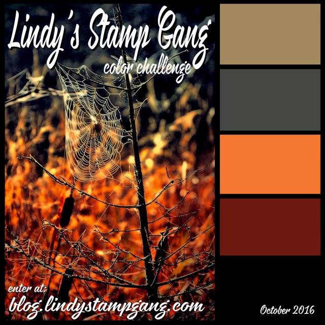
My color palette was inspired by Lindy's Stamp Gang Challenge for October. You can find the details at their BLOG.
The products I used were: Hag's Wart Orange Magical (from this Halloween set);
Red Hot Poker Orange Starburst Spray; Fuzzy Navel Peach Starburst Spray; A Bit O'Bubbly Starburst Spray; and 3 embossing powders: Byzantine Bronze; Queen Sheba's Silver; Midnight Violet.  

I was inspired in composition by the October challenge at Creative Embellishments, HERE. They had this lovely inspiration:
pumpkin
 I used their chipboard gears in various sizes. (Here's a few of them.) I also used these jack o'lanterns.
 There was a twist to their challenge to add a touch of metal.
(If you like to create things...any things...check out these monthly challenges. You get an opportunity to win some quality products from their shops!)
 
So here is what I created:
Steampunkin':  This has been a vision in my head for a couple Halloweens now. This was the year to make it. It's a 12 X 12 canvas. I collaged a background of patch-worked papers in black and white. I used a large piece of watercolor paper as a "mother board" for all the orange. I used the Lindy's magical and Starburst sprays to get the color. I tore out my pumpkin and stamped the light bulbs. (Stamp image from Joggles.com)
Next comes the fun.
All those gears along the edge were embossed with a variety of the Lindy's powders. I used them in combination with each other and added in some copper (from Ranger) for the small pumpkins. I love that the Midnight Violet powder looks black but gives a purple hue in just the right light. That gold shimmer from the Starburst sprays added some great "glow" to both the lights and the pumpkin.
All the gears were embossed chipboard so I added my metal "twist" on the face. I used 2 metal bottlecaps as the base for my eyes and various keys for the mouth. All the pieces are attached with Multi Medium (Ranger). I also threw in some buttons, rhinestones, and little orange roses to fill in some gaps and add a touch more color.

Thanks for dropping by!
-Wy
"Amuck, amuck, amuck, amuck..."  --Hocus Pocus

Sunday, August 07, 2016

Creative Chemistry 103: Day 3

Creative Chemistry 103 class Day 3was "Paste" day. Most techniques used some form of texture paste. I'll share the one that I finished but I'm still waiting for more paste to dry. Probably post that tomorrow if it works out.


Texture Paste Embossing:  This was the technique I got excited about. I always love the look of thick embossing but can't ever get it with just embossing powder. What a great way to get the thick layer without all the extra heating. I used super fine copper EP from Ranger with a bit of EP from Lindy's Stamp Gang, sorry I forget the color...Reindeer Moss? This technique goes in the arsenal.

I'll probably get a couple Steampunk type cards out of these tags.
-Wy

Sunday, July 24, 2016

Creative Chemistry: Week 8: Embossing and Distress

Just a quick post to share a card I made for the Summer of Creative Chemistry: Week 8. You can still sign up for the next installment, Creative Chemistry 3, with Tim Holtz.

This week was about using Distress products with embossing techniques. I tried one that I hadn't before and really liked the results.

Here's my card:
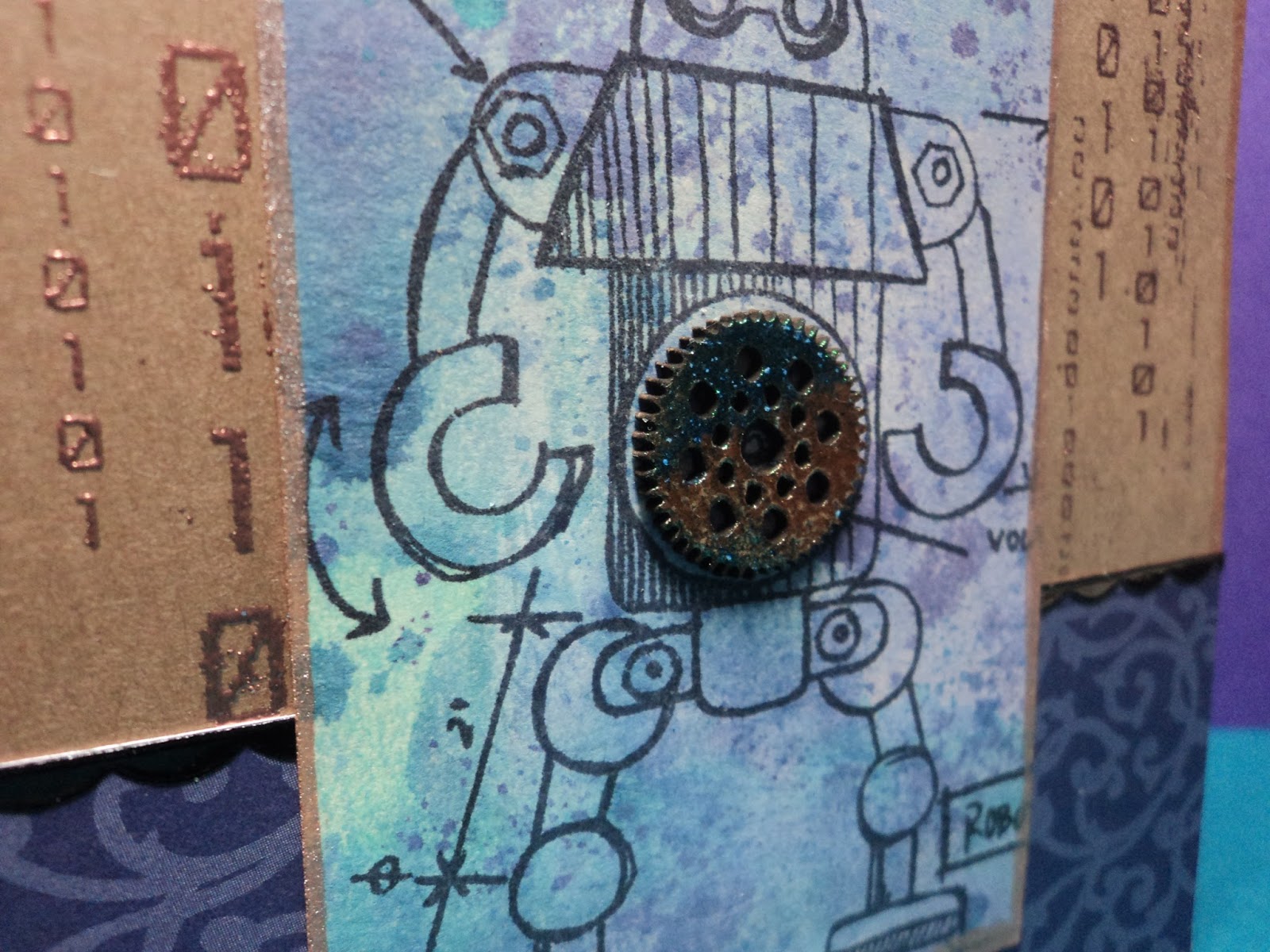
Gear Up!:   I used the Tarnished Silver embossing technique for the chipboard gears. WOW. I really like how they came out. I liked the silver ones so much that I decided to try to do some copper ones. (Cuz you know, it's my favorite metal!) They turned out wonderfully pitted and so I tried out my new Distress Paint, Lucky Clover over them. Love.


The robot was stamped with Black Soot Distress ink and smudged to fade it out some. I colored it in with Cracked Pistachio Distress Stain mixed with Perfect Pearls (Turquoise and Interference Green). After coloring it in, I decided that he was too faded and went over the lines (only on the robot) with a Sakura Glaze pen.

Not bad for a day.
-Wy
"Robot Roll Call: Cambot, Gypsy, Tom Servo, Crooooowwww!" (It's official welcome MST3K to Netflix!)

Sunday, June 12, 2016

Summer of Creative Chemistry: Distress Stains

If you are interested in learning A LOT about your crafting supplies, especially inks, stamps, and Ranger products, you should take Online Card Classes Creative Chemistry. It's well worth the investment. I've learned far more than just how to use Ranger products, I've learned how they relate into everything I own.

For Challenge Week 2, I pulled out a little used product of mine: Distress Stains.


Binary: I made the tags with the marbled stain technique which is very similar to wrinkle free distress. This tag was made with Dusty Concord, Shaded Lilac, Broken China, and Picket Fence. It's edged with Bronze? I decided to keep the robot stamps out. (I think it might be a robot summer for me. I'm seeing them everywhere and adding computer code, circuitry, and gears to my extensive collection of supplies!) 
I used a stamp from Creative Embellishments (Binary) and Ranger Super Fine Copper embossing powder for the background. The gear in the center is also from CE. I embossed the chipboard with some powders from Lindy's Stamp Gang...it looks A-Mazing up close!

I really enjoyed this card but the color combo was one I had done in the past. I knew it would work well. So I decided to try something else as well.

After all, if the technique worked with Picket Fence (the "opaque" stain), it should work with any of the metallics, right? Yea, sort of.
Seahorse:  I made these tags by substituting the Bronze stain for the white. I used Broken China, Salty Ocean, and Cracked Pistachio. I like the result though the finished result resembles the wrinkle free distress look more than the marbled stain. But I realize that the difference is just as much about how you drag your tag through your stain as it is about which colors and how much you use.

The seahorse stamp is from 100 Proof Press and the seaweed is another chipboard offering from Creative embellishments. I used more Lindy's embossing powder on the seaweed. I like how the green seems to brighten the card.
 
There's a really intense shimmer with the metallic stains. Difficult to photograph but you can see a bit of it at the top.

I did some other backgrounds but have yet to finish the tags. Maybe tomorrow.
-Wy

Wednesday, March 02, 2016

Sapphire Feathers

All I can say is that when I love a color; I become obsessed!
Color of the week is Chipped Sapphire, Night, Midnight Muse, Navy...however, you label it...it's that deepest of blue. It's the blue that can be used for a Night sky or a deep ocean. It's that shadow of blue that foretells of threatening clouds on the horizon; the kind that bring the lightning.

I also have lots of new stamp sets that I haven't used yet so I pulled one out today. The stamp set is from Hot off the Press: Feathers. It's one that I'm going to be using a lot...it is very versatile. I hadn't really realized it when I bought it, but this is a layering stamp set. (When I bought it, it was on sale and BEFORE the stamp layering trend had really kicked in! Now everybody is coming out with a set of stamps that can be layered over each other!)

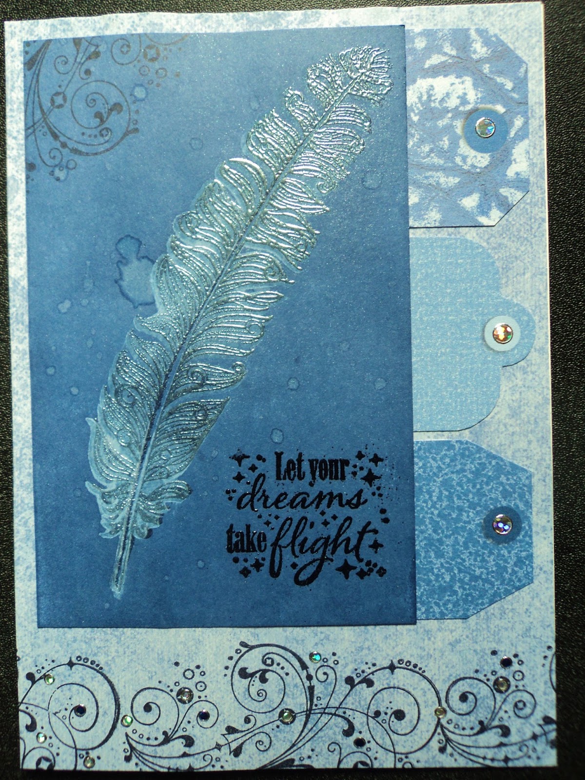
It all really began with my idea for layering. I wanted to use gelato to stamp the back stamp (more solid image) and use ink over the top for the detail. Then, I wanted to ink blend over the top of all that. Gelato forms a resist against ink. So I gave it a try and this card ultimately resulted from my experiment.
I stamped the "shadow" of the feather in gelato but it doesn't really show up after the ink blending. I also stamped some smaller feathers which you may see faintly in the background. Even though this just started as an experiment, I liked how it came out and decided to make a card out of it anyway.
But this led to the question of why didn't the gelato show up? I figured the background wasn't dark enough so the resist didn't really show up well. Hence, my next experiment/card.
So I went all out. I applied Chipped Sapphire Distress Ink directly to my cardstock from the pad. I rubbed it right in there. Then, I stamped my shadow feather on top with gelato. It looked better than the first experiment. But instead of stamping the detail feather in black on top, I decided to just emboss the image. I stamped with Versamark ink and applied Lindy's Stamp Gang Magic Moon Pearls powder. (This is a new favorite! Love how it makes anything beneath it look pearly!) The embossing actually looks like I stamped with a colored ink and embossed. Added water drops because...you know...that's what Distress Inks are REALLY good for.
Even though it looked fantastic, it wasn't exactly what I was shooting for. I was hoping the embossing would have been almost invisible...less pronounced. So I've got even more experimenting to do with this!

I learned from my last art fair that people are looking for sympathy cards and my sister-in-law told me that she always seemed to be in need of that type of card as well. Sympathy cards had not really been part of my inventory. Of course, I usually make blank cards...so that they can be used for any occasion. But with a sympathy card, I discovered it was important for it NOT to be blank. It's hard enough to find something to say to someone who has lost a loved one, let alone write it in a card.

That's why I went in search of a stamp set with sentiments for sympathy cards. I found this one from My Favorite Things. I liked the simplicity of the sentiments and the way they would easily fit onto a card front or on the inside or both.

So the next two cards started with the shadow feather stamp. I had just stamped it off a couple times to get more of the gelato off of it before cleaning it. I got two more decent images so made a couple sympathy cards.

I used up old paper and Dazzle stickers (both from Hot off the Press) and overall just had a good time making some cards!

All my requirements for a good art day were met: using up scraps, trying out new stamps, playing with products just because, and using a favorite color.

I'm gonna hate going to work tomorrow! :)
-Wy
"I reject your reality and substitute my own."  --Mythbusters

Monday, March 23, 2015

Lost Coast Designs 50 Shades of Green!

I discovered Lost Coast Designs at a Stamp/Scrapbook show in Syracuse, NY some years ago. I didn't buy anything that first time as I was scrapbooking at the time and wasn't doing much with rubber stamps. But I loved the look of them. Next time I saw them, I bought a dragon. Next time a bubble background that I couldn't resist, then a crow. My collection was slowly but surely expanding and it has almost doubled with my recent order. Because NOW I'm rubber stamping!

If you check out the blog, you'll find they have a challenge/blog hop going on dedicated to green.


Now would be a great time to pull out those Lost Coast Designs (LCD) stamps and play with them!

Here's the card I made with my NEW Favorite stamp:


Green Window:  This lovely window was too detailed and marvelous to muck up with a lot of embellishment. So I went simple. I stamped the image onto glossy cardstock and embossed it with black sparkle embossing powder (Ranger). I applied Distress ink (Crushed Olive and Peeled Paint) around the outside of the image. I colored in the window with Distress markers (Mowed Lawn, Shabby Shutters) as well as one from Stampin Up (Mossy Meadow?). Cut it out and mounted it on a A2 size dark green card.


Here's a close-up photo where I hope you can see the embossing sparkle a bit more.

Super excited about this stamp. I plan to do a stained glass window next as well as find a texture background that works with it.

So if you want some more inspiration or to join up, check out the blog and the inlinks below!
Enjoy!
-Wy


Sunday, February 01, 2015

My Planner...finally.

I decided since I was making this anyway, I'd link it up to the Simon Says Stamp Wednesday Challenge (Anything Goes!).

Here's what I made:

I haven't used a planner since college (um...some 20 years ago). Instead, I have always used just a small pocket calender to jot down an appointment or two. (It's true; I have no social life!) But this year, I saw all the cute little planners coming out at CHA and I have seen the Erin Condren planners...I thought they were such fun. (And I've developed a need to keep more deadlines and work schedules organized.) But there were 2 problems: 1. They were costly. 2. They weren't EXACTLY what I needed.

Most planners seemed to be WAY MORE than my little life required. Yet I was hesitant to make my own because I liked the "schedule" look of the lined pages. Sort of a calender, sort of a schedule. And some times of the year would be more busy than others. I also wanted it to double as a sort of sketchbook for random ideas with blank pages or graph paper or some other place to just doodle.

That's when I stumbled across this video on YouTube:  Sea Lemon Planner
I was totally excited about the template for the pages! That was exactly what I needed and she was sharing it. The size was perfect as well at 8.5 X 5.5, half a sheet of copy paper. So here's the planner I made this weekend. (Only a month into the year; not bad...better than waiting for something from CHA to hit the shelves!)


So the first thing I did was print out the sheets from the template, making sure they were double-sided. (If you're unsure of how to do that, or don't have a printer...with ink...just save the download on a flash drive and take it to a copy store. My local UPS Store can print it out while you wait and do it on a thicker paper, if you're particular about those things.) I just went with standard, cheap copy paper and amazingly I had just bought ink for my very old printer.

I cut those sheets in half as well as some blank copy paper and some graph paper. I stacked it all up as it would appear in the planner. I opted to put my blanks and my graph paper at the back of the book.

On to the covers! I just cut a piece of cardboard in half that had once been the backing of a scrapbook paper pack, I think. (I'm not certain because it came out of my HOARD of saved cardboard. I kept an ungodly amount in hopes of making journals. I'm still working on that...) You can use just some cereal boxes cut up!

I decided on a theme from a new stamp set I had and some paper I loved so much, I hardly used it.


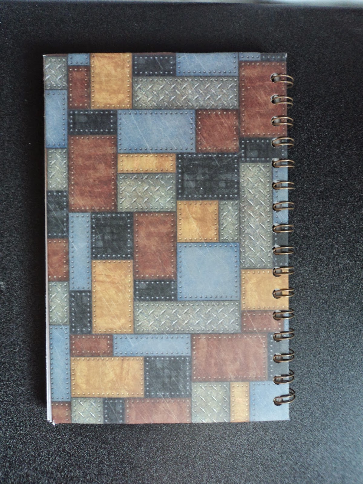
 Scrapbook paper: Hot off the Press, Steampunk. Stamp: Dandy Robot, Stamper's Anoynomous

I cut a 12 X 12 paper down to 12 X 9 and cut off the corners to wrap it around the cardboard. I used Scor-Tape to secure it. I cut another piece down to 8 X 5 to go on the inside of the covers.  I cut the banners at the top from scraps from the paper pack, matted them on black cardstock, and added some old typewriter numbers from my stash.


I stamped the robot onto white cardstock and colored it with Distress Markers. I used Perfect Pearls, Copper to color in the face and hand so he has a little shimmer. I went around the edge of the cover with a ColorBox black pigment ink and added embossing powder. (Lindy's Stamp Gang, Byzantine Bronze) Once I had the cover done, I decided to add a little something to the inside front cover.


I added two coin envelopes decorated with the same paper pack and a few rubber stamps from an old 7gypsies set (that doesn't impress me much). The top one that's horizontal lifts on the right to reveal the pocket while the bottom one is pretty straight-forward.

 
I didn't embellish the back as I want this to be usable. It will be slid in and out of my desk and stacked under projects and stuff. I wanted it to be flat and secure.

When I had everything the way I wanted it, I just used my Cinch binding machine and added the binding. It's a 1/2 binding wire in old bronze. (The Cinch is like a Bind-it-All and uses the exact same wire.)


So there's my new planner! Ain't she a Dandy?
I'll be giving it some work soon. I may need new pens...

Have a great week!
--Wy
"Candy is dandy but liquor is quicker."

Sunday, January 18, 2015

Red Carpet Studios Challenge #87: Frozen

Please go to Red Carpet Studios Challenge Blog for ALL the details on how to enter your paper project into our challenge. Or see MY POST with new rules at the bottom! (PLEASE, check out the NEW rules even if you've been playing right along with us. We changed a few things from last year to make the challenges more fun and give you more time to enter your favorites!)

This week's challenge is based on the movie "Frozen". You know the one. That Disney flick with the "newest" princesses, Elsa and Anna. The one that your 5 year old niece can't stop singing...yup, that's it!

The Challenge is to use something glittery in your project! Our Sponsor for this month is 


You may be randomly drawn to receive a lovely prize pack!


Here's my card:
Frozen Wish:   I struggled with the challenge for this. I honestly don't use what I consider to be anything glittery. I use metallics, shiny things, and pearlescent but nothing that screams glitter. My first attempt at a card was miserable. I went back to the drawing board and finally got inspired. It's simple but I like it. The paper looks like a snowstorm and the glitter mat is...well...it's glittery. The stamp image has touches of white embossing powder to make it look snowy.


So how did I get inspired when I was running on fumes? I took a step back. I went through my paper stash in search of something glittery. Amazingly, I found that glitter paper. I think it's the only sheet I own. I'm sure I didn't buy it but it was probably given to me. Then, I realized that I didn't have to think of snowflakes and snowy hills. I could just be inspired by the word and the colors. This stamp reminds me of "snow in summer" when all those dandelions puff out and set their seeds to the wind.

Hope you enjoyed. Be sure to check out the challenge and join us with your project. I'd love to see what you make on this theme!
--Wy
"Let it go, let it go. I am one with the wind and sky. Let it go, let it go. You'll never see me cry."  --Frozen

Sunday, July 13, 2014

Red Carpet Studios Challenge #74: Grown Ups

After my patriotic banner for the last challenge, I decided to go a bit simpler this round.

This Challenge is inspired by the movie, Grown Ups.

Challenge: Create a project that features "a kid at heart." Amusement parks, summertime fun, family get togethers...we can't wait to see your inspiration!
Challenge ends July 26th!

Here's the card I made. It measures 6.5 X 5.

Bubbles:  I cut the circles out for the bubbles and added a sheet of clear acetate behind the whole front. It didn't seem the effect I wanted so I added an iridescent embossing powder to each bubble to give the look of more dimension. I used a Versamark pen to add the curve then just heat set the powder (Stampin Up, Iridescent Ice). I inked the background with Distress Ink and outlined each bubble (Peacock Feathers). I just hand drew in the bubble wand and outlined two banners with sentiments. At the end, I decided it needed a few more small bubbles and added them in with an extra-fine tip Sharpie.

I like the card as it is one layer but still has quite an impact. A word of advice: The acetate will warp under heat embossing unless you have some of the "new" acetate I've heard about that does not. Mine did and at first, I wasn't too thrilled but after adding in my "sketchy" pen marks, I decided that it added to the card's homemade appearance. :)

So there's my card for some FUN! Hope you enjoyed.
I'd love to see what you make. Please go over to Red Carpet Studios for all the details of the challenge and submit a photo of your project!
--Wy
"Growing old is mandatory; growing up is optional."

Sunday, April 13, 2014

Gettin' Inky wit it!

Finally had some time to do a spread in my art journal that has been terribly neglected since I started my new job. All I needed was a nudge from The Aviary; Challenge Blog to Paper Wings Productions.
I'm trying more and more to make greeting cards with tags and background papers I have made from "inky" experiments but I don't get them done as much as I'd like. So I went with the old stand-by for inky fun for me...the Art Journal.


Fantasy Fish:  This spread started out with a layered ink background primarily from Dylusions inks; Fresh Lime, Cut Grass, and a touch of Vibrant Turquoise. I stenciled in the corners with London Blue and stamped with a bottle cap in Crushed Grape. I used two old background stamps and added those images with StazOn ink, both Timber Brown and Forest Green.


In trying to determine what this page was going to be about, I thought maybe more torn flowers and a garden since it was so green and I was tending toward cool colors. So I stamped the circles from Inkadinkado and ripped them from patterned paper. I had a dragonfly cut from a magazine but wasn't sure I wanted to use it. I wanted to stick with a rubber stamp theme. I went through some old stamps that I had carved and found my Steampunk Goldfish stamp. So I decided to go with an underwater garden.


The page spread turned out to be a combination of an earlier garden/flower spread in the journal and the canvas, "Goldfish Dream", found in an earlier post. I made the "seaweed" in the same manner and I added some gear bubbles to enhance the steampunk theme.

Just had a fun afternoon playing with lots of things and gettin all inky wit it!
--Wy
"Let me examine a purely speculative hypothesis which I am not going to put forward as anything other than fantasy."  --Quote taken from old book about UFOs.

Saturday, January 18, 2014

Goldfish Dream: Canvas


This 8 X 10 canvas started with the kernel of an idea I had been toying with for awhile; using aluminum foil colored with alcohol ink for a background. That was my start.

I tested a few scraps of foil for how the alcohol ink would look, stick, and what would rub it off. I experimented with how to attach it to the canvas and if Mod Podge (my "glue" of choice) would affect the surface if I was extra messy with it. Did I like the foil more crumpled or more flat?

After some fun, I made a few decisions including the main focal elements. I wanted a deep sea view using my favorite jellyfish stamp (from 100 Proof Press ) and I wanted the canvas to be very transparent/metallic. I didn't want to cover much of the colored foil with paper elements or cut-outs as I wanted that look of gazing through water.


So using a blue palette of alcohol inks, I colored the foil and liked the metallic look it retained. But since it was already attached to the canvas, it was impossible to stamp directly on it and get a clear impression. So I decided to stamp on clear acrylic sheets and cut them out. In addition to the jellyfish, I added a school of fish (Lost Coast Designs) and a spore in the left corner. (This was part of another idea that I trashed early on of using the spore as a Sunlight source shining a ray into the depths...scrapped it.)

I attached the stamped images with gel medium. It dried clear and invisibly and I was careful not to use too much as it seemed to affect the alcohol ink beneath it.

The canvas still looked quite plain so I added the middle line of "bubbles" using very old epoxy circles that have been in my stash for way too long. I debated about putting some kind of paper under them, like dictionary, but wanted to stay true to my original idea of a see-through look.

This is where I originally decided the canvas was complete: Deep Dive.


But I didn't like it. It didn't look finished. I tried adding purple fluid acrylic around the edge to frame it out but it didn't help. I kept staring at it wondering what it needed.

It needed a foreground and it would have to be something that stood out. I thought I'd cut out some seaweed to add; stamped images that would be cut from paper then attached. But then I pulled out some embossing powder; and man, did things change!

I'm becoming a big fan of torn paper and I'm using it a lot in my stuff. Since I had wanted to highlight the bubbles with dictionary paper, I decided to tear my seaweed from that. Then, I sprayed it with Dylusions ink, Cut Grass. And here's where I got excited!
I had in my stash from several years ago some of the Moon Glo embossing powders from Lindy's Stamp Gang. My sisters and I bought a few colors after seeing some amazing techniques done with them. Naturally, after we got home, we forgot about them and how to really maximize their usage. I was on the verge of getting rid of them. I decided to give them a whirl on my seaweed to make the paper look glossy and wet.

So glad I did! I used a Starlight Gold/green powder mostly but added in some Desert Moon/ ??  (sorry I forgot the other color in the mixture. Each embossing powder from Lindy's is a two-toned powder!) I inked the whole face of the paper with Versamark ink and sprinkled the powder on. As it melted it curled the edges of the paper, but what a great look for me. The translucent nature of these colors allowed the paper to show from underneath as well as the green ink. And the touch of brown you see in the photo is from the embossing powders. These powders also give a pearlescent sheen to the paper making it reflect similarly to the foil on the background. I LOVE IT!


After adding my seaweed (squeal) with gel medium, I wanted just one more element; something to tie it all together. I added my goldfish. I thought about that movie "Finding Nemo" where the fish in the tank all dream of getting to the ocean. Nothing fancy about him, just cut out, attached, and outlined with a subtle hint of gold gelato.

So now...finally...this canvas is finished. "Goldfish Dream" is a new favorite of mine.
--Wy
"Just keep swimming." --Dori from "Finding Nemo"
Note: After my paper curled up from the embossing, I did manage to uncurl it mostly. The very edges remained curled but that was the look I wanted, very 3-D. I just needed enough of the surface to make contact with the canvas so that it stayed attached.


Featured Post

The Chocolate Game

 Let's talk about something sweeter than my other blog posts of late. Let's talk chocolate. But no guarantees that anything I want t...