Showing posts with label gelato. Show all posts

Sunday, July 09, 2017

Art Journal Adventure: June 2017

There are those times when you tell yourself you're working too hard. I'm kicking myself as I realize this is my first post for July. But...meh...I do what I can. Don't we all?

Art Journal Adventure for June was a bit tricky. The prompts weren't exactly my cup of tea but I finished them. This journal is a large Dylusions journal and the prompts can be found at the Joggles blog or Facebook page.

Week 23: Color Gradations: Fantasy Flower:  My plan was simple: use Gelatos for the background gradation and use up the red paper scraps I had from one of my canvas creations. (Look back and guess which one.) I ended up with this large fantasy flower and the blue/yellow/green combo is one of my favorites. I just added a bit of wording and called it done. This has to be one of my favorite pages so far.


Week 24: Something Old/New/Borrowed/Blue: Regretfully Yours:  This week was challenging but it started with "New". I had the new Gelato colors from Faber-Castell; the iridescents. But since I had done the background last week with gelatos, I decided to use them differently. I used them to stamp the butterfly and it worked great. I tried pink as a background again, hoping to redeem myself from the "fantasy fiasco" of a few weeks back. I don't think I gained much ground. I needed blue so I went with a "chipped sapphire" tone. The page came together under the wedding theme.

So here are the elements: New; Iridescent Gelato, Old; photos, Blue; blingy butterflies and squares, Borrowed; the quote, "I can hardly wait to regret this" (Dyan Reaveley set) that seemed quite appropriate. (Note: the page was neater until I did the next spread. I used spray ink on the other side and some seeped through the spine and the edges. Fortunately, the color matched the blues already on the page. So it's more of a "happy" accident.)

Week 25: Borrow Supplies: May:  I borrow very few things from my sisters because I have more supplies than I can ever possibly use. But my sister does have a die cutting machine and I don't. She cut me these two birds and I just had to use them for this page. This page isn't actually in my journal; it was a separate sheet torn out and used as a mop-up page. This will probably appear in a calendar I'm working on to represent the month of May.

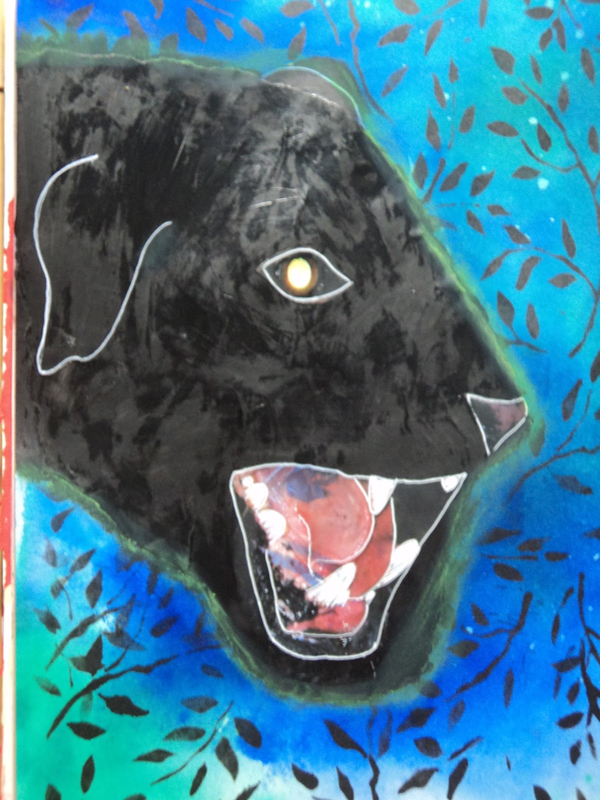
Week 26: Mystery: The Hound of the Baskervilles:  This was a theme I could get behind and since I had just ordered a new paper pack, I went with Sherlock Holmes. I needed another paper pack like I need a hole in the head but when you're a Sherlock Holmes fan, there are some things that you simply must have. It's elementary. I knew I'd use the paper pack's ephemera to collage with but I wasn't crazy about the colors. The orange/green scheme seemed too "Autumn" so I hoped a deep blue and jade would contrast. I think it looks okay but I'm not entirely satisfied with it.


 I wanted to create the Hound but my drawing skills aren't the best. So I went through my magazine cut-outs and found a jaguar snarling. I decided that I might be able to paint it into a dog. Whether or not I was successful is debatable. I think I'll have to come back and look at this page after a month or two and decide. I kept the mouth and eye and covered the rest with black paint. Then went back in with a white pen to add details to the darkness. I also highlighted the outer line with a bright yellow/green gelato to give it the phosphorous glow.
Hound or jaguar, monster or shadow, it is quite the specter of the novel and I rather like it.

More to come soon.
Have a great week!
-Wy
"Where there is no imagination, there is no horror."

Sunday, March 19, 2017

Art Journal Adventure: February 2017

Ok, so I totally forgot I was supposed to post for the month of February. Of course, since I took a vacation, I didn't really have time to catch up with all my prompts until this last weekend.
Overall, I like the pages I've got done. One page just doesn't float my boat but it's done.

Without further ado, here's pages from the AJA for February.

 Week #6: Use a Subtle Color Palette:  This page cannot be photographed by my amateur skills with any real success. Take my word for it; it's way prettier in person. I used all Lindy's Starburst sprays. I'm not entirely sure on the colors but I think Cosmopolitan Pink, Fuzzy Navel, and Edelweiss Green with a touch of Glory of the Seas Gold. In all honesty, I liked the way the background looked so much, I didn't want to mess it up. So I just used two stencils with the same colors and added in the rays and the tree.
It is REALLY subtle because you need to adjust the page to even see the patterns. I even wrote the word "peace" in white pen in the corner. It's just barely there. But it's a page you really have to look at and I like that.


Week #7: Use Text as the First Layer: I have often used dictionary pages as a background paper and wanted to try something different. I just wrote down the lyrics to songs that were playing as I worked. I didn't need to get all of them just the lines that I could scribble out in the time it took to fill the page. I've got about 4 songs in there in some form.

I've always like to do flowers on top of text so I decided to just go for that and use up some old gelatos. It was working ok until I added the black outline. Yuck. It seems too thick and too bold. Not quite what I had in mind. But it is what it is.

Week #8: Include a reference to Time:   This was a tough prompt for me as I didn't want to go down the path I always have. I didn't want to end up with clock faces all over my page. So in trying to meld this prompt with another project, (and with a little help from my sister) I remembered a poem of Poe. The Bells. I took that quote and ran with it.

 The entire poem is really about the advancement of Time through the tolling of various metal bells. Brazen bells, iron bells, silver bells, golden bells. The repetition of the poem is practically a chant, the progressive march of time over life. So this page with its three different bells is my interpretation of the poem. I was trying for the feel of the inside of a clock tower that chimes on the hour.
I was so happy with this background. I LOVE IT! I honestly didn't think it would turn out. But using Dylusion Black Marble paint with a Tim Holtz ink applicator was the key to success on this one. The paint dried quickly and the applicator allowed a thin coat that didn't seep under the stencil. The black paint also covered very well with just a couple coats. The coppery colored background is Lindy's Starburst sprays in various coppers and golds. It's hard to cover up the mica but the Dylusions paint did a pretty good job.
I tore the bells from scrapbook papers and went over the torn edges with gelato. (You know, my usual.) I'm not sure I spelled rythme correctly (it should be rhyme)...but I don't even care. This page is ranking high in my all time favorites!


Week #9: Transform one or more of your edges:  I never remember that I can alter the size of pages if I want. I never remember that I could just rip out half a page and work with the remainder. While this was a good reminder, I had trouble deciding what to do with the page. At first, I wanted to incorporate the edge into the design but I wasn't sure how to do that without going totally abstract. I decided to use a stamp I got a while back and hadn't yet used. (I showed it to my sister this past weekend and said, "I really need to use this." So hey, El, I did it!) The wavy edge would work for an underwater scene.
Initially, it was all going to be about those fish bones but I was reminded of the scene in Finding Dory where Dory is stuck in a bucket with a bunch of dead fish. I decided to go with the notion that these bones were what was left from some sea creature's lunch. I went with an octopus...because hey, Octopus! I didn't have room for the entire octopus but tentacles are the best part anyway.

I wanted the background to be more green than blue because I wanted to keep it a little creepy. I added the large pink circles of paint as a finishing touch as it seemed to need a pop of color. And let's face it, those circles look like the sucker marks of an octopus. Am I right?

So those are my February pages for the Art Journal Adventure. Here's to hoping the March pages will be just as satisfying!
-Wy
"To the moaning and the groaning of the bells."  --Edgar Allan Poe, "The Bells"

Monday, December 26, 2016

Inspiration Journal: Finale 2016

I have finished my Inspiration Journal 2016. I followed along with Donna Downey for some Inspiration Wednesdays this past year and amazingly, didn't fall too far behind in my work.

I don't like all the pages and some are downright ugly but that's really the point to an art journal. I needed to play with things to see what I like and what doesn't really float my boat. Because what excites Donna Downey doesn't always excite me. That shows up big-time in these pages.

So here's the big finale!


UGH! Texture!:  Donna used baby wipes to create these round wells that would hold pouring medium. I don't use baby wipes much and I certainly didn't have pouring medium. So I used a few baby wipes and some paper towels. But I detest the "messy" look the baby wipes create. I tried to clean it up, so to speak, on the other side of the spread (where I have the two wells) but decided I really didn't like either of them. I used a clear gel glue to substitute for pouring medium and I thought it was working well until I let it sit overnight. When I came back to it, there were tiny bubbles throughout the glue that distort the image underneath it. It adds another layer of texture I don't like. So I gave up early on this page and wrote my frustration on the insert. Moving on...

Magic Foil:   This spread diverged from Donna's quite a bit. She put chipboard beneath the foil and then gessoed over the top to sand it all back to bring out touches of the silver. After the fiasco with the spread above (and the discovery that I don't like THAT much texture in my journal), I was hesitant to use chipboard. I thought I might be able to create texture with white glue but it sank into the paper and didn't stay 3-D. So I had these foam stickers and all the letters to spell out MAGIC. I then applied the foil over that trying hard not to get too much glue on the foil.
See, here's my take on using aluminum foil: let it show. Foil has such a wonderful metallic shimmer why would you gesso over that? Paint will stick to foil. And fluid acrylics are mostly transparent (depending on the color) so the shimmer shows through it. The end effect is similar to metallic/mica paints. Aluminum foil is also a "white" surface and allows the true pigment color to show. So with all these things that I liked about foil, why not just paint it right on there and skip sanding it all together.

The foam stickers aren't prominent but you can tell what it spells in person. I added the black stars because they looked magical. The black also really allows those colors to pop.

Sing for Spring:  Donna used pan pastels. Nope, don't own them. The very word "pastel" translates in my brain as "chalk" and yucko for chalk. So I knew I'd be using my gelatos for this spread. I liked Donna's colors but when it came time to do the page, my color choice was determined by the birds. I didn't have a flower stamp large enough and I didn't feel like drawing one or waiting for paint to dry. So these little collage image birds dictated my colors. I realized I had gelatos that matched rather well.

I did seal the gelato with ModPodge so I could stamp over the top of it. The colors seemed very wintry to me so decided to stay on that theme. On the back of the inclusion, I wrote, "Keep Spring in your heart" to tie it all together.

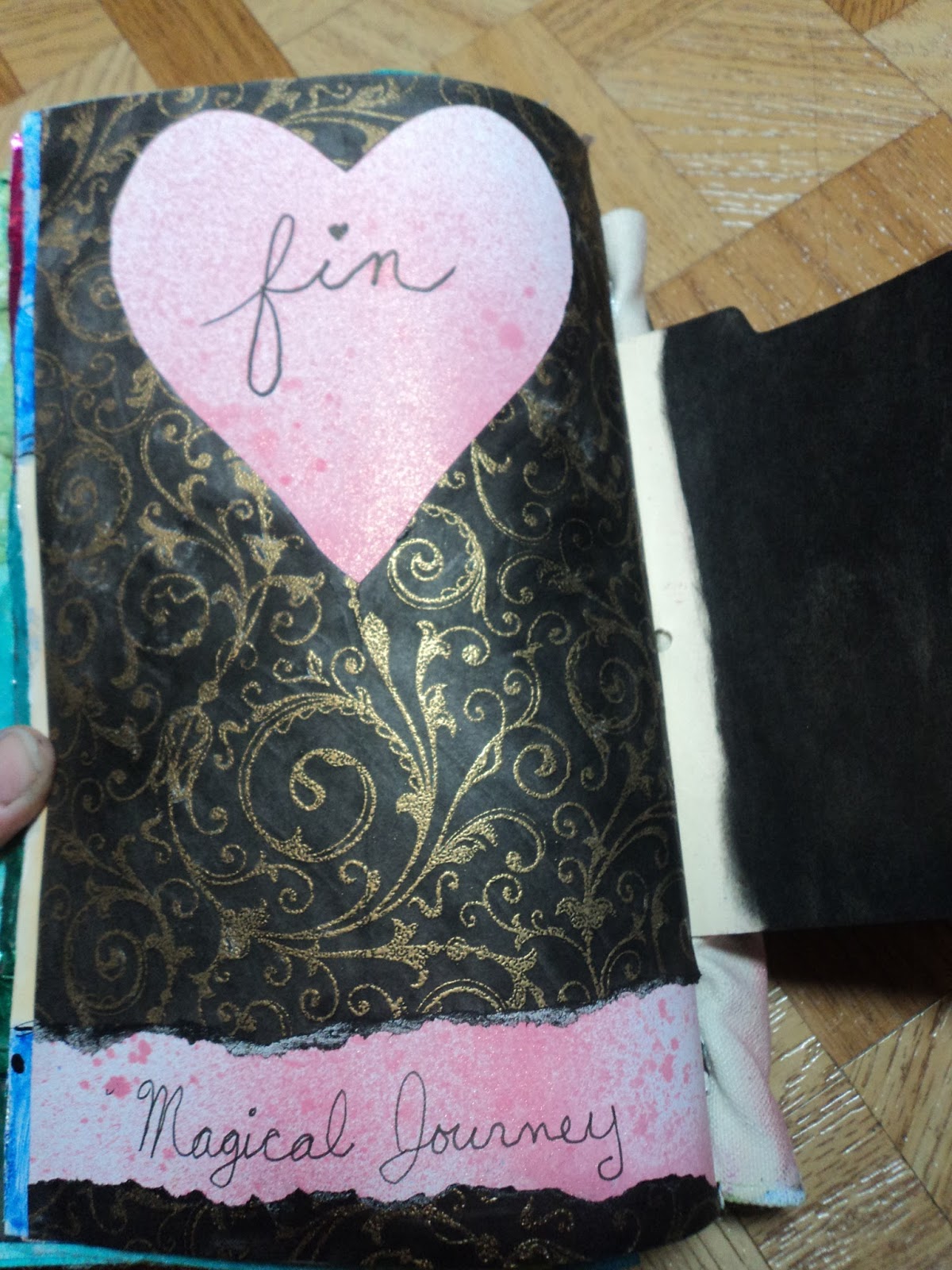
Fin:  My last page was to use up the paper I had cut the heart out of on the above spread. I colored it black and kept it super simple. Done!

I discovered a love for simplicity in these last pages. That wasn't exactly how this journal started out. It's finished, though, and the last pages were fun for me. I may not like them best but they were exactly what I wanted when I wanted it.
In 2017, I will once again be following Donna Downey's Inspiration Wednesday.
For Good or for Ugly.
-Wy

Wednesday, March 02, 2016

Sapphire Feathers

All I can say is that when I love a color; I become obsessed!
Color of the week is Chipped Sapphire, Night, Midnight Muse, Navy...however, you label it...it's that deepest of blue. It's the blue that can be used for a Night sky or a deep ocean. It's that shadow of blue that foretells of threatening clouds on the horizon; the kind that bring the lightning.

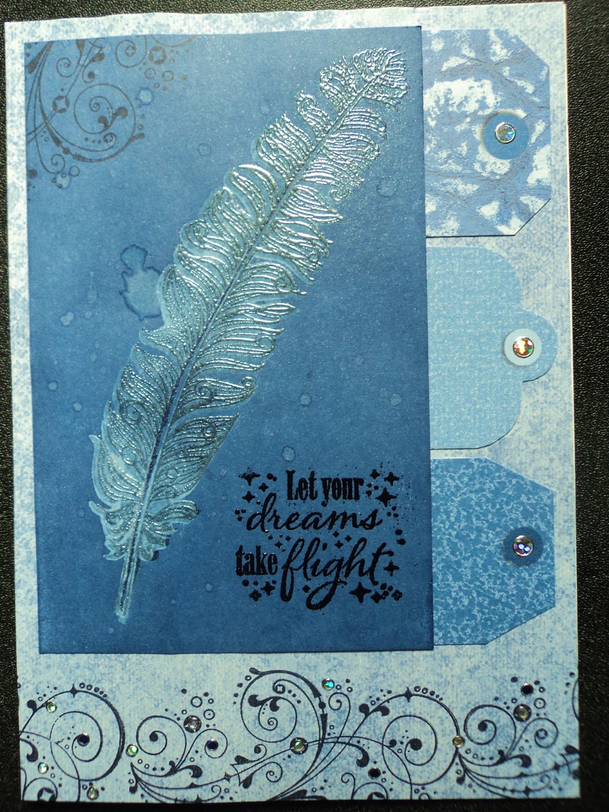
I also have lots of new stamp sets that I haven't used yet so I pulled one out today. The stamp set is from Hot off the Press: Feathers. It's one that I'm going to be using a lot...it is very versatile. I hadn't really realized it when I bought it, but this is a layering stamp set. (When I bought it, it was on sale and BEFORE the stamp layering trend had really kicked in! Now everybody is coming out with a set of stamps that can be layered over each other!)

It all really began with my idea for layering. I wanted to use gelato to stamp the back stamp (more solid image) and use ink over the top for the detail. Then, I wanted to ink blend over the top of all that. Gelato forms a resist against ink. So I gave it a try and this card ultimately resulted from my experiment.
I stamped the "shadow" of the feather in gelato but it doesn't really show up after the ink blending. I also stamped some smaller feathers which you may see faintly in the background. Even though this just started as an experiment, I liked how it came out and decided to make a card out of it anyway.
But this led to the question of why didn't the gelato show up? I figured the background wasn't dark enough so the resist didn't really show up well. Hence, my next experiment/card.
So I went all out. I applied Chipped Sapphire Distress Ink directly to my cardstock from the pad. I rubbed it right in there. Then, I stamped my shadow feather on top with gelato. It looked better than the first experiment. But instead of stamping the detail feather in black on top, I decided to just emboss the image. I stamped with Versamark ink and applied Lindy's Stamp Gang Magic Moon Pearls powder. (This is a new favorite! Love how it makes anything beneath it look pearly!) The embossing actually looks like I stamped with a colored ink and embossed. Added water drops because...you know...that's what Distress Inks are REALLY good for.
Even though it looked fantastic, it wasn't exactly what I was shooting for. I was hoping the embossing would have been almost invisible...less pronounced. So I've got even more experimenting to do with this!

I learned from my last art fair that people are looking for sympathy cards and my sister-in-law told me that she always seemed to be in need of that type of card as well. Sympathy cards had not really been part of my inventory. Of course, I usually make blank cards...so that they can be used for any occasion. But with a sympathy card, I discovered it was important for it NOT to be blank. It's hard enough to find something to say to someone who has lost a loved one, let alone write it in a card.

That's why I went in search of a stamp set with sentiments for sympathy cards. I found this one from My Favorite Things. I liked the simplicity of the sentiments and the way they would easily fit onto a card front or on the inside or both.

So the next two cards started with the shadow feather stamp. I had just stamped it off a couple times to get more of the gelato off of it before cleaning it. I got two more decent images so made a couple sympathy cards.

I used up old paper and Dazzle stickers (both from Hot off the Press) and overall just had a good time making some cards!

All my requirements for a good art day were met: using up scraps, trying out new stamps, playing with products just because, and using a favorite color.

I'm gonna hate going to work tomorrow! :)
-Wy
"I reject your reality and substitute my own."  --Mythbusters

Friday, February 19, 2016

Distress Crayons VS Gelatos

This remarkable match-up reminds me of Godzilla vs. King Kong. (Not a kaiju fan? Skip to the next paragraph.) At the end of that movie, the audience is left to wonder who really won the battle? We see King Kong swimming away out to sea, supposedly back to his beloved Skull Island, but no where is Godzilla. But since Godzilla is seen in many more movies afterward, it would appear that Kong wasn't exactly a victor. In fact, how many movies has King Kong been in since that battle with Godzilla? One maybe two? So overall, maybe Godzilla was the real victor. This is precisely the situation I have with Distress Crayons vs Gelatos.

Gelatos are a product from Faber-Castell. They are/were very unique. Gelatos are a pigment stick that comes in a small tube that can be applied almost like a lipstick. They are very soft and creamy but look more like a crayon when applied dry. When they are wet, they look more like a paint. They can be blended together either with water or just with the smearing of your finger. They come in a variety of colors and in small or large tubes (Double Scoops), if you are applying it to a large area, such as a canvas.

Distress Crayons are a product from Ranger and Tim Holtz. These debuted at CHA 2016 this past January and there has been a lot of talk about them. These "crayons" are also a soft pigment stick that plays well with water and is "water-reactive" like all Distress products. They come in a pen-like tube that is narrower and longer that the standard Gelato tube. It is creamy and can be smeared/blended and comes in 18 colors (currently) that match the Distress palette also from Ranger.

So I did a little head-to-head comparison.
In this corner: Gelatos. 
Club Scrap - Faber-Castell Gelatos Colors Gift Set #2385
And in this corner: Distress Crayons.

“Set

Let the combat begin!

So I decided to just swatch the new crayons out on a single page in my Art Journal. I picked out Gelatos in colors that seemed most appropriate to match against the crayons. I will admit this was a little tough. The palette of the Distress line can be very unique and the set of crayons I had chosen were a bit more "earthy" in tone than most of the gelatos I owned seemed to be. But I did the best I could with what I had.


I used a large Dylusions journal and gessoed the page. Once dry, I split the page in half so it had a top and a bottom. On the top, I made swatches of the Gelatos, and on the bottom, I used Distress Crayons. My purpose was to test 3 things: 1. How well did they smear and blend? 2. How well did they work with water or how well the color moved with water? 3. Did they smear a lot when a finishing coat of ModPodge was used over the top of them?
I laid down some of the pigment stick in the upper half of each stripe first. After I laid down all 6 colors, I went back to blend with my finger. The middle portion of the stripe is where I used my waterbrush to lift the color and spread it with water. The bottom of each stripe is an experiment that presented itself and I'll touch on that in a bit.
First, Gelatos:
I am very familiar with this product and have been using it for over a year now. I am a big fan of it. The gelato applied very easily to the gessoed page and smeared/blended with ease. I used my finger to blend it and no water. It rubbed around without much effort depending on the color. The blue and purple seemed to require a bit more work than the others. The waterbrush lifted the pigment without trouble and moved it around to create a more "watercolor" type look. I may even have been able to wash the pigment off the gesso if I had wanted. When the top coat of ModPodge was applied, the gelato lifted a little but didn't smear too badly. I was using a light coat and a light touch. As you can see in this photo above, even after the Mod Podge, the white areas are still pretty white which tells me that the color didn't move much with the Mod Podge.

Next up, Distress Crayons:
This being a brand new product this year, I had relatively little info on it. (Only a few YouTube videos I had seen.) The Crayons applied very easily, and smoothly to the gessoed page. They had the same consistency of the gelato and at first application, they seemed more creamy than a gelato. I tried the smear/blending test first with my dry finger. Here's where the story gets a little long and weird.

I applied the crayons first and applied all the colors by just scribbling them on the top of a stripe. I blended the red and it seemed very similar to a gelato. This is when I decided to apply the rest of my colors before blending. It seemed a better plan than blending and wiping off fingers then applying and repeating. So I left the crayons unsmeared until after I completed the gelato application and smearing. Here's the weird thing that happened: when I came back to the crayons to blend them with my dry finger, they didn't want to blend. They didn't want to smear. They didn't want to leave the lines of color they were currently in. At first, I thought maybe it was just the Rusty Hinge color. But all of them reacted the same. Even on the gessoed surface, they were very stubborn about being rubbed. In fact, I was left with streaked colors...as in you could tell where the lines had been. It was much worse than the above photo portrays. This was an instant turn-off for me. Blending and smearing with a dry finger was the main way I used gelato and if these crayons weren't any good at that, they were dead to me.
BUT, I had smeared the Festive Berries rather well when it had first been applied. So that led me to believe that perhaps, you needed to rub the crayons soon after application or they dried too much to blend later. This became my unforeseen 4th experiment at the very bottom of each stripe. I went back and applied each crayon color again at the bottom ONE AT A TIME and smeared it immediately. Each one worked rather well with similar results to a gelato. To be fair, I went back and applied the gelato colors to the bottom of their respective stripe and let them sit for about the same time as the crayons had. After they had had time to "dry", I tried to blend them with my dry finger. They blended just like they had when first applied. Hmmm...

The Distress Crayons were just like the gelatos when I used the waterbrush on them and the color was easy to lift. The Mod Podge test was a bit different than the gelato but not unexpected. The Mod Podge applied lightly with a light touch really caused the crayons to "bleed". I assume this is because of the crayons "water-reactive" properties. This is why the photo shows the crayons smeared better than they actually did. With water, these crayons move very well and the Mod Podge lifts a bit of that and evens it out. This happens to gelato but to a much lesser extent.

HERE'S THE HEAD-TO-HEAD:
Both products are very similar but your choice will depend on your personal preference mostly. It will also depend on the application and technique you want to use it for.

Both products are soft and creamy and are applied from a tube. Both can be used directly onto a surface or lifted with a waterbrush to create a watercolor or softer look. Both work on a gessoed surface and can be coated, lightly, with Mod Podge to "seal" them in.

Distress Crayons come in an interesting pen-like tube that is easy to grip and makes application more precise for small areas.
Gelatos are in small, more rotund tubes that are easier to use for large background areas.

Distress Crayons must be blended almost immediately upon application or the blend-ability disappears unless you add water.
Gelatos are much easier to smear and blend without the application of water.

Distress Crayons come in 18 colors. Though more may be added, they will remain in the confines of the Distress color palette. If these colors, don't appeal to you, you're screwed. Gelatos come in 52 colors some of which have a "shimmer" to them or a metallic sheen, if you will. But if that doesn't interest you, no big deal.

I have learned from other sources of these two differences as well:
Distress Crayons have the water-reactive property that allows them to splay out from the source as the pigment follows the water.
Gelatos don't do that.

Distress Crayons can NOT be used directly onto rubber stamps for stamping. Because of the above reactive property with water, they cannot be rubbed onto a rubber stamp then misted and stamped.
Gelatos can be applied directly to a rubber stamp, misted lightly with water, and stamped to produce a decent image. (and because you've used gelato, it becomes a resist to inks.)


THE VERDICT:
The winner is...wait for it...
Gelatos! 
Or is it...could it be...
Distress Crayons!

For ME, the winner is Gelatos. I already own a bunch and they have never let me down. I adore smearing them with a dry finger and using them around the edges of paper I have collaged down. When the Distress Crayons wouldn't blend after a given time frame, I lost the new product excitement. I rarely get excited about Distress products "water-reactive" nature. In this instance, it means very little to me. If I wanted to use these with water, I'd just reach for a paint or an ink or a watercolor. I never use my gelatos like a paint...I use them like chalk or crayons. I don't want to water them down. I want that strong color.
I DO LIKE the Distress Crayons for the colors. I have a few favorite colors in this palette that don't have a comparable counter-part in a gelato...like Peeled Paint or Seedless Preserves. I DO LIKE the pen-like packaging they come in, though it doesn't lend itself well for how I smear that stuff over a background. It's just kinda cute, ya know? I doubt I'll buy any more of them. I've got what works for me and I'll stick with it.

So what's the winner for you?
Depends on what you want to use it for and how you work.
Hope this helps you narrow it down!
--Wy

Thursday, January 07, 2016

Artist Journal: The Grand Finale

Over Christmas and New Year's, my modem died. So I used the time "off-line" to finish my Artist Journal.

Yup...FINISHED.

Do I like all the pages? Not especially. But are they done? Yup. The Artist Journal was never about making great art or even sharing it with others; it was about trying out some ideas to see if they'd pan into anything. It was always about just sitting and decompressing from the rigors of the day. Art journaling is my escape whether or not anything comes from it.

So here's the final pages of the Artist Journal: (I apologize for some of the fuzzy photos. I was trying to rush to get the pages photographed to share and didn't want to retake them.)


Feathers:   Being stuck for ideas, this page came about from the decision to used Hot Pink and Bright Blue paint. I cut out the little photos on the back of an extra bird calendar to use as collage. I've used them on a few other pages but picked out the ones with a mostly pink color to match the background. Stenciling with blue and some bright orange dots added for layering. I ripped some extra patterned paper into feather shapes and glued them down but not on the edges so the feathers have some dimension. Black spatters to finalize the page. (I'm going to remember the torn paper feathers. They were easy to make and have a great look.)


Life is Art: Next decision was to play with some "new" Lindy's Stamp Gang Magicals. I wondered if they would work in the same fashion that I've seen Brusho work. I wondered if they would give similar results to the pigmented watercolor so I just tapped some on and sprayed with water to see what would happen. Results were very attractive so I just added some collage elements to finish it off. The large butterfly is a stamp from Stampin Up, the quote is a stamp from my stash, the tag was a mop-up leftover sitting nearby, and the music was the only thing I actually went looking for. (I think I might have been going to use some song lyrics on this page but when I found the quote stamp, I went a different route.)


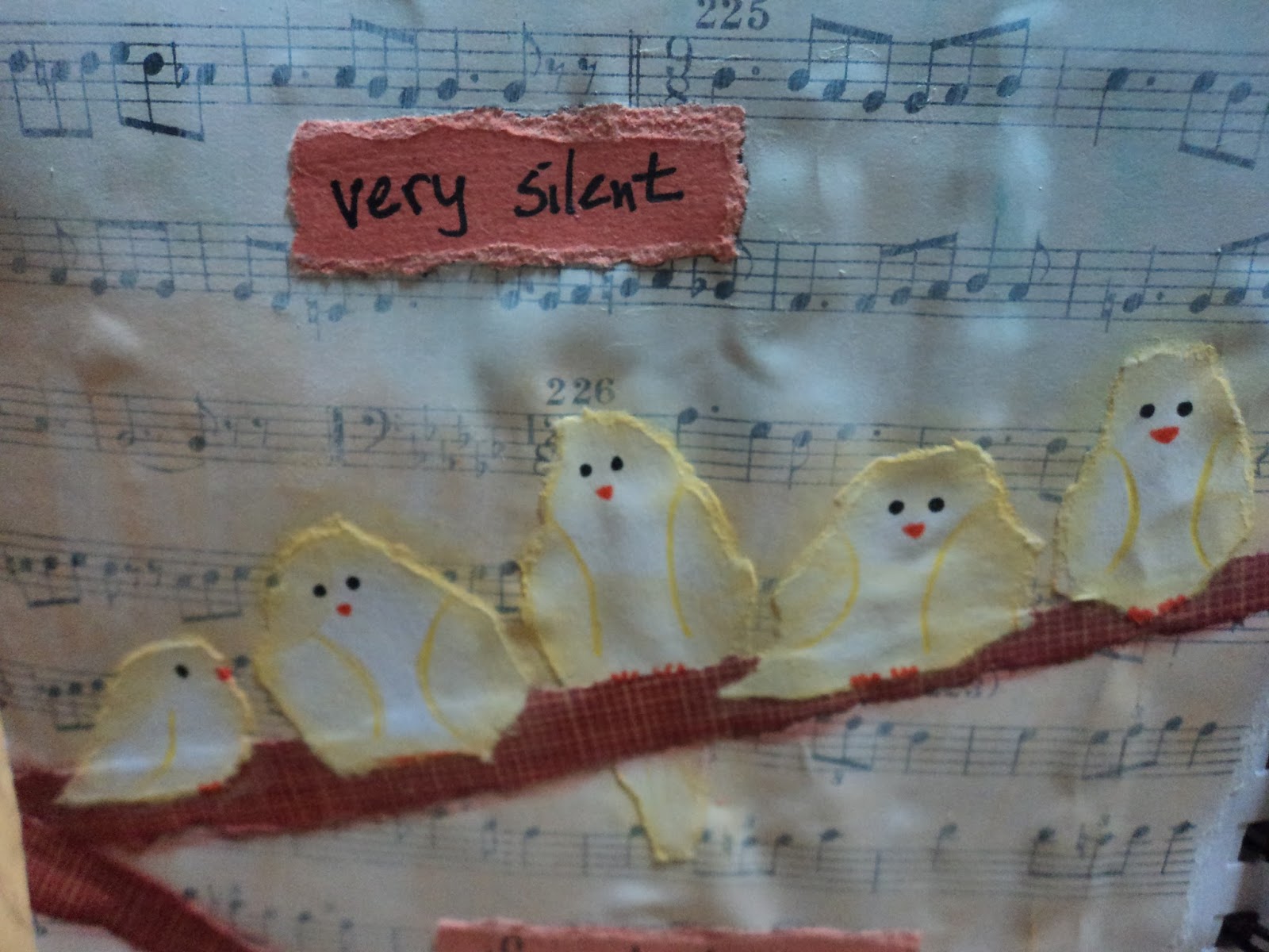
 Fluffy Yellow Birds:  Added music paper to the page then added white gesso to prime it. I used three pale shades of gelato (Faber Castell) to make the wide striped background. I had these scraps of brown paper strips that I used for the branches and a coral shade of cardstock to use for one of my favorite quote. More torn scrap paper (a soft yellow bubble pattern from the stash) to form my little birds. I cannot believe how well this page turned out. I originally planned only three birds but the paper was tearing so well that I figured I could get 5 out of the scrap. I just added the little faces and feet then defined the wings. I used Glue-N-Seal (Ranger) to adhere them and outlined them with a soft yellow gelato. (Butter is the color, I think.) Definitely one of my favorite all-time pages! (This year might be the pastel year for me. I find myself more attracted to it lately.)


 Never Forget:  I was stuck for ideas and just told myself to go with what I know. I love how black makes colors pop...especially a rainbow of colors. To a gessoed page, I made three rainbow circles from the bright set of gelatos. I scribbled the color directly onto the page then blended it with my finger. (This is my favorite way to use gelatos. It keeps the color bright but they still blend over a gessoed surface.) I didn't add any sealer over that because I knew I was going to add the black. I decided to go with the Glossy Embossing Paste in Black from Dreamweaver. I wanted the glossy shine to contrast with the matte finish of the gelato. I applied it through a stencil and let it dry overnight. Then, I was stuck again. I added a black tag (I just took a manilla tag and painted it black.) with colorful circle stickers that seemed to match. Then doodled with a white Signo pen. The tag covers up a bit of mess I made with the stencil which is good. But adding the tag with Matte medium probably wasn't so good. The Matte finish dulls the embossing paste along the edges of the tag. But...I don't really notice it that much. Still love the page!

Here's a few of the pages that helped to complete the journal, but would be more of an Honorable Mention:


 More rainbow gelato fun.


I had to use up paper that was taking up space in my work area! Flying fish bones!


Trying my hand at something more abstract as well as using stamp images inside of smaller shapes. Meh.

A mess of a page. The black acrylic paint went horribly wrong with the small stencils I was using on a terribly non-flat surface. So I threw on the last of some stickers and just decided to leave it a mess. I share the ugly pages, too. They ain't all masterpieces!

Fin:  The last page in the journal but not the last page that I completed. The background is actually packaging from one of Dyan Reaveleys stencils or art journals. Added my torn paper flowers and a strip of washi tape to hide a seam. Complete. Finished. Done. Fin.

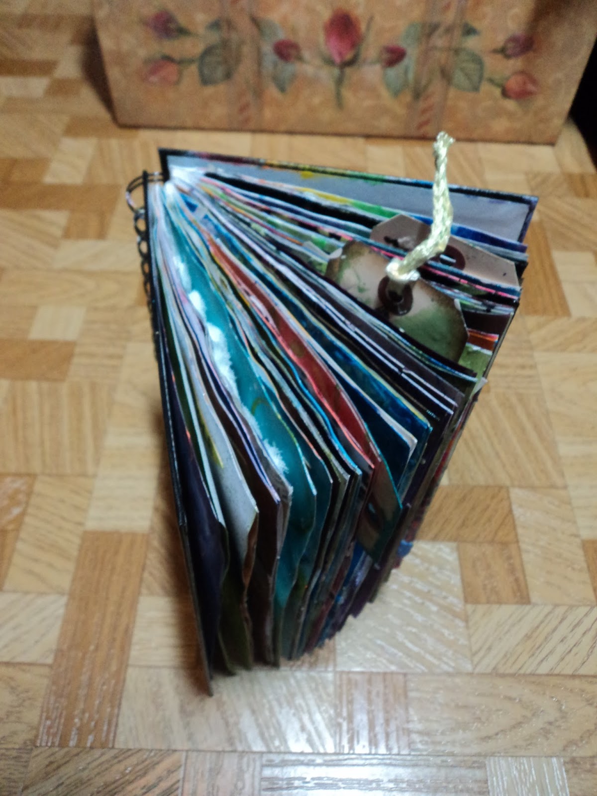
Here's the chunky journal that has been TWO YEARS in the making:


Thanks for hanging in to the end of this massive post! But I wanted to just GET IT DONE!
Happy New Year!
-Wy
"The cares of tomorrow can wait till this day is done."  --The Irish Rovers, "Come By the Hills"

Featured Post

The Chocolate Game

 Let's talk about something sweeter than my other blog posts of late. Let's talk chocolate. But no guarantees that anything I want t...