Ok, so I totally forgot I was supposed to post for the month of February. Of course, since I took a vacation, I didn't really have time to catch up with all my prompts until this last weekend.
Overall, I like the pages I've got done. One page just doesn't float my boat but it's done.
Without further ado, here's pages from the AJA for February.
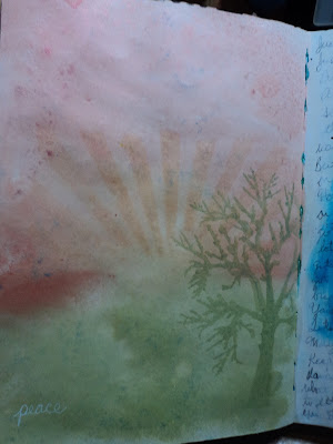
Week #6: Use a Subtle Color Palette: This page cannot be photographed by my amateur skills with any real success. Take my word for it; it's way prettier in person. I used all Lindy's Starburst sprays. I'm not entirely sure on the colors but I think Cosmopolitan Pink, Fuzzy Navel, and Edelweiss Green with a touch of Glory of the Seas Gold. In all honesty, I liked the way the background looked so much, I didn't want to mess it up. So I just used two stencils with the same colors and added in the rays and the tree.
It is REALLY subtle because you need to adjust the page to even see the patterns. I even wrote the word "peace" in white pen in the corner. It's just barely there. But it's a page you really have to look at and I like that.
Week #7: Use Text as the First Layer: I have often used dictionary pages as a background paper and wanted to try something different. I just wrote down the lyrics to songs that were playing as I worked. I didn't need to get all of them just the lines that I could scribble out in the time it took to fill the page. I've got about 4 songs in there in some form.
I've always like to do flowers on top of text so I decided to just go for that and use up some old gelatos. It was working ok until I added the black outline. Yuck. It seems too thick and too bold. Not quite what I had in mind. But it is what it is.
Week #8: Include a reference to Time: This was a tough prompt for me as I didn't want to go down the path I always have. I didn't want to end up with clock faces all over my page. So in trying to meld this prompt with another project, (and with a little help from my sister) I remembered a poem of Poe. The Bells. I took that quote and ran with it.
The entire poem is really about the advancement of Time through the tolling of various metal bells. Brazen bells, iron bells, silver bells, golden bells. The repetition of the poem is practically a chant, the progressive march of time over life. So this page with its three different bells is my interpretation of the poem. I was trying for the feel of the inside of a clock tower that chimes on the hour.
I was so happy with this background. I LOVE IT! I honestly didn't think it would turn out. But using Dylusion Black Marble paint with a Tim Holtz ink applicator was the key to success on this one. The paint dried quickly and the applicator allowed a thin coat that didn't seep under the stencil. The black paint also covered very well with just a couple coats. The coppery colored background is Lindy's Starburst sprays in various coppers and golds. It's hard to cover up the mica but the Dylusions paint did a pretty good job.
I tore the bells from scrapbook papers and went over the torn edges with gelato. (You know, my usual.) I'm not sure I spelled rythme correctly (it should be rhyme)...but I don't even care. This page is ranking high in my all time favorites!
Week #9: Transform one or more of your edges: I never remember that I can alter the size of pages if I want. I never remember that I could just rip out half a page and work with the remainder. While this was a good reminder, I had trouble deciding what to do with the page. At first, I wanted to incorporate the edge into the design but I wasn't sure how to do that without going totally abstract. I decided to use a stamp I got a while back and hadn't yet used. (I showed it to my sister this past weekend and said, "I really need to use this." So hey, El, I did it!) The wavy edge would work for an underwater scene.
Initially, it was all going to be about those fish bones but I was reminded of the scene in Finding Dory where Dory is stuck in a bucket with a bunch of dead fish. I decided to go with the notion that these bones were what was left from some sea creature's lunch. I went with an octopus...because hey, Octopus! I didn't have room for the entire octopus but tentacles are the best part anyway.
I wanted the background to be more green than blue because I wanted to keep it a little creepy. I added the large pink circles of paint as a finishing touch as it seemed to need a pop of color. And let's face it, those circles look like the sucker marks of an octopus. Am I right?
So those are my February pages for the Art Journal Adventure. Here's to hoping the March pages will be just as satisfying!
-Wy
"To the moaning and the groaning of the bells." --Edgar Allan Poe, "The Bells"


No comments:
Post a Comment