Showing posts with label artist book. Show all posts

Tuesday, October 27, 2015

Artist Journal: Plugging Along

Some more pages in the Artist Journal. Just to prove that I'm still working at being an Artist. (with a capital "A")

Owl at Sunset:  Just wanted to play around with Distress inks on a background and my new Tim Holtz stencil, Rays. I just like this one.


Dem Bones:  I do love the skull stencil...I've used it many times in my journal. I tried it out here with my new GLOSSY black embossing paste from Dreamweaver. Yup...I like the glossy finish. The black is well...BLACK. More Distress ink background practice, too.


Red and Blue:  Not quite sure how to describe this page. I thought the background was just ugly...red over a blue-violet. Decided to just collage over it. This page is to remind me that 1. Backgrounds aren't permanent. 2. When a theme doesn't produce itself, just go with colors. 3. Eyeballs are cool! 4. Not every page has to be gorgeous and I don't have to like them all.

Sometimes just the action of throwing things down on a page, whether color, texture, or collage elements, is enough to get something going. The next project after the ones like these always seem more pleasing to me, but you still have to just get in there and start!

Thanks again for viewing my blog and sticking along to the end!
-Wy
"When you have more than you need, build a larger table not a higher fence."

Wednesday, July 08, 2015

Artist Journal: Still Working

Still working in the Artist Journal as I call it. (to distinguish it from my other journals that I work in)
If you need the lowdown on the journal, go to this POST.

Otherwise, here's a few more pages that have been done. No tutorials or anything, just general comments.


Hippie Chick:  (Pay no attention to that man behind the curtain!)  The page on the left was just an experiment with new gelato colors and to use up those "confetti" stickers. Nothing too special, just fun.


Twilight Flowers:  This page is actually a tester page. I have an idea for a canvas and wanted to "test" out a few things first. Test #1: Applying ModPodge over gelato. A light coat still causes a bit of color blending so I need to keep that in mind. Test #2: Can I apply spray inks over the Mod Podge coat? The ones I used seem to work well. But I didn't apply another coat of Mod Podge over the top of them. But they will dry over the Mod Podge. Test #3: Do flowers in darker colors still look pretty? I'd say yes. Also tried out a new flower form; the pansy. Test #4: Modeling paste. Will it stay white? Nope. It lifts the ink spray. Good to know.


Ribbet: Wow, do I really like this page! I was stuck (let's face it, I have been stuck for awhile in this journal!) so I took a look through my magazine clippings. Went through my Animal folder and saw this bullfrog. I was attracted by the gold flecks in the eyes. So I used my Izinks for the background. I just used them like a paint and they look fabulous! You can't really see it in the photos but the Izinks have a very "metallic" finish. They look like you've painted over aluminum foil. Background stamp is the bubble background from Lost Coast Designs stamped in Azure StazOn. Used up some scraps for the top...tried out the new Distress color Mermaid Lagoon on the embossed paper. Very nice! I outlined the frog with some black gelato and blended it out with my finger to give him a nice shadow.

 Ghost Writer:  This page is the second attempt; the first is on the backside. It was intended/inspired by a challenge over at the Challenge blog: Quoth the Raven. (If you are a fan of Edgar Allan Poe, you need to follow this challenge blog. Just the samples are great to look at!) Anyway, I missed the challenge deadline but really love the page. I don't often do scenes in my journal and this is a bit out of my comfort zone. Overall, I was practicing my shading and playing with two products that have been sitting the bench for awhile: my Distress inks and my Inktense pencils. (Damn, I love those Inktense pencils. Everytime I play with them, I just love the results!)

Here's a few close-ups:
I folded a piece of cardstock to make my own little book. I stamped some text in red ink on the inside. It opens up.


Sorry it's sideways! This stamp is from Stamper's Anonymous; Tim Holtz. (I think it's the chemist set?) Colored in with Inktense pencils.


 The Picture is a collage image of Poe's gravestone outlined with Inktense pencil. The window is also all Inktense pencil with the moon taking on a tinge of red...or maybe blood? All the brown in the background are varying shades of Distress Inks. The red wallpaper detail is pencil through a stencil. I like the indistinct look I got from it.

Hope you enjoyed! I'll be posting some from my newest Art Journal; the Inspiration Journal very soon. Thanks for reading!


--Wy
"It's the other side of the evening and it's time for us all to go home."  --Irish Rovers, "The Other Side of the Evening.


Friday, June 05, 2015

Artist Journal: Glass Bead Glitter Gel!

I have discovered a product that I now cannot live without: Glass Bead Glitter Gel from Faber-Castell. Whoa. It's a whole new dimension of sparkle and texture...and I love it. (Despite not being much of a Glitter Girl!)

I've played with it a couple times and decide that I like it best applied rather thick through a stencil. So, yup, you guessed it: that's what started off this page in the Artist Journal.


My idea: Use glass bead glitter gel! (Seriously, this was the whole idea when I sat down!) My idea expanded when I saw my large butterfly stamp at the ready on my craft table. I love the look of natural elements on old paper. But I realized I already had several pages in my Artist Journal all ready to go. (Translation: I had two pages glued together and covered with white gesso.) So I decided to replicate the look of old paper using Gelatos for the primary coloring agent. I just love this product and it works like a dream on gesso covered pages.


Minions assemble! Got out all the stuff I figured I'd need for the idea.(Honestly, this is fastest I've ever come up with and implemented an idea for the journal!)


Step 1:
The stamp I selected (Swallowtail from Stampin Up!) didn't have a coordinating stencil or die so I went ahead and cut one myself. I just used an old manilla folder and stamped it right on there. It didn't have to be perfect. (But I did use a waterproof ink as I didn't want the ink to come off of it when I used the mask portion of it.) Cut it out with an exacto blade and voila! I had a stencil and a mask of my stamp.


Step 2: 
Now that that was done, I went ahead and stamped the butterfly onto my journal page. Once again, I used a waterproof ink (StazOn in Timber Brown). Then, I placed my newly cut mask over the image to shield it from my background. I didn't tape it down or anything, just held it in place with my hand. (Really, you can use any of your preferred forms of masking here.) I added two colors of gelato to the page to make the background. I just scribbled it on then used my finger to rub it around and blend it together.


As you can see the gelato blends beautifully on a gessoed surface. I didn't use any water here just rubbed them in with my finger but you can use water to help the process. (Both of these colors are from the Steampunk pack; Iced Chai and Cinnamon.)
Step 3:
After this was blended, I LEFT THE MASK IN PLACE.
Here's why: I added a bunch more stuff to the background. I stenciled, stamped some text, and added black paint splatters.


For stenciling, I used more gelato. I used two shades of green (lime and margarita mix) and the stencil, Branches from Joggles. I applied the gelato directly to the stencil and rubbed it into the design with my finger. (This method gives you quick and easy blending of colors without disturbing the gelato layer beneath it!) If you don't like messy fingers, you could use a blending foam or dauber here.


So once you've got all your background done, it's time to remove the mask! (Sorry, my photo doesn't show my paint splatters. I actually added them as an afterthought...but it's easy enough to throw the mask back on the image!)


Step 4:
Now it's time to color in the butterfly! Again, I used gelato. I finally settled on purples and pink for something different. (I'm a traditional girl about butterflies and like them to "look real" most of the time!) I scribbled some gelato (purple metallic, purple, and passion fruit) onto my craft sheet. Then, I just added a touch of water with a paint brush and painted the image. (I added a bit too much water at first...how did I know? My color wasn't as dark as I wanted. Less water, deeper color.)


Last Step!
Add the Glass Bead Glitter Gel. Here's where we use the stencil we created at the beginning. I just lined up the stencil over my butterfly. I held it in place with one hand and applied the bead gel with a palette knife with the other. As stated, I like the look of a relatively thick layer. Just be careful along the edges as you apply the gel so it doesn't seep underneath the stencil.

Looks scary, huh? I mean, I colored it so nice and now it's covered with sparkle frosting.
Not to worry, it dries clear. I let it dry overnight. When you come back in the morning, it's like Christmas!


Finished!
The photo shows off the sparkle but you really got to feel this stuff and see it up close. There are tiny little glass beads imbedded in there. You can see little round "bubbles" in the gel and it's such a unique texture. It shows off any color or pattern you've got underneath it so it makes a great top layer.

Hope you liked my page and I hope you'll try out some Glass Bead Glitter Gel soon. It's really a show-stopper.
-Wy
"Happiness is a butterfly, which when pursued, is always just beyond your grasp, but which, if you will sit down quietly, may alight upon you."  --Nathaniel Hawthorne


Thursday, May 14, 2015

Artist Journal 2015: Will I finish it this year?

Same journal I was working in last year! I had such a hard push at the end of last year to get my Art Journal done that I neglected this one mostly. I have done a few more pages in it so I thought I'd share. I'd like to finish this one by the end of 2015 but who knows?
For those that missed it, this journal is a Pro Art Sketch book that measures 5.5 X 8". It has 80 pages which I am gluing together as the pages are pretty lightweight. I generally put two pages together with Gel Medium and then gesso the pages. I tend to use acrylic paints in this journal and not ink sprays.

So here's a few photos and general info:

Fly:  I have hoarded an ungodly amount of magazine pictures. (And I don't subscribe to any currently!) So time to use 'em up along with all the alphabet stickers I still own! Fluid acrylic over masking tape and dictionary paper for background.


The Splendid Sun:  Background of acrylic and some text stamping. The bright colors reminded me of hot summer days and this quote came to mind. Magazine picture along side was added as the colors in it matched perfectly and the black border made the colors even brighter. Love the face in it as well; reminds me of a face you'd find in the celestial object.


Turquoise Torn Eyes:  I painted a page black, used a Tim Holtz stencil with white, splattered with turquoise. But it's all about the eyes. I love how they seem to be underneath the background along the edges.
I wasn't sure if this page was done but I've decided that to add any more will only muck it up. I like it as it is.


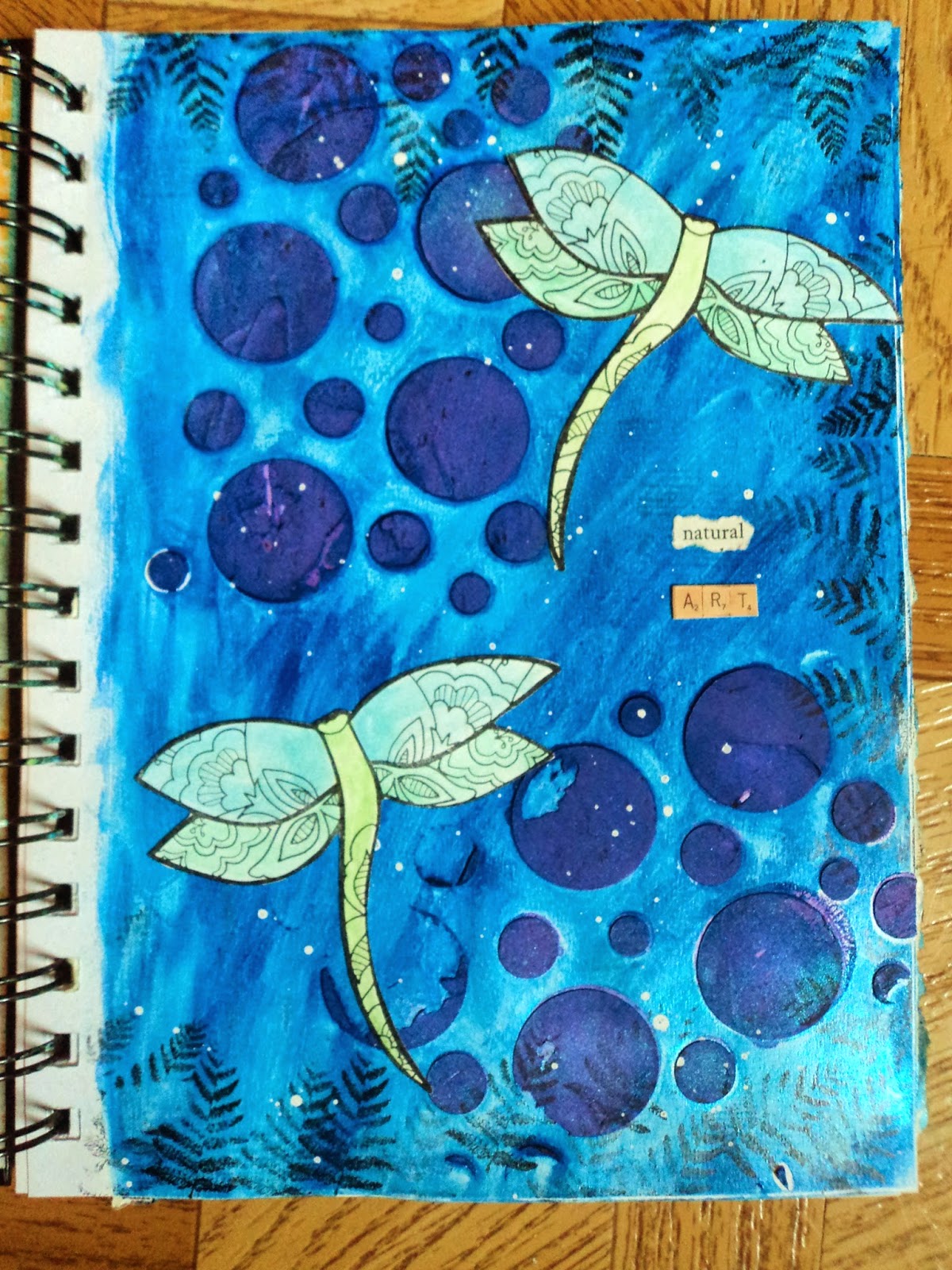
Natural Art:  I was playing with whipped spackle (Faber-Castell) and colored some purple. This was the leftover put through a circle stencil. I added blue acrylic over the top. Stamped dragonflies were cut out and glued down along with the title. Meh.


Incomplete:  This is the page opposite the Torn Eyes. I haven't finished it yet. I keep coming back to look at it to see if an idea strikes me but nothing so far. I may just add some splatters and a quote and call it finished.

I haven't shared all the pages in the journal. I have some that are just "practice"...what I see as me getting warmed up creatively. When I get some more, watch for my posts under Artist Journal.

Have a great day!
--Wy
"Give me the splendid sun with all his beams full-dazzling."  ---Walt Whitman

Tuesday, October 14, 2014

Artist Journal 2014: Part 2

My continuing work in my Artist Journal. If you missed the previous post, you can find it HERE.  This is the book that tend to have more acrylic paint work and collage in it that my Art Journal. So here's a few spreads to share. I don't share everything but those ones that seem to have their own voice.


Neon Peace:  I don't usually take photos of pages before completion but this was an exception. (I had the background paint on it when I took the last batch of photos but it wasn't done. I took a photo of it anyway. The page has been done for awhile now but I didn't have any other pages done. I like to post a few pages at a time.) After trying to figure out what to do on top of NEON, I decided to just roll with my '80's vibe and throw in a little hippie '60's. I think I was finally successful in making a Happy page.


A Certain Darkness:  Opposite of the "Happy Hippie" page, this page was inspired by a tag I did for Halloween. I got this quote stamp from Unity Stamps as I use a lot of night skies and stars in my work. (what can I say? I love the stars and the moon!) The tag had an owl, however, perched on an outstretched limb of the tree. But I loved the look of my torn paper moon and birch tree, so I decided to recreate it in my journal. This background was perfect. The background was an odd bluish-green acrylic that I tried to tone down with a layer of gesso. I still didn't like it so I went over the whole thing with black paint and wiped some away with a baby wipe. I love the gelato "glow" on this page. I had used Mod Podge to attach my paper elements and gelato works so well smeared along the edges.


It's Not Easy:   This page was going to be some kind of bubbling cauldron with it's green circle background but my drawing got in the way. I painted in the cauldron but something was off. I realized that the lip of the cauldron was in front of my bubbling spray. I painted over it and tried again. Much better. Then, I outlined with a pen and cut it off again! So I gave up and collaged some dictionary paper over the cauldron to start over. But I couldn't get a good idea going. I decided to just stick with green and get the page over and done. So it's not easy being green.


Amazingly, I took more photos of started pages so my next post about the Artist Journal should have some Before and After shots!
Thanks for reading!
--Wy
"Just a small town girl, living in a lonely world." --Journey

Wednesday, September 17, 2014

Altered Book: The Book of Fire

Fire is the element of transformation, of change, of resurrection. One walks through Fire to come out something or someone different on the other side. So I transformed a book into...another book?

Yeah...I wish I could say that the above was my inspiration but it was nothing quite so poetic. In fact, I have a whole lotta books waiting around for me to alter, embellish, and otherwise transform. This was on top of the stack.

The book was originally, Wonders of Nature by National Geographic. I ripped out the photos I liked and decided to just keep ripping to prep the book for...something. It was a photo of an erupting volcano that fascinated me and made up my mind to do the whole book about the element of fire. The whole idea was a daunting one for me. See, I hardly use red in my artwork and yellow is a challenging color for me. Yellow is my nemesis color; I always get stuck and horribly brain-washed when I use it in large scale projects and backgrounds. Red and yellow are the primary colors of fire and THAT was a crippling hesitation.


So I began by rifling through all my file folders and pulling out any imagery that dealt with Fire or Heat. Any pictures I could use as focal points, any full page photos that would cover up the book yet lend to embellishment. Anything to keep me from a book full of red and yellow. The page above was original to the book and I painted over it. The figure walking down the road was originally surrounded by water. I used acrylic paint to make flames and smoke. It was my first spread in the book and a real confidence boost. It turns out to be my favorite.


 This is not the volcano that originally inspired me but this is the volcano page. The text (mountains born of fire) was saved from the original book. The simple yellow splatters on the black background seemed just the right touch and not too distracting from the brilliant photo. I had alphabet stickers to use up and I had red and yellow letters! (Imagine that!)

Another page in the original book which I almost tore out was about the Giant Sequoia. I left it in intending to paint over it but when I read the text/caption on it's opposite page, I decided to change around my plan. My plan was to put the single Smokey Bear image onto my page about Wildfires. But the Giant Sequoia gets so big and lives so long because it has fire-resistant bark. (isn't it amazing what you learn?) So I decided to dedicate the page to Smokey and preserve the educational text. (and because it linked the tree to the element of fire) I made the background with a stencil to give it a bark like appearance then added my hand-doodled beetles for a bit of vertical interest. (I LOVE my blue beetles and they will make many more appearances in my work, I have little doubt!)
 

This spread is a throwback to my scrapbooking days. I used to scrap a lot of photos about geocaching and letterboxing which gave me quite a collection of camping, hiking, and outdoorsy stickers. I was determined to use up some of them on these pages dedicated to the Campfire. When I set up the book, I left some pages with "inserts" or half-pages. I had no real plan for them and they fell wherever. I was stumped with what to do with this half-page. I had an idea to used half-burned matches to make a design element but it was a lot of space to cover and the sticker collage already made for a pretty busy background. So I took the idea from the Smokey Bear page and made the insert "log like". This quote is a new addition to my collection, "To poke a wood fire is more solid enjoyment than almost anything else in the world."


The campfire stamp (in the circle) always makes me smell smoke and crave roasted marshmallows! My only regret with this page (and I really thought there'd be more than one because most times I go way overboard on throwing stickers around) is that I had thought more about the background paint. I wish I had pulled the yellow up over the red to simulate rising flames rather than the red looking like it's falling into the yellow. (those are golden fluid acrylic paints whose colors I don't remember)

Hope you enjoyed a little tour of my recent work. It frees up some space on my "To Do" board and the completion of altered books always makes me happy. Finally, something finished! This wasn't the entire book just a few pages to share and maybe inspire.
Have a great week!
-Wy
"The phoenix must burn to emerge."

Featured Post

The Chocolate Game

 Let's talk about something sweeter than my other blog posts of late. Let's talk chocolate. But no guarantees that anything I want t...