My current art journals are my Art Journal and my Artist Journal. I distinguish the two by the media I use for the backgrounds. My Art Journal is a Strathmore Visual Journal, made for mixed media. I like to use spray inks in this one because the thick paper absorbs it well and still has a smooth finish for stamping.
My Artist Journal is a Pro Art Sketch Book. I originally bought it for a letterboxing logbook but found that the paper sucked for stamping. The paper is thin so I don't use it for sprays anymore. I discovered that if I glue a couple pages together and gesso them, acrylic works very well on them. I tend to do less stamping directly to the page but rather cut out a stamped image and glue it on.
So this post is to catch up on some of the pages of my Art Journal.
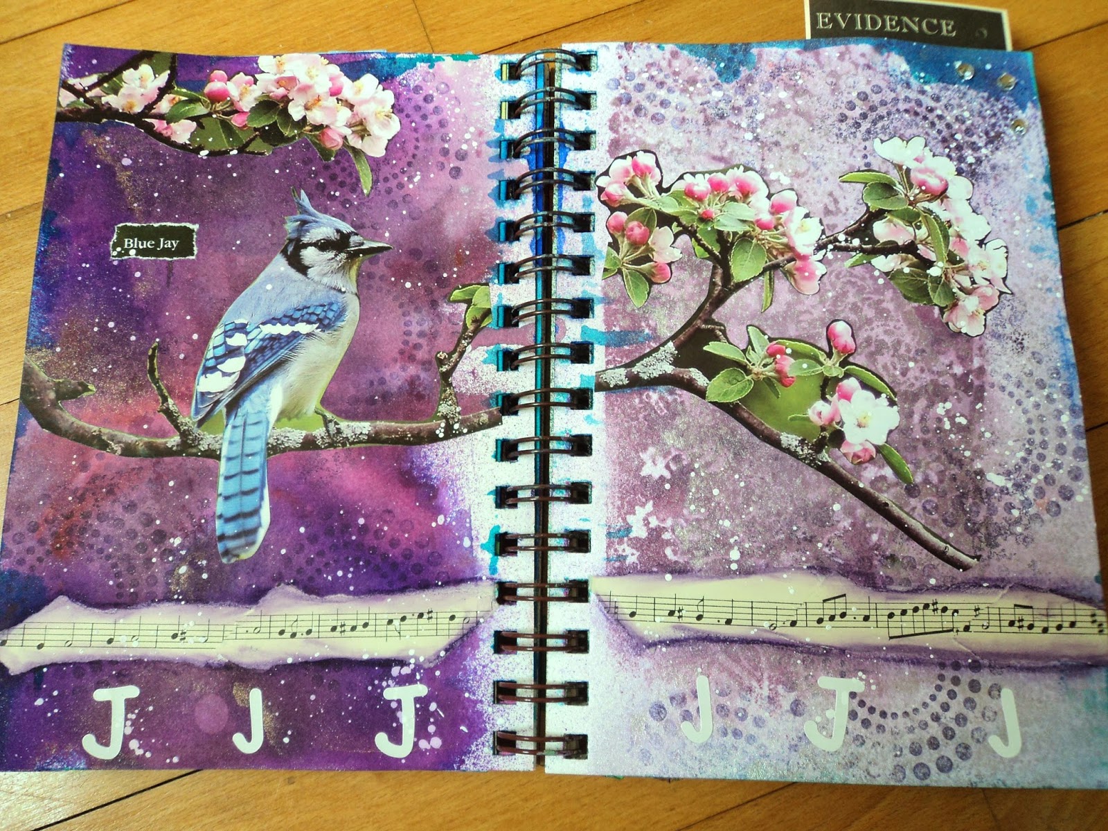
Blue J: My Mom gets all kinds of free calenders in the mail. More than any of us can ever use. She lets me pick some out to cut up and I almost always choose ones with birds. That's where I found this Blue Jay. I like this spread as it has some of my favorite stuff: cool colors, old paper, circles, and splatter. The purpose of the background was to use up one of my Smooch sprays. I've had this lavender one for a long time and just wanted to finish it off. I still have a little left. (Argh!)


Spooky: This spread was inspired by two new colors of Dylusion Sprays I recently acquired; Polished Jade and After Midnight. I added a bit of Turquoise in there, too, I think. It looked so spooky that I decided to roll with it. I added some White Linen spray through a couple stencils and stamped alot of imagery with a couple hand-carved stamps I had done. (gravestone cross and tree branch hand)

I carved this skull and it's a stamp I use a lot. I stamped it with white acrylic paint then added the little masque (also from a carved stamp). The masque is just colored with a brown distress even though it looks glittery in the photo. (But that's an idea I may use to jazz this up a bit!) The pages have a glitter to them but for the life of me I can't remember why. For all the stamping on here, this page spread still doesn't feel finished to me.

Meditations of the Heart: This page was one that had me stumped for the longest time. I still can't say that I love it but it is finished. It was the background that threw me. When I added the After Midnight spray over the green it went much darker than I anticipated. The bright green stumped me. The gears always make me lean toward a vintage look and I wanted something different. The edge toward the spine was a hideous mess, so I knew I had to cover that edge. I wasn't really sure I wanted to add the dragonfly but I thought it accented the blue in the paper. When in doubt, stick a flower down! I'm not in love with it but it has it's merits.

Specimen: I had a ton of scraps all over my table and a really ugly background. Sooooo, I covered it up mostly. My fallback position for a overly dark background is the night sky. This alien head was a template I had used for a picture and the UFO is the top of a toadstool. I'm not sure why this page makes me happy but I do like it even if it's just a simple collage.

I don't always experiment on my pages but this was an experiment in embossing powder. I have used it on Scor Tape before but I hadn't mixed colors. This blue and black mixture was very cool.

Natural Beauty: This page started with two things: the desire to get away from the cool colors I had been using and the collection of reddish birds I had in a partially used collage sheet from Joggles.com. I received a free collage sheet and it was filled with butterflies and birds. My only problem was that most of them had a streak (or more) of a color I don't use much: RED. So that became the challenge of this page; make it red and use up all those stinkin images!

I fussy cut all the birds and butterflies but I knew I needed a bigger focal. I found this old photo copy of these women. And what better to tie together the sepia tones and the red than orange! I went through the scrap paper pile and found the orange patterned paper. Everything else was just a matter of matching color and arranging the elements the way I wanted.

Hope you enjoyed this little tour through my Art Journal. I'm caught up!
--Wy
"Art washes away from the soul the dust of everyday life." ---Picasso

No comments:
Post a Comment