I wish I had a title for this art journal but it really just evolved from a lot of mop-up pages, stencil-cleaning pages, and magazine cut-outs. I've torn a lot of pages out of it to use the sheets for my Divination Card artwork, too. So how do you boil that down into a snappy flashy get-your-attention title?
Anywho...here's a few of those pages.
Birdsong: I'm obsessed with the newer colors of Dylusions...the Laidback Lilac and Periwinkle Blue pair perfectly together. This page was based around this bird that I had colored but not used for another project. Happy page.
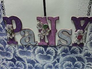
Pansy: Trying out a little prototype for a card for the new Divination Deck. I use my art journal to try out design elements and composition before committing. Experimenting with stamp masking here. I think I may be on to something.
Shy Girl: Decided to do something different with this "mop-up" page. I usually try to fill in the background to make it more solid, if that means anything. I have heard it said that white space should be kept but I admit that I don't do it out of habit. I was inspired by James Burke who creates the most interesting character illustrations. After watching a few of his videos, I decided to cobble something together along those lines. Shy Girl came out of that process.
I have plenty of mop-up pages in this journal and I love how this page came out of it. I think there will be more "characters" in this journal as I really like being able to just use up scraps and create a complete focal image. I'll be doing more of this type of page soon.
I'll have a few more pages to share soon.
Thanks for looking!
-Wy
If you haven't liked my Facebook page, please do. It keeps you updated on when a post goes live and on any shows I may be attending with artwork and cards to sell. Thanks!!


No comments:
Post a Comment