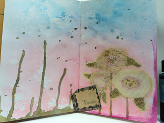
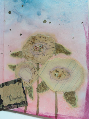
but here's Page Spread one that I previously shared for a Lindy's Stamp gang challenge.
It fit into Lindy's challenge colors so I don't really get to mark one done off my Pinterest board.
If you want to see how obsessed I am with color palettes, you can check out my Pinterest board for Colors.
So here's a color palette that I can cross off the list.

The only little cheat I may have done, now that I see this palette on my home computer and not my tablet, is that middle color. I thought it was more gray than green, ah well. I got the rest of them. :)
Here's the page:
Cat TV: Background of spray inks...trying to see the differences between 3 Lindy's stamp gang colors: Blue Hawaiian Blue, Sassy Sapphire, and Time Travel Teal. Conclusion: Teal is more greenish, other two are very similar. My first thought was to make a gray fence and put vines along it. When looking through my scraps, I found the upper and lower border pieces. I was keeping them as they reminded me of birch trees but I liked how they framed the page spread. Looked like an aquarium or movie screen. Knowing I had to add green, I went with the aquarium.
I like this page overall. I like the colors and I don't think my drawing is totally awful...you can tell the cat is a cat. (though the fish...) But at least, I'm trying to incorporate more doodling and drawing into my journals and not just collage elements. So yup...I like it.
Can't wait for my next play time.
--Wy


Love that idea! This looks great. Good call on the colors!
ReplyDeleteThanks!I love these colors together.
DeletePretty cool!
ReplyDeleteThanks!
Delete