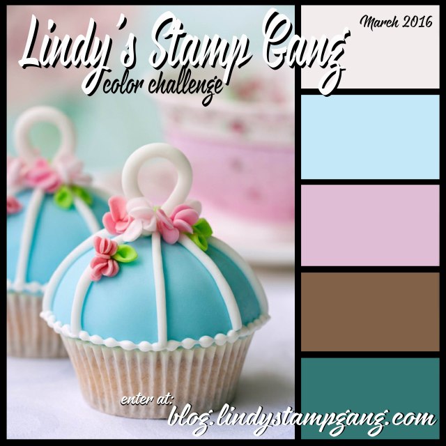
I saw this color palette over at Lindy's Stamp Gang for their March Challenge! I decided to give it a whirl. If you are unfamiliar with Lindy's click on those links and check out the store and their blog. They make the most amazing shimmer sprays. I only wish my photos could show it off better. It's super hard to photograph it. You really do have to see them in person. Anywho...
Here's what I came up with:
Timeless Paper Flowers: I had recently ordered a few "lighter" colors from Lindy's because I realized I didn't really have any soft colors in my small collection. So I added a few, namely the Drink Me Silly set! as well as a couple pinks. On this two page spread, I used Blue Hawaiian Blue (from that set) and Cotton Candy Pink (not in that set). I added a bit of water to one page, sprayed, and then smooshed the opposite page over the top to create a two page spread. I didn't fuss too much about it as I liked the little white spaces where the ink didn't transfer and the little mister dots. I tore out some circles for my flowers from paper I had in my stash. It was old 7 Gypsies paper...Conservatory. I just glued them down and added a touch of gold gelato around the edges to blur them into the page. I added the Timeless tag...well, because it was on my table. I liked the look of these cream colors against the pink but added a touch of acrylic paint (magenta) along the corner edge to make it pop.
This is where I forgot the colors in the challenge...blue, pink, cream...then....umm...maybe green?
So I added in the drips and dots of My Mojito Green (also in that set). More true to the color palette would have been Time Travel Teal, which is a much used color in my collection. But hey, I think it works pretty nicely. I like the Mojito green for it's "dirty" quality...really helps to pick up the brown tones in the flowers. It really matched the paper of the leaves and I really didn't want to add another color to distract from the flowers.
So there it is the first page of my Color Palette Journal. I'll be posting more pages here as well as the color palette that inspired it.
I hope you'll drop by once in a while to check in on my progress.
Have a great day!
--Wy
"The Earth laughs in flowers."


ooohhh super nice
ReplyDeleteThanks for playing along with Lindys