These are pages from my large Dylusions journal that was used last year as my Inspiration Wednesday journal. I'm trying to finish up the book. After these pages, I'll have 6 pages left to complete. As usual, I don't share ALL the pages but a few I find interesting.
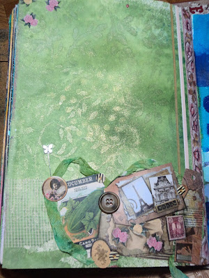
Vintage Green: I just love the way the subtle background vines shimmer as the page tilts that I didn't want to cover it up. So a small collage of vintage tags and stuff brought in some browns and pink. Not what I started out to make but I like it. (My starting idea was pink flowers on a green leafy/vine background.)
Glacier: It all started with the torn paper that was left over from something else. I liked the way I could line up the white parts of the paper. It said "mountain range" at first but the blue overtones made me think of a glacial wall. Added some spackle with a flower stencil that reminded me of snowflakes and used blue acrylic paint to frame the middle section for a focal point. Some days you just want color and my color was blue.
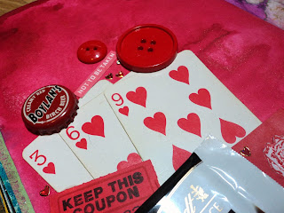
Just Red: Speaking of color: this is just red. I hadn't done a background in red for a while in my journal so decided to add one. But after using some spray ink, I just didn't know what to do with it. Decided to use up collage stuff and pulled out every red thing I owned. And yes, I did eat the Lindt chocolate as I was working so I could use the wrapper. I'm not certain the collage is that great but I do like the page.
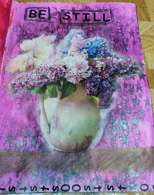
Be Still: This page got a little out-of-hand and I'm not entirely sure that I reigned it in that well. But it is what it is. In my own defense, it is HARD to spray ink and stencil with a cat sleeping on your lap. (And he's a pretty big cat, not some fluff ball.) Anyway, I knew I wanted pinks but I've got no pastel pink...so went with more of a magenta. Those inks were ok but when I tried to tone it down with some Dylusions White Linen spray...well, let's just say, mine is a bit old and the sprayer went out on me. I dropped it in with a paintbrush but just got an opaque version of magenta, really. Gave up with the white. Added some stenciled stars and letters in darker colors. Looked okay but I had been telling myself that I needed to add some "interest" to my backgrounds. (A lot of the ones I had been doing didn't have many layers, they were focused more on color it seemed.) So added the bubbles stamp in black StazOn. That kinda put the page over the edge...now it was too busy and too dark. My options: gesso or cover it up. I opted to cover most of it. (Why not gesso? Because then I'd be stuck with a blank page pretty much. I wanted Forward, not Back.) This page isn't the best but the title says it all...the vase reminds me of a still-life and I had to be still for my sleeping cat. *smile*
Gone Fishing: I have so much collage stuff that is "nature" or "outdoor" themed. It's leftover from my scrapbooking days when I would scrapbook all my letterboxing adventures. So I pulled out my magazine cut-outs and found a lovely wooded creek to use as my background. Problem? It was an ad for an SUV and that was front and center in my background. Solution? Cover the SUV with the large fish and more collage elements. And what they couldn't cover up, washi tape did. I really like how it turned out.
Thanks for checking out my journal. More to come soon.
--Wy
Art Journal Lesson Learned #1: Don't journal with a sleeping cat on your lap!


No comments:
Post a Comment