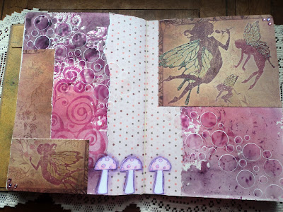
So while some of my spreads in this large Dylusions journal are inspired by Donna Downey, I also add in my own layouts to get the hang of working with this larger size. I have come to the conclusion that I like the smaller size better but this does have it's place. It might be growing on me.
The Fairies: This spread started with the background of spray inks that were mopped up from a canvas I had been experimenting on. I just loved the colors and didn't want to lose too much of it. These old scrapbook papers from a Once Upon a Time pack had been sitting in my scrap pile since my altered fairy box project. So I used them up. I learned that I don't much like the straight edges on those pieces, I probably should have torn them.
I also wanted to try out a new product I bought called translucent texture paste (matte) from Ranger. Really liked it. It dries totally clear with the thickness of a paste. It ended up a bit too clear for what I wanted here but I will be using it elsewhere!
Mythbusters: This show was a favorite of mine for many seasons. I don't crave it like I used to but loved the show overall. I had saved an advertisement for the show from a Rolling Stone magazine and it was so huge that I never knew what to do with it...I didn't want to cut it up! So this large journal was perfect!
I literally did NOTHING to the left half of this spread. Just collaged the whole page down.
The right side of the spread became my little notes page. I put down some ledger type paper and just went to town writing little notes reminding me of some favorite episodes. (like Goldfish Memory, Chicken Cannon, and Balloon Pilot) Then, just dressed it up with a few cutouts from the other magazine page and some Distress inks. I love this page.
Splendor from a Bud: I had the need to use spray inks so I did! I just wanted to play with some colors and stencils and created this funky orange and pink background. I added the stamped flowers up the middle then searched for some big images. I was amazed how well my golden lady matched the layout.
The skeleton was added to tie the lady into the quote as well as to make the inference that we place too much emphasis on being skinny; that skinny is beautiful no matter what.
This magazine clipping had just the right shade of pink and the quote was inspiring.
Wonderland Garden: This spread definitely displays my doubts about the larger page size. It was quite intimidating at first. The background came together all right but my other supplies were disproportionate. So I fell back to an "Alice in Wonderland" theme. Alice had quite a time growing smaller and growing taller. Overall the page was fun to play with and helped me to figure out how big Big is.
Alice is a digistamp from an unknown company/artist/merchant. If anyone knows where this image is from, I'd love to know. (Leave me a note in the comments) I got it in a "grab bag" as a prize on a challenge blog a couple years ago and it was unclear which image was from which sponsor.
The mushroom and caterpillar are from dictionary paper. I had these stamped and cut-out little circles in my scraps and wanted to use them up.
Remember the snotty flowers in the garden? I used up some paper flowers and just added a stamped face. I added this quote as it's one of my faves.
Hope you enjoyed seeing some pages. I'm still working in this journal and will post more when I get some more finished that are worthy of being photographed. (smile)
Thanks for stopping in.
--Wy
"I reject your reality and substitute my own." --Adam Savage in Mythbusters, quoting someone else?


No comments:
Post a Comment