I have finished my Inspiration Journal 2016. I followed along with
Donna Downey for some Inspiration Wednesdays this past year and amazingly, didn't fall too far behind in my work.
I don't like all the pages and some are downright ugly but that's really the point to an art journal. I needed to play with things to see what I like and what doesn't really float my boat. Because what excites Donna Downey doesn't always excite me. That shows up big-time in these pages.
So here's the big finale!
UGH! Texture!: Donna used baby wipes to create these round wells that would hold pouring medium. I don't use baby wipes much and I certainly didn't have pouring medium. So I used a few baby wipes and some paper towels. But I detest the "messy" look the baby wipes create. I tried to clean it up, so to speak, on the other side of the spread (where I have the two wells) but decided I really didn't like either of them. I used a clear gel glue to substitute for pouring medium and I thought it was working well until I let it sit overnight. When I came back to it, there were tiny bubbles throughout the glue that distort the image underneath it. It adds another layer of texture I don't like. So I gave up early on this page and wrote my frustration on the insert. Moving on...
Magic Foil: This spread diverged from Donna's quite a bit. She put chipboard beneath the foil and then gessoed over the top to sand it all back to bring out touches of the silver. After the fiasco with the spread above
(and the discovery that I don't like THAT much texture in my journal), I was hesitant to use chipboard. I thought I might be able to create texture with white glue but it sank into the paper and didn't stay 3-D. So I had these foam stickers and all the letters to spell out MAGIC. I then applied the foil over that trying hard not to get too much glue on the foil.
See, here's my take on using aluminum foil: let it show. Foil has such a wonderful metallic shimmer why would you gesso over that? Paint will stick to foil. And fluid acrylics are mostly transparent (depending on the color) so the shimmer shows through it. The end effect is similar to metallic/mica paints. Aluminum foil is also a "white" surface and allows the true pigment color to show. So with all these things that I liked about foil, why not just paint it right on there and skip sanding it all together.
The foam stickers aren't prominent but you can tell what it spells in person. I added the black stars because they looked magical. The black also really allows those colors to pop.
Sing for Spring: Donna used pan pastels. Nope, don't own them. The very word "pastel" translates in my brain as "chalk" and yucko for chalk. So I knew I'd be using my gelatos for this spread. I liked Donna's colors but when it came time to do the page, my color choice was determined by the birds. I didn't have a flower stamp large enough and I didn't feel like drawing one or waiting for paint to dry. So these little collage image birds dictated my colors. I realized I had gelatos that matched rather well.
I did seal the gelato with ModPodge so I could stamp over the top of it. The colors seemed very wintry to me so decided to stay on that theme. On the back of the inclusion, I wrote, "Keep Spring in your heart" to tie it all together.
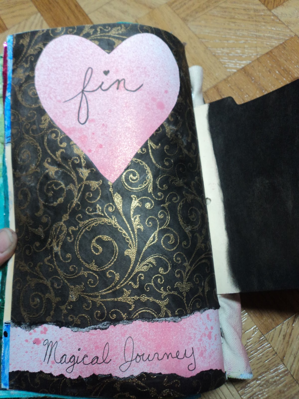
Fin: My last page was to use up the paper I had cut the heart out of on the above spread. I colored it black and kept it super simple. Done!
I discovered a love for simplicity in these last pages. That wasn't exactly how this journal started out. It's finished, though, and the last pages were fun for me. I may not like them best but they were exactly what I wanted when I wanted it.
In 2017, I will once again be following Donna Downey's Inspiration Wednesday.
For Good or for Ugly.
-Wy


No comments:
Post a Comment