I had a revelation this week when I decided to pull out some tags and "finish" them. I use tags to "mop up" extra ink or paint when I'm working on a project in my basement. When the tag has sufficient color to it, or I don't want to junk it up anymore, I bring it upstairs to my bedroom where my "crafting/card making" space is.
(My basement has most of my "art" supplies while my bedroom holds my card making supplies. Hence, I make trips up 2 flights of stairs when I begin to move things from one space to another. It's a great work-out and inspirational tool...if I'm too lazy to go back upstairs for a supply, I make do with what's on hand. That can make for some interesting results.) The tag then gets thrown aside until I feel like finishing it with perhaps a stamped image or scrapbook paper or whatever.
So my revelation was that I had WAY TOO MANY UNFINISHED TAGS! This has bolstered my resolve to STOP making tags that won't get finished in a timely manner. So this Creative Chemistry lesson was not a tag.
Or even a card.
I paired up the techniques of Week 6 (Layering Stencils) with my Color Palette Journal. It's been a while since I worked in this journal but I did make a change that seems to help with my productivity. I have written out the palette I want to use in terms of colors that I may actually own...like the names of Distress Inks. That gives me an instant starting point for the colors, at least.
So here's the next spread in this journal, courtesy of Creative Chemistry:
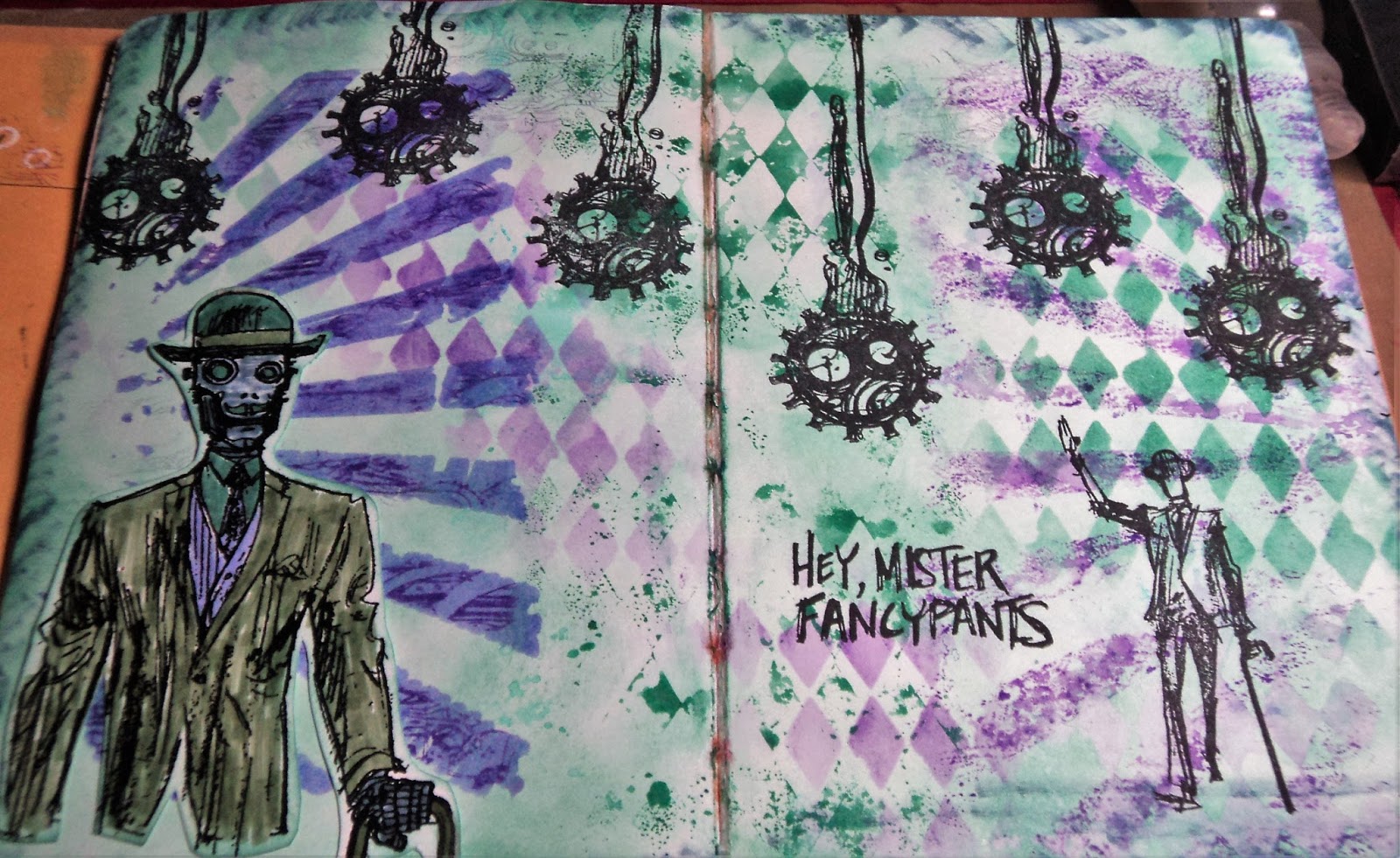
FancyPants: Did I mention I'm on a robot kick this summer? I love this stamp set from Stamper's Anonymous called Dandy Robot. It's challenging to use so I am often stumped with it.
This is the color palette inspiration for this spread: Flora Brights #1.
The colors I matched to the palette were: Evergreen Bough, Bundled Sage, Wilted Violet, Shaded Lilac, and Stormy Sky.
(All Distress Ink colors.) I had Evergreen Bough and Wilted Violet in ink pads (mini) and the rest in markers. So I focused on Evergreen Bough...and I absolutely love this color. I just recently got the ink pad and like it much more than Cracked Pistachio for a really nice patina color. And since I was making that color my background, it made me think of the Dandy Robot stamp set. I often use copper embossing with this stamp set and that would look great with Evergreen Bough. BUT, I decided to stick to the palette. Copper was a color...not a neutral. I allow myself black and white but consider browns as a color.
Anyway, here's the Creative Chemistry part:
Layering Stencils: The Challenge was to use two techniques with Layering Stencils. I used two stencils on this page.
(My plan to add a third just never panned out.) I used the Rays and Harlequin. I used the Ink Monoprint with the Harlequin stencil down the middle of the page. I also used that technique with the Rays on the right side of the page. I had ink on the stencil from the other side so made a monoprint from that.
Here's a close-up look at my Stamping through a Stencil. I used the Rays and stamped with Wilted Violet Distress ink through it. The edges weren't as defined as I wanted so I also used Sketching through a Stencil here. After I had stamped, I went in with a Shaded Lilac Distress marker to define the rays. It smeared the stamping a bit but I liked it.
I even, inadvertently, pulled some of the background color up with the Harlequin stencil. You can almost make it out in the very right bottom corner in the above photo.
So the background made good use of Wilted Violet, Evergreen Bough, and a touch of Shaded Lilac. I decided to incorporate the last two colors on the Robot.
I stamped and embossed the robot on white cardstock. I used Bundled Sage for this jacket and brought the Stormy Sky in on his face and hand. I discovered that my Stormy Sky marker was rather dry so I couldn't bring as much of that color into the layout as I originally intended.
(I was hoping to use it with the stencils but it was on it's last legs. In fact, I've already pitched it.)
Stamping with Jet Black Archival ink rounded out the spread and I was really happy with it.
Now I have to get busy with more color palettes. Did I mention my
Pinterest board is now up to 250 palettes? I think I added about three more yesterday...damn. If you want to check out the board, I have picked out my next several palettes. See if you can find them: Rainbow Spring #2, Dirty Pastels #3, and Mineral Hues #4.
Thanks for dropping by!
-Wy


This is so great that you did with all of this for the assignments for cc102. Love it.
ReplyDeleteDiana
MontanaHens - Twitter, Instagram & Pinterest
https://playingwithoutlimits.wordpress.com/
Thanks, Diana! I am falling in love all over again with Distress colors.
Delete