Color of the week is Chipped Sapphire, Night, Midnight Muse, Navy...however, you label it...it's that deepest of blue. It's the blue that can be used for a Night sky or a deep ocean. It's that shadow of blue that foretells of threatening clouds on the horizon; the kind that bring the lightning.
I also have lots of new stamp sets that I haven't used yet so I pulled one out today. The stamp set is from Hot off the Press: Feathers. It's one that I'm going to be using a lot...it is very versatile. I hadn't really realized it when I bought it, but this is a layering stamp set. (When I bought it, it was on sale and BEFORE the stamp layering trend had really kicked in! Now everybody is coming out with a set of stamps that can be layered over each other!)
It all really began with my idea for layering. I wanted to use gelato to stamp the back stamp (more solid image) and use ink over the top for the detail. Then, I wanted to ink blend over the top of all that. Gelato forms a resist against ink. So I gave it a try and this card ultimately resulted from my experiment.

But this led to the question of why didn't the gelato show up? I figured the background wasn't dark enough so the resist didn't really show up well. Hence, my next experiment/card.
Even though it looked fantastic, it wasn't exactly what I was shooting for. I was hoping the embossing would have been almost invisible...less pronounced. So I've got even more experimenting to do with this!
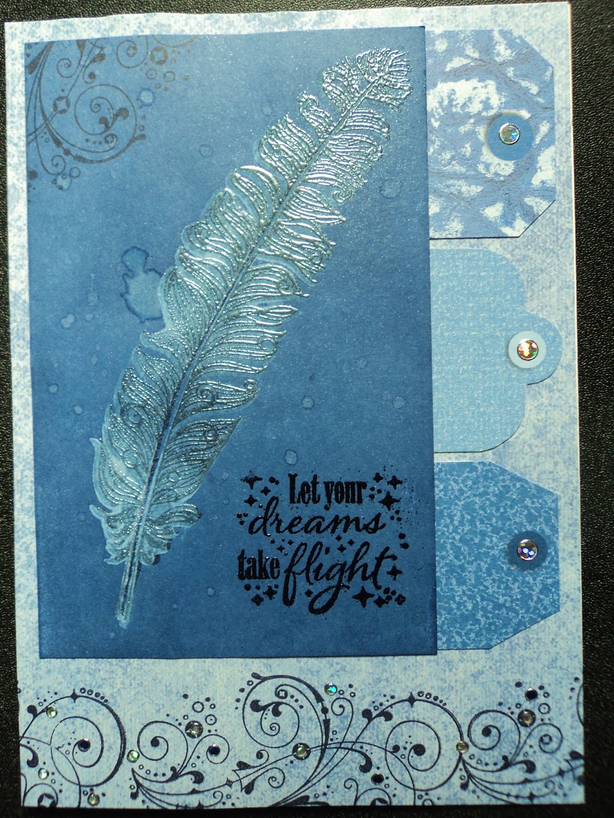
I learned from my last art fair that people are looking for sympathy cards and my sister-in-law told me that she always seemed to be in need of that type of card as well. Sympathy cards had not really been part of my inventory. Of course, I usually make blank cards...so that they can be used for any occasion. But with a sympathy card, I discovered it was important for it NOT to be blank. It's hard enough to find something to say to someone who has lost a loved one, let alone write it in a card.
That's why I went in search of a stamp set with sentiments for sympathy cards. I found this one from My Favorite Things. I liked the simplicity of the sentiments and the way they would easily fit onto a card front or on the inside or both.
So the next two cards started with the shadow feather stamp. I had just stamped it off a couple times to get more of the gelato off of it before cleaning it. I got two more decent images so made a couple sympathy cards.


All my requirements for a good art day were met: using up scraps, trying out new stamps, playing with products just because, and using a favorite color.
I'm gonna hate going to work tomorrow! :)
-Wy
"I reject your reality and substitute my own." --Mythbusters

No comments:
Post a Comment