I'm not really sure what to think of my next batch of journal pages in the Inspiration Wednesday Journal.
(I've been following along with Donna Downey's class. You can find it HERE.) I'm not in love with any of them, really. I find bits and pieces that I like in some of them and others just seem to be a mess or somehow incomplete.
On a positive note, I have found that a couple pages that I thought were downright ugly at the time I created them, have grown on me. I have come to rather like them...still not love but certainly a friendship. Whether that denotes that I just needed to step back from them for a time or whether the other pages are simply MORE ugly, I can't be certain. :)
I'll let you have a look at them anyway. Maybe you'll find something in them. They may not be high-quality artwork but they were good teachers.
If you'll recall from last time (way back in March), I had ended on quite a thrilling page. The whales had left me feeling very good about the way the journal was heading. Ah, then...crash....burn...
Argh, Flowers! or JG401028: My red "flowers" were a disaster. I disliked them so much I covered them up mostly with a medallion stamp. I think that one step did wonders for this spread. I actually rather like it. I can see several layers, which I always struggle with and it has that black polka dot. I have no idea why I love that pattern so much. This was tough page to let go of.
Pick Two: Another still life lesson; this one was about Value. I picked two colors of paint and added white to see what I can create. My colors were Primary Cyan and Quinacrodone Nickel Azo Gold. I thought this was ruddy terrible. Looking back on it, it's ok. I like the painterly look of the background and the deep shading I was able to achieve behind the vase. Mostly the only thing I learned that's positive is that when you mix those two colors, you get Viridian green...one of my favorite colors. But hey, remember these two pages...you may have deja vu later.
Loosen Up: I had high hopes for this page but it turned on me. It's sort of a lesson in painting the negative space and leaving an image in the unpainted part. I think I may have chosen a poor subject. I hated painting this page...I think it shows. It doesn't seem too bad now but I really didn't like painting during this week's inspiration. Maybe I didn't want to paint around it...I wanted to paint it. Ah well.
Pocketful of Posies: From the last spread, I needed this one to get me back on a positive vibe. This was just what I wanted. I laid down tissue paper underneath with this similar pattern. Then, just painted over it...like a coloring book almost. Since I was going to be painting over the blue background somewhat, I didn't mind painting all that blue. I could allow the flowers to extend out over it so I didn't have to be precise. I thought about adding a quote but liked it just the way it is. Still seems incomplete, though.
Not Again!: Deja Vu? Me, too. This page started out much like the first spread in this post minus the ugly red flowers. I just couldn't get anything to come together with this inspiration. I'm not sure what happened, really. Usually the colors make me happy anyway and there is my black polka dot in there, but this seems to lack something vibrant...something focused. I admit that I just gave up on it. Maybe I'll come back to it later...way later. Unlike the top spread, where I came to like it, this one just lets me down.
Deja Vu 2: This one look familiar? Kinda like that lesson on Value, huh? This one was a bit more fun. I laid down gelatos first then added line work with paint markers. It looks a bit messy for me but I do like all the bright colors in it. Surprisingly, the other vase page seems "better" to me. I think it's because I lacked shading in here and it looks very flat to me. I really like the flowers better in this one, though. Meh.
OMG! No Blue!: Finally did a spread without teal or blue in it. I admit I was getting worn out with those colors. This is an indifferent page. The part of the inspiration that I found the coolest, I totally forgot about and never put in! Anyway, the collage is so-so...mostly just putting together leftovers. It's the paint that I don't like. The contrasting colors aren't so terrible
(I'm actually a huge fan of purple and yellow!) but I couldn't get a good blend on them. The purple just really seems to stick out in a messy way. Learned a lot about contrast here.
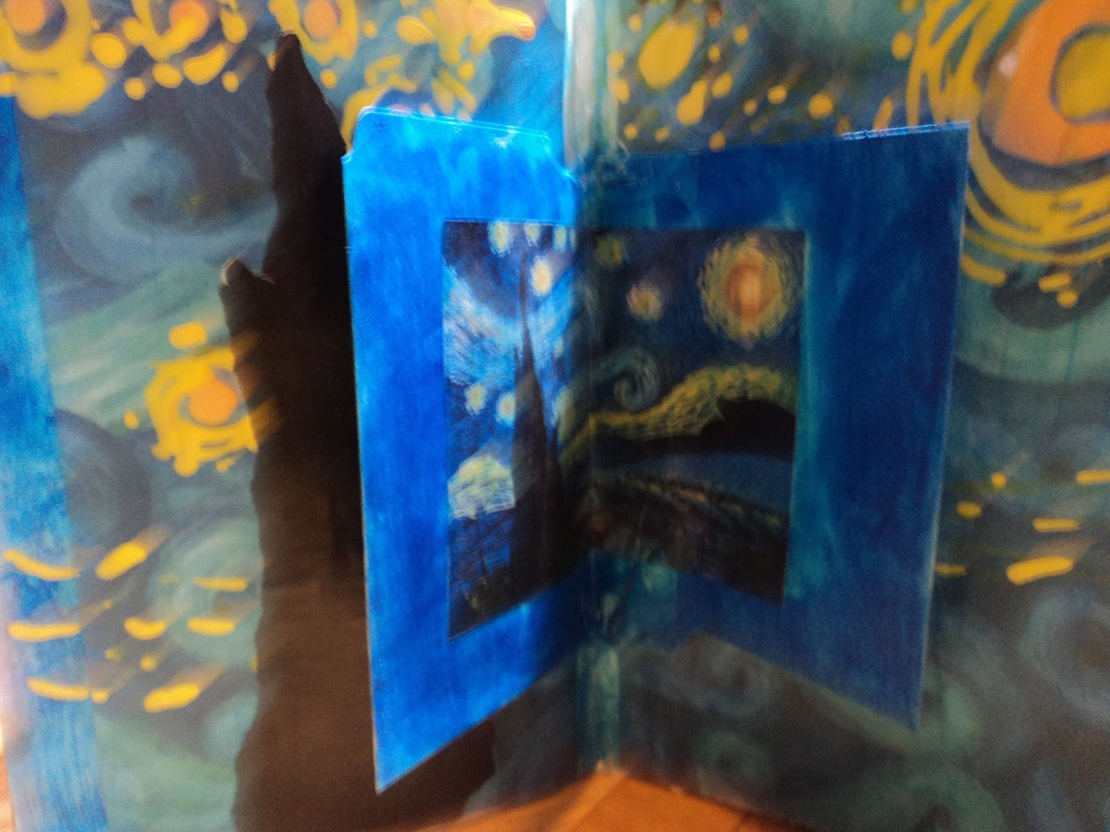
Tribute to Van Gogh: I can't say as I have a favorite classic artist...I'm not well educated there. But I do have favorite works of art and Starry, Starry Night is one of them. This inspiration simply had to be this work for me. My image transfer went to hell in a hand basket and not even Jesus was resurrecting it. So I found one of my favorite sheets of paper...that blue wave pattern in the background. Guess why I like it? Guess? It reminds me of Starry Night. So I just went with it. Easy peasy page that I just had to have...a simple, playtime to remind me that it's just an Art journal...it ain't a masterpiece.
And once again, the Inspiration Journal confounds me. I hate it. I love it. But once again I can close out this post on a high note.
Having also started the next segment of this Inspiration Journal, I can honestly tell you...it sinks once again. sigh.
Thanks for hanging in there till the end of the post!
(How did this end up with so many pages? I might have had a leftover from the first three months in there. Oops.)
Anyway, have a great summer! I'll see ya in the fall for more with this journal.
-Wy


No comments:
Post a Comment