FINALLY...
finished
the Art Journal.
The large Dylusions journal is finished. The last two pages are a little play time and a little experiment. I learned from both pages.
First:
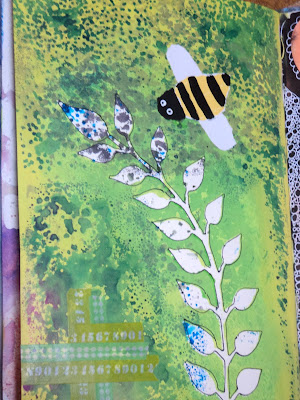
Bumblebee: I made this page on Valentine's Day...it was -28 degrees outside. Any wonder I was thinking of green plants and garden bugs? The vine was already there as this was a little used mop-up page for a couple stencils. Since I had the mask for the vine (as well as the stencil) I decided to put it to good use and practice some more with my Dylusion paints. I added Fresh Lime first right around the vine then layered Lemon Zest over the top of that along the edges of the page. Then, I sprayed ink (London Blue) over that to get those little splotches. (Technically, I used a stencil here but it didn't have quite the effect I wanted. I'll get to that.) I thought about a flower, maybe a pansy, for the page or maybe a bird. But then, I outlined the vine with a fine black sharpie and wanted more black. What better than a bumblebee?
Here's what I learned:
1. Dylusion paint layers very well...one on top of another. You can "see" the color beneath the second layer. Example: I put the green on first then tried to layer yellow over the top near the edges to brighten it up some. The yellow never really came out yellow even though the bottom layer was dry. It remained a light greenish color. (I, in no way, think this is a bad thing. It's just something that needs to be understood when using the product. I may have added the yellow first if I had thought about it.)
2. Spray ink works ok over the paint. I remember noting in a past post that the ink didn't seem to work well over the paint. In this experiment, I sprayed London Blue ink over the dried paint and it seemed to sit on top of the paper longer but it did dry. And relatively quickly. It's when you use too much spray that it becomes a problem. The "blobs" of spray where I had too much ink needed to be toweled off. So in this case, less is more. The lighter sprays of ink work fine and dandy on top of the paint while blobs of ink tend to sit on the paper without sinking in.
3. Certain stencils are better for certain mediums. The stencil that I used to make a pattern on this layout (all those dark green spotches which is actually a blue ink) didn't have the effect that I wanted. I wanted it to look like falling rain and the stencil is designed that way with more openings toward the top and scattered dots toward the bottom. But because I tend to overspray stencils, the effect was lost due to the ink leaking underneath the stencil. So this particular stencil is probably better suited for a thicker medium like molding paste or embossing paste or some form of heavy acrylic.
Last:
Distress Crayons: Since this page was a little wonky in the back of my book, I decided to try out my brand new Distress Crayons. I made this "swatch" page comparing the Crayons to similar colored Gelatos. I tried them out and made some notes about them. I'll go over a more detailed comparison in my next posting. The differences weren't overwhelming but for the way I work and how I would be using them, they were noteworthy. I also didn't really work with them with a lot of water. That may have to be a different playtime.
The journal is finished.
On to the NEXT!
--Wy


No comments:
Post a Comment