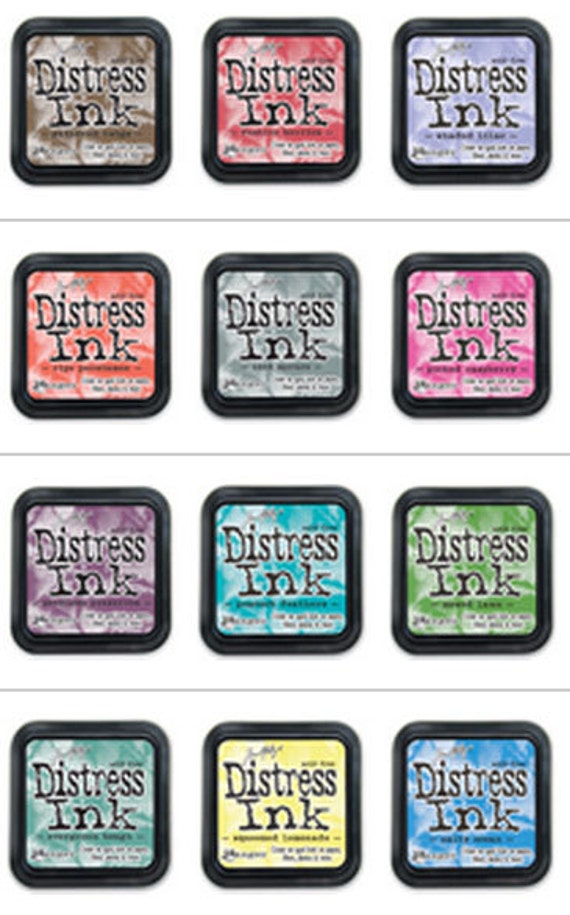
Here's my theory: I don't use the seasonal colors because they don't blend well with the other colors in the line. If you want shading, you have to use it like a watercolor and blend the color out with water. I prefer to use at least three colors to get a good blend...like Copic coloring. I'll even settle for two. And while Seedless Preserves is a great color, it has no lighter tone to match. (Milled Lavender just seems too blue.)
I'm particular about my colors...I hate to blend Festive Berries into Barn Door...they are NOT the same reds...they are a red-blue and a red-orange. Just as Mowed Lawn, which is a beautiful green, doesn't blend into Forest Moss or Crushed Olive. When I say "blend", I mean coloring without having that irritating marker line between colors. I want one color to blend into the next without that ugly seam. It does take a bit of a technique but it's also about how close your colors are to each other to start. I think this is why I don't reach for these colors much. So many of them are stand-alone colors that don't really fit into any of the color families that the Distress line has already established.
On the other hand, Peacock Feathers works quite well with many colors in the established line. It also works well with the other seasonal color, Evergreen Bough. As well, Gathering Twigs works within the other browns to make it more useful as a marker.
Don't misunderstand me; I really like these colors, all of them. I tend to use them as its own set. The "seasonal" colors would seem to be the "bright" Distress colors as the rest of the line seems to be the "natural" colors. That's how I tend to view them and that's basically how I use them.
So my hopes are high for the new colors coming out this year! (See my predictions in this post!)
--Wy

No comments:
Post a Comment