I took up a big job this week. I decided to sort through and weed out all the photos on my computer that focused on my artwork/card making. Add on top of that project, the fact that I have been working more hours at my "paying" job this month and you end up with posts like this. Not much new, but reflective.
I mainly take photos of my cards and projects to add here to the blog. I like to keep the better ones in case I apply for a design team or want to submit to some magazine etc. Having done this for several years now, it's interesting to look back on some of them to see what's changed and what hasn't. It popped into my head that this would be an interesting time to see if I had developed any certain kind of style.
I have always struggled with defining my style. I mean, I know what I like but to pigeon hole all my work under a particular "style" gives me the willies. Yet, it is that "style" that makes an artist's work stand out and be recognized as distinctive. Applying for design teams requires that you can define your "style". I wish I could. Even "mixed-media" doesn't seem right. My cards don't look like that but my canvases and art journal do, mostly. "Collage" is a broad term that doesn't really define a style but more of a technique. I am not an art school grad and even terms like "shabby chic" don't seem broad enough.
How to combine it all under a simple "style"?
Can you see my problem? How do you take all the above and lump it into a style?
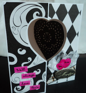
I did learn by looking back on my past cards that I like to use a main large focal image and support it with background paper. I like a clean look to a card with a large focal or the entire front of the card to be an image. I usually rubber stamp cards and do very little with "mixed-media". For cards, I use stamps, ink, and patterned paper. I'll do some ink blending and coloring. While I'm not sure it falls into the CAS (clean and simple) category, the cards that I like the best have very little embellishment. Like those two above.
Not like these that I made in the past:
While I liked the concept and even the color palettes of these cards, they are too busy for me to really love. The Oscar card has disjointed elements, the rainbow card has competing images, and the Pop Of Color card has just too much pattern. I don't hate these cards but I recognize now that they didn't come easily. I worked too hard on them, thought too long, or maybe just hit a road block.
That's what I learned today in my art journal. The page I was working on just wasn't making me happy. I realized upon looking at it that I could see how hard I had worked on it. I needed to loosen it up, to not think so much about that finished project and just throw some stuff around. I needed to relax into the page and make it happy. (I'll be sharing that page when I share my next installment of my Inspiration Wednesday Journal.)
But that still doesn't help me define my style. What kind of style is defined by a large focal image supported by messy backgrounds or patterned paper that just make me happy? I know there are things that I'll always like (ocean life, cute critters, and circles) and things that I always won't (crazy birds, girl forms, and red) but that doesn't mean you won't see the things I don't like in my work. And my work is not defined by cute critters. In fact, I tend to go back to flowers mostly. Flowers with long stems. Backgrounds of blue and green. What do you call THAT style? Scenic?
Perhaps, I should start using the term "eclectic". "Eclectic": deriving ideas, style, or taste from a broad and diverse range of sources.
I have shied away from the term because I always felt that it told you nothing. In some sense, it does. It basically tells you that you're into everything.
Or maybe I just haven't the right word yet. Maybe I haven't the art background to determine my style.
Or maybe I'll forget about it and just do what I like, when I like it. I've never been a fashionable trendsetter.
Perhaps my style is "Me".
-Wy


No comments:
Post a Comment