I had such fun doing my Dark Canvas (now titled "The Man in the Moon") that I wanted to get started on another one right away. I was thinking of a dragonfly. I like those friendly kind of bugs: dragonflies, butterflies, ladybugs, bumble bees, moths, and the occasional catepillar. I also like the color palette of a dragonfly; blues and greens with a bit of metallic glimmer. So I began the same way; ripping up patterned papers and decoupaging them down to the canvas. I selected blues and yellows primarily. That was about the prettiest the canvas would look for awhile!
I thought that maybe, remarkably, my drawing skills would allow for a simple form such as a dragonfly. I mean, it's a body and two sets of long narrow wings, right? How hard could that be? Well, I sketched it on there with a pencil so that I could paint in the background. I wanted the dragonfly to look like the patchwork of paper already on the canvas. I drew it big, too, to fill up most of the space since I had no idea if there was going to be much of a background.
I then, filled in around the dragonfly with yellow fluid acrylic and decided, whoa...too much YELLOW! (I think I've mentioned before that I have an aversion to large blocks of yellow. I only like it in small doses.) So then I went over that with blue fluid acrylic and the ensuing lt green was much more paltable. I stamped a bit of texture on it with some generic rubber stamps but felt that the dragonfly was too plain. I hit on the idea to Zentangle in it. But for the head, I pulled out some purple glitter glue and spread that on there. It didn't quite have the effect that I wanted. It was very dark and very textured when I thought it would dry rather smooth. Overall, it looked clumpy and "messy". But I figured I'd roll with it. Now the dragonfly looked disconnected as it had a big fat textured head and a patchwork of paper body.
Sooo, I went over the whole canvas again with a wash of blue acrylic. It toned down the body and wings and gave the background a deeper shade so the cheap glitter glue didn't look so out of place. I added a stencil of leaves along the edges of the canvas in heavy body white acrylic. It wasn't perfect but was good enough. Then, once they were dry, I painted them with Silks acrylic Peridot, a nice metallic green. I have to tell you that all of this took a couple weeks to accomplish because I really wasn't sure what I was doing. I wasn't in love with it when I set it aside at this point but was confident the Zentangle would make it more eye-appealling.
I procrastinated. I left it on my table for a couple weeks always intending to get to the Zentangle but the more I stared at it, the less I liked it. So finally, I broke down and just sucked it up. I pulled out some pencil and sketched the Zentangle onto the body then painted it with purple acrylic. I finished the body and part of a wing. But my thoughts were still, "I don't like this". I was debating on whether to finish the Zentangle and hope that it would all look cool in the end, or scrap it.
Then, my sister came in and I showed it to her. Before she could say anything, I told her that I wasn't sure about it. She said, "you mean you're not sure about the penis with wings?" So I was definately NOT finishing that. But what to do with it? Just trash the canvas? It seemed like such a waste, but I wasn't sure I could make anything out of it as it had that big glob of glitter glue on it. I did like the stenciling. Hmmm...
So I decided to paint over it and see if the paint would cover up most of my crap. I painted over everything but the stenciled leaves with yellow Folk Art acrylic...the cheap stuff, just in case it didn't work. It did work. Even the glitter glue was painted yellow. I layered on some green paint and then it dawned on me that the yellow textured spot looked like the inside of a Coneflower or Rubeka. Even a pretty Echinacea. So that's the direction I took.
Why did I pick orange/yellow to do the flower? Why not? And I had cheap red and yellow paint.


I finger painted the petals and let them be a bit sloppy. I put in the stem and a little leaf at the bottom. I was starting to feel better about this canvas. I went over the stenciled leaves with a bit of Mod Podge that was colored with some leftover green and yellow paint. That's why they look a bit glossy. I did my touch-up with green around the petals before adding in some outline and detail to the flower.
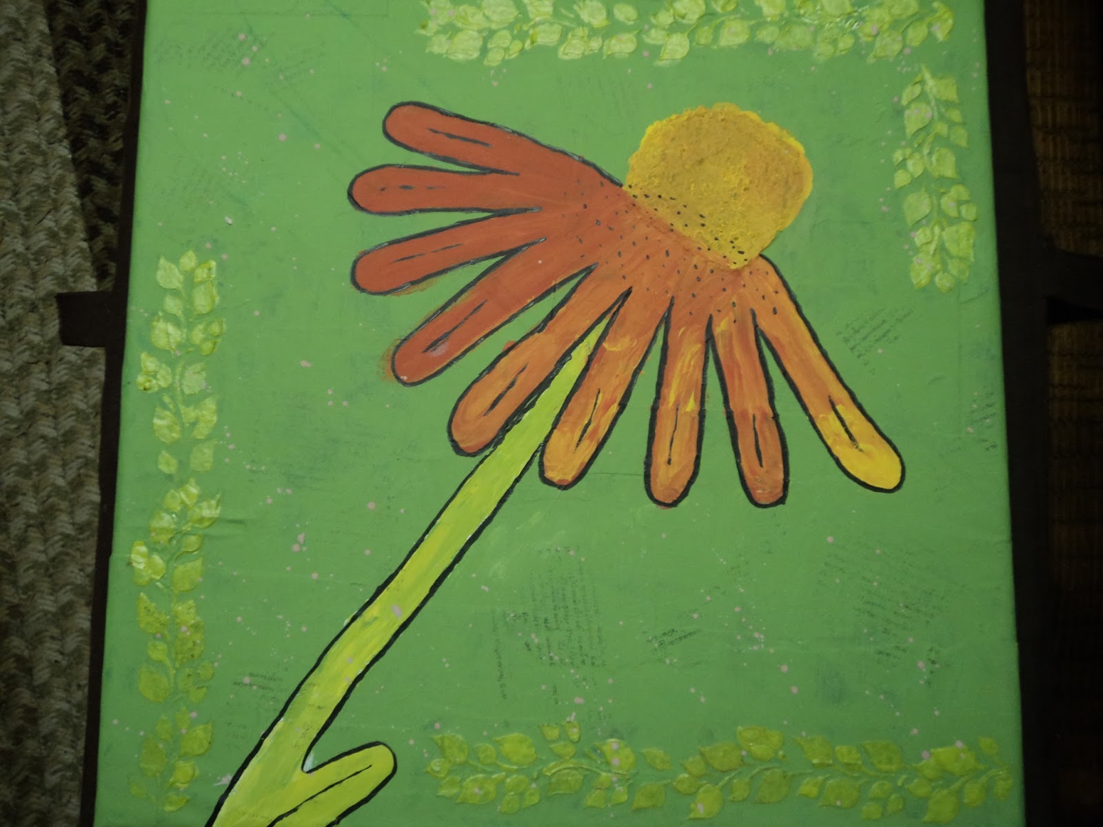

I had to put in some background texture because it was so plain. So I stamped a writing stamp in random places then did some lt brown dots. I colored some left over white acrylic with Distress Ink, Vintage Photo to get the brown. I tried not to drip it on the flower itself.


Added some yellow circles in the background and found this quote by Lady Bird Johnson, "Where flowers bloom so does hope." I thought it fitting and the left upper corner needed something. Torn paper with Distress Ink edges decoupaged onto the canvas as I put a layer of Mod Podge over the entire thing. The Mod Podge darkened the brown paint drops, too! Yeah!
Finally decided to call this one done. It's not spectacular but considering the ugly layers that lie beneath it's surface, I'm not gonna complain about how it turned out. We all start somewhere and it's nice to know that when things don't work the way I want, I can transform it into something else!
--Wy
"Sisters are different flowers from the same garden."

No comments:
Post a Comment