Okay so I skipped a day...so much stuff to learn and not enough materials or time to do it!
So I moved along to my favorite plaything: Alcohol Ink.
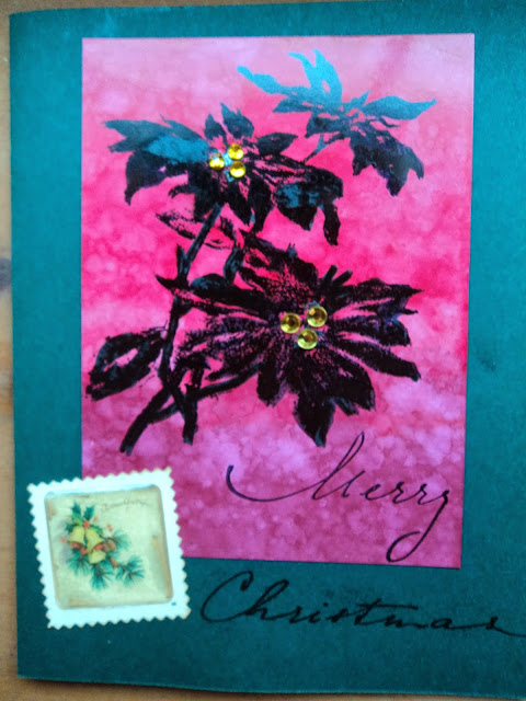
Here's my card I made with the Ombre Technique.
The Red piece is the alcohol background. I used Watermelon, Red Pepper, and Cranberry. This technique was pretty straight-forward but you do need an eye for color. Ombre to me is a very subtle shifting of color from light to dark or vice versa. Some of the color families in my stash didn't have all the shades I needed to make a good ombre. Red turned out well (when I decided to eliminate the pink colors) and so did my Green combo. I did a yellow/orange which was okay but my blue was awful. I just didn't have a good "middle" blue...the bright color seemed too bright against my Cloudy Blue light color. So I may need to see the other options available in inks that I don't own to create a good blue.
This card isn't perfect as my stamped image didn't come out well when I stamped it. Then, I made the mistake of trying to touch it up with a Distress Black Soot Marker...oops! The marker has a matte finish against the rest of the glossy background and can be discerned from the original stamped (with Archival ink) image. Oh well, someone in my family will like it anyway! And it's easy enough to replicate.
I played with some monoprinting and faded layers with the alcohol ink as well. I liked Monoprinting better than I thought I would but I will be more careful of what colors I select and not so much mixative in the blend. Faded layers sort of worked but I didn't have great luck. I did do sort of an alcohol ink reverse monoprint which turned out rather cool. So I will do more with that technique when I find some blending foam!
Have a great weekend!
--Wy
"I have decided that one useless man is called a disgrace; that two are called a Law Firm; and that three or more become a Congress! And by God, I have had THIS Congress...." 1776, John Adams


No comments:
Post a Comment