Art Journal Adventure: March 2017
The month of March in the Art Journal Adventure. If you're new to the blog, this journal is inspired by weekly prompts put out at the Joggles Blog. Every Monday a new prompt is given and you can go to work in whatever art journal you got or follow along in a dedicated one like I've got. I'm using a large Dylusions journal this year.
So let's get started. Remember, this is for a whole month so it's a long post! (But I know you just look at the photos anyway...right? heehee)

 Week #10: Travel: When I see pages dedicated to travel, I usually like them. I like maps and postal elements that are usually used in these artworks. But I admit that I don't much like to travel. I like day trips and long weekends but long vacations aren't my thing. I do them once in awhile but I get more excited to have a week off from work to stay home. Anyway, travel pages are always difficult for me to do because for me...getting there is NOT the fun part.

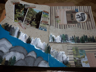
 So my Travel theme turned more into a "vacation" theme and I wanted the look to be very "scrapbook"-like. I used up some old supplies (which always makes me happy) and I got to break out some new washi tapes. The ADK stands for Adirondack which is an area close to me to which I have traveled for many a day-trip. The "photos" (they are really souvenir postcards) are of Ausable Chasm, another day trip destination.

 I wanted this spread to reflect the natural beauty of the Adirondack Mountains. There is nothing quite like going to the mountains in the summertime. It seems remote but isn't. It seems pristine but has a lived-in feel. It is wood and water and rock, the bare essentials of the earth. It is wild. It is a different world right next door.
I really like this page spread. I'm particularly proud of my river. It didn't seem like it was working but it turned out just fine.
 Week #12: Silhouette: I was inspired by a couple things that came together in a timely manner. In the week that the prompt was posted, I received my rubber stamps in the mail. The stamps that arrived were two sets that I had pre-ordered back in January. The Tim Holtz sets of sea life and butterflies. I desperately wanted to use the butterflies. My original plan was to create a silhouette with the Fearless Face stencil system (Joggles) and use the cut-out butterflies for hair. (I have not abandoned this idea either. I'm certain it will show up in art journal or canvas soon.) But my brother posted on Facebook that week about his wall. His house has a stone wall that every few years or so collapses after a hard winter. He had posted a photo of the collapsed section. For some reason, the image of the stone wall stuck with me and this is the page that came from all those things coming together.

 The rocks of the wall are tinted whipped spackle that I was using up as it was drying out. I used a black gelato to mix into the spackle and I mixed up three different batches. One turned out pretty stone gray, another turned out rather dark, and the other I didn't mix well so it came out with a fantastic streaked look. In any case, it worked way better than my original plan (just to stencil with black) and gave the spread some dimension.
 Since all the butterfly stamps were very unique, I went with a rainbow effect for my pop of color. The background is all Lindy's Starburst spray (Black Orchid Silver) and a touch of Magical powder (Lindy's Screamin Banshee). My silhouette turned out fairly well for free handing it. In fact, it rather looks my cousin, Patty. This spread may end up on canvas as well because I just love it.

 Week #13: Opening: I struggled with inspiration for this page. But the phrase of "open your mind" just kept resurfacing so I went with that. Having wanted to use the face stencil on the silhouette page and then changing my mind, I reached for it here. I laid down the background colors then walked away for about a week and completely forgot my idea! Thanks goodness, I recalled it as I sat down to work but I almost changed gears completely. (Note to self: when walking away, leave yourself little hints as to where you were going with a page half-done!) Any way, I attribute the bright colors to the lack of them on the previous spread and the rest just happened to be within reach on my table. I like it but it still seems to need Something.
 Week #14: Home: I struggled with this one, too. I immediately thought of "home is where the heart is". I tried to pull in "home made" as well with a quilt like look. It didn't turn out quite the way I wanted but I think that's because I went with the washi tape. I think I may have liked this better if I had cut papers for the large rays rather than using the tape.

 This page is a learning page for me. It tells me a lot of things and that's okay to have in my journal, too. Some days art is hard. That was this day.
So there's March all summed up...some good, some bad.
Here's hoping April will be much the same or better!
-Wy
"Some days you're the pigeon; some days your the statue."
So let's get started. Remember, this is for a whole month so it's a long post! (But I know you just look at the photos anyway...right? heehee)


I really like this page spread. I'm particularly proud of my river. It didn't seem like it was working but it turned out just fine.


So there's March all summed up...some good, some bad.
Here's hoping April will be much the same or better!
-Wy
"Some days you're the pigeon; some days your the statue."

Comments
Post a Comment