The Art Journal: Almost Done
This is the Big "Inspiration Wednesday" Dylusions Journal from last year. After this set of pages, I've got 2 pages to finish. Whew!
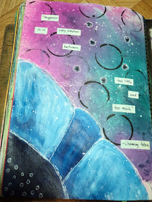 Way Station: I was just playing around on this page. I had no direction but figured I'd try to put a big flower across a corner. Meh. The quote sums up my feeling on the whole thing, "Happiness is a way station between too little and too much." --Channing Pollack.
 Be Mine: With Valentine's Day coming up, this is my traditional anti-Valentine. This was a clean-up page for my stencils and spray inks in cool colors. It's hideously busy so I stuck with some black as a focal. Not sure whether the "Be Mine" is a request or a demand.
 Cheetah: This page began with the black spots. Those spots are from the small round ink applicator from Tim Holtz. I was using it to apply black Dylusions paint on the page above and cleaned it off on this page. I loved how the circles were incomplete and reminded me of a leopard or cheetah. After going through my stash and coming up with a few cheetah images, I went with it. (I also might add here that I used a combination of spray inks on the background; Lindy's Starburst in Glory of the Seas Gold and Marigold Yellow Orange, a new favorite of mine, as well as Dylusions Pure Sunshine.)
 I was organizing my button hoard last week and discovered some safari themed ones and added them in. I put on the whipped spackle and pushed the buttons into it while wet to be sure they held.
 The string of running cheetahs along the bottom are cut out from a separate paper and colored with Crayola markers. I carved the cheetah image to make my own rubber stamp. I like how the image can be made to look like the cheetah is running. This turned out to be one of my favorite pages!
 Survivor: I haven't watched Survivor, the reality show, in many years. I used to be a big fan. I laid down the green and blue background then got stuck. Rummaging through the magazine cut-outs, I found the logo and it matched too well not to be used. I knew I still had some "jungle" themed stuff and took off from there. I decided to break the rule of collage that all things need to touch but I decided after I got them all down that I could connect them with the circles. In the end, it reminds me of a board game.
 I decided to add this 3-D interactive element. (After all, Survivor is an interactive game/reality show.) I adore the way it looks but it is a very thick element to add to an art journal. Overall, it was worth it.
 I managed to use up a lot of collage scraps with this 2 page spread and I like it.
 ???: I've got no catchy title for this page. The quote is it, I suppose. This is the back of the THICK shaker element from the above layout. There was no way I was going to be able to utilize this page as I normally do. It would never lay flat so any ink would just cause a mess, stamps would be useless, and my collage batteries were running low. So my idea was to be abstract. I was going to spray a spot of ink in ROY G BIV and then tear a spot of colored paper to match and....well, okay, so my plan changed when my "spots" of ink just went all over. Still liked how it looked and decided to just fill the page with the Picasso quote. Yo, it's done.
 Happiness is a Butterfly: This is one of my favorite butterfly quotes. I stamped the butterflies first then used a mask to protect them as I stamped the background text. I wasn't sure how much color to add to this so I went with spray inks on the background and left my focal uncolored. (for now anyway. Still not sure I like it that way.) I meant for there to be more turquoise in this background but the yellow ink got away from me. :)
Thanks for taking a peek at the journal. Hope you get a chance to make something soon!
--Wy


Thanks for taking a peek at the journal. Hope you get a chance to make something soon!
--Wy

Comments
Post a Comment