Artist Journal and a Little Inspiration
It's official. I counted the blank pages left in my Artist Journal: 20. (Two, as of this writing, have some background paint on them and no idea of where they'll end up!) I have a month left to finish them.
It's December. The Holiday Season. Time for baking and shopping. It's the busiest shipping time of the year. (That's important because I work at The UPS Store where we package and ship just about ANYTHING.) To complete this journal by the end of the year will be tight.
Unless my creative mojo drinks a gallon of coffee.
I'll share a couple more pages to keep up my spirits. But to understand the first page, you've got to see the page in the Inspiration Journal.
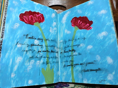
 Red Flowers: IW#22. This is where I learned why I liked
heavy body acrylics. I'm not an enthusiast for texture in my art
journal. (Seems weird that I like Donna Downey's style...she loves texture in the journal...me: not so much) I like the layered look without the bulk. BUT I do like how
heavy body acrylic holds a line. The flowers were done with a palette
knife. I got a bit too much smearing on my quote but I just went back
and highlighted the parts that I wanted to stand out. I didn't really
have a pen that would smear "a little". Totally forgot that Donna had
used a text stamp on the background and while I didn't go back and add
it, I liked the look. Decided to just leave it organic...how I
remembered the lesson rather than going step by step. I like this spread
so much that I did another one like it in my Artist Journal to use up
some paint.
Red Flowers: IW#22. This is where I learned why I liked
heavy body acrylics. I'm not an enthusiast for texture in my art
journal. (Seems weird that I like Donna Downey's style...she loves texture in the journal...me: not so much) I like the layered look without the bulk. BUT I do like how
heavy body acrylic holds a line. The flowers were done with a palette
knife. I got a bit too much smearing on my quote but I just went back
and highlighted the parts that I wanted to stand out. I didn't really
have a pen that would smear "a little". Totally forgot that Donna had
used a text stamp on the background and while I didn't go back and add
it, I liked the look. Decided to just leave it organic...how I
remembered the lesson rather than going step by step. I like this spread
so much that I did another one like it in my Artist Journal to use up
some paint.
And this is the page:

 Dark Flowers: What to do with extra heavy body acrylic paint? Make flowers! I redid the IW lesson above here in the smaller journal. I left off a large quote but added the look of the text in the background. I just spread paint over the page with a palette knife to leave the white gaps rather than add more white paint over the top. I finished off the flowers with a coat of Silks Acrylic Glaze (Ice) (also left over). I'm in love with it. The flowers are much thicker in this journal as I was trying to use up the paint I had mixed. The color is actually a very deep blue-violet. (I was going for a straight-up purple but added too much blue to my smidge of red!) The only thing I might do is go back and add a bit of dark color to the stems to make them stand out a bit more.

 Inch Worm: This is one of those pages that I thought was finished but after a while it looks like it needs something. (You know that Elusive Something!) I may be adding some black line doodles to this page; it looks heartlessly plain. But it does make me happy. I like how the torn paper looks like bamboo! Just playing with scraps and gelatos. A nice way to spend some time.
Gearing up to get 'er done this year!
--Wy
"Inch worm, Inch worm, measuring the marigolds..."
It's December. The Holiday Season. Time for baking and shopping. It's the busiest shipping time of the year. (That's important because I work at The UPS Store where we package and ship just about ANYTHING.) To complete this journal by the end of the year will be tight.
Unless my creative mojo drinks a gallon of coffee.
I'll share a couple more pages to keep up my spirits. But to understand the first page, you've got to see the page in the Inspiration Journal.


And this is the page:


Gearing up to get 'er done this year!
--Wy
"Inch worm, Inch worm, measuring the marigolds..."

Comments
Post a Comment