Art Journal 2014: Part 3
Thought I had a bright sunny day to take some photos but got so wrapped up in chores and creating that by the time I went to photograph, the sun was setting! Damn! So my apologies for the weird color on a few of these photos!
Once again, this is my Art Journal and you can see previous pages HERE and HERE.
Onward:
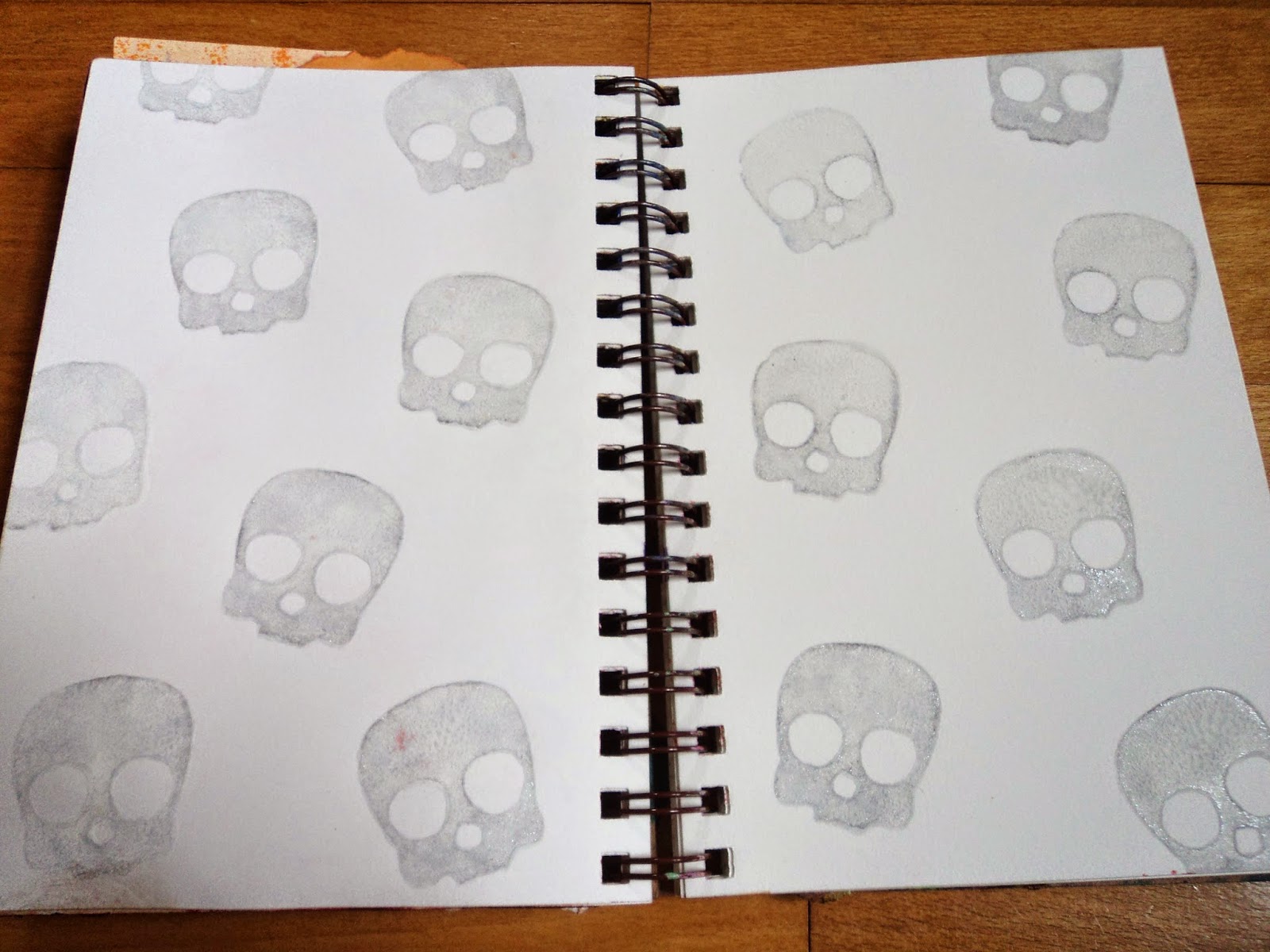
Sweet Sugar Skulls: This spread started this way; with a skull stamp that I carved dunked in white acrylic paint with a touch of pearl. My intention was to create a resist. But it sat for a LONG time before I could figure out what to do with it.

Finally just decided to lay down some purple spray. (A homemade spray with Distress reinker, Seedless Preserves with some Perfect Pearls Interference Blue.) I added some stenciling along the edges with same. Stamped with some splotches in StazOn Royal Purple. I wiped off the skulls as I went along but the ones along the edge stained a bit. (I'm thinking that I might have sprayed that in Glimmer Mist Haunted Shadows and that's why it stained rather than resisting. Not sure, don't quote me on it.)

I used regular Sharpie markers to add the sugar skull details. The sharpies worked well over the acrylic and I had a bunch of bright colors. I colored the eyeholes in with black sharpie and outlined them to make them pop out. Me likey.

Time Was: This page came together out of the necessity to cover up the mess. My spray had leaked through the page and I added the dictionary paper to cover it up and start "fresh". (I'm so in love with using old dictionary paper!) After that was down, I sprayed ink over it. (Lindy's Stamp Gang spray Time Travel Teal and Rusty Lantern Lime and Copper Glimmer Mist) The colors were very patina so I went vintage and used up some collage elements I had in my stash.
 The letters were torn from a book that I am currently altering. (It's Halloween themed and the original title is Poison.) I got TIME but didn't have letters for much more than WAS so I left it at that. I inked the letters with Vintage Photo Distress Ink.
I REALLY like this page!

Life is Art: My sister gave me a wonderful stamp (given to her from a friend) and I decided to use it for this page. I wanted something bright and I wanted to use my favorite stencil, the Tim Holtz, harlequin design. The rest is just scraps and little collage items. The color is really off in these photos, but it is mainly Dylusions ink in Squeezed orange and Bubblegum Pink. I just love how the black makes it seem even brighter.

I stained this envelope and tag to match the layout and used that stamp.
 Also used two hand-carved stamps; the filigree heart and the Monarch. (My Go-To stamp for almost everything! I love it!)

Life's a Beach...NOT: This page is to use up some stickers! And mostly because I was stuck for so long staring at this background. I really like this Lime green from Dylusions but it stumps me when I lean it toward yellow rather than blue. But my beach stickers had all the right colors. Let's face it, I wasn't going to be needing them, either. I am just not a beach person. Water..fine. Swimming...fine. Sandcastles...fine. But just sitting in the sun on the beach, reading a book or whatnot...yuck. Not for me. So decided just to make the statement.
I've got more pages to blog about soon and more to finish up before the year is over. Some are good, some aren't...but who cares!
Thanks for reading!
--Wy
"Follow your heart but take your brain with you." --Anonymous
Once again, this is my Art Journal and you can see previous pages HERE and HERE.
Onward:
Sweet Sugar Skulls: This spread started this way; with a skull stamp that I carved dunked in white acrylic paint with a touch of pearl. My intention was to create a resist. But it sat for a LONG time before I could figure out what to do with it.
Finally just decided to lay down some purple spray. (A homemade spray with Distress reinker, Seedless Preserves with some Perfect Pearls Interference Blue.) I added some stenciling along the edges with same. Stamped with some splotches in StazOn Royal Purple. I wiped off the skulls as I went along but the ones along the edge stained a bit. (I'm thinking that I might have sprayed that in Glimmer Mist Haunted Shadows and that's why it stained rather than resisting. Not sure, don't quote me on it.)
I used regular Sharpie markers to add the sugar skull details. The sharpies worked well over the acrylic and I had a bunch of bright colors. I colored the eyeholes in with black sharpie and outlined them to make them pop out. Me likey.
Time Was: This page came together out of the necessity to cover up the mess. My spray had leaked through the page and I added the dictionary paper to cover it up and start "fresh". (I'm so in love with using old dictionary paper!) After that was down, I sprayed ink over it. (Lindy's Stamp Gang spray Time Travel Teal and Rusty Lantern Lime and Copper Glimmer Mist) The colors were very patina so I went vintage and used up some collage elements I had in my stash.
I REALLY like this page!
Life is Art: My sister gave me a wonderful stamp (given to her from a friend) and I decided to use it for this page. I wanted something bright and I wanted to use my favorite stencil, the Tim Holtz, harlequin design. The rest is just scraps and little collage items. The color is really off in these photos, but it is mainly Dylusions ink in Squeezed orange and Bubblegum Pink. I just love how the black makes it seem even brighter.
I stained this envelope and tag to match the layout and used that stamp.
Life's a Beach...NOT: This page is to use up some stickers! And mostly because I was stuck for so long staring at this background. I really like this Lime green from Dylusions but it stumps me when I lean it toward yellow rather than blue. But my beach stickers had all the right colors. Let's face it, I wasn't going to be needing them, either. I am just not a beach person. Water..fine. Swimming...fine. Sandcastles...fine. But just sitting in the sun on the beach, reading a book or whatnot...yuck. Not for me. So decided just to make the statement.
I've got more pages to blog about soon and more to finish up before the year is over. Some are good, some aren't...but who cares!
Thanks for reading!
--Wy
"Follow your heart but take your brain with you." --Anonymous

Love your journal!
ReplyDeleteBeautiful!
ReplyDelete